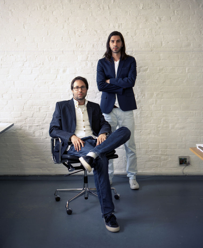
henrik kubel and scott williams photo by tomoko suwa
A2-TYPE is a type foundry set up by design studio A2/SW/HK (scott williams and henrik kubel) in 2010. earlier this month designboom spoke to henrik kubel to learn more about their work.
designboom: why did you decide to specialise in typography?
henrik kubel: it’s similar to adding your signature to a piece of work and it’s a unique way of creating bespoke design for clients that wish to stand out.
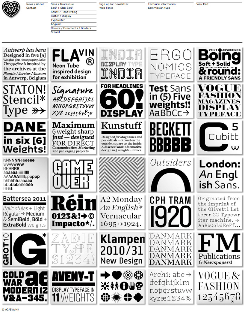 overview of the typefaces available from A2-TYPE
DB: besides yourself and scott how many people work in your studio and how do you go about dividing / sharing the work?
HK: we are 2 people and we do all the work. A2/SW/HK is a design studio and part of our philosophy is to design new typeface for every project we work on; whether it’s a series of books (A2 beckett), a set of stamps (danmark), a brand identity (aveny-T) or signage for an exhibition (ergonomics).
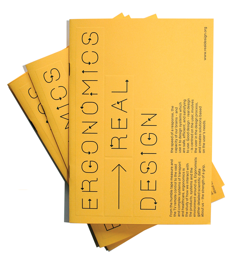
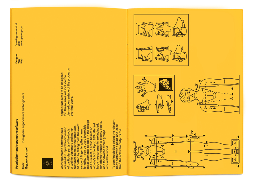
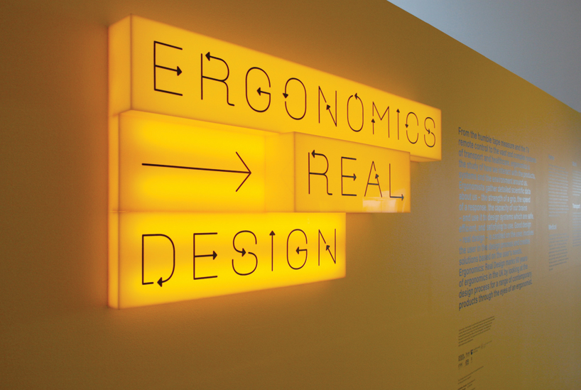 ‘ergonomics — real design, 2009—2010 design museum, london exhibition identity, applied graphics and brochure including bespoke display typeface exhibition design by michael marriot photography by luke hayes & A2/SW/HK
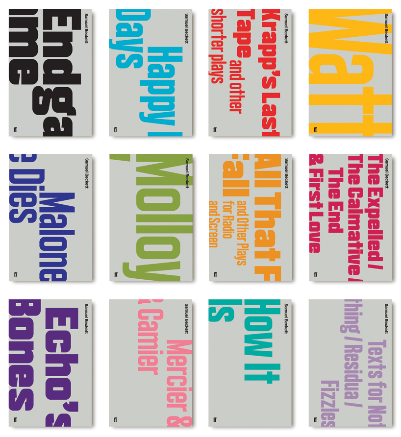
samuel beckett, complete works, 2009—2010 faber & faber, london cover design & bespoke typefaces
DB: how do you justify the time and cost of designing a new typeface to the client?
HK: drawing bespoke typefaces is integrated in the way we work in our studio, it’s simply how we do things. we do occasionally use existing fonts, depending on the client and the project. the clients we work with understand our approach and see it as a unique add on to their project.
DB: what made you decide to release your typefaces commercially?
HK: we could see the potential in selling our fonts to a wider audience after our first release; new rail alphabet developed in collaboration with margaret calvert in 2009. we set up A2-type as a platform for publishing our existing library of fonts and also to originate and release new designs.
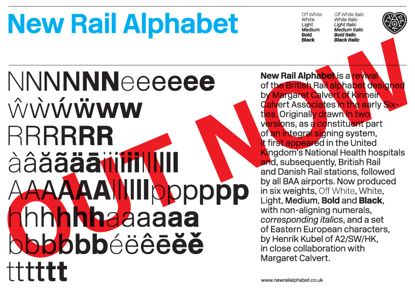
new rail alphabet, 2009 A2-TYPE, london typeface in 6 weights; off white, white, light, medium, bold & black + corresponding italics designed in close collaboration with margaret calvert

one work, 2006— afterall books, london and the MIT press art direction, bespoke typefaces and design
DB: what influences you more, contemporary trends or historical preferences of your own?
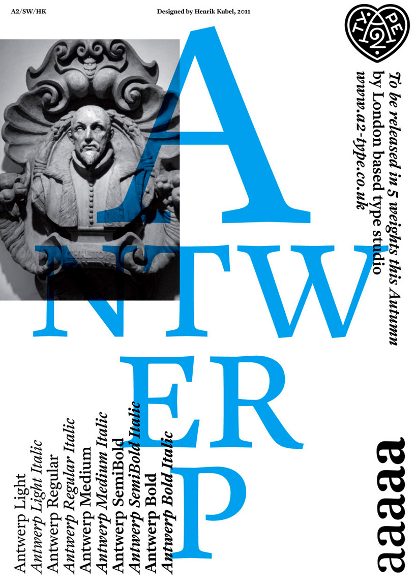
HK: we are influenced by both, mostly the clients brief. recently I used the archives at plantin-moretus museum in antwerp in belgium as a source of inspiration for designing a ‘historical’ font with contemporary proportions for books and magazines. it’s named antwerp and it’s available in 5 weights plus italics.
DB: have you ever been impressed or upset with how somebody has used one of your typefaces?
HK: when other designers use our fonts, we look at it and try to learn. I have seen many examples where other designers use our fonts beautifully.
DB: do you ever revise / overhaul typefaces after their commercial release? do you notice details you’d like to change?
HK: our fonts are tried and tested extensively in our design studio before we release them. we tend to release fonts with a standard character set at first and then follow up with advanced character sets and expanded weight range at a later date. it takes time for our audience to get to know a specific typeface or family of types and keeping the system rigid and not too overwhelming is something we think works well at the moment.
DB: when you design a typeface do you start with certain letters or words to determine how the entire typeface will look?
HK: HOH + non + a, g, and a couple of numbers. these glyphs contain enough DNA for the rest of the letters to be crafted.
 india typeface for wallpaper*, 2011 A2/SW/HK in collaboration with geetika alok
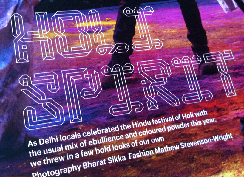
 summer of love: art of the psychedelic era, 2005 tate liverpool art direction, design and bespoke typefaces
DB: which characters do you find the most difficult to design?
HK: it all depends on the style of typeface. the letter ‘S’ always throws up interesting questions!
DB: have you ever designed a ‘non-latin typeface’ – would you like to work on this kind of project?
HK: I have designed a couple of greek alphabets but not released anything yet. designing type is to me about the overall structure and the reading pattern / harmony created by the individual glyphs when they are set as combined units; words – I believe this system applies to most languages – it’s simply a matter of executing this core concept. frank e. blokland from dutch type who has taught me in the past is doing some fantastic research on the subject of harmonics, patterns and dynamics in type: www.lettermodel.org
DB: roughly how long does it take to design a typeface?are certain styles more difficult to design than others (serif vs sans-serif)?
HK: crafting good type takes time, in the end it comes down to the project deadline.
DB: what are the most important things to consider when you start work on a new typeface? what advice would you give to students / young designers?
HK: I work on the regular weight including the italic style first (basic character set). I test this extensively to make sure it’s perfect before I start expanding the glyph set and add weights etc.
DB: how do you rationalize style over legibility?
HK: both should work together. (zadie)
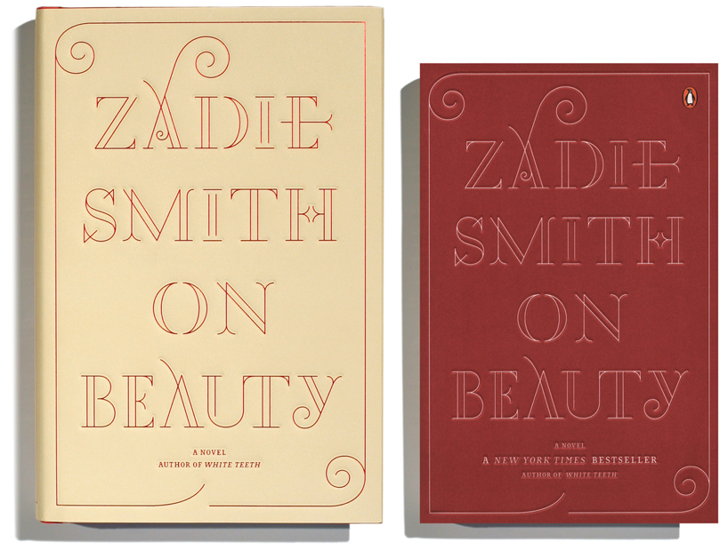
zadie smith: on beauty, 2005—06 penguin books, new york hardback and paperback cover designs including bespoke typefaces
DB: how different does a new typeface have to be from an existing one to avoid copyright issues? how can you monitor this whilst designing?
HK: I have a fair knowledge of what’s on the market and we have also built up a solid collection of period typeface specimens and reference books. in addition to this, we have some fantastic and very supportive colleagues in the industry, so I often share my designs to get a second opinion.
DB: what are some of your favourite typefaces – old and new by other foundries / designers?
HK: ‘caslon grand canon’ (metal type) – this typeface is just beautiful! another favorite of mine is transport alphabet designed by jock kinneir and margaret calvert in 1957. which we are currently reviving in collaboration with margaret calvert.
Db: what are you working on right now?
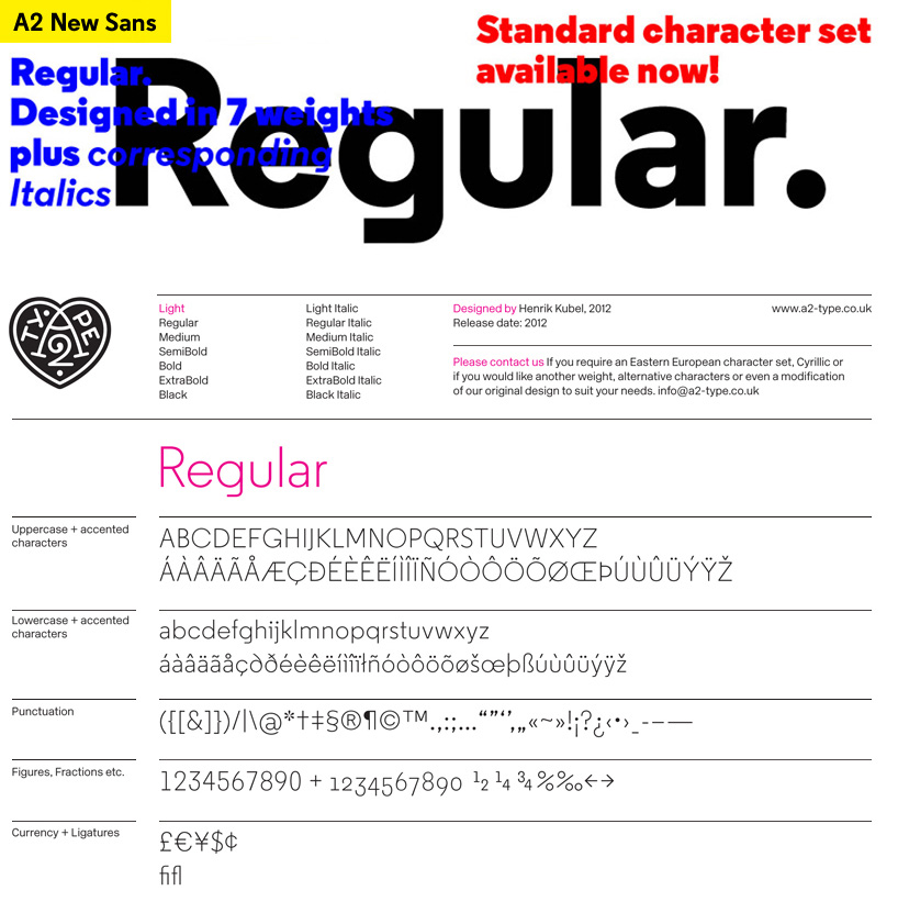
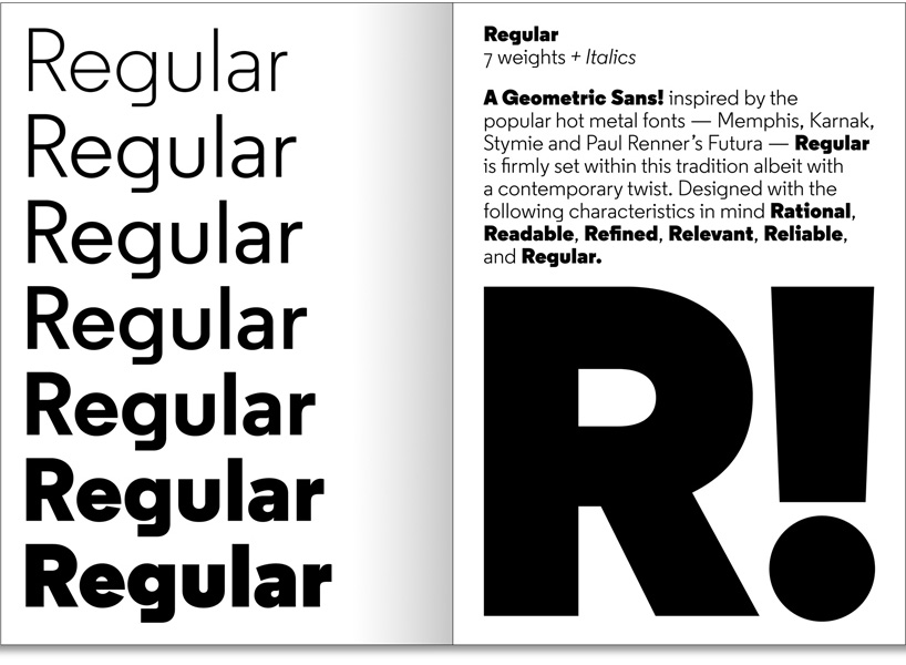
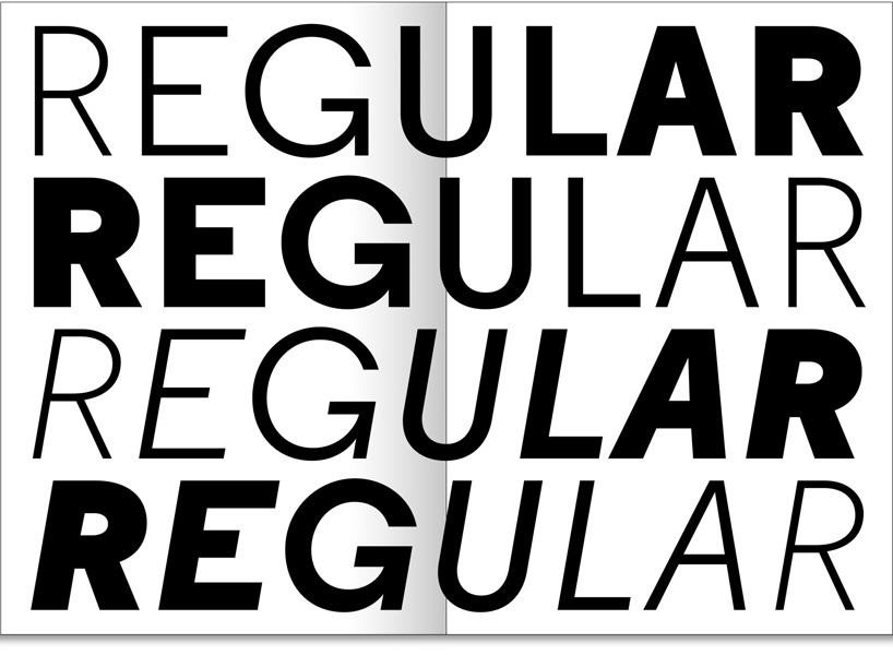
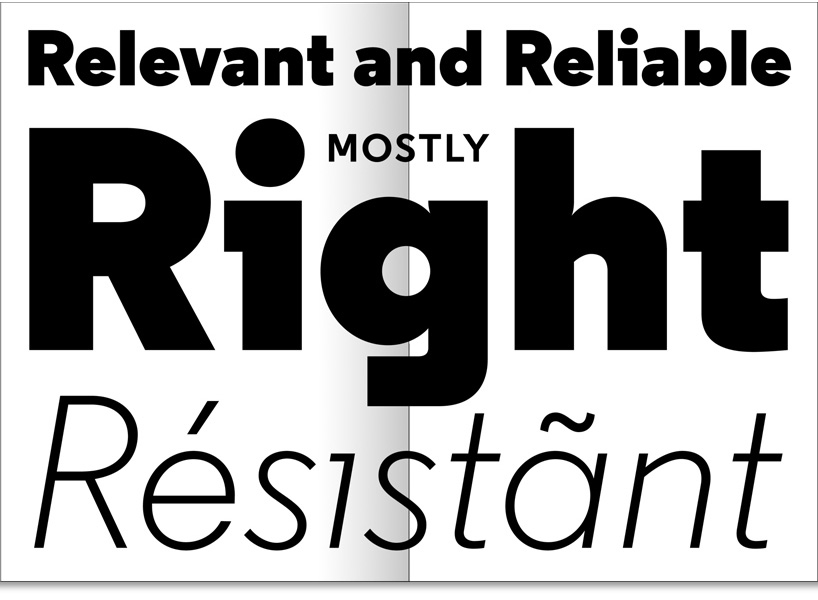
HK: we have just released a new font called regular., it has been designed in 7 weights + italics. regular is a geometric sans with its basic structure inspired by some of our favourite hot metal fonts: memphis, karnak, stymie, scarab and paul renner’s futura. regular is in many ways a revival but it is also a font that has contemporary references and key words like: rational, readable, refined, relevant, reliable and responsive were part of the check-list during my design process.


more… scott and henrik are members of alliance graphique internationale, AGI. read more here the team publish their fonts through: www.a2-type.co.uk, www.vllg.com in new york and www.playtype.com in denmark.
![]()
DESIGN-AEROBICS – GRAPHIC DESIGN 2012 ONLINE COURSE – STARTS MAY 17
Save
A2-TYPE (2)
 Nov 01, 2012
typography design (133)
 Sep 13, 2023
 Feb 23, 2023
 Jan 24, 2023
 Jan 19, 2023
PRODUCT LIBRARY
 Sep 07, 2024
 Sep 02, 2024
 Aug 29, 2024
 Aug 21, 2024