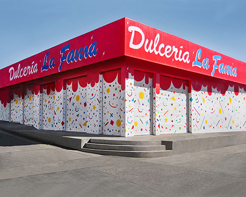
IHC updates dulceria la fama’s brand + store façade in mexico
the identity is developed from the candies and elements related to the children's parties like clowns and fantasy characters.
prefer designboom on google[FEATURED]
IHC updates dulceria la fama’s brand + store façade in mexico
(above) the brand was established in 1987
all images courtesy of IHC
‘dulcería la fama’ is a family-run business focusing on the distribution of candies at retail or wholesale, including the offer of toys and articles for children’s parties. the company has become a family tradition that has been developed by three generations and established as a brand since 1987. for several years, the image and brand identity has been transformed and renewed periodically attempting to distinguish itself from local competition.
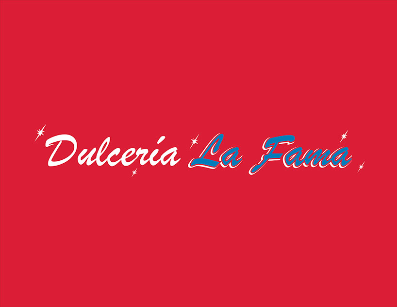
logotype based on the brush script MT italic reinterpreted by a local sign maker
when faced with the new design of the brand and store façade, mexican-based studio IHC took into consideration several existing elements such as the name of the brand which in spanish refers to celebration and distinction. another existing component that was addressed was the built store volume and its façade. from this starting point, it was decided to clean the external faces, leaving a more legible volume to transmit the spirit of the brand graphically.
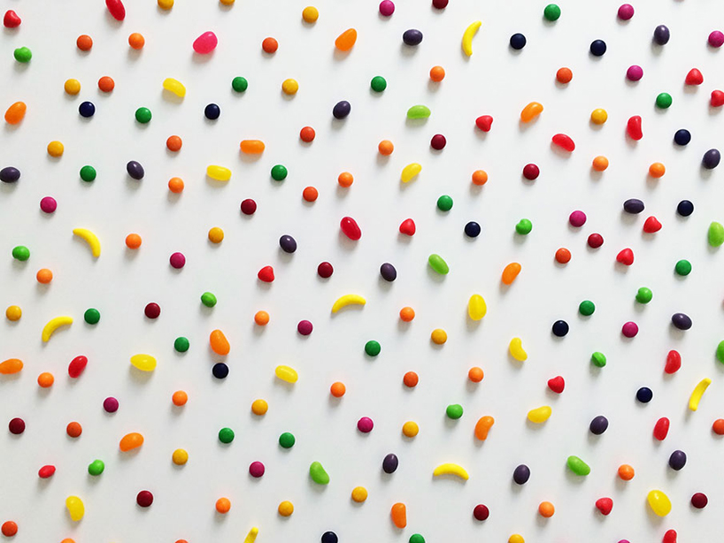
the main inspiration comes from the candies
the brand is based essentially on primary colours and geometric shapes that allude to topics such as childhood and happiness. the logo references the mexican traditional craft of rotulismo without seeking greater skill in a typographic solution and leadership in the same brand. the motivation for the development of the identity comes mainly from the candies and elements related to the children’s parties like clowns and fantasy characters. through the design of a geometric and seemingly random language, a texture was determined for the façade store to express a colourful childhood paradise. these graphic elements became a resource to extend the presence of the brand to other components such as products, vehicles for cargo transportation and employee uniforms.
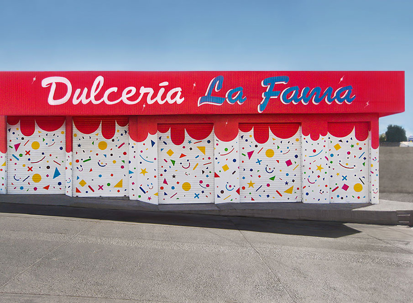
west façade
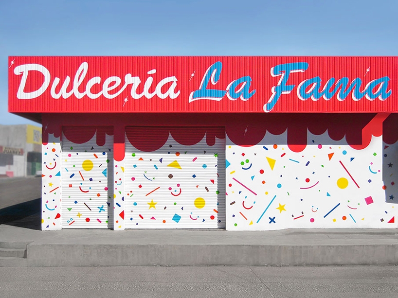
south façade

detail from one of the façade walls
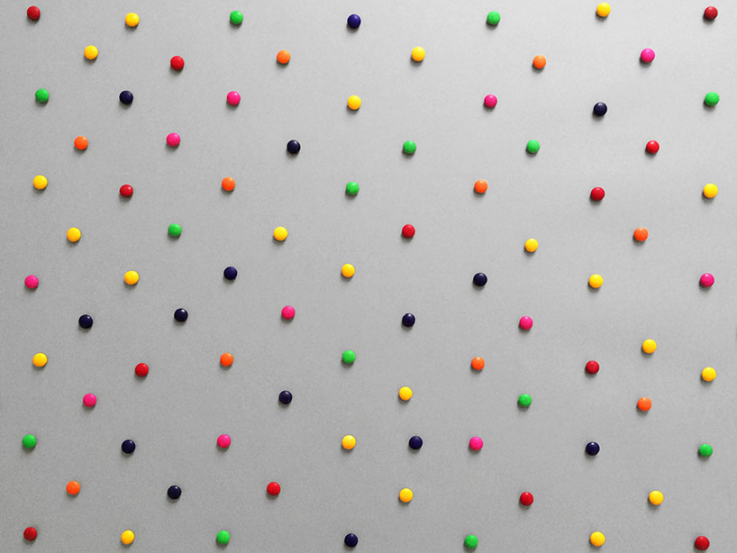
the resource of the pattern as a key element
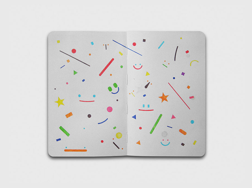
a preliminary sketch very close to the final concept
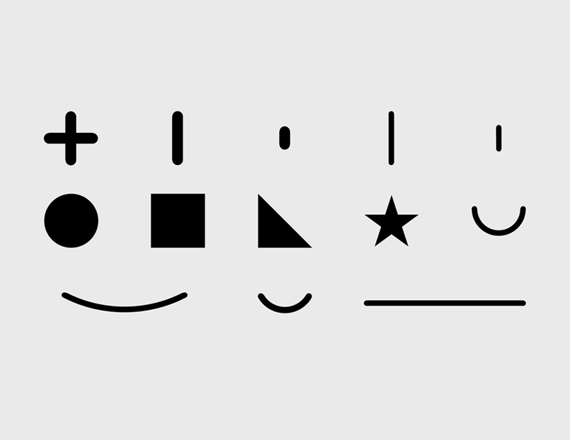
some shapes were selected and variants were done in three sizes

main idea on the resource of the grid and the alternation of elements to achieve a seemingly random pattern
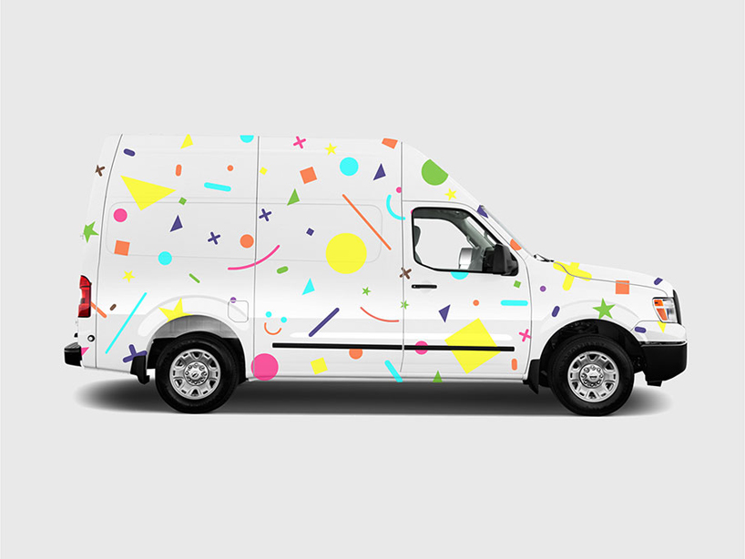
cargo vehicle
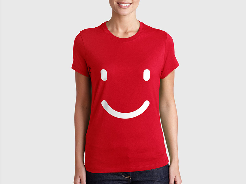
a simple uniform for employees
designboom has received this project from our ‘DIY submissions‘ feature, where we welcome our readers to submit their own work for publication. see more project submissions from our readers here.
shop
your own online design shop — no sales commission collected