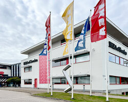
swedish furniture giant IKEA has unveiled a new logo but it is so subtle you might not have noticed. designed by stockholm-based seventy agency, the slight differences are intended to ‘future proof’ the logo in a digital world.
![]()
image courtesy of brand new
the studio achieved this through various alterations including redrawing the letters and reducing the flares to create a more optimal visual experience in digital formats. it also increased the open and closed counters of the letters E and A to increase legibility. the trademark symbol was also moved from outside the logo to be incorporated into the design, enabling an easier alignment of the logo.
![]()
image courtesy of brand new
‘we wanted to maintain the unique characteristics of the original iconic design, but make subtle, yet impactful changes to the logo for a better experience across all formats‘, explains joakim jerring, creative director of seventy agency.
![]()
all other images courtesy of seventy agency
the proportions between the oval and the rectangle have been modified with the studio increasing the size of the brand name. as a result the letter size was increased by 15%, creating a bigger brand presence without increasing the amount of media space.
![]()
‘the updated IKEA blue and yellow colors will take on a larger branding role, aiding the experience of IKEA in current and new meeting points‘, added seventy agency. ‘the new colors make it easier to reproduce the logo more consistently. they are now optimized for individual color experiences, even when they are not sitting next to each other.‘
![]()
‘the new colours make it easier to reproduce the logo more consistently,’ it continued. ‘they are now optically enhanced, optimised for individual colour experiences, even when they are not sitting next to each other.‘
project info
company: seventy agency
client: IKEA
type: logo redesign
IKEA (115)
 Oct 09, 2024
 Aug 29, 2024
 Jun 05, 2024
 May 31, 2024
 Feb 29, 2024
logo design (246)
 Aug 09, 2024
 Jul 03, 2024
PRODUCT LIBRARY
 Sep 07, 2024
 Sep 02, 2024
 Aug 29, 2024
 Aug 21, 2024