new york city-based industrial design office visibility works with clients in a variety of fields, including furniture, lighting, electronics, appliance, and tableware design, always with a focus on the purity of an idea, as well as its material and formal actualities. founded by joseph guerra and sina sohrab in 2012, the studio has since worked on a variety of objects, from a deodorant stick to an ashtray for one and a bundle of fitness elements, all designed with a witty yet practical approach.
 all images courtesy of visibility
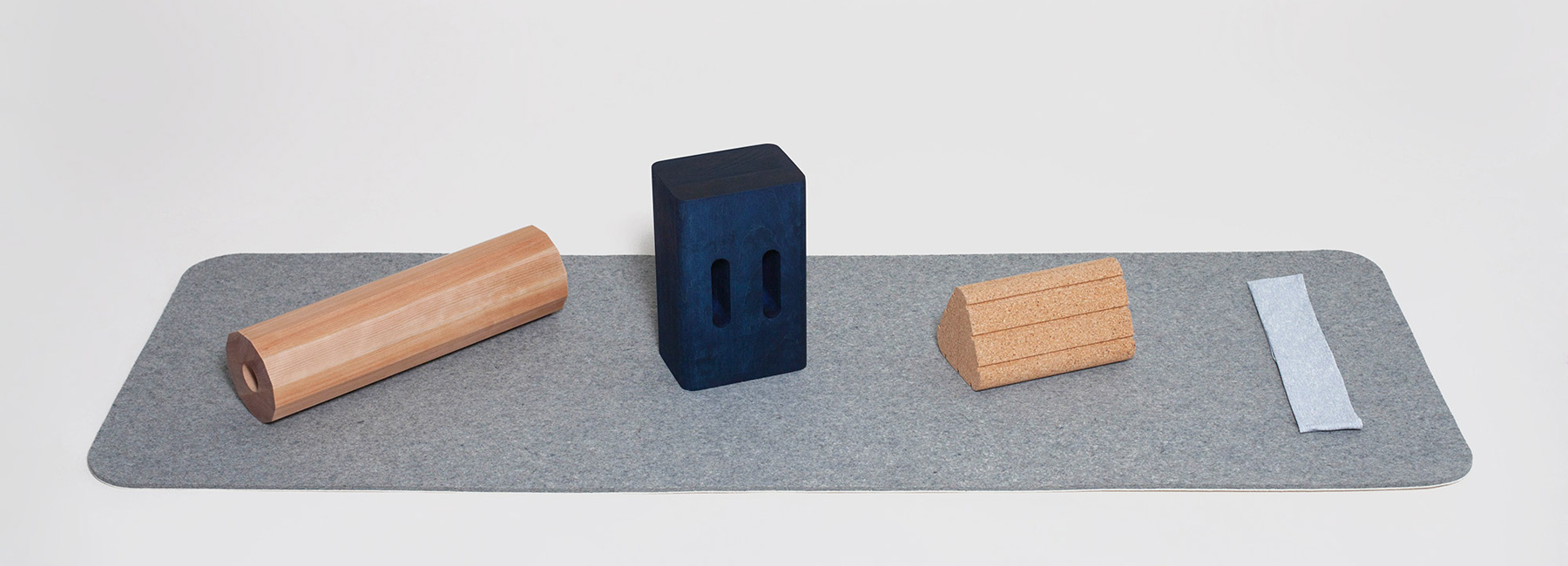
fitness objects designed in collaboration with recreational apparel brand outdoor voices
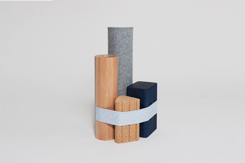
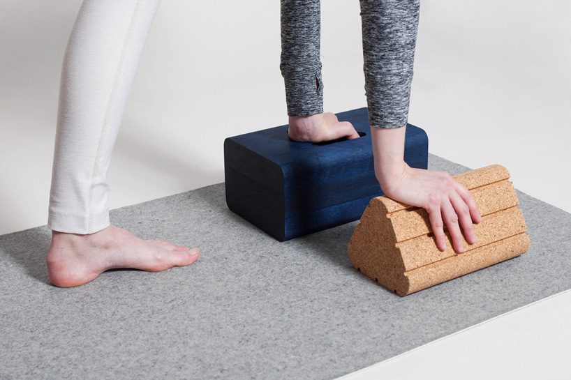
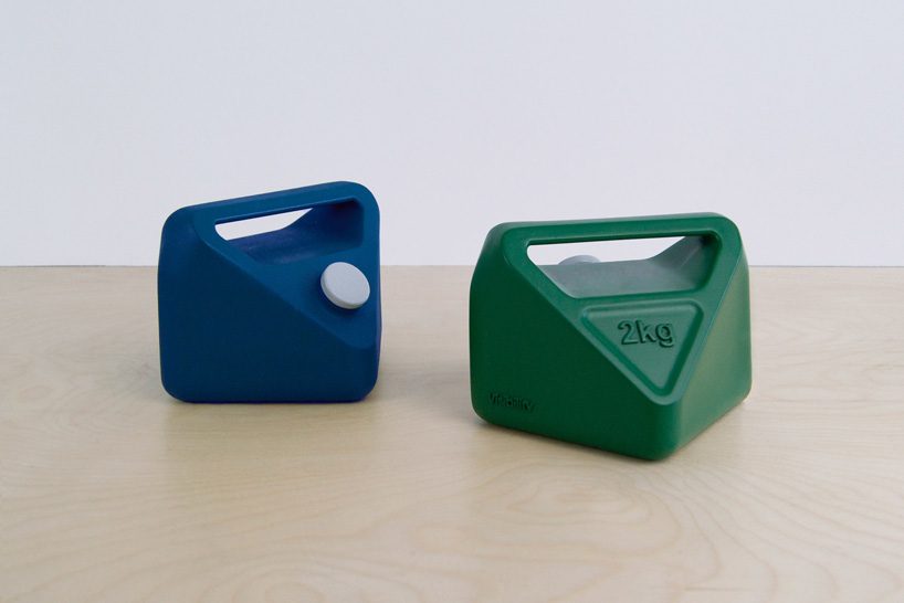
visibility‘s work has been internationally recognized and exhibited, gaining it a place in forbes’ 30 under 30 annual list of entrepreneurs. their products include a collection of five fitness objects created in collaboration with NY-based recreational apparel brand outdoor voices that play with color and natural materials. the set comprises a resistance band, a wood yoga block, a triangular cork block, a wood roller, and a felt mat, all designed to bring warmth to a domain that can often come across as sterile or unconsidered.
 the forms fit together in a bundle, held together by a fabric resistance band
another collaboration of visibility is that with myro, for who they designed a refillable deodorant system that uses 50% less plastic than a typical drugstore deodorant. addressing both the health concerns and the ecological impact concerns that surround its industry, the fully recyclable replacement pods are easy to use, while the deodorant itself is natural and aluminum free.
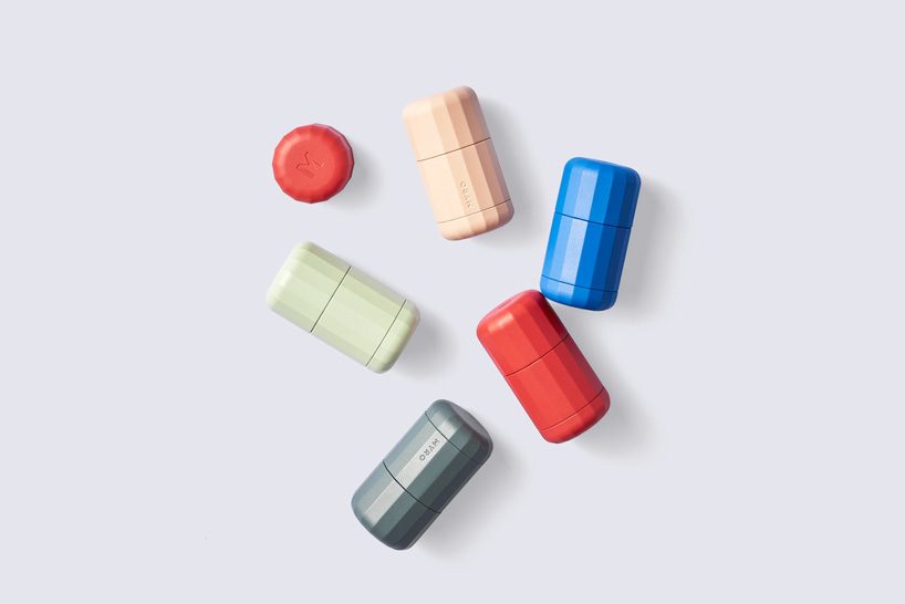 refillable deodorant system designed for myro
 the multifaceted shape of the hardware is designed for easy turning and a tactile experience
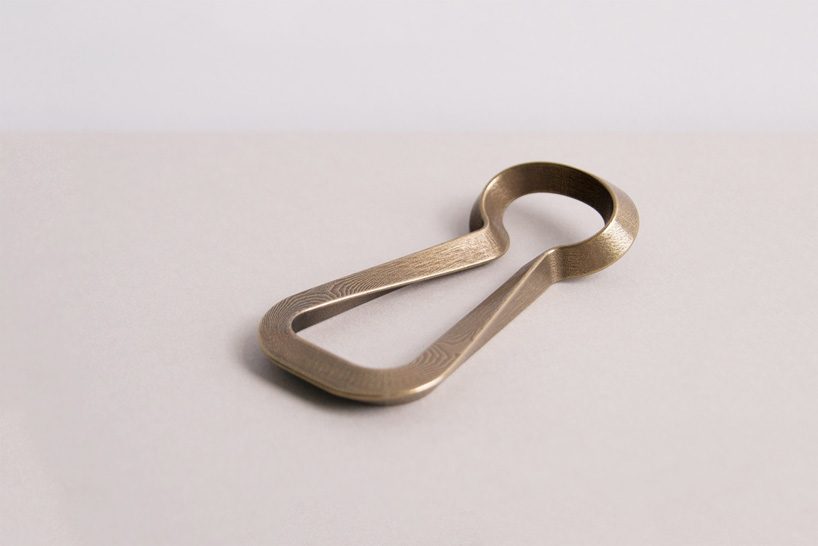 a self-initiated design, the bottle opener uses an inward facing triangular cross section and a sweeping form
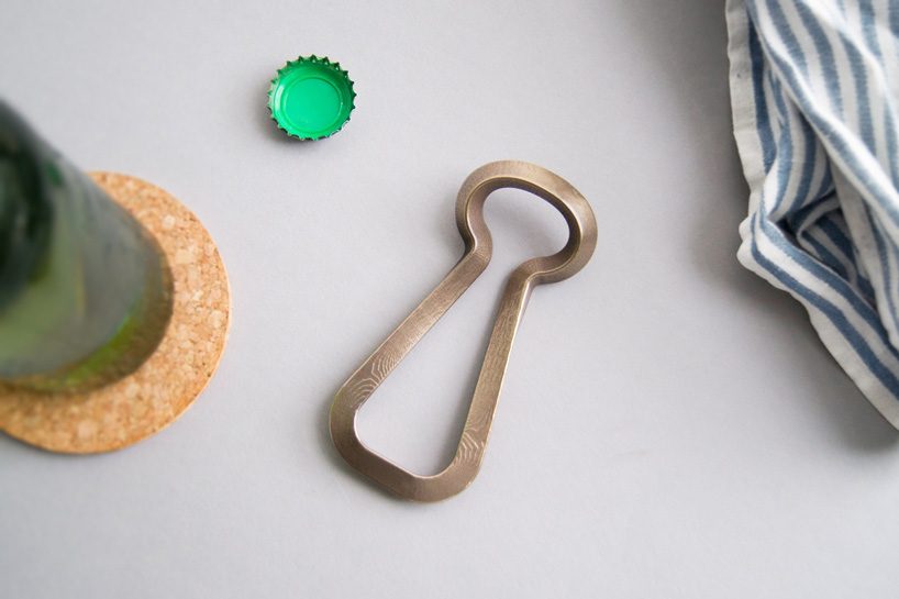 its form allows for the opening of bottles without the need for a crossbar, thus permitting for a more open and radical shape
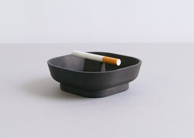 cigarette for one is an ashtray designed for the one-year anniversary exhibition at fisher parrish gallery, created as a totem to the dying ritual of smoking
 this refillable paperweight is designed for fisher parrish gallery and draws from japanese water weights
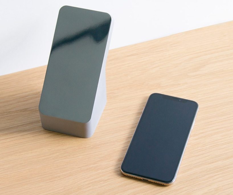 created for emma scully gallery, the tabletop mirror works with the iconic and monolithic form of the smart phone
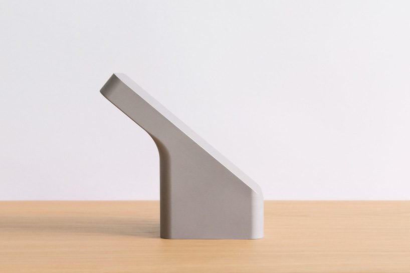 only the face is polished to a mirror finish while the rest is a raw material (machined aluminum), as if cut from stone
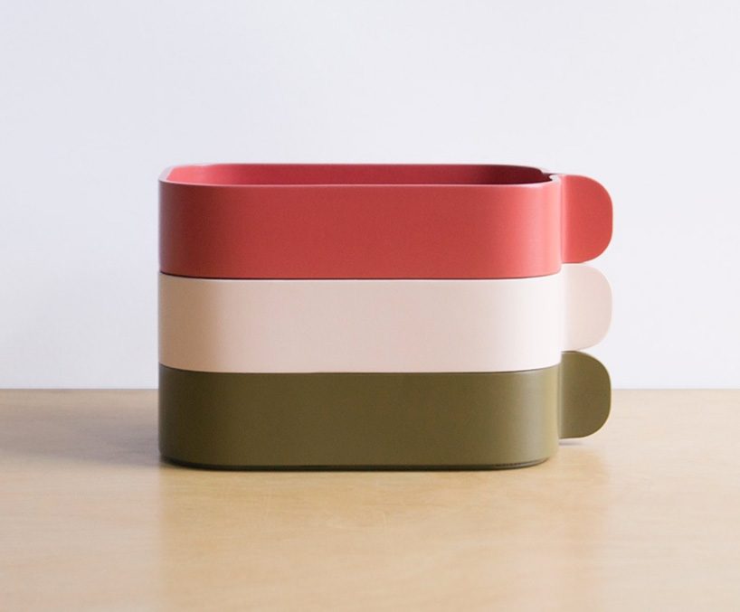 the bent boxes for normann copenhagen is are built simply and take inspiration from the japanese tradition of magewappa, bentwood housewares
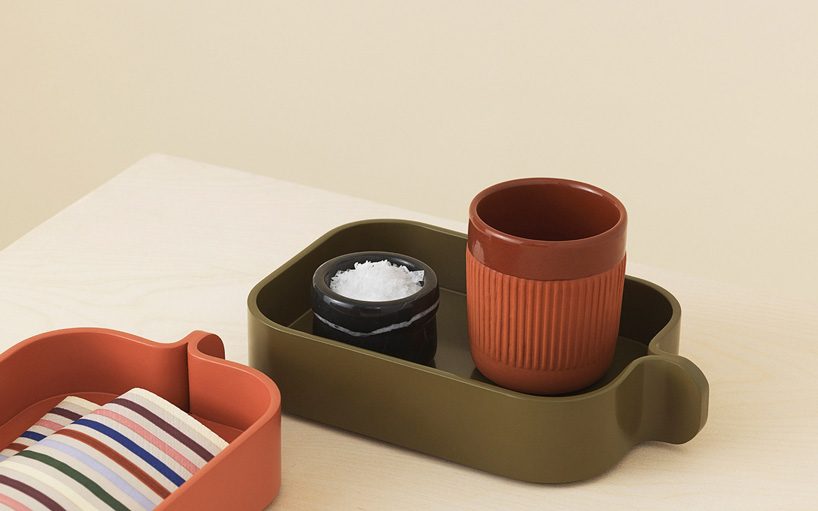 constructed from a single strip of wood wrapped around a base, their forms are easy to understand and open ended
 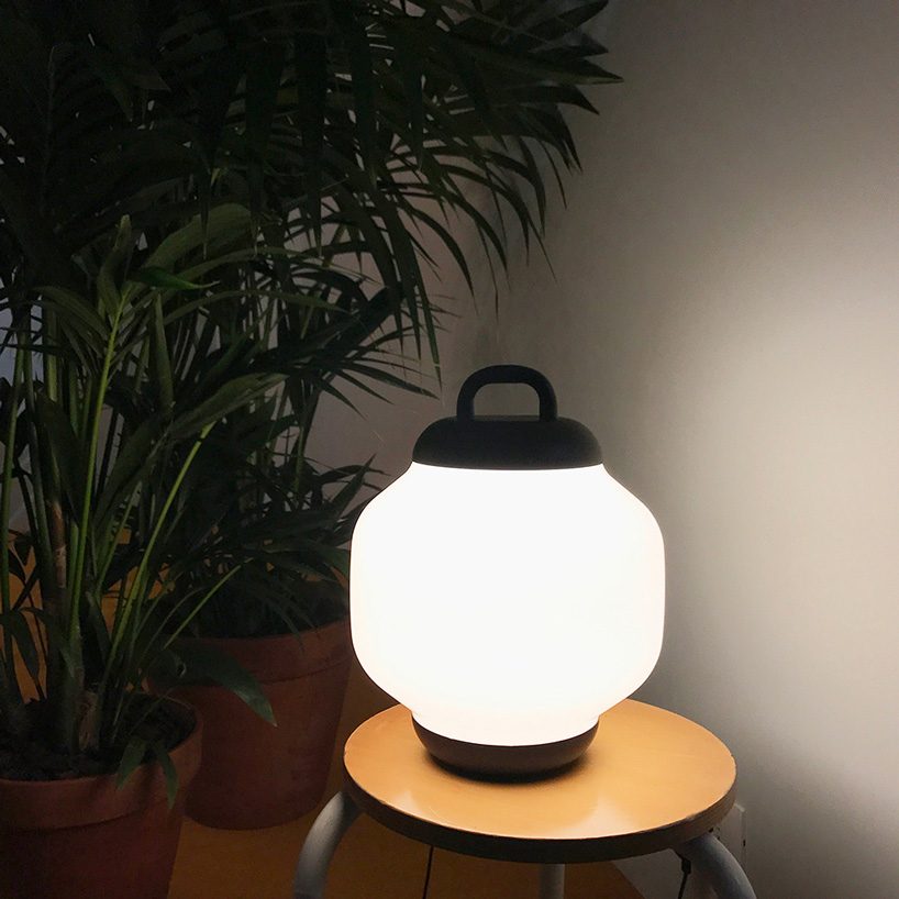 designed for roll & hill, the esper lamp draws from chochins, the archetypal lanterns typically found outside sushi restaurants and late night hang-outs in japan
project info:
designer: visibility
 Mar 10, 2026
 Mar 08, 2026
 Mar 04, 2026
 Feb 24, 2026