muirmcneil: hamish muir and paul mcneil
muirmcneil was founded in 2010 by hamish muir and paul mcneil. the london-based studio focusses on exploring parametric design systems to generate appropriate solutions to visual communication problems.
hamish muir was co-founder of the london-based graphic design studio 8vo (1985-2001), and co-editor of octavo, international journal of typography (1986-92), he’s also an AGI member.
paul mcneil is a typographic designer with a background in visual identity and brand communications. he currently works in postgraduate design at the london college of communication where he is course leader, MA contemporary typographic media. he’s a ISTD member and HEA fellow.
designboom: how did the two of you meet and what made you decide to start your own studio?
hamish: we taught together at the london college of printing (now LCC) on various design workshops a few years ago and started to have interesting pub conversations about approaches to design. our studio practice is a collaboration that came about in 2008 when we began investigating the relationship between geometric type and legibility for a project instigated by hamish. this eventually became our fontfont threesix type system.
DB: how do you divide or share the work you do?
paul: quite loosely – we both get directly involved in every aspect. we have complementary ways of approaching design problems and enjoy investigating possibilities through extensive experimentation. we often take the long way round a problem, deliberately not looking for a quick solution but trying to extract every drop of visual energy from a process or composition. we discuss every detail of our projects at length and often disagree.
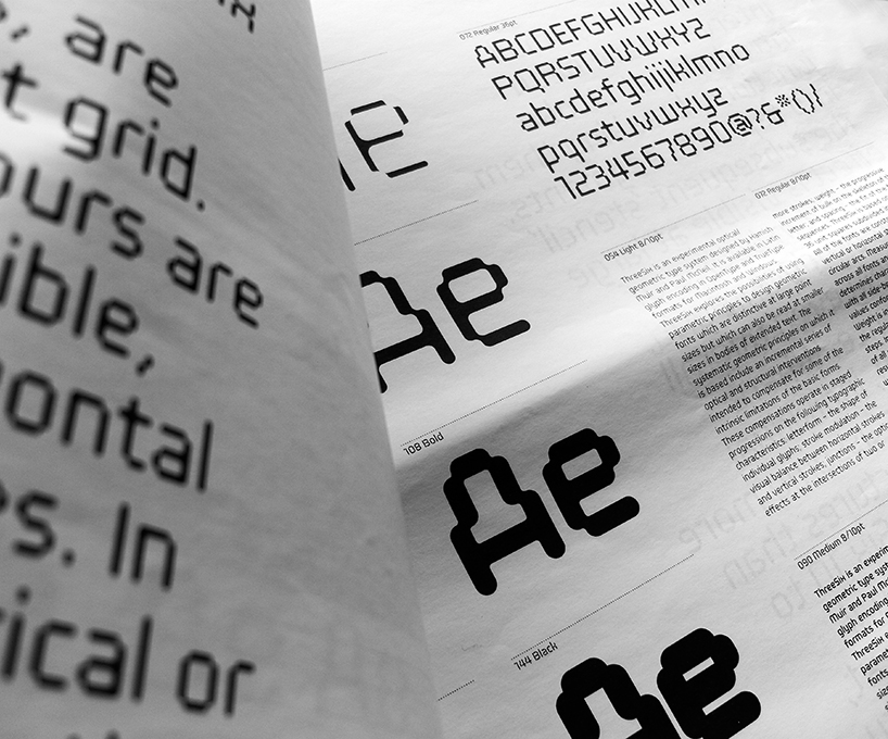
muirmcneil threesix is an optical / geometric type system consisting of six typefaces in eight weights. the threesix project explores issues of legibility and readability in the design of geometric typefaces for use in extended text as opposed to those intended solely for display purposes. threesix also concerns the use of generative and rule-based design methods for form-giving in typographic media.
in threesix a systematic progression of optical and structural interventions is used to generate a set of geometric typefaces which are highly distinctive at large sizes but which can also be read in bodies of extended text with comparative ease. a series of compensatory optical strategies are exploited to create the illusion of evenness in the fabric of reading matter. these structural modifications are plainly visible at large display sizes but, at text sizes, the reader experiences only the resulting overall effects on what he or she is reading rather than their specific formal causes.
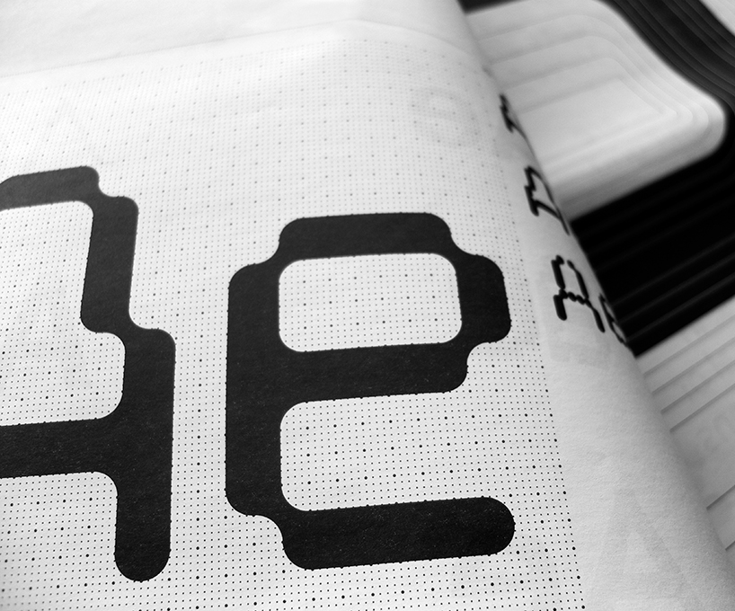
threesix works within strict geometric constraints. all of its typefaces are based on a grid of 36 unit squares subdivided into nine units and all are constructed from a set of modules using vertical or horizontal straight lines and circular arcs. more
DB: what would you say each of your strongest skills are and how do they compliment or contrast?
paul: I don’t think I’m particularly skilled or talented but I don’t see that as a failing. I’m interested in solving visual problems and I consider them as tasks requiring clear intentions, visualisation, sensitivity, analysis and re-iteration among many other things. I’m not saying these are skills, but rather a loose set of methods. the muirmcneil collaboration has required additional ‘skills’ most useful of which is trying not to cling to fixed personal positions or ideas; no easy matter.
hamish: my approach to design has always been quite intuitive (another way of saying somewhat unstructured and non-analytical, although that doesn’t mean I’m not careful in decision-making). after a few years at 8vo it became clear that a strategic approach was needed, or at least a logical and structured way of achieving designed outcomes. we both enjoy exploring the use of systems, strategies and sets of conditions to generate outputs while also using our aesthetic sensibilities and personal judgements. we appreciate the tension between the two approaches. in every project we work on together, after initial conjecture and testing one of us usually ends up setting the rules of the game and often it’s paul.
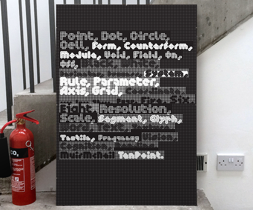
tenpoint – a modular type system that attempts to locate typographic objects at the lowest limit of their function as vehicles of communication; to use the fewest dots.
DB: what type of project(s) do you enjoy the most?
hamish: I would have to say posters. the scale of the ‘canvas’ and the physical qualities of real ink on real paper still make this the most rewarding format in which to explore the relationship between language, form and color.
paul: I enjoy the aesthetic and functional qualities of systems; I’m interested in any project or problem where the design process is in the discovery or definition of rules and conditions that ultimately lead to outputs. I find this root-level location for design liberating rather than confining and, when it works out well, very fruitful (quite literally). and like hamish, I find posters really satisfying.
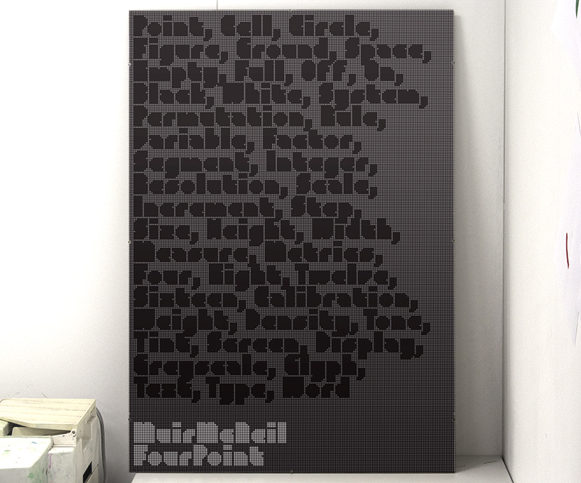
fourpoint – an optical/geometric type system that explores the relationships between scale, density, information and resolution.
DB: which project(s) have had the biggest impact on your careers so far and why?
paul: the project of re-orienting my career and trying to continue learning: returning to university as a student after several decades in commercial design practice; subsequently becoming a lecturer in typography and developing muirmcneil with hamish.
hamish: threesix‚ following the closure of 8vo in 2001, I worked on my own and produced nothing I was ever very happy with. the collaboration with paul, which began with threesix, was a fresh start; new challenges and new adventures.
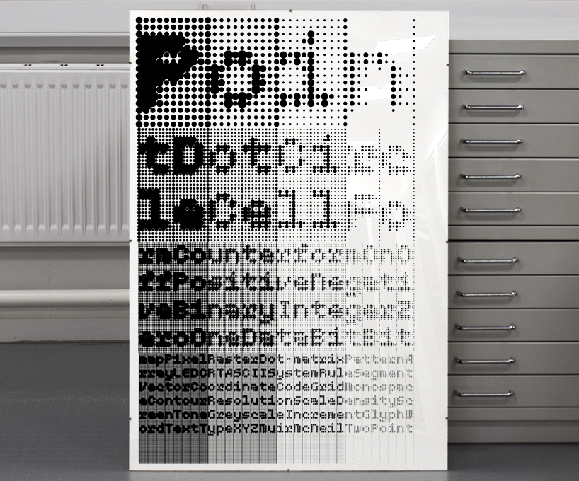
twopoint – a monospaced geometric type system based on early dot matrix and led display lettering.
DB: has anyone or anything recently challenged your views on graphic design?
paul: karl nawrot and radim pesko with their lyon/lyno type project. when I first saw it I felt really queasy‚ but soon came to appreciate its playful forms and the equally challenging ideas that underpin it.
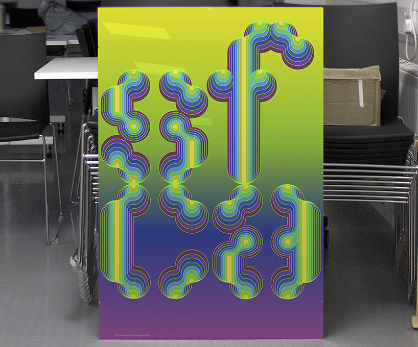
insideout – poster for ‘insideout’, an exhibition of one-off posters organised by the AIGA san francisco chapter. participants from inside the bay area and outside were asked to design a poster based on a personal impression of san francisco. muirmcneil’s ThreeSix 31 typeface, with the contoured layering attributes of its eight weights, seemed to be the ideal vehicle with which to create a typographic psychedelia with minimal content – SF CA is a concise and easily recognisable way of representing the city in typographic form. the colours speak for themselves.
DB: what do you enjoy the most about working with type and letterforms?
paul: I like type for two particular reasons: firstly because of the dual codes it communicates: the constant, beautiful friction between its function as a carrier of language and as a system of differentiated signs; secondly because type and typography at a certain level are as close as design can get to pure abstraction with no values, messages or intentions. I’m interested in exploring ways of testing the connection between type, text and language and have a body of unfinished work which I hope to develop further. some of the muirmcneil projects are an aspect of that.
hamish: I prefer working with type over image or other media because of its direct connection to language, it’s an extension of writing and in that sense one can give things voice and tone in a direct way without the layered meanings that using image introduces.
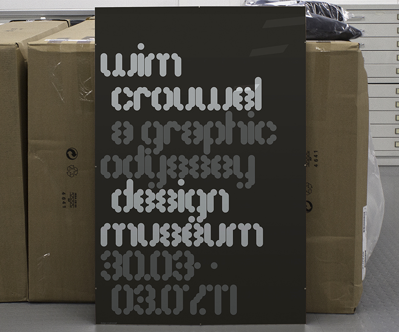
crouwel – to celebrate the 2011 exhibition ‘wim crouwel a graphic odyssey’ at the design museum, london, the curators commissioned muirmcneil and six other design studios (philippe apeloig, build, cartlidge levene, experimental jetset, david pidgeon and spin) to each design a silkscreen poster based on the format (95×63.5cm) and grid used by crouwel in many of his posters for the stedelijk museum.
DB: what is the biggest lesson you have learned with regards to designing typefaces?
paul: we aren’t‚ really type designers so much as designers making type. there’s probably a lesson in that. we appreciate what traditional type designers do but they often seem motivated by intrinsic details and driven by what current technologies afford. we’re more interested in the architecture of visual communication and see type design as a component of its engineering, as the bricks in the construction.
hamish: type design demands a highly structured workflow.
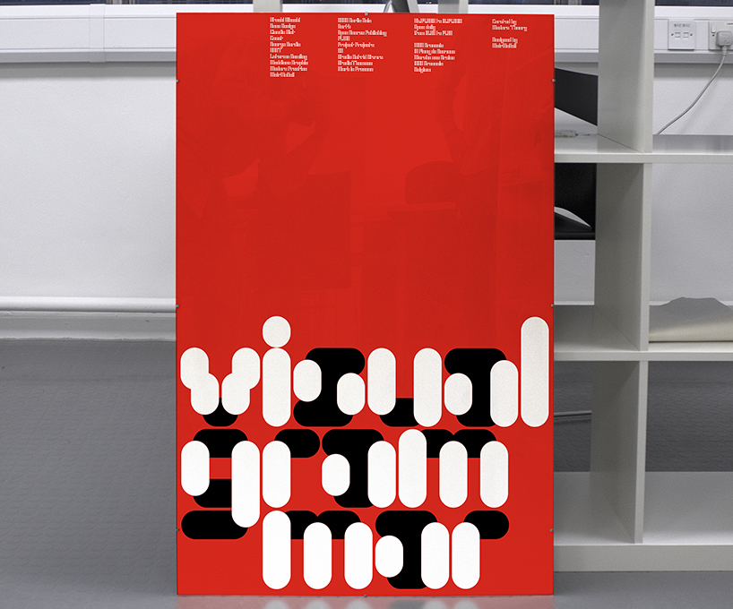
visual grammar – modern practice invited 10 design studios to each produce a poster to ‘communicate an aspect of the fundamental components of visual grammar’. muirmcneil produced a typographic poster using only the text provided in a way that distilled the words to visual abstractions. ‘we anticipated that separating form from meaning would speak about visual grammar in a direct and immediate way.’ the final poster is a typeset composition where the boundary between what can and what can’t be read is blurred. the large type is set in threesix 07, a system of seven typefaces comprising only rounded horizontal and vertical strokes, separated into interlocking layers. the body text is set in one weight and size of threetwo 00, an extensive modular type system in which letterforms are composed from dot grids at fixed increments. as type sizes become smaller, resolution decreases; although bodies of text appear to retain typographic features, characters are unrecognisable individually.
DB: how do you think online design resources have influenced the graphic design being produced today?
hamish: it’s hard to say but one senses design ‘eating itself’. it seems very difficult today for young designers to sort the worthwhile from the worthless and to establish their own values, when everything is presented in such multifarious and unmediated ways with little reference to context or provenance. thank goodness the same preponderance of easily accessible design references wasn’t around when we started our careers.
panopticon poster – featuring panopticon font by muirmcneil
DB: what do you both share a passion for besides your work?
paul: george smiley, thin wallander (not fat wallander), proper burgers, the anchor and hope on the cut, paul klee, karl gerstner, silkscreen…
interact – featuring interact font by muirmcneil
DB: do either of you have any superstitious beliefs or self imposed rules that you live by?
hamish: we find it tricky enough living by the rules set by everyone else.
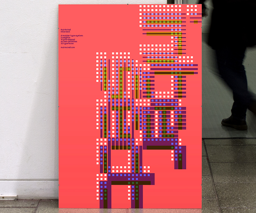
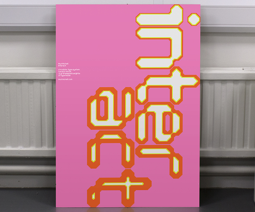
intersect – featuring intersect font by muirmcneil
DB: what’s muirmcneil’s motto?
paul: we have one for every day of the working week:
measure twice, cut once
less is less
design = order x time
rigour, vigour, bigger
proofread, then proofread again. and again.
if you see a fork in the road, take it.
make more mistakes.
graphic studio interviews (193)
 Nov 21, 2022
 Feb 10, 2019
 Jun 21, 2018
 May 17, 2018
 Oct 04, 2017
muirmcneil (3)
 Jun 11, 2015
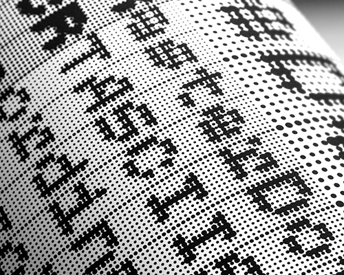 Dec 04, 2014
PRODUCT LIBRARY
 Jul 23, 2024
 Jul 01, 2024
 Jun 13, 2024
 Jun 06, 2024