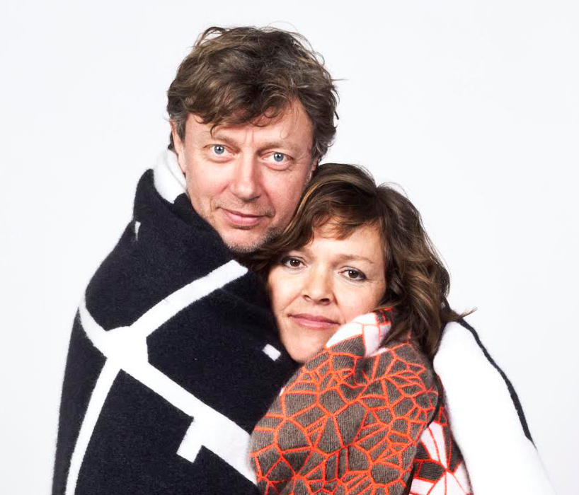
thonik’s founders: thomas widdershoven and nikki gonnissen
thomas widdershoven and nikki gonnissen are the founders of thonik, a studio based in amsterdam that specializes in graphic design, interaction design and motion design. designboom spoke to thomas and nikki to learn more about their work, influences and process.
designboom: how did you meet and decide to start your own studio?
niiki: we met in 1993 in the vondel park, which is the equivalent of amsterdam’s central park. thomas saw me eating icecream with some friends. he sat down nearby and blew me a kiss. when I left he cycled after me until I stopped and talked to him. it turned out we were both in our final year of art school – me in utrecht and he in amsterdam. I knew about the ‘singing saw’ an obscure poetry magazine he was art-directing. my mum liked the design and had given me a copy. that same year we decided to work together and we opened thonik.
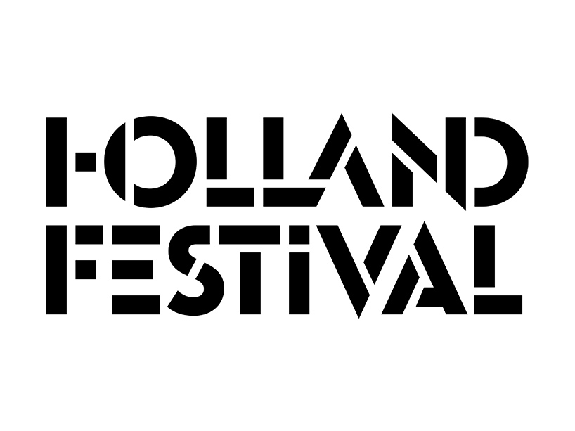
holland festival identity – logotype
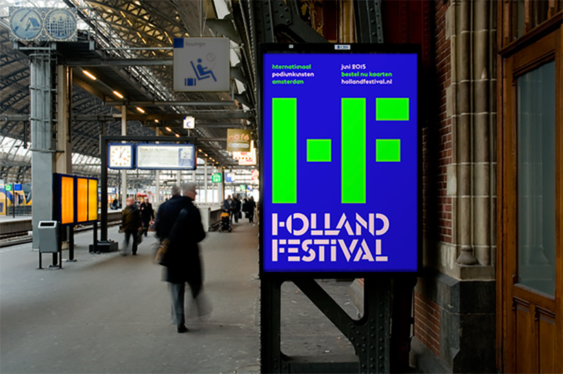
holland festival identity – poster
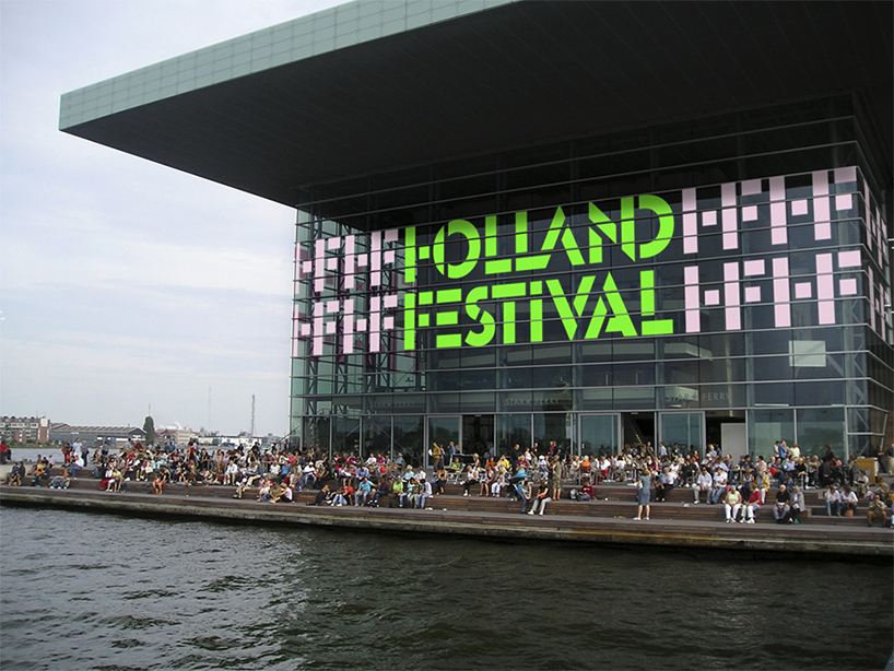
holland festival identity – environmental graphics
DB: how do you divide or share the work you do?
thomas: we share our work, but also we share our lives. for the past year and a half I have been the creative director at the design academy eindhoven. it is a part-time job, but still very time-consuming so we have had to divide the work more then we used to.
DB: what would you say each of your strongest skills are and how do they compliment or contrast?
nikki: after 21 years together it is still hard to answer this question. thomas is more analytical and I’m more socially driven. but our antennae are often pointed in the same direction. we are inspired by the same things.
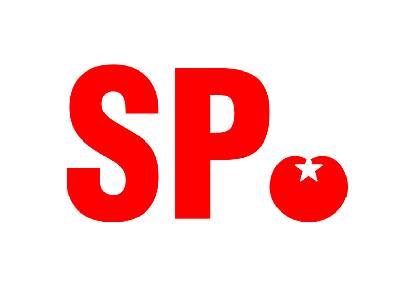
socialist party identity
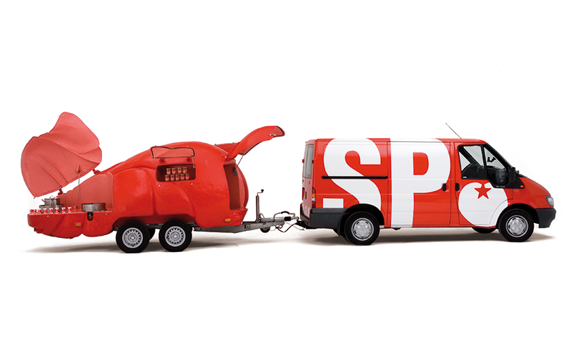
socialist party – tomato soup express in collaboration with joep van lieshout
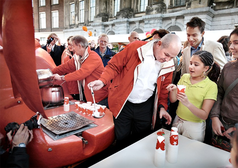
socialist party – tomato soup express in collaboration with joep van lieshout
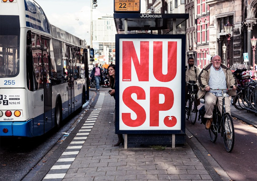
socialist party – poster
DB: what type of projects do you enjoy working on the most and why?
nikki: the best projects are the ones with a cultural or social reference. our approach is to work with a very clear concept, and each step in the design process becomes the logical outcome of that concept. our favourite projects are ones where the idea can be localized at the core.
DB: which project(s) have had the biggest impact on your careers so far and why?
thomas: the campaign we designed for the socialist party in the netherlands received the most international publicity even outside the professional design world. the party was known for opposing many things so we introduced positivism into the campaign. the tomato was their symbol, as in people throwing rotten tomatoes at things they were against. we turned the tomato into something positive and party members into campaigners happily sharing tomato soup with bystanders on the street during their campaigns. it was a soup express touring the country.
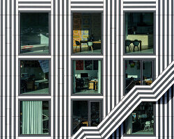
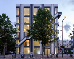
for the power station of art in shanghai we worked to strike a logical and aesthetic balance between the english and chinese typography. this is a very contemporary issue – communicating the more multi-polar world that is our reality. the commission came with an existing logo comprising five rectangle bars, which we broke a part. the new identity is very much about rethinking established and expected norms and acting more freely.
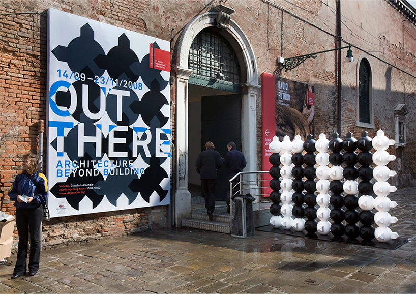
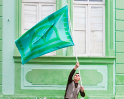
out there identity – poster and wayfinding system
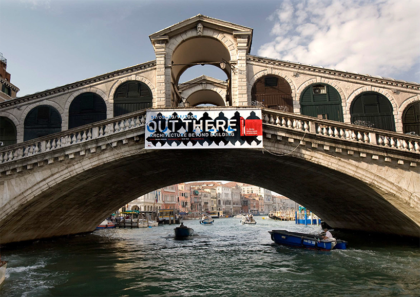
out there identity – banner
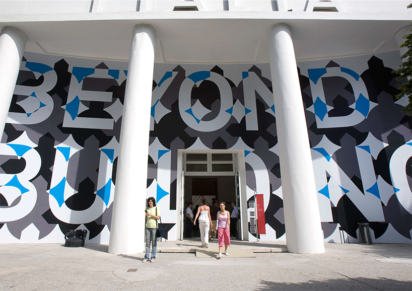
out there identity – environmental graphics
DB: what do you enjoy the most about being graphic designers and creating visual identities?
nikki: we like to be able to contribute to graphic culture but what really drives us is being involved in social change, like, for example, the campaign we did for the socialist party. it didn’t just change the image of the party, it also influenced the way democracy works in the netherlands. campaigning, which is normally dull and conservative became lively and experimental. and we made a very confrontational and controversial commercial showing an old lady stripping herself naked, symbolizing how homecare for the elderly was being stripped by the government. her protest was heard and the commercial sparked a change in the law.
DB: what is the biggest lesson you have learned with regards to creating visual identities?
thomas: a simple idea offers a lot of freedom to experiment. for aaron betsky and the biennale in venice, we simplified architecture to a house perched on top of the world, which was our response to the ornate architecture of venice. the symbol was then repeated to form a pattern. in the scenography of the exhibition this pattern was erected as 3d word walls. meandering through the 350 meter corderia were 17 words spanning 240 meters, which worked as a physical guide for the audience. for the print work the globe-and-house grid was used to develop a graphic language of two-tone typography.
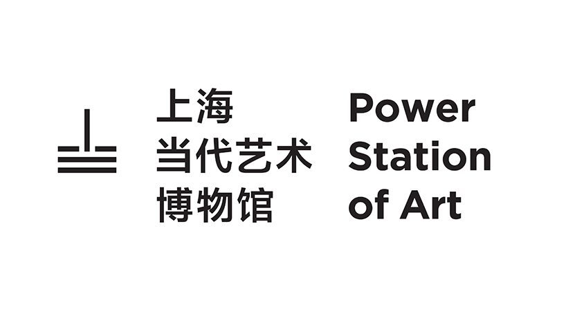
power station of art identity – logo
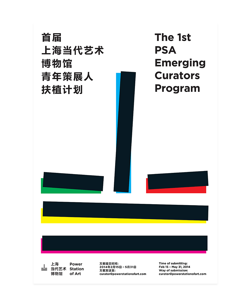
power station of art identity – poster
DB: how do you think the internet has influenced the graphic design being produced today?
thomas: the biggest change is motion graphics. at the moment films are the most striking and effective medium online.
we have been doing motion graphics since ‘over the edges’, an exhibition in gent, belgium in 2001. for the SP we produced viral movies – personalized films with the political leader acting as a sort of clown. back then in 2005 this approach was very fresh – a complete novelty in the political domain. for the VPRO television network we do station calls. so motion design has already for a long time part been part of our approach. we also just released the new holland festival identity with a small film, which has spread via social media.
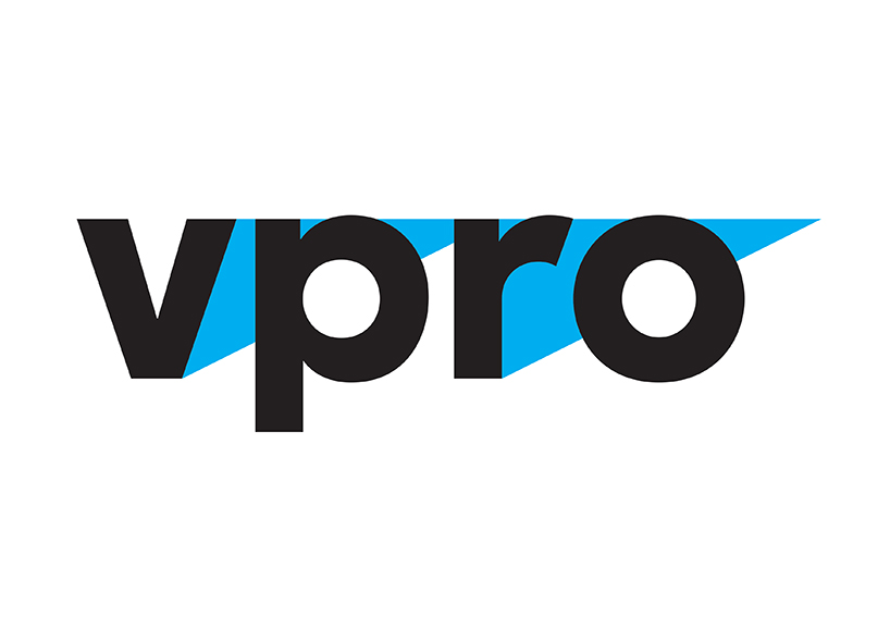
VPRO (television station) identity – logo
VPRO identity – stationcall
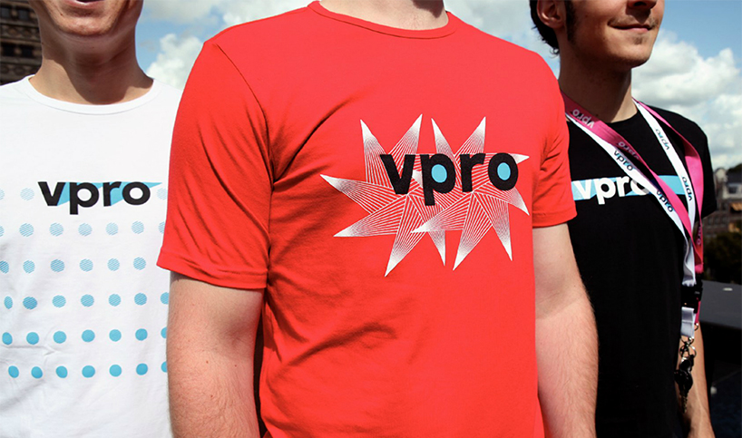
VPRO identity – t-shirts
DB: has anyone or anything recently challenged your views on graphic design or how you work?
thomas: very simple typography used to be the core of our design, and avenir was our favourite font. we really were the forerunners of the new sobriety movement. first holland had wim crouwel and his strict modernism. then we had the more outrageous characters like anthon beeke. we reeled it back in by fully embracing the early modernist influence albeit with a twist, a good dose of humour, and dare i say fun.
more recently we’ve shifted away from that foundation to explore other fonts and more elaborate designs. for example, for the boijmans van beuningen museum in rotterdam, we’ve used a typeface based on lance wyman’s font for the mexico olympics in 1968.
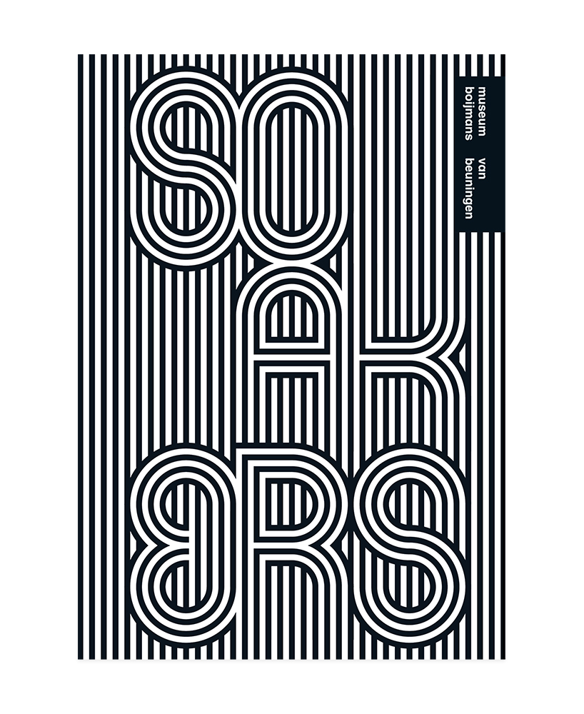
boijmans van beuningen museum identity – poster
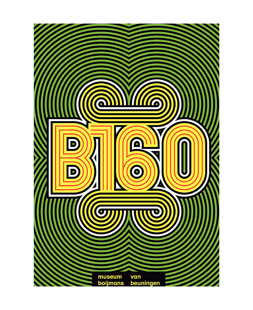
boijmans van beuningen museum identity – poster
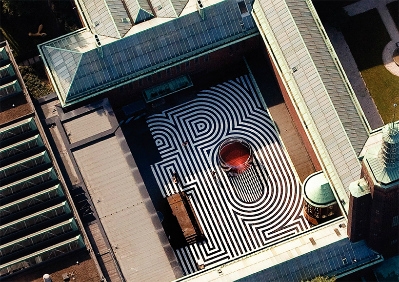
boijmans van beuningen museum identity – environmental graphics
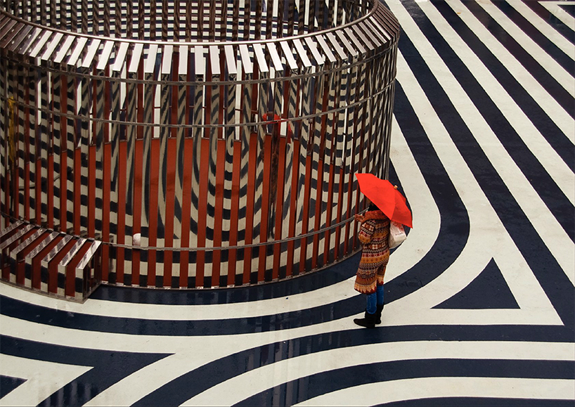
boijmans van beuningen museum identity – environmental graphics
DB: what do you both share a passion for besides your work?
nikki: we both love to drink chinese long leaf green tea.
DB: do either of you have any self imposed rules that you live by?
thomas: john cage, when asked to sum up his philosophy in one sentence said ‘get out of whatever cage you find yourself in’.
DB: what is thonik’s motto?
nikki: ‘happy modernism’.
graphic studio interviews (193)
 Nov 21, 2022
 Feb 10, 2019
 Jun 21, 2018
 May 17, 2018
 Oct 04, 2017
logo design (246)
 Aug 09, 2024
 Jul 03, 2024
posters (78)
 Mar 28, 2024
 Mar 06, 2024
 Jul 29, 2022
 May 26, 2022
thonik (4)
PRODUCT LIBRARY
 Sep 07, 2024
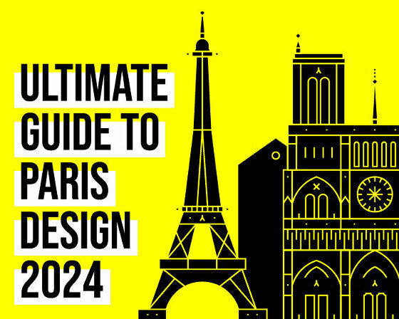 Sep 02, 2024
 Aug 29, 2024
 Aug 21, 2024