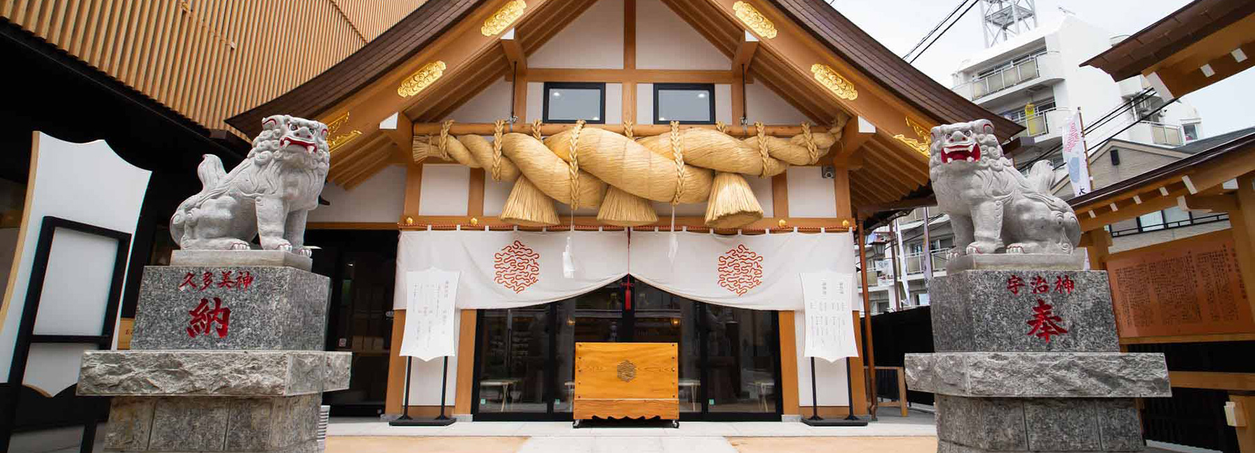
creative director yu yamada has collaborated with art director kishino shogo to refresh the brand identity of a historic shinto shrine in japan. built in the shimane prefecture in 1744, the izumo taisha is one of the oldest and most important shrines in the country. the project took on the shrine’s saitama branch and celebrated its 35th anniversary by renovating its structure and unveiling a new graphic identity that has been imprinted throughout its spaces and activities.
images courtesy of yu yamada and kishino shogo
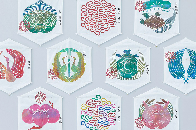
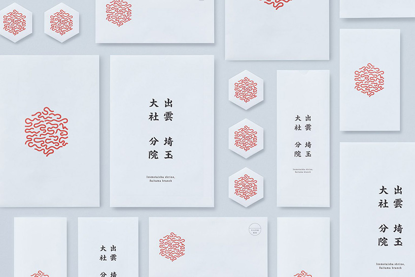
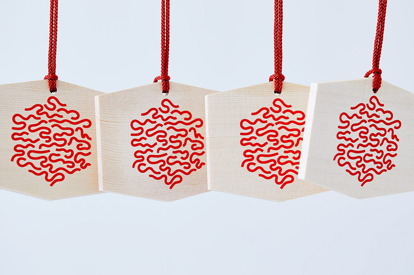
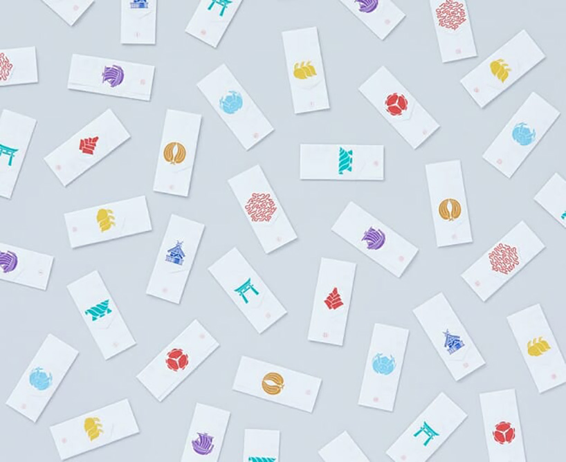
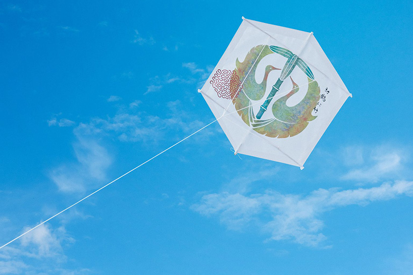
the starting point of the graphic project was the name of the shrine — izumo — meaning shrine in the clouds. From there, the creative team took the official crest niju-kikko-ken-hanabishi (二重亀甲剣花菱) and combined it with clouds, resulting in an eye-catching red and contemporary design. for the amulets and kits, symbolic animals like turtles, cranes and rabbits were used.
‘the new graphics were unveiled earlier this year, right before the pandemic hit,’ spoon tamago reports. ‘but the shrine managed to quickly move their operations online, offering remote ceremonies and prayer services. it’s also a nice way to visit the shrine and see how the new graphics are being used.’
project info:
name: izumo taisha saitama branch rebranding
designers: yu yamada and kishino shogo
project year: 2020
via: spoon tamago
PRODUCT LIBRARY
 Jul 23, 2024
 Jul 01, 2024
 Jun 13, 2024
 Jun 06, 2024