jiyoun kim studio presents ‘ayunche brand refreshment project’ covering every design aspect surrounding the brand, including symbol, pattern, color strategy, and variations of products and packages. the studio aimed to transform the brand’s core identity of deriving natural ingredients and oriental perspective into a fresh and refined message. the renewed project expresses a more sophisticated, urban-centric, and trustworthy professional imagery yet natural.  all images courtesy of jiyoun kim studio
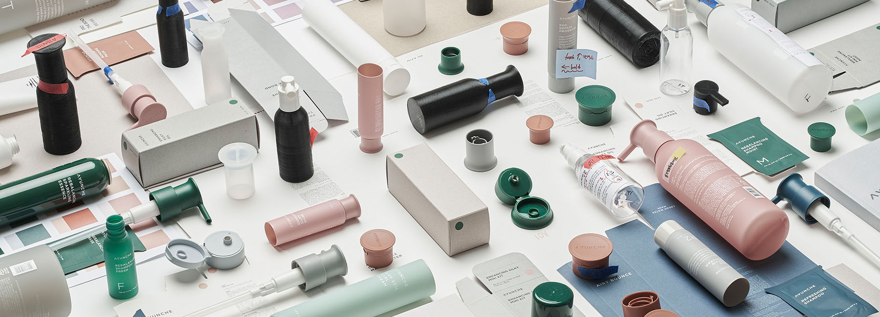
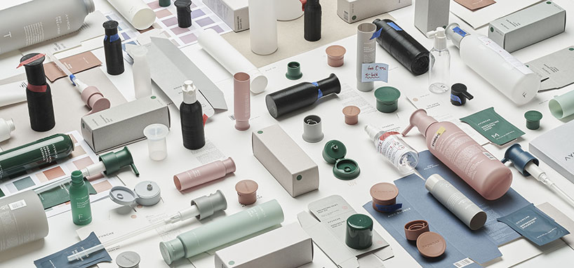
with this in mind, jiyoun kim studio focused on the material, not on color; eco gray, the main material representing the brand symbolizes the unique texture of the recycled paper. while it consumes nature, it comprehends the meaning of consumption, fulfills its social responsibilities, and it does respect nature but never worships. furthermore, it avoids extravagance yet inspires the surroundings creatively when expressed.
jiyoun kim studio, together with ayunche, defined the core keyword as eco-chic and revealed it as a penetrating attitude through the entire brand. it is expressed using all types of recycled papers and focuses on natural textures rather than processed colors. eco gray is applied to most ayunche product lineups, using a low saturated and semi-transparent container that naturally reveals the materials’ characteristics.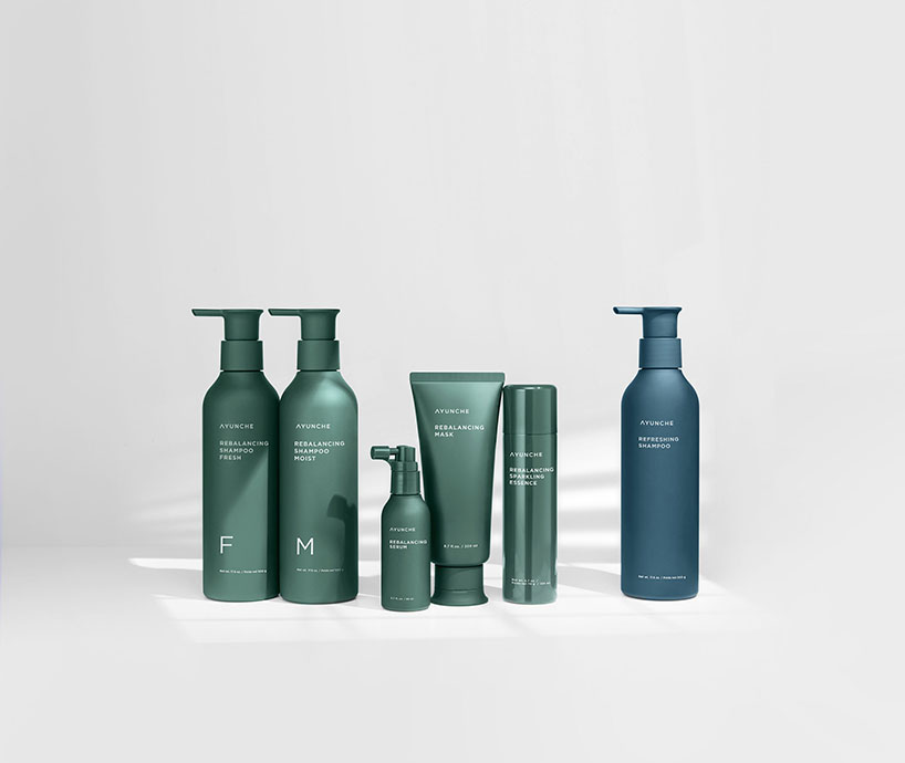
another lineup has adopted low saturated colors derived from nature to blend with eco gray seamlessly. the multiple-shaped lids provide a natural change within the simple and restrained outline. this element not only expresses the brand visually but also improves the actual functionalities such as the usability of opening and closing the cap, usability of the pump, and stability when placed on the floor.


project info:
name: ayunche brand refreshment project
designer: jiyoun kim studio
design team: jiyoun kim, hannah lee, dokyoung lee jiyoun kim
year: 2021
client: amos professional
designboom has received this project from our ‘DIY submissions‘ feature, where we welcome our readers to submit their own work for publication. see more project submissions from our readers here.
edited by: christina petridou | designboom
jiyoun kim (10)
 Jul 20, 2022
 Jan 01, 2022
 Apr 13, 2021
 Jan 26, 2021
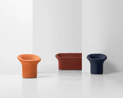 Dec 06, 2019
packaging design (102)
 Jul 24, 2024
 Jul 13, 2024
 Feb 14, 2024
 Nov 13, 2023
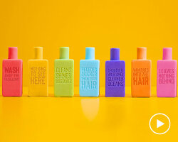 Nov 10, 2023
PRODUCT LIBRARY
 Jul 23, 2024
 Jul 01, 2024
 Jun 13, 2024
 Jun 06, 2024