INTERVIEW WITH Joachim roncin, paris 2024’s head of design
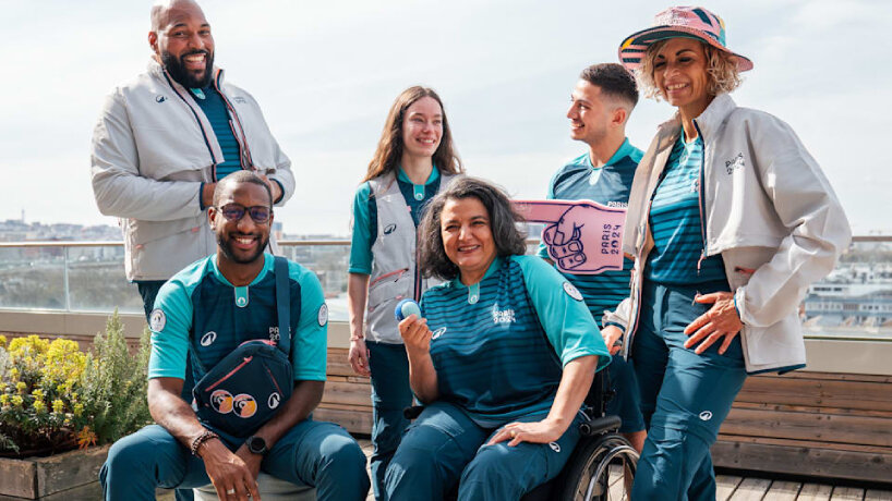
It’s March 2024, months before the Paris 2024 Olympics and Paralympics begin on July 26th and August 28th respectively. Joachim Roncin sits down with designboom in an interview to discuss the visual identities of the Games. He’s the events’ Head of Design. He has mapped out and created the torches, medals, mascots, and posters. He’s the mastermind behind all the colors, logos, merchandise, and everything vibrant visitors see when they visit Paris during the 2024 Olympics and Paralympics. During our interview, he tells designboom that he’s already stood in front of around 20,000 volunteers attending the conference for the Paris 2024 design reveal of the volunteers’ uniforms, with another 20,000 viewers listening in via streaming. For around ten minutes, the Games’ Head of Design talks about how the outfit with Decathlon came to life.
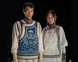
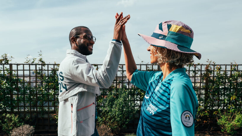
It’s made of an elbow-sleeve shirt dyed in blue-green with a dark blue stripe pattern in the middle and a bucket hat in pastel pink, adorned with colored geometric shapes from the Paris 2024 design palettes. ‘I didn’t want to immediately impose the look of the Games on their outfit,’ Joachim Roncin shares with designboom in an interview ahead of the Paris 2024 Olympics and Paralympics later this year. ‘That’s why we thought of the Marinière, the t-shirt used by famous French designers, including Jean Paul Gaultier. It was very interesting to incorporate our key elements into this iconic French clothing. We were happy to see that the volunteers were happy when we presented it.’ Joachim Roncin isn’t just still reeling from the public’s reaction during the presentation of the outfit. In our conversation with him, he revisits all the design drops and visual identities the team has created so far, from the medals and torches to the posters and mascots.
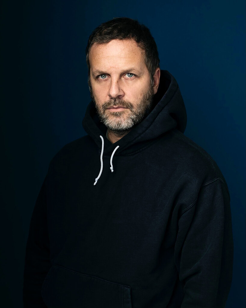
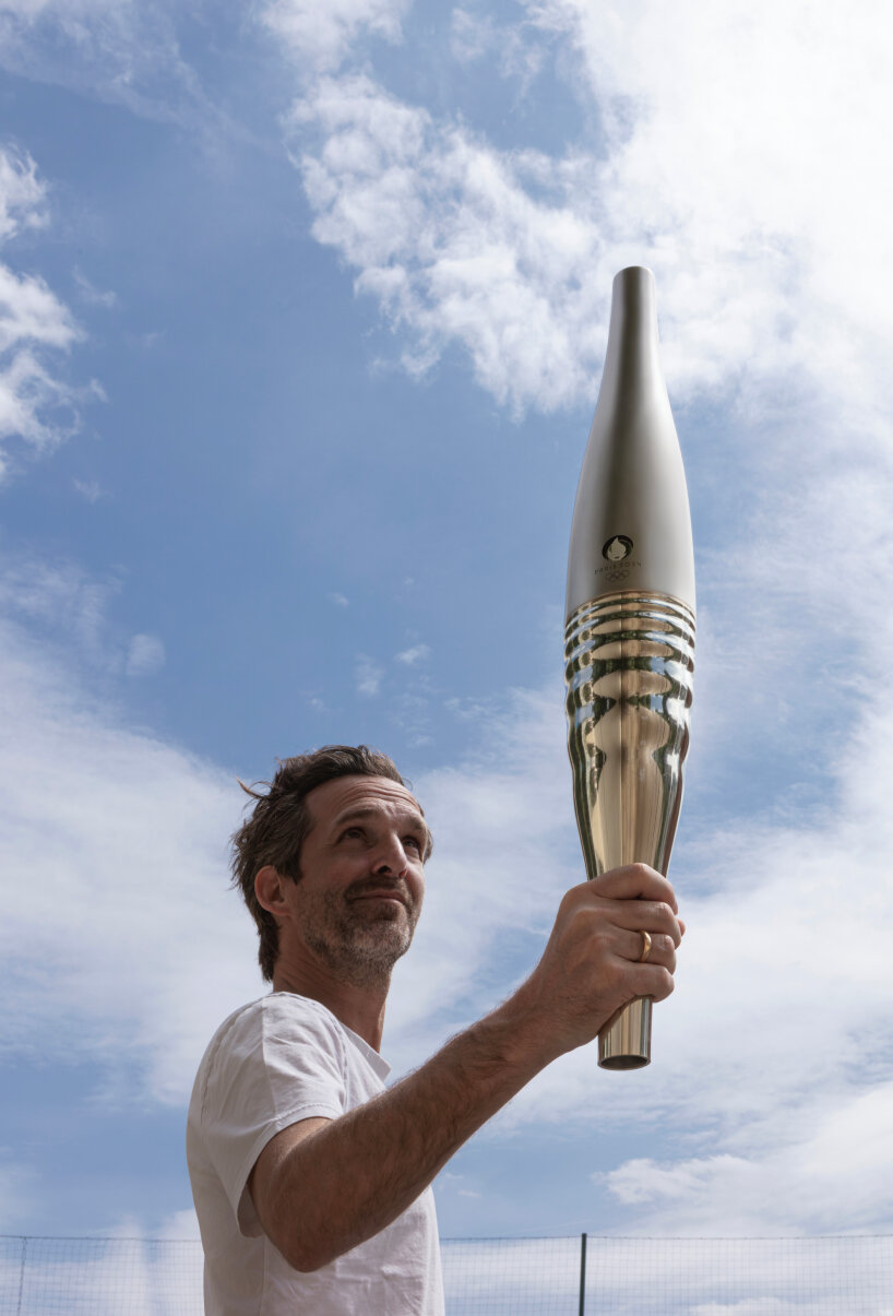
Joachim Roncin, Paris 2024 Olympics and Paralympics’ Head of Design | images courtesy of Paris 2024
fierce and determined rooster for the logo
Joachim Roncin admits he’s demanding of himself when it comes to work and designing the visual identities of Paris 2024. He values assuming the role of Head of Design and applies what he’s learned in his 25 years of working in the creative industry, drawing on design ethics and creative flair from his background as an Art Director, for the benefit of the Olympics and the Paralympics. Beauty isn’t the sole standard for him anymore. ‘I feel that anybody can create something beautiful, but imbuing depth into a design is what’s truly important for us,’ he explains to designboom. He hasn’t completely discarded beauty but has put his own twist to it for the Paris 2024 designs.
He acknowledges that some people may not like what they’ve released, and that’s fine. ‘You cannot please everyone with your design,’ he tells designboom. ‘But you can unite everyone around something, if the meaning is right. Winning the battle of “I like it” or “I don’t like it” is very important to me. I strive for my designs to carry deep meaning.’ Depth became the starting point for designing Paris 2024’s visual identities, and rebranding was one of the driving forces, incorporating elements that had not been present before.
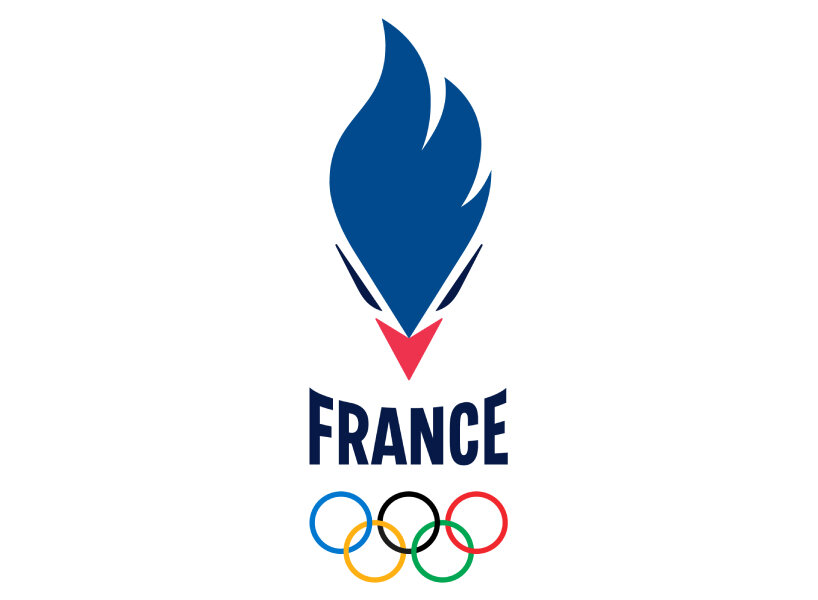
Joachim Roncin cites the example of the rooster’s face in the new logo of the French team. He and his design team angled its head to face the athletes, making eye contact with them as if encouraging them to move forward, conquer victory, and give their best effort. Its eyes are fierce and determined, capturing the expressions athletes may experience and project as they take on the Games. ‘While it’s important for every athlete to be proud of being French, I think it’s much more important for them to be proud of being an athlete. Being an athlete requires strength and determination, focusing on their work and performance until they’re ready to compete, win, and learn,’ he says.
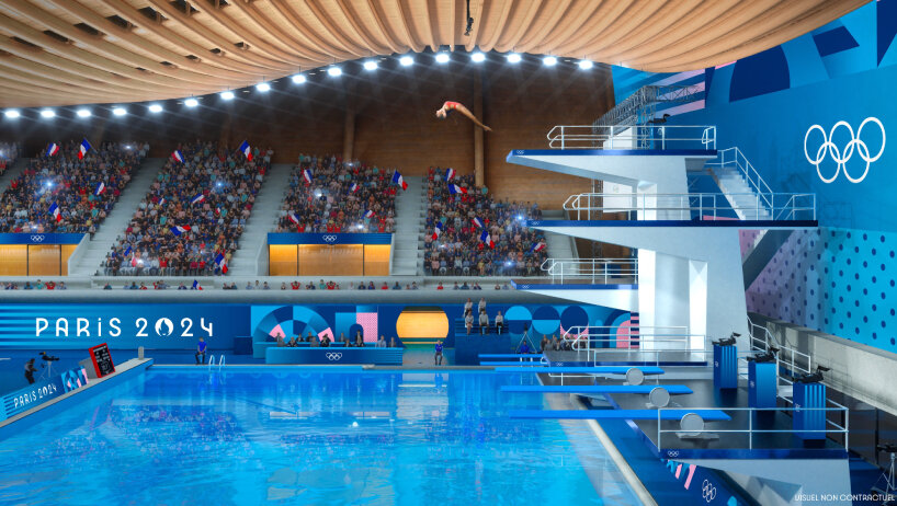
design look of Paris 2024 Olympics and Paralympics
Same visual identities for the olympics and paralympics
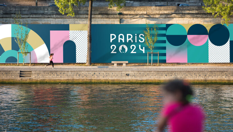
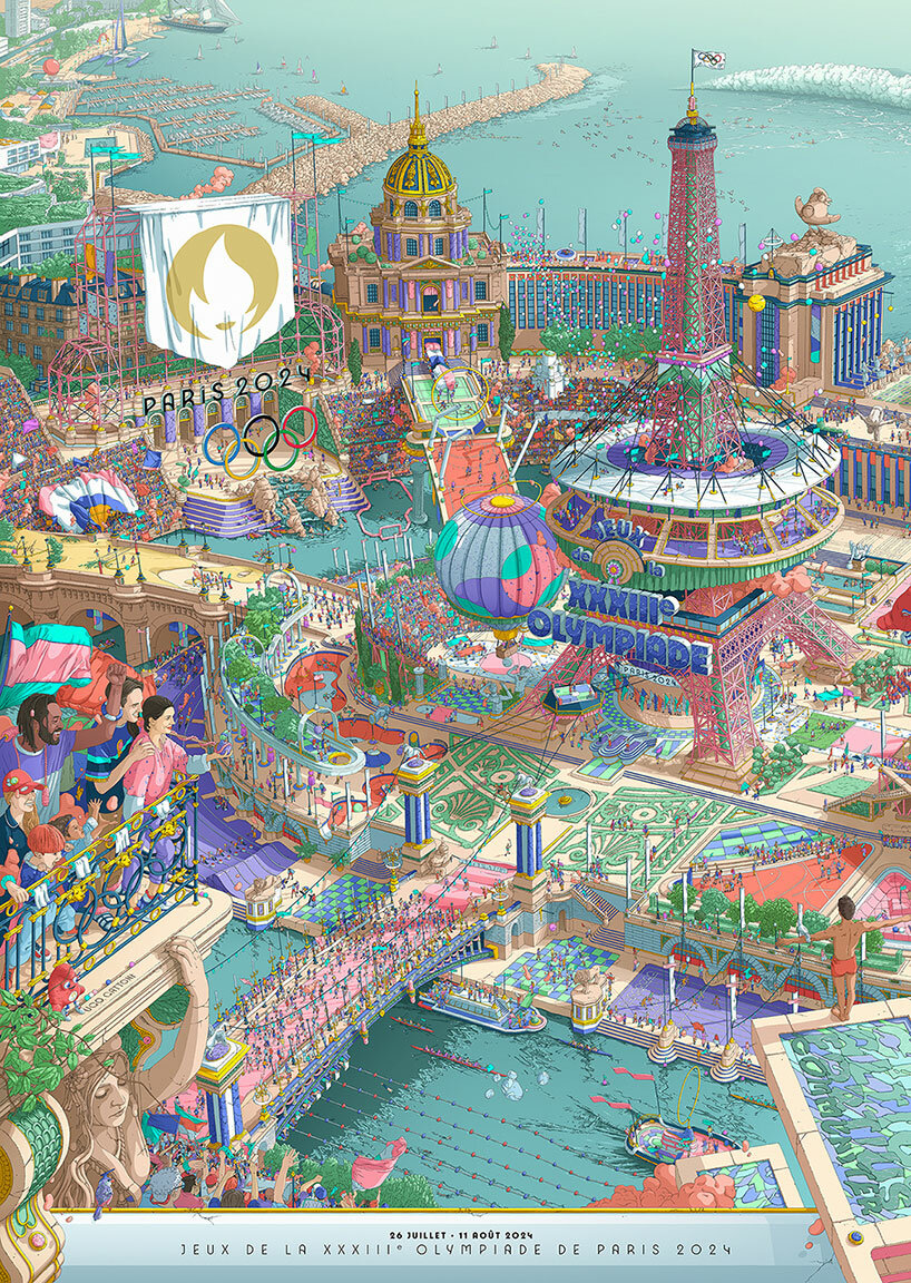
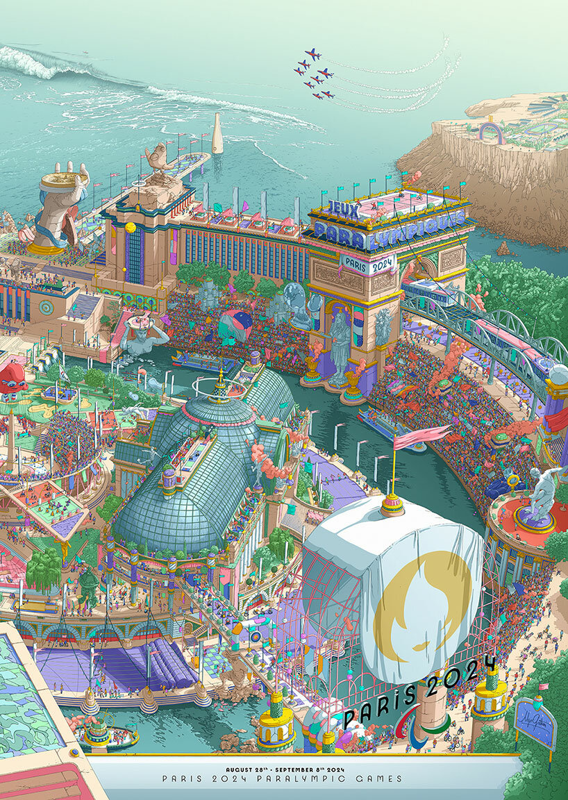
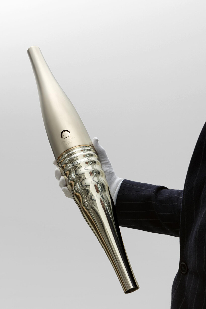
One of the design paths Joachim Roncin takes is bridging the visual identities between the Olympics and the Paralympics. Under different organizations, the International Olympic Committee and the International Paralympic Committee, Paris 2024’s Head of Design made it his mission to make their designs distinctive in color and flair yet cohesive in identity, like twins. The torches are the same. The medals are the same. The mascots are the same. The emblems are the same. Even the posters are the same, split into two but able to be joined together like puzzle pieces. Joachim Roncin wanted the official posters to brim with all the clues and cues of Paris 2024 in a single landscape image, cut into two for a diptych.
The artist Ugo Gattoni followed through as he made the posters a carnival of festivities celebrating both the Olympics and the Paralympics, and all the subtle details and grand things that make up the sports events. ‘This is exactly what is interesting in design: you cannot only think about what’s inside the image, but how the image is proposed to the public. We could have done one poster with Ugo Gattoni about the Olympics on one side and another one on the other side for the Paralympics. Two different designs, two different stories. But since Paris 2024 is one main story, we put them together. When you join the two posters, you have the whole image, the whole story,’ Joachim Roncin shares with designboom.
Joachim Roncin creates uniform visual identities for Paris 2024
joachim roncin’s Pictograms made of lines and sports symbols
During his conversation with designboom, Joachim Roncin says it has always been part of the plan to make these posters as joyful as possible, a shower of color that can paint Paris’ streets, away from the institutional curriculums that previous Olympics and Paralympics design assets may have adhered to. There aren’t any detailed texts on the posters informing the public about the Games. For the Head of Design, smartphones can do that and offer the phone-invested generation details about the sports event. The posters then serve as a stoplight, inviting people to take a break for a while, scan the pink-filled landscapes, look for clues pertaining to the Games and the other visual identities he and the team have created, and just wander, lose themselves in the imagery, be vacuumed into the kaleidoscopic and multi-layered world Ugo Gattoni co-curated, a moment to enjoy the brief escapism.
For Joachim Roncin, it’s not about revolutionizing the design of the torches, medals, mascots, posters, and all that. It’s about sprucing up and shaking up Paris 2024 and how the public used to view them. After going through the sports events’ archives, he made up his mind to move forward with revamped designs, making ‘Let’s break the rules, let’s create something fresh’ his mantra. Take the Paris 2024 pictograms as an example. He thought they represented men in the previous ones, their silhouettes and forms reenacting specific sports, until today. On his mark, these stick figures are gone, replaced by lines, geometric shapes, and icons that portray the sports being played, like boats, ropes, rackets, weights, and more. Their identities are fluid, non-gendered. They’re objects of sports focusing on the Games. They’re one of the Paris 2024 visual designs spearheaded by Joachim Roncin.
volunteer uniforms in collaboration with Decathlon
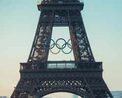
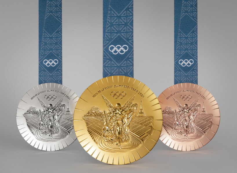
eiffel tower’s iron for the paris 2024 medals
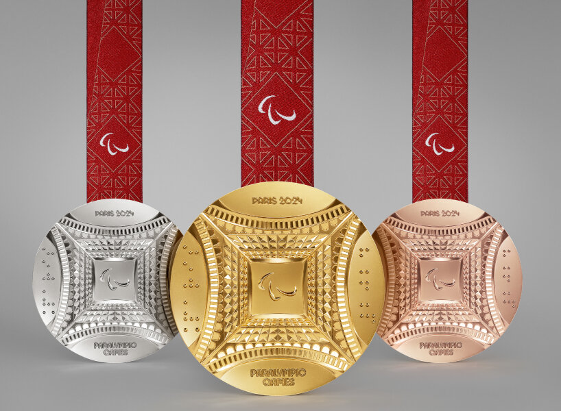
If there are souvenirs for all the hard work, determination, and hundreds of hours that the participating athletes have poured in, Joachim Roncin and his design team think the medals should be one of them. It’s not enough that they bring home a round object forged in gold, silver, and bronze. The Head of Design then worked with Chaumet to make these medals pieces of high-end accessories sculpted with French savoir-faire. Since the Olympics and Paralympics are taking place in Paris, the Eiffel Tower, a famed landmark of the city, appears on the medals as images and symbols. It also comes through as a material because Joachim Roncin and Chaumet decided that behind these medals, the hexagon at the center is hammered out from the real piece of iron used in constructing the Eiffel Tower.
Joachim Roncin tells designboom that the hexagonal design at the back of each medal represents France and all the rays of light surrounding the country. ‘I personally love the kinetic art movement, so when you move the metal, you can see the ray of light reflecting in it. This is something that moved me a lot. I thought, “This is what we really wanted to do since the beginning.” We worked for almost a year, with many meetings. There was almost a friendship between us (Chaumet), and it was really nice. They understood exactly what we wanted to do, and we understood exactly where we wanted to go as well,’ the Head of Design shares with designboom. These medals, along with the torches, are going to be handed out to the winning athletes inside Louis Vuitton trunks specially crafted for Paris 2024, another collaborator of Joachim Roncin for the Games.
pink bucket hats are distributed to the volunteers too
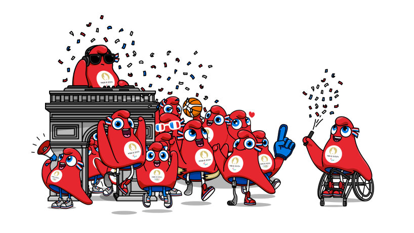
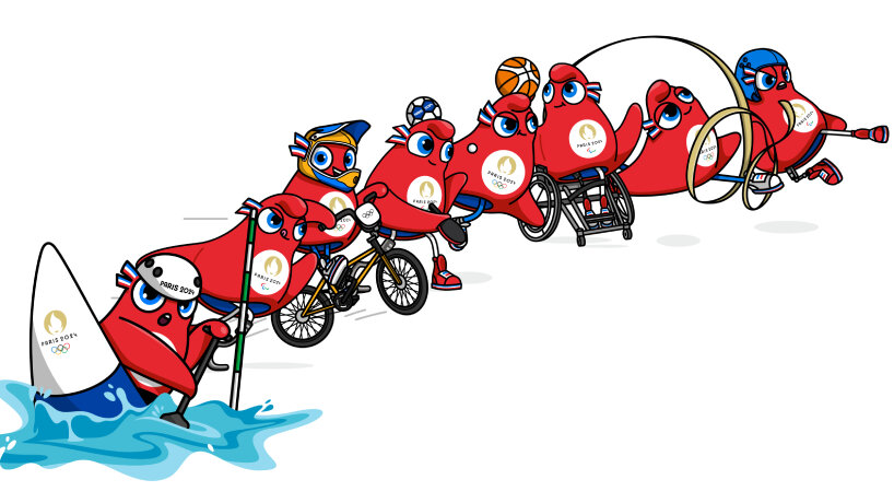
There are times when Joachim Roncin feels like he has condensed 30 years of work into his now-five-year stint as the Head of Design for Paris 2024, but along the way, he discovers new techniques and information that fascinate him, softening the pensive moment. It happened with the mascots; he didn’t know back then how he and the design team could produce them as plushies. He met up with different manufacturers to discuss how the historical Phrygian cap can be made into fluffy phryges, open for distribution. ‘There were about 20 prototypes initially, starting with just a triangle. I showed them the design and specified details like the eyes and curves.
We faced some technical difficulties and had to adjust our approach. There was a lot of interaction during the 3D creation and development of the live mascot outfits, which was another new industry for me,’ says the Head of Design. What started out as an idea met a fruitful ending since these phryges now show up as mascots, keychains, hats, and mugs to take home and be brought to the stadiums as viewers of the Games watch the sports events, which have a few weeks of window in-between. Joachim Roncin opens up to designboom about the dates of the Games, which was a concern for them at the beginning.
rooster in the new logo of the French team for Paris 2024
‘Previously, they had to completely change everything – the decor, the setup – between the two editions. We thought it was wasteful for the planet and financially inefficient to change everything, so we decided to adopt a more sustainable approach. Instead of discarding everything, we opted to change only certain parts to transition from the Olympics to the Paralympics. During the Olympics, the decor will remain the same for the Paralympics. We’ll only change the logo, not the entire decor. The concept of the games’ appearance revolves around squares, so we just need to remove one square containing the Olympic rings and replace it with the Agitos, the Paralympics logo, to avoid unnecessary waste,’ Joachim Roncin explains to designboom.
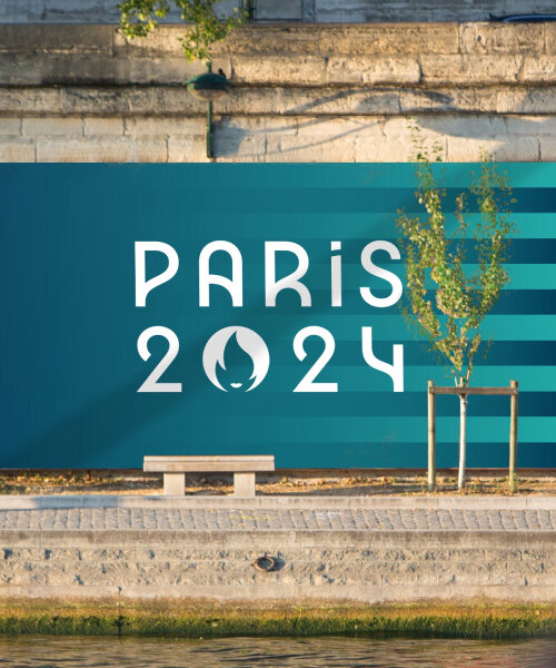
When visitors come to Paris 2024, they may take notice of the way pink shines through all the visual identities of the Olympics and Paralympics. Joachim Roncin sees this hue as a French color, hence permeating one of the main shades for the design along with light tones of blue. ‘I feel that this color should be everywhere, even in detail. When I worked with Decathlon, I emphasized putting pink details everywhere. That’s why there are pink details in the poster and why visitors will see all the street signage in Paris in pink during the Games,’ he shares with designboom. It’s bold, fresh, and fun, words that share the same spirits that the Head of Design wants to put forward this summer.
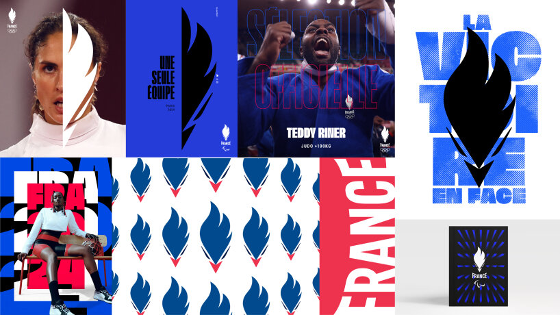
iterations of the Joachim Roncin’s rooster logo design for Paris 2024 Olympics and Paralympics
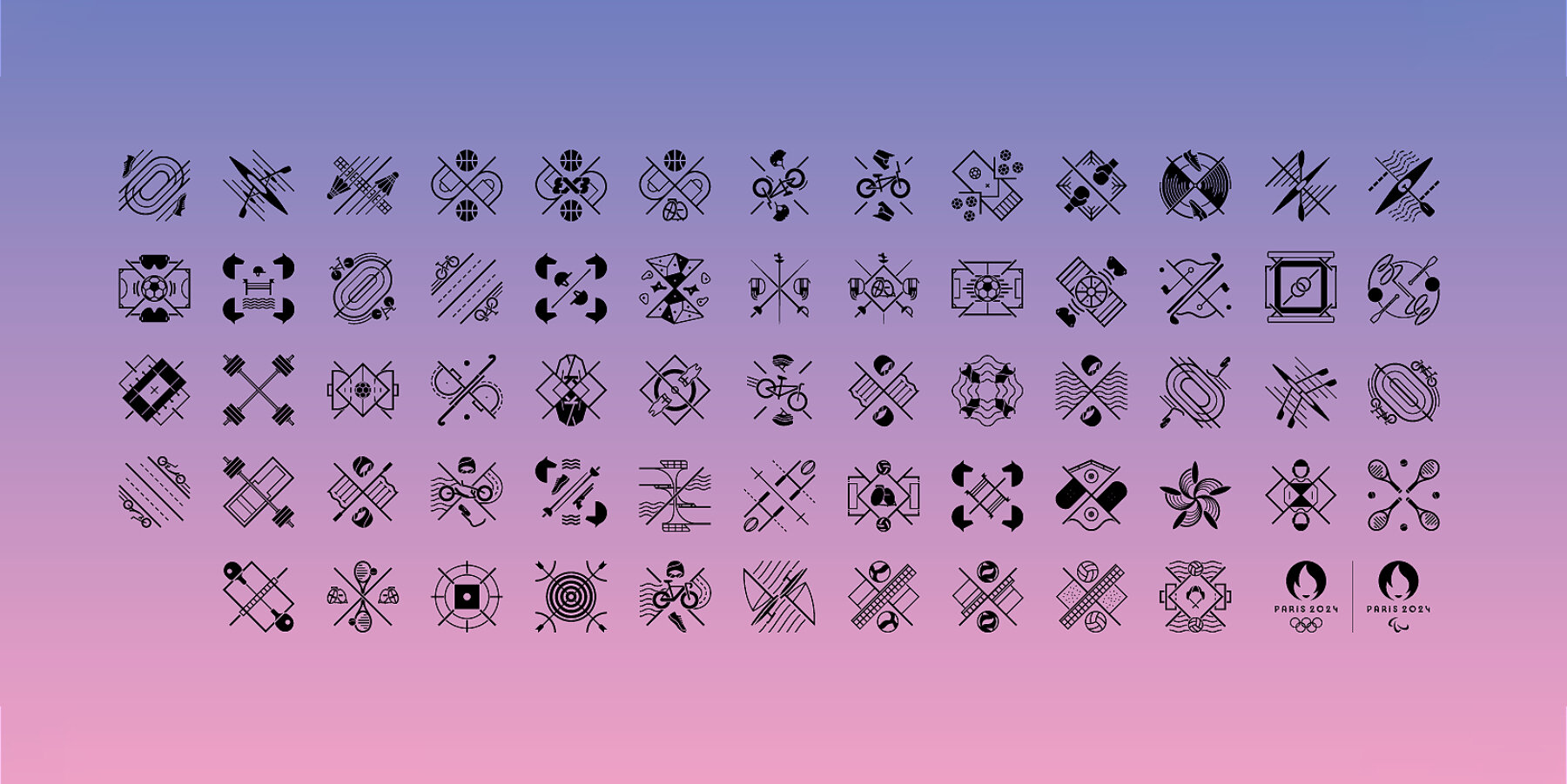
Joachim Roncin’s sports pictogram design for Paris 2024 Olympics and Paralympics
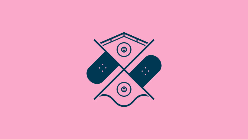
Skateboard pictogram
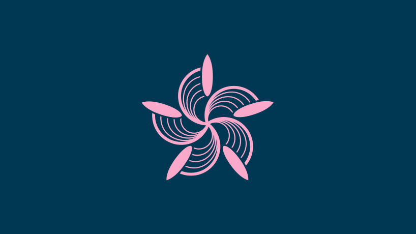
Surfing pictogram
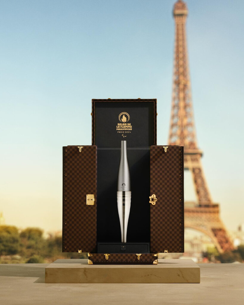
Louis Vuitton trunks design for the torch of Paris 2024 Olympics and Paralympics
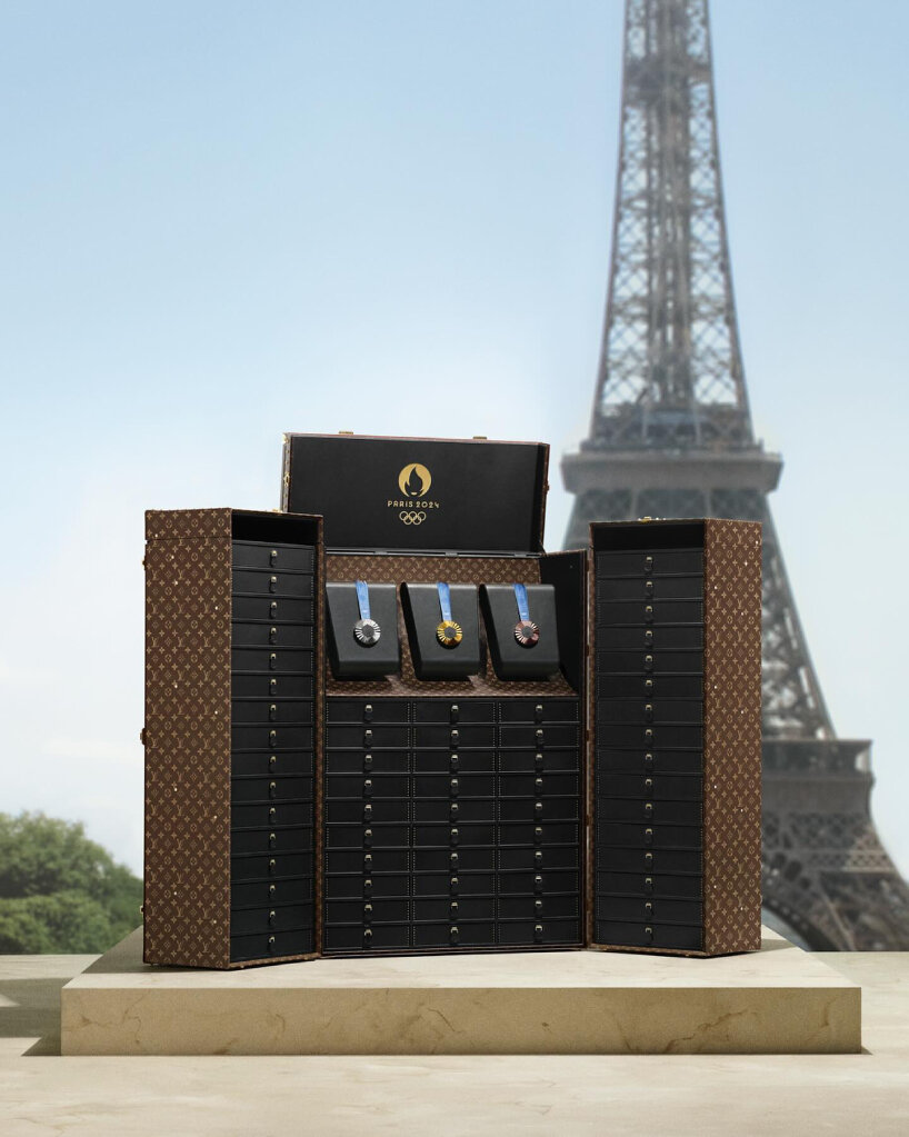
Joachim Roncin says even the medals are placed inside the Louis Vuitton trunks
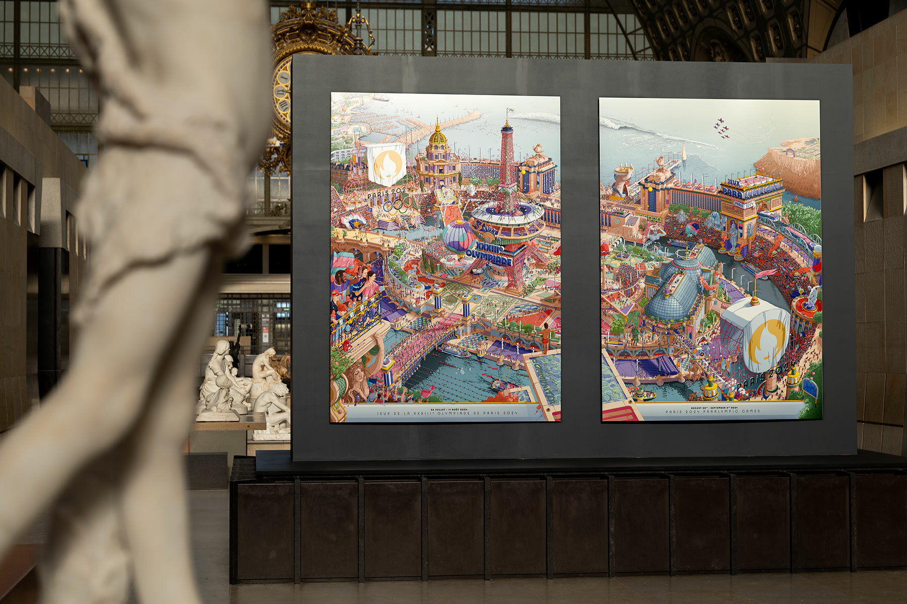
Ugo Gattoni designs posters of Paris 2024 Olympics and Paralympics
project info:
head of design: Joachim Roncin
event: Paris 2024
dates: July 26th, 2024 to August 11th, 2024 (Olympics); August 28th, 2024 to September 8th, 2024 (Paralympics)
design interviews (58)
paris olympics 2024 (22)
PRODUCT LIBRARY
a diverse digital database that acts as a valuable guide in gaining insight and information about a product directly from the manufacturer, and serves as a rich reference point in developing a project or scheme.
