
re-design – daily products of the 21st century
‘toilet paper’ answered by shigeru ban (pp. 26-29)
W110 x D110 x H115 mm
author: kenya hara
contributors: li edelkoort, john maeda, jasper morrison and naoto fukasawa
publisher: lars müller publishers
language: english
year: 2011, third edition
size: 16.5 × 24 cm, 6 ½ x 9 ½ inches , 472 pages, 389 illustrations
ISBN: 978-3-03778-105-0
http://www.lars-mueller-publishers.com/
_____________________________________________________________________
‘design, is basically not self-expression. instead, it originates in society. the essence of design lies in the process of discovering a problem shared by many people and trying to solve it. because the root of the problem is within society, everyone can understand plans for solutions and process for solving the problem, in addition to being able to see the problem from the designer’s perspective. design is appealing because the process creates inspiration that is engendered by this empathy among human beings in our common values and spirituality.’ – kenya hara (p. 24)
japanese graphic designer kenya hara has been in the pursuit of nothingness, concentrating on identification and communication, making his expertise of design not of ‘things that are’, but of ‘things that happen’. since, 2001 he has been a member of the advisory board and also acted as art director of the japanese brand, planning and advertising to promote MUJI’s new vision.
focusing on the purity of form and its meaning, this book brings forth hara’s theories and philosophical approach to design, presented across eight sections: 1. re-design: daily products of the 21st century; 2. haptic: awakening the senses; 3. senseware: medium that intrigues man; 4. white; 5. muji: nothing, yet everything; 6. viewing the world from the tip of asia; 7. exformation: a new information format; and 8. what is design?.
hara’s dialogue throughout the publication is supported by examples of his own work, allowing us to see how he deconstructs and reconstructs one’s senses through design. for him, design is not necessarily always about creating something new, but also the act of making the known unknown. as a curator, he organized the exhibition ‘re-design: daily products of the 21st century’ based on this notion of getting leading japanese creators to (re-)design some very mundane commodities such as toilet paper and tea bags. it was a bit of an experiment in having individuals to re-evaluate the design of existing objects. hara’s intention was not so much to actually have these designers and architects come up with improved designs of the existing, but the results did in fact show clear ideas and exhibited a difference in the thought behind them and the conventional products.
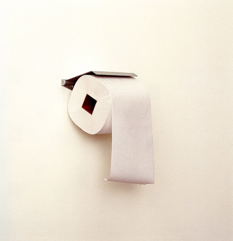
shigeru ban and toilet paper
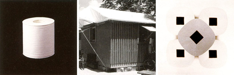
for example, architect shigeru ban was given the subject of toilet paper. known for his use of paper to construct permanent buildings, for his ‘re-design’, ban transformed the typically round core of a toilet paper roll into a square. though simple in its approach, the new design offered resistance, reducing the consumption of resources while also sending out a message to economize. when packing the square rolls, they fit together more seamlessly saving space upon transportation and storage.
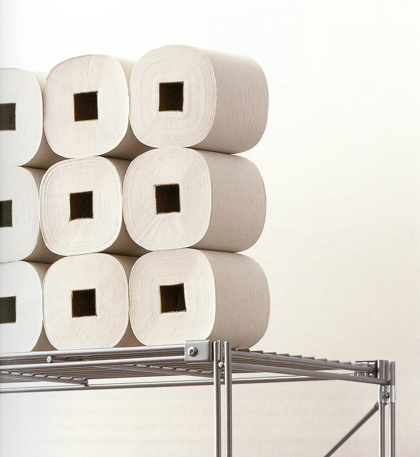
the simple re-design of the round toilet paper roll to a square allows the product to fit together nicely when packaged, saving space during transportation and storage
re-design – daily products of the 21st century
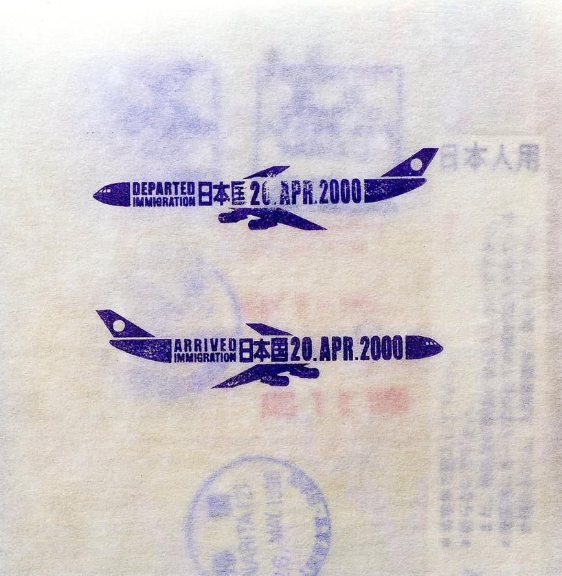
‘exit/entry stamps’ answered by masahiko sato (pp. 30-33)
as part of the exercise, hara asked masahiko sato to re-design the exit and entry stamps for passports at international airports, with the underlying note that it should ‘warm people’s hearts’. his response features an airplane pointing to the right’ for arrival with the date graphically composed as the body of the aircraft, and an airplane pointing to the left as the departure stamp.
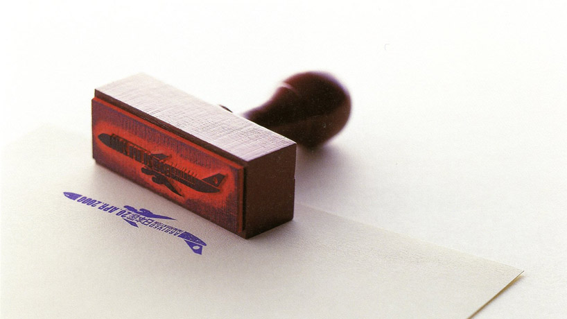
re-design of exit and entry stamps for passports at international airports by masahiko sato
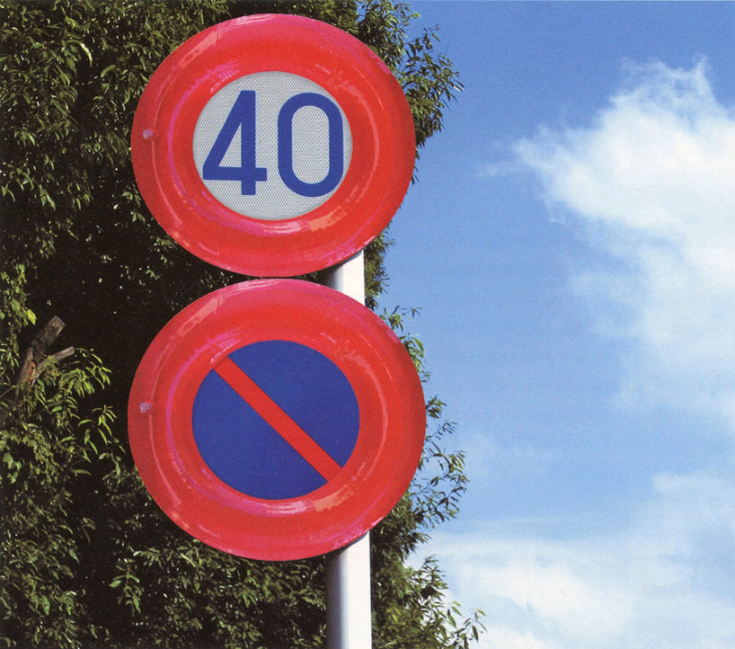
re-design – daily products of the 21st century
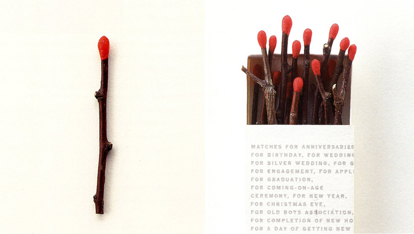
‘matches’ answered by kaoru mende (pp. 38-40)
small size box: W37 x D65 x H8 mm
medium size box: W37 x D136 x H8mm
large size box: W37 x D240 x H8mm
another project was that of lighting designer kaoru mende, who hara asked to reconsider matches. his concept was to take twigs and coat their tips with a combustible substance. the idea behind this was that, these small sticks have a final role before returning to the soil.

‘HAPTIC logo’, 2004 (pp. 68)
animal hairs on silicone
H720 x W720 mm
art director: kenya hara
graphic designer: kenya hara
in chapter two, ‘haptic: awakening the senses’ hara presents the outcomes of an exhibition whereby he asked participants to design an object motivated by ‘haptic’ considerations rather than shape and color. it was an exercise in ‘feeling’ rather than form. refused the right to sketch out their designs, the contributors designed pieces which stimulated other senses and feelings upon interaction with them. for hara, design is about igniting the senses, using them to change our perception of that which is around us, and how things could be.
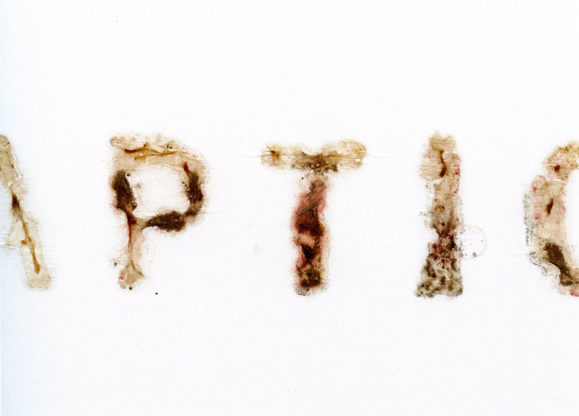
‘HAPTIC logo’, 2004 (pp. 69)
drawn with cultured mold fungus
W300 x H300 mm
art director: kenya hara
graphic designer: kenya hara
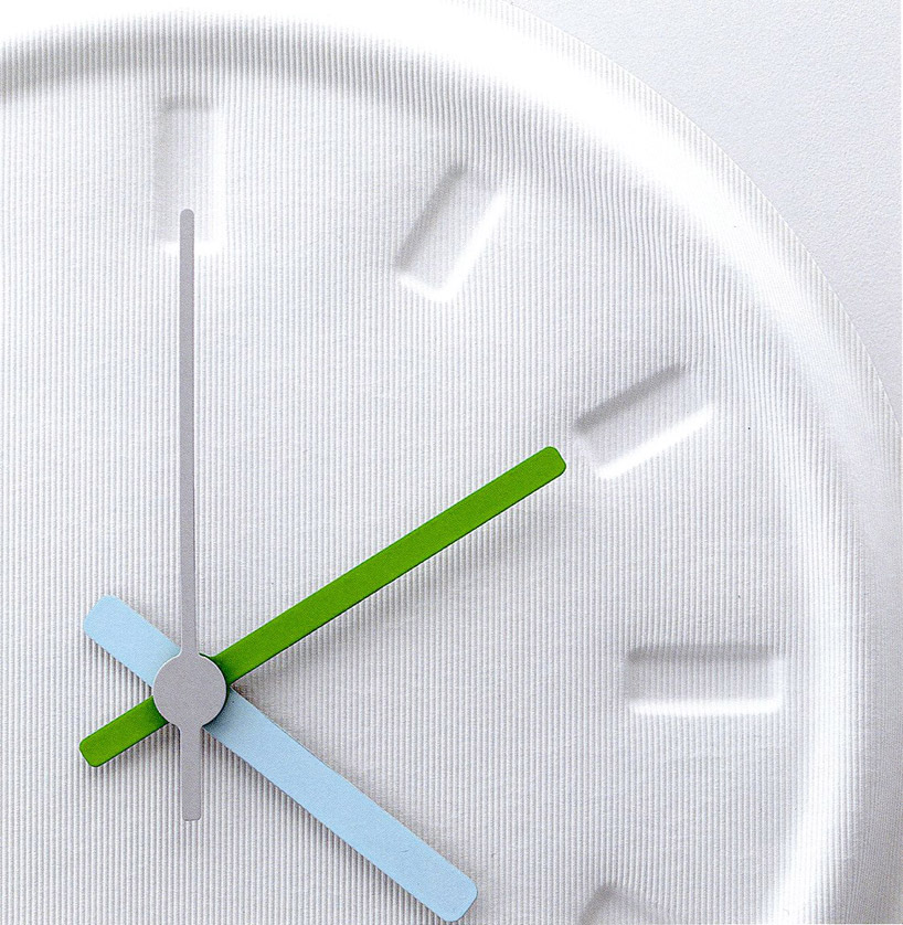
‘wall clock’ by jasper marrison (pp. 80-83)
made from WAVYWAVY, a new paper product with remarkably high elasticity
∅156.5 x 70 mm
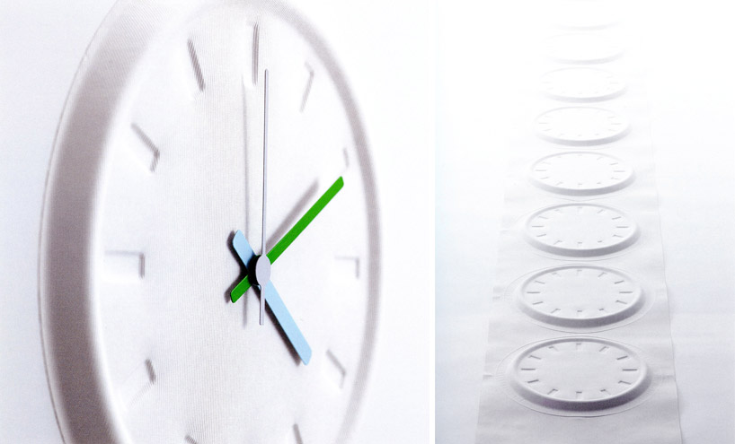
‘wall clock’ by jasper morrison
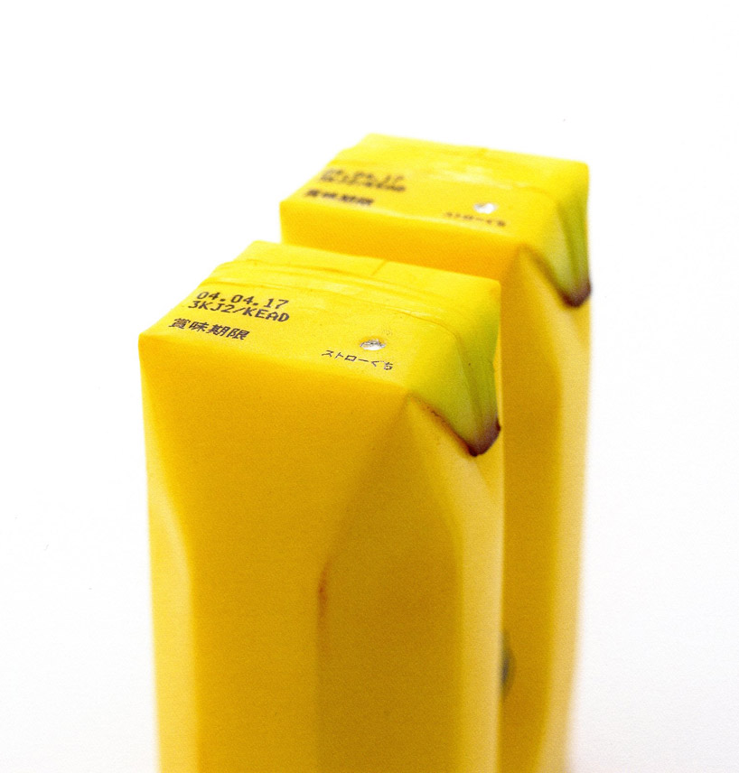
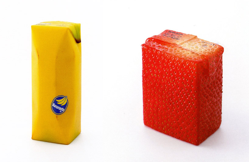
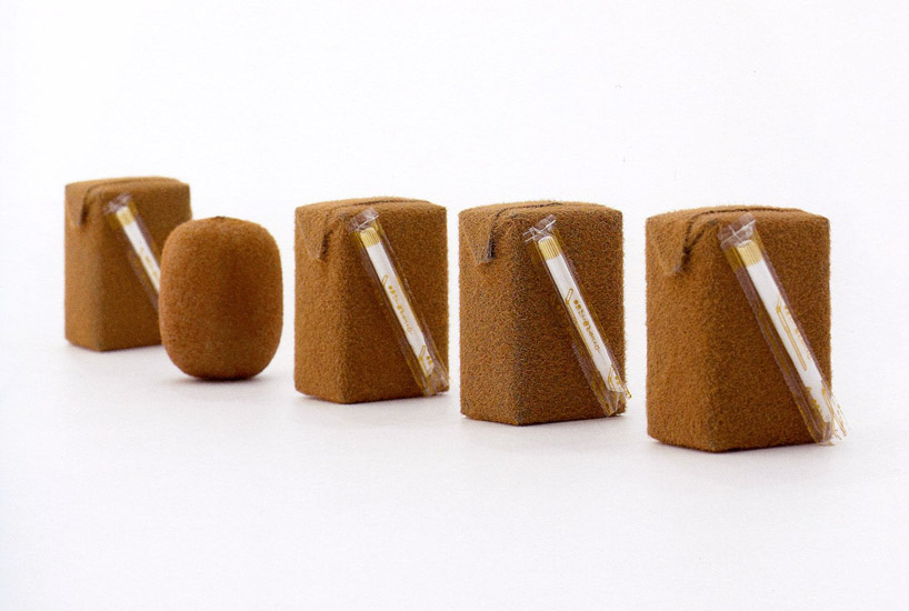
‘juice skin’ by naoto fukasawa
non rigid plastic
technology: electrostatic flocking, technology for playfood production
‘juice skin’ by naoto fukasawa
banana: W58 x D44 x H126 mm
strawberry: W55 x D33 x H67 mm
‘juice skin’ by naoto fukasawa
kiwi: W56 x D40 x H78 mm
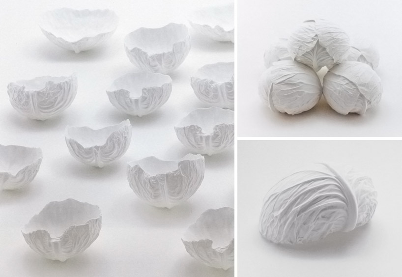
‘cabbage bowls’ by yasuhiro suzuki (pp. 104-109)
paper clay
technology: silicone molding
W200 x D200 x H150 mm
the matrix in which hara primarily works is ‘white’, not solely as a color, but as a design concept: ‘white is not white. the receptivity that senses white is what gives birth to whiteness. so we cannot look for white. we need to search instead for a way of feeling that will sense white. depending on this search, for the receptivity that senses white, we will be able to aim our consciousness towards a white that is a liter whiter than the average white. with that ability, we will become conscious of white. and then we will become aware of white enmeshed in an incredible diversity in the world’s many cultures. we will become able to understand words like ‘tranquility,’ or ’emptiness,’ and discern the meanings dormant within them. as we turn our attention toward white, the world gathers more light, and shadows deepen in degree,’ he says. this philosophy comes through in the book itself whereby white acts as space in which images and text are arranged in a manner which allows everything to ‘breathe’ in such a way that provides the reader with a sense of calm. there is no chaos, just simplicity so that even though the information at hand may seem complex, the ‘white’ brings a sense of clarity.
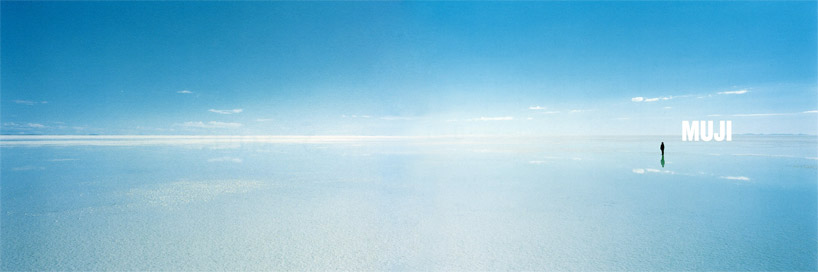
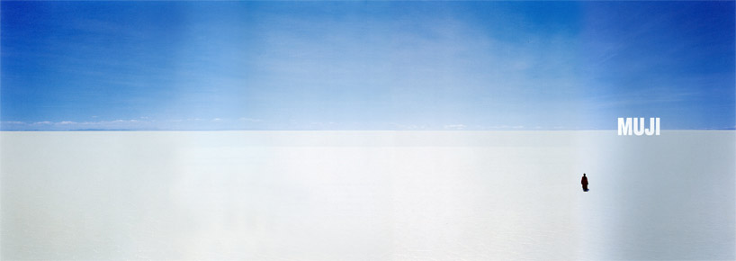
MUJI advertisement, 2003
‘horizon’ poster, uyuni salt lake (pp. 226-227, pp. 246-251)
offset printing
W2912 x 1030mm (B0x2)
location: uyuni salt lake, republic of bolivia
client: ryohin keikaku co., ltd.
art director: kenya hara
photographer: tamotsu fujii
graphic designer: kenya hara, yuki inoue, izumi suge
coordinator: aoi advertising promotion inc. / kumiko kitamura, maho ikeda
of course, the book is not completely without a section dedicated to the great designer’s role at MUJI, for which his work has made and shaped the brand into what it is today.
is it for me?
this book is perfect for design hobbyists and practitioners alike. the thoughtfully written and executed graphic layout of the publication emphasize kenya hara’s aesthetic beliefs and will get you to consider re-adjusting your sensory perceptions and how you experience the world around you.
‘vinyl / stripes’ by emiko ai (pp. 397-399)
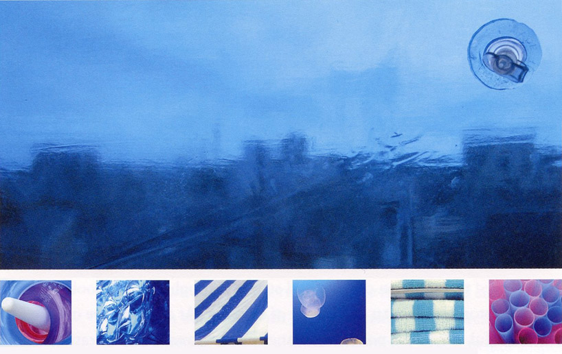
‘vinyl / stripes’ by emiko ai (pp. 397-399)
‘vinyl / stripes’ by emiko ai (pp. 397-399)
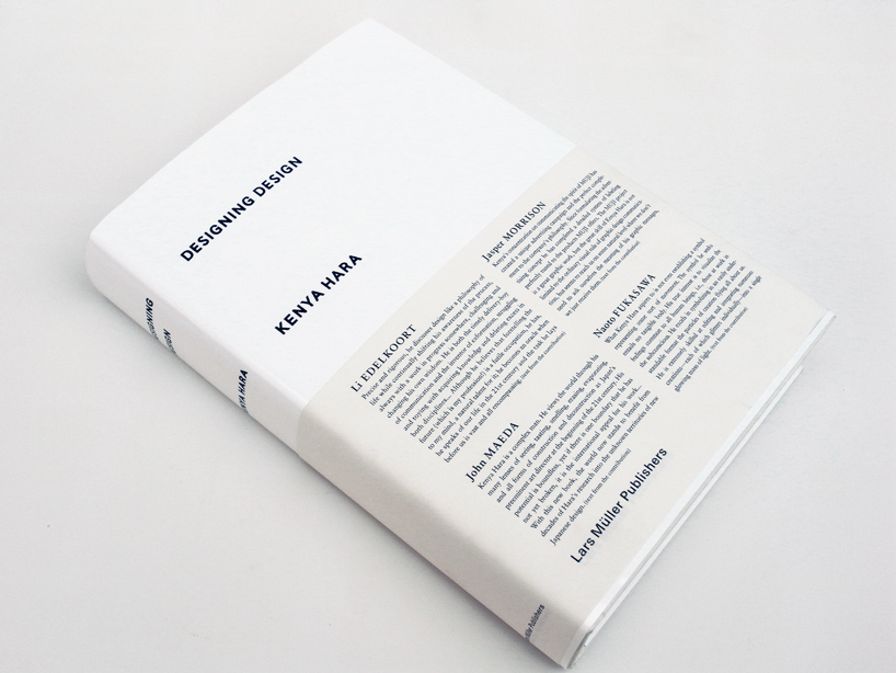
‘designing design’ by kenya hara (cover)
designboom book reports (203)
 Sep 20, 2024
 Aug 13, 2024
 Aug 03, 2024
 Aug 02, 2024
kenya hara (11)
 Dec 15, 2023
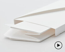 Apr 27, 2021
 Feb 17, 2021
 Nov 08, 2020
 Jul 27, 2020
PRODUCT LIBRARY
 Sep 07, 2024
 Sep 02, 2024
 Aug 29, 2024
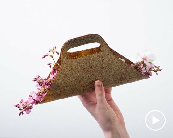 Aug 21, 2024