auge design completes leibniz brand refresh
Design agency Auge was commissioned by German food manufacturer Balshen to complete the rebranding of Leibniz, the iconic biscuit known for its teeth-shaped design and imprinted ‘Leibniz Butterkeks’ typeface. Drawing from the biscuit’s original look, the refresh introduces a new packaging, typography, and logo, creating a fresh visual identity that engages warmly with young families while reminding consumers of the brand’s legacy.
Leibniz, the iconic biscuit known for its teeth-shaped design
all images courtesy of Auge Design
‘freshly baked’ typeface and signature Leibniz yellow
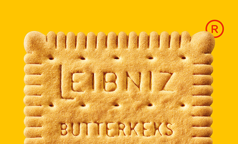
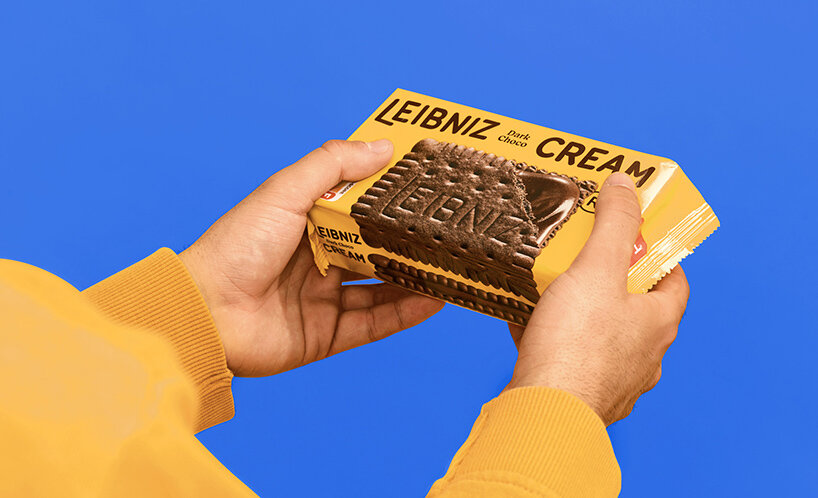
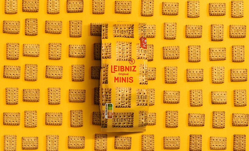
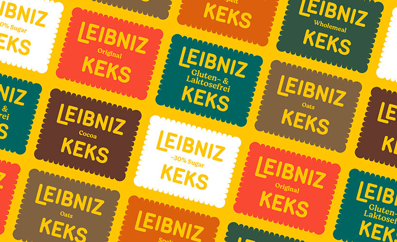
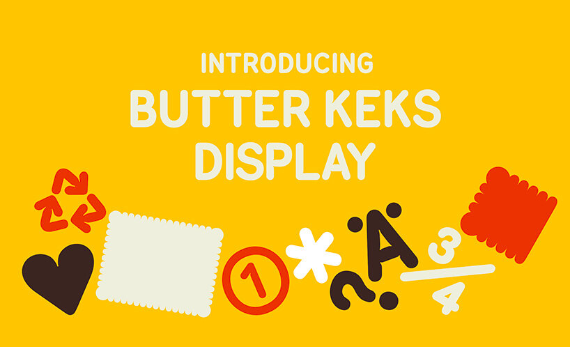
Auge Design has preserved the original Leibniz biscuit shape with its characteristic 52 teeth that dates back to 1891. At first sight, the logo appears to be unaltered as well. ‘We decided to keep the original logo rounded style and ‘baked’ it exactly the way biscuits are,’ Auge Design explains. Further inspection reveals the design studio’s delicate smooth inktraps, which resemble the way dough swells and sets as it emerges from the oven. The rounded edges and swollen dough look are also incorporated into the new logo and the bespoke typeface, titled Butterkeks Display.
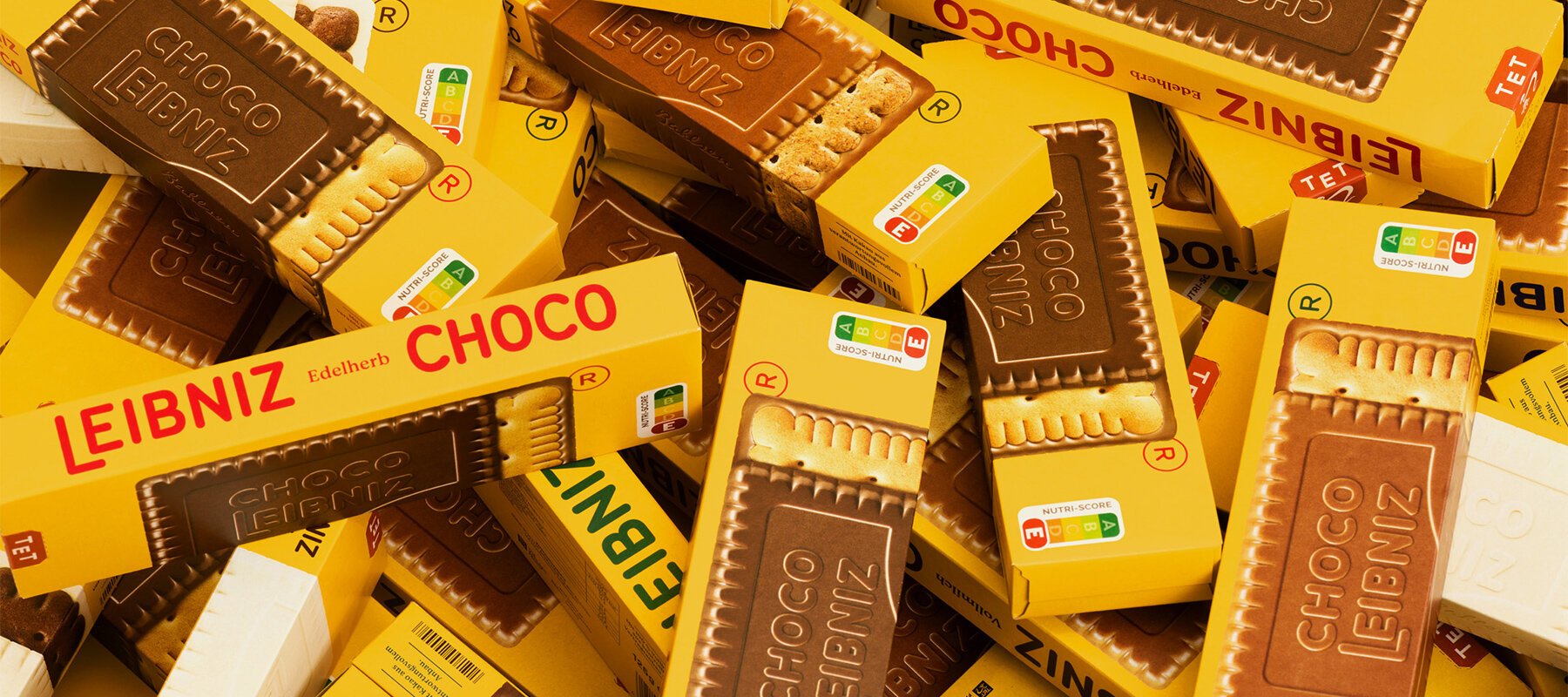
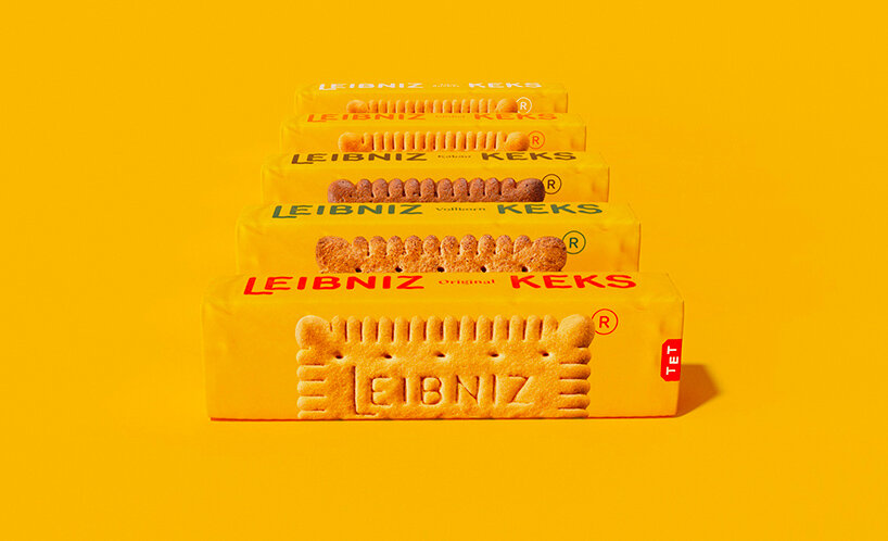
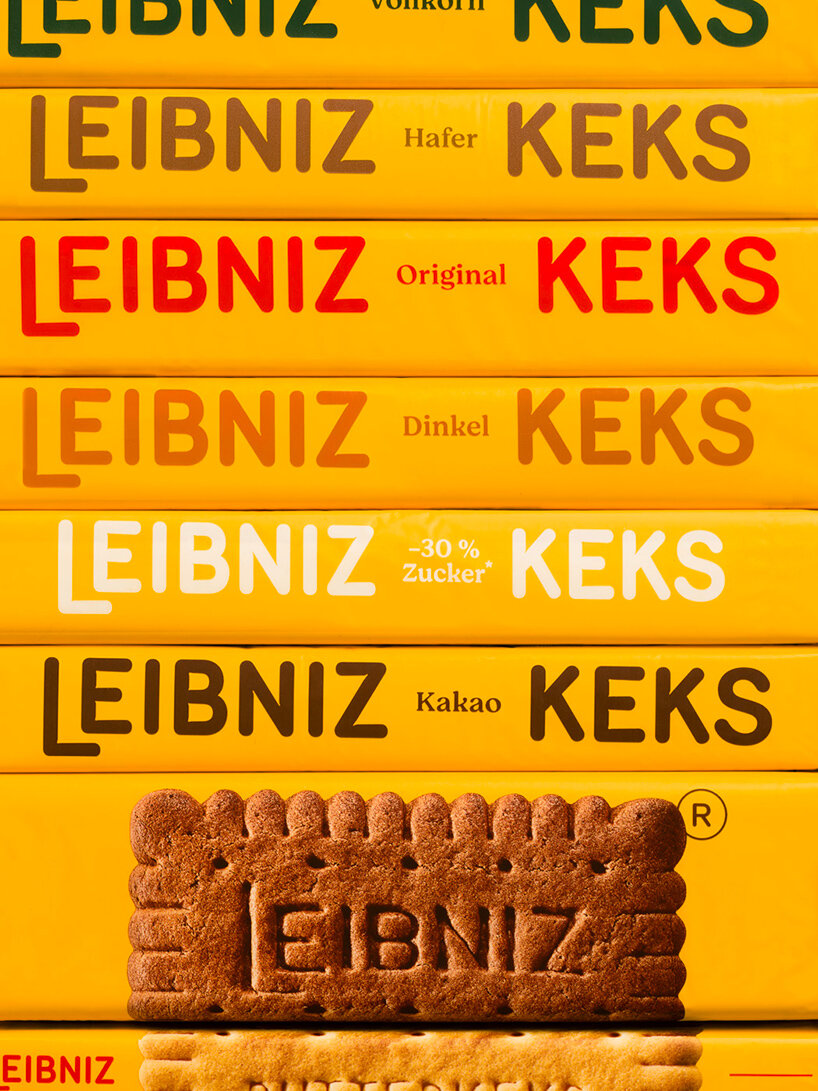
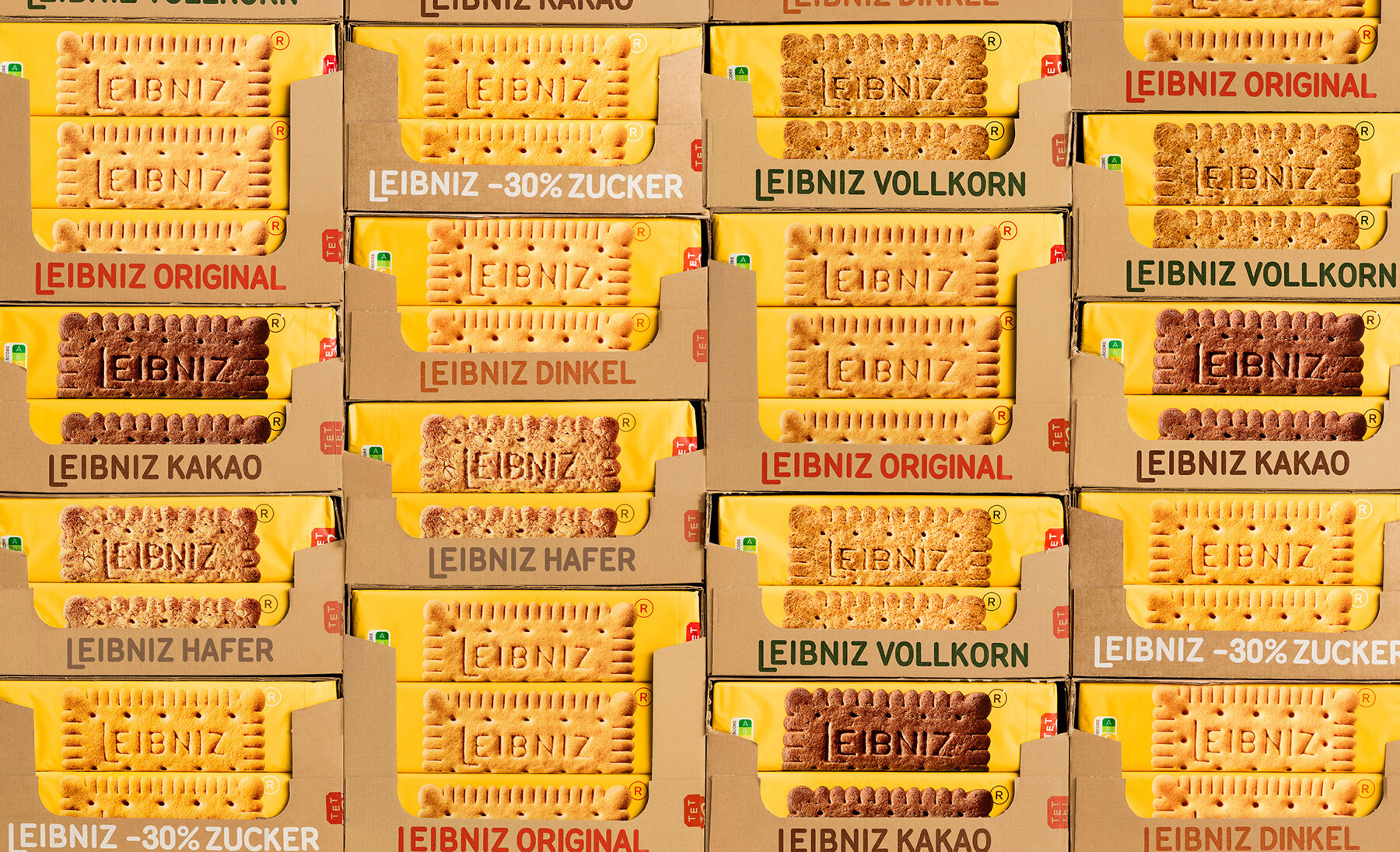
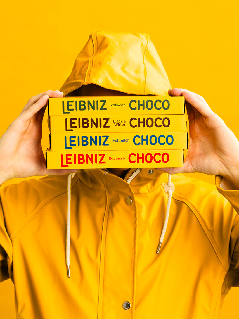
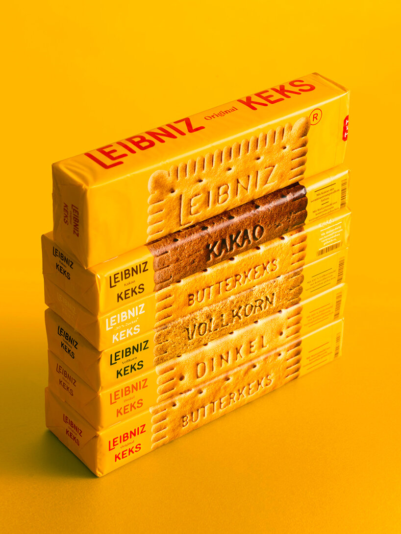
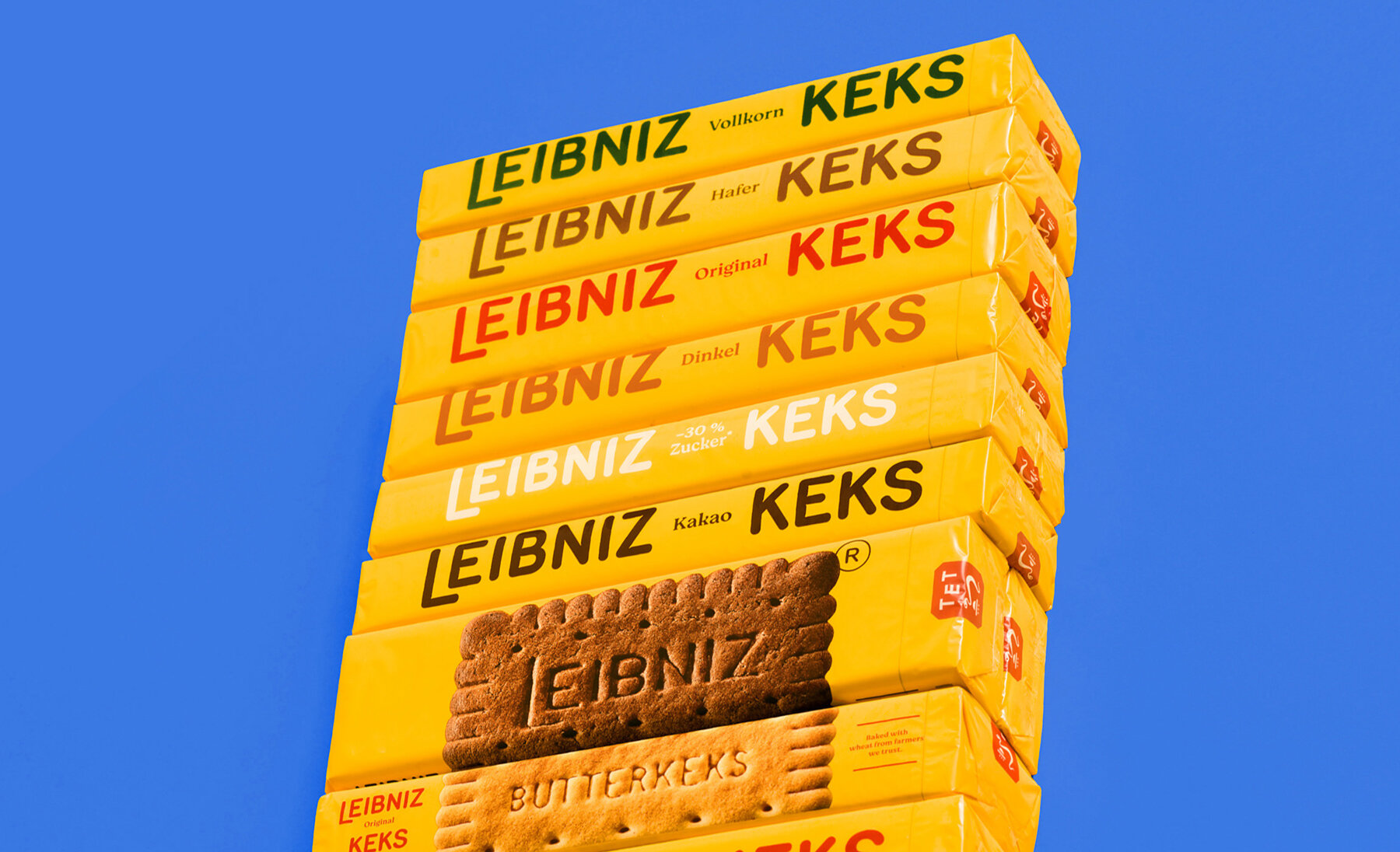
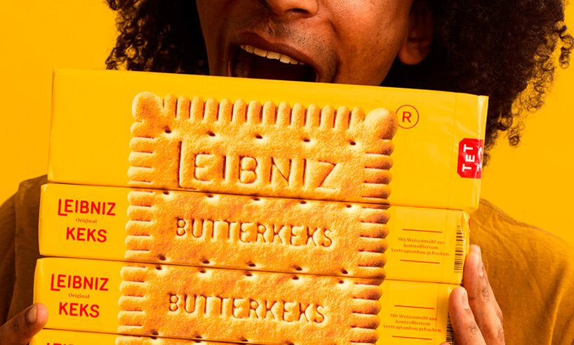
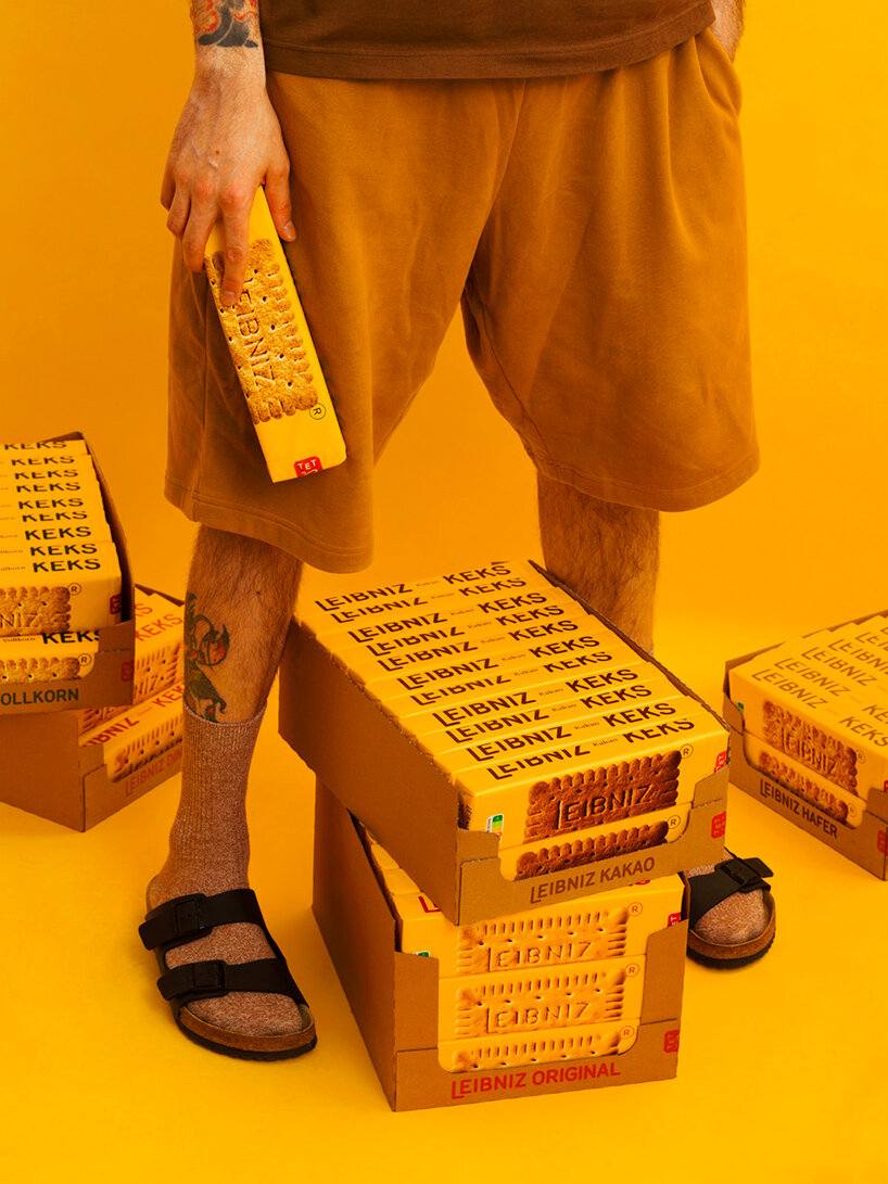
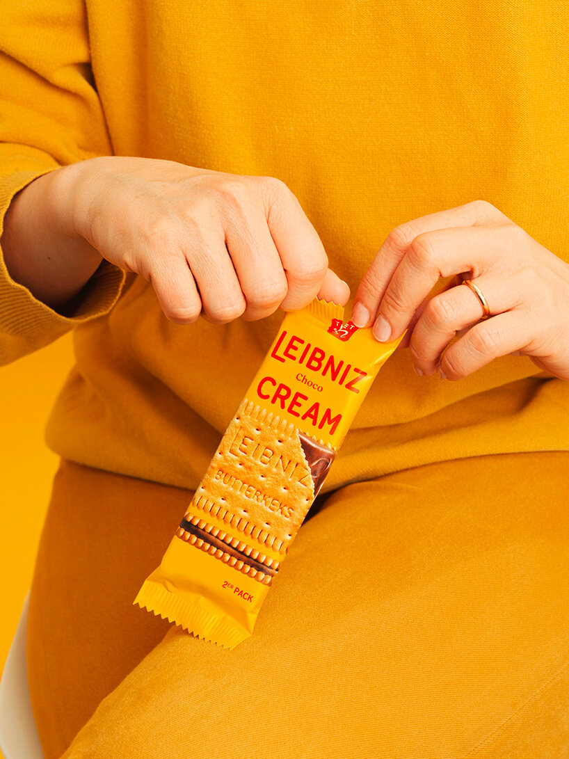
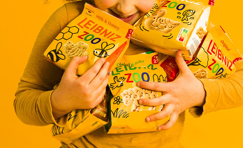
Auge has created an architecture comprised of six distinct ranges in which the biscuits are the ultimate hero, capable of carrying all necessary information. The warm character of the new brand identity is underlined by preserving the iconic Leibniz yellow and improving the sunflower tone across the new packaging. ‘The distinctive Leibniz yellow increases the wall impact on shelf,’ the design studio notes. The sides of the packaging feature a huge logo that embrace the flavor, while a natural color palette reminds consumers of ‘the goodness of the products’. What’s more, macro photography of the biscuits dominates the new packaging, in order to massively enhance every single detail of the biscuits’ texture and make the flavor recognizable at first glance.
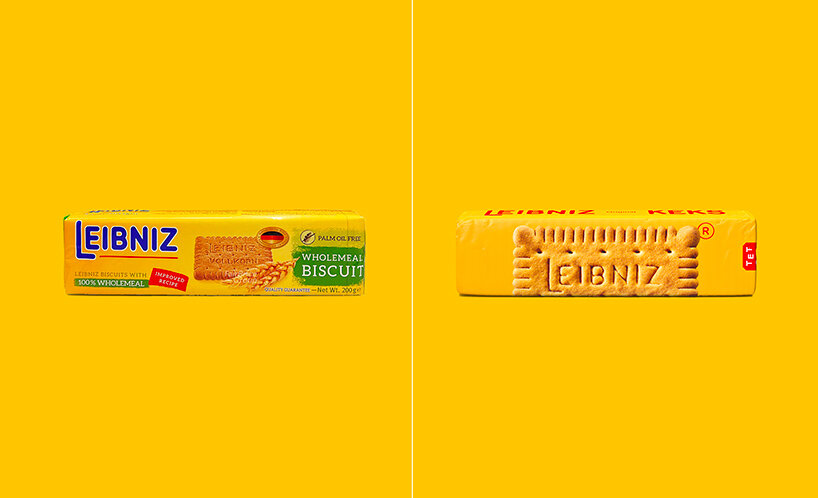
before & after of the Leibniz packaging
the signature sunflower tone highlights the warm character of the brand
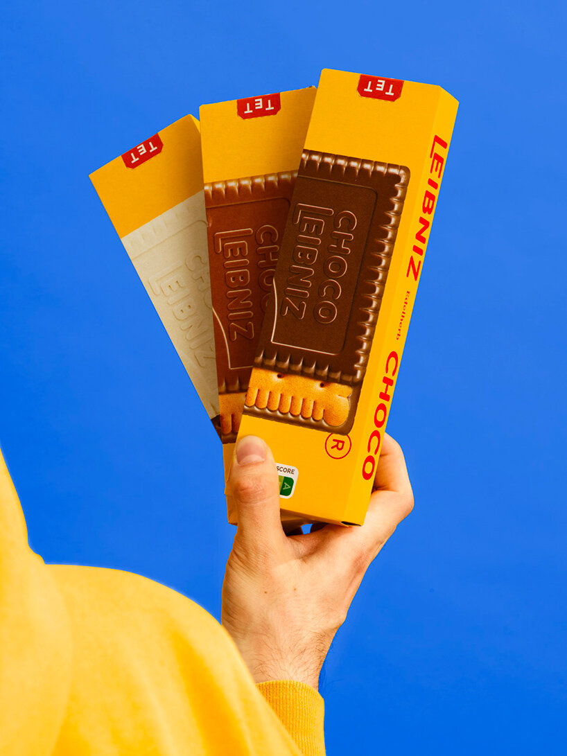
macro photography of the biscuits dominates the new packaging
the rounded edges and swollen dough look are incorporated into the new logo and the bespoke typeface, titled Butterkeks Display


project info:
name: Leibniz Design Relaunch
designer: Auge Design
logo design (245)
 Jul 03, 2024
 Aug 14, 2023
packaging design (102)
 Jul 24, 2024
 Jul 13, 2024
 Feb 14, 2024
 Nov 13, 2023
 Nov 10, 2023
PRODUCT LIBRARY
 Jul 23, 2024
 Jul 01, 2024
 Jun 13, 2024
 Jun 06, 2024