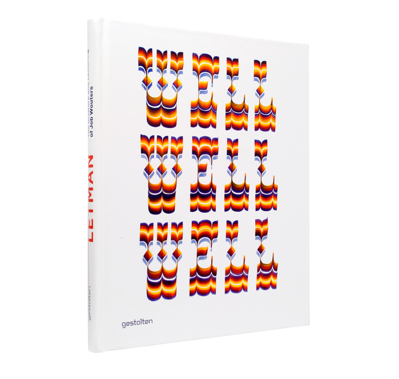
letman book cover by letman, published by gestalten, 2012
title: letman (the artwork and lettering of job wouters) author: letman published by: gestalten format: 21 x 26 cm features: 160 pages, full color, hardcover language: english ISBN: 978-3-89955-453-3 available from gestalten
________________________________________________________________________________________ designboom rating: ![]()
![]()
![]()
![]() (excellent) ________________________________________________________________________________________
(excellent) ________________________________________________________________________________________
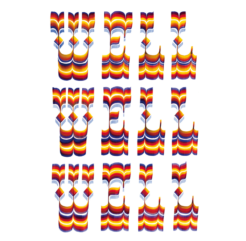
working under the pseudonym letman, the dutchman job wouters is known for his synthesis of illustration and lettering. he creates decorative letters and typefaces that are a hybrid of graphic design, screen printing, graffiti, illustration, and painting clearly influenced by eastern character symbols.
his typographic compositions have been featured in work for clients including audi, heineken, dries van noten, tommy hilfiger, eastpak, and universal.
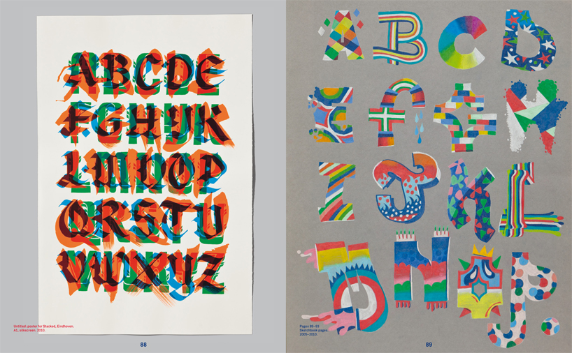 spread from letman by gestalten left: untitled: poster for stacked, eindhoven right: sketchbook pages
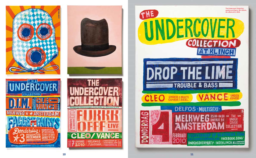
spread from letman by gestalten the undercover collection: posters and flyers. 30 × 100 cm, A4, offset print. 2010
‘letman’ published by gestalten is a visual treat for any illustration or graphic design fan and of course will particularly appeal to those with a penchant for typography.
the book opens with an insightful introduction written by gijs frieling that ponders the context of handwriting in the digital age. the rest of the book is all images, allowing you to digest the myriad styles and mediums in which wouters has applied his skill for hand lettering without any interference.
— to mark the release of ‘letman’ designboom spoke to job wouters:
DB:please could you tell us a bit about your background and how you came to specialize in hand-lettering? JL: when I was a youngster I was interested in graffitti, especially graffiti-writers, who could write their names flawlessly in different styles. later on I studied typography and graphic design at the royal academy in the hague and the rietveld academy in amsterdam, where I deepened my fascination for type and lettering.
what do you enjoy most about working on the end product by hand? it’s a matter of control, I have more control over physical tools, than their digital counterparts. I also feel more connected with my work if I can touch and retouch them by hand them. nothing beats the joy of a perfect hand drawn loop.
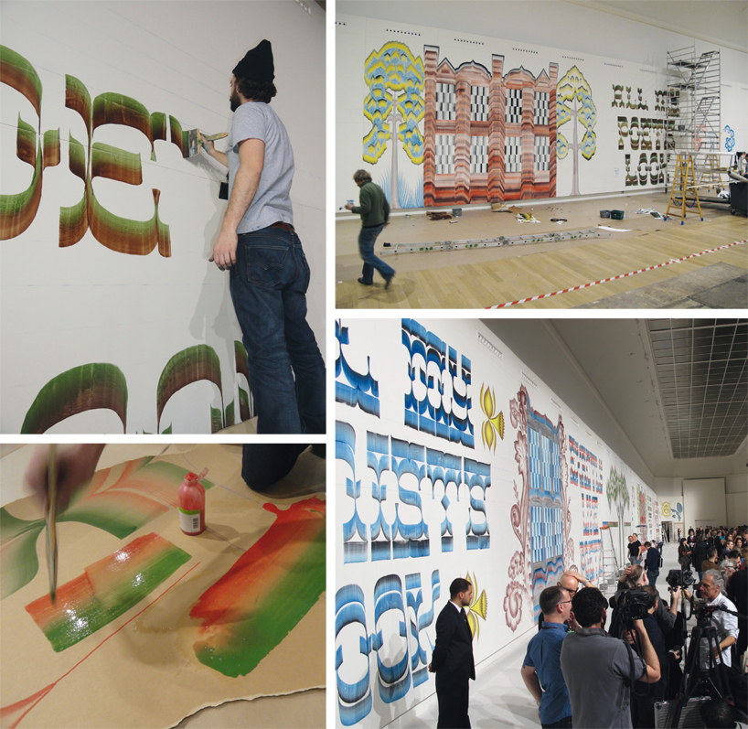 lord arthur savile’s crime, menswear collection for dries van noten: live painting for A/W launch collaboration with gijs frieling. assisted by jeroen erosie, jana van meerveld, menso groeneveld, and julie van der scheer
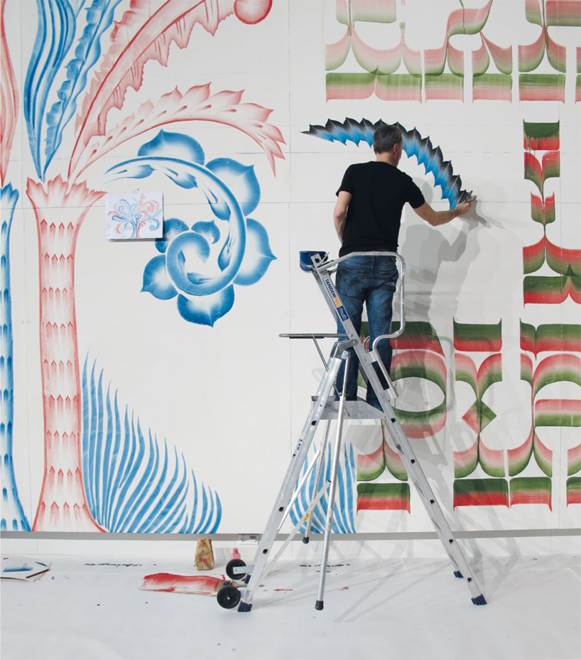 lord arthur savile’s crime, menswear collection for dries van noten: live painting for A/W launch collaboration with gijs frieling. assisted by jeroen erosie, jana van meerveld, menso groeneveld, and julie van der scheer
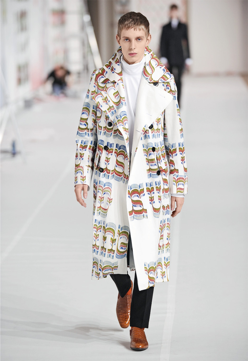 lord arthur savile’s crime, menswear collection for dries van noten: lettering for garments
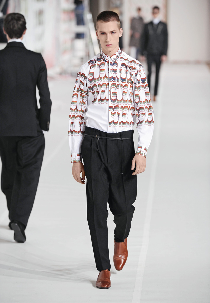 lord arthur savile’s crime, menswear collection for dries van noten: lettering for garments
how much does the computer feature in your work process? it depends on the project, but often my drawings need to go to a digital environment, so scanning, separating colors, and other pre-press activities are part of the job too.
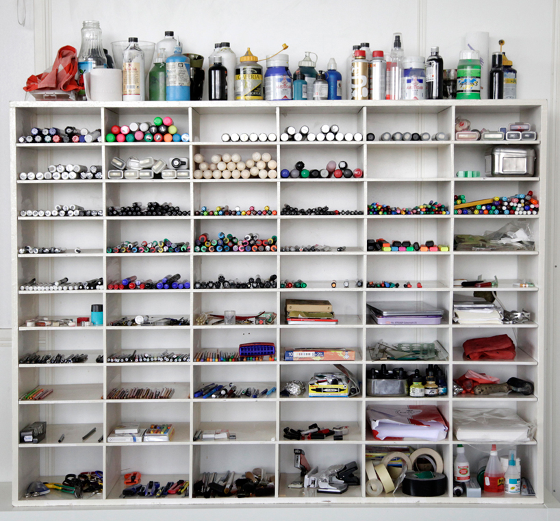
what equipment do you use the most? nothing out of the ordinary: some brush pens, some markers, a couple of crayons, some good flat brushes, some calligraphy equipment, a bit of quality ink, or good paint, and a light table.
 self portrait by job wouters / letman
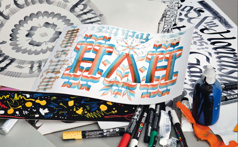 part of a still life series of typographic sketches. photography by qiu yang. commissioned by it’s nice that, 2011
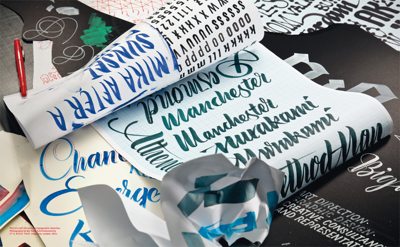 part of a still life series of typographic sketches. photography by qiu yang. commissioned by it’s nice that, 2011
 design miami: live lettering for audi, USA. collaboration with mutabor, germany, 2008
who / what would you say is the biggest influence on your style of lettering? I couldn’t choose, I think it more a whole spectrum of influences that drives me, not one style or person in particular. comic lettering, graffiti, calligraphy, (amateur!) shop lettering, people’s handwriting, airbrushed circus vans, scribbles on toilets, hells angels’ outfits… fascinations come and go.
as for persons I must say that I get more inspiration from contemporary artists than from my fellow designers, although my brother roel wouters is an excellent designer, with an excellent new studio called ‘moniker’ ;-).
which styles of letters are the most difficult to draw? simple letters are tough because the less one is able to hide behind decoration the harder it gets. try to draw an elegant set of classical roman capital in a few strokes is very difficult, I still have to look up proportions to do it properly.
do you challenge yourself to learn new styles? yes, actually it’s one of the activities that I enjoy the most.
which has been your defining project to date? I guess working on the mens collection with dries van noten earlier this year. (together with gijs frieling) I had a private and exquisite view into the high-end fashion world, which was quite memorable.
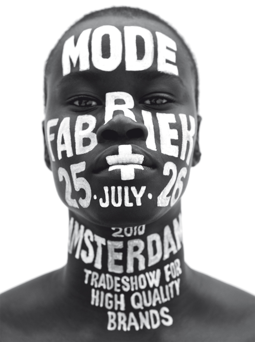 modefabriek: lettering for the modefabriek, amsterdam, 2010 photography by philippe vogelenzang
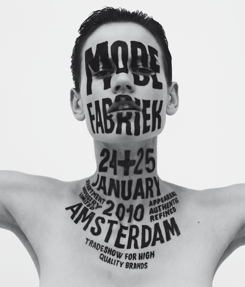 modefabriek: lettering for the modefabriek, amsterdam, 2010 photography by philippe vogelenzang
what’s the biggest lesson you have learned from your work? if I love a project it will show in the end result and if I don’t love it, that will show too. ideally the viewer will receive the same amount and type of energy from the work as what I put into it while I was making it.
besides art and design what do you have a passion for and why? I have a superb little son of 6 months old and obviously I have a great passion for him.
what is a project or collaboration that you would like to work on in the near future? I’d like to work more on physically large projects, the amount of work I put in a poster does not differ enormously from the preparation for a mural, only the impact of the two final products differ a great deal. so less posters and more murals!
gestalten has made a beautiful large book filled with pictures of small works. if another book was to be made about my work in the future, I’d like it to be a small book filled with pictures of large works.
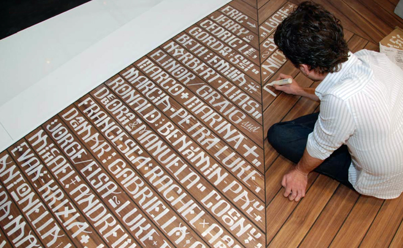
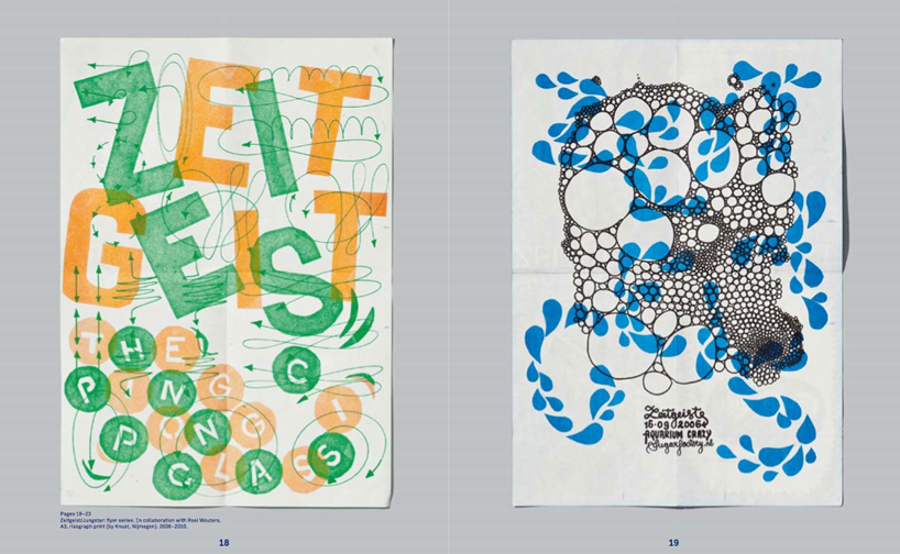 spread from letman by gestalten zeitgeist/jungstar: flyer series, 2008–2010 in collaboration with roel wouters A3, risograph print (by knust, nijmegen)
letman book cover by letman, published by gestalten, 2012
_________________________________________________________________________________________
designboom ratings: ![]() ……………………. interesting
……………………. interesting ![]()
![]() ………………. good read, worth a look
………………. good read, worth a look ![]()
![]()
![]() …………. very good
…………. very good ![]()
![]()
![]()
![]() ……. excellent, recommended
……. excellent, recommended ![]()
![]()
![]()
![]()
![]() . must have _________________________________________________________________________________________
. must have _________________________________________________________________________________________
designboom book reports (197)
 Jul 12, 2024
 Jun 30, 2024
 Jun 17, 2024
 Jun 01, 2024
 May 29, 2024
typography design (133)
 Sep 13, 2023
 Feb 23, 2023
 Jan 24, 2023
 Jan 19, 2023
PRODUCT LIBRARY
 Jul 23, 2024
 Jul 01, 2024
 Jun 13, 2024
 Jun 06, 2024