this baking brand bears packaging influenced from the austerity regime in israel
berlin-based graphic designer and photographer liad shadmi drew from the values of simplicity, functionality and meagerness in the design of a series of packaging for a brand of baking products.
prefer designboom on googlefrom 1949 to 1959, the state of israel was — to a varying extent — under a regime of austerity, during which rationing and similar measures were enforced. berlin-based graphic designer and photographer liad shadmi drew from the values of simplicity, functionality and meagerness in the design of a series of packaging for a brand of baking products.
all photos by keith glassman
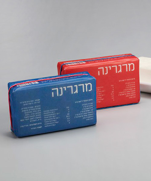
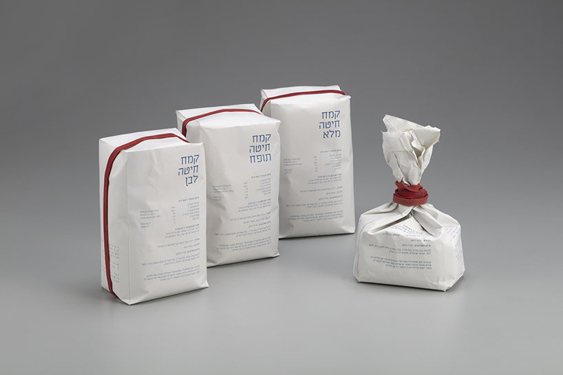
‘I tried to create a ‘non branding’ project,’ shadmi says, ‘where everything is very simple — no logo, and almost nothing else.’ each package has a red mark that indicates the opening of the container. shadmi added rubber bands to some of the bottles and bags that seal the item shut and keep it fresh. the package focuses on the product itself, and provides consumers with all the necessary information about the ingredients and food source. few colors and minimal graphics communicate a sense of seriousness and simplicity that draws from the austere era of 1950s israel.
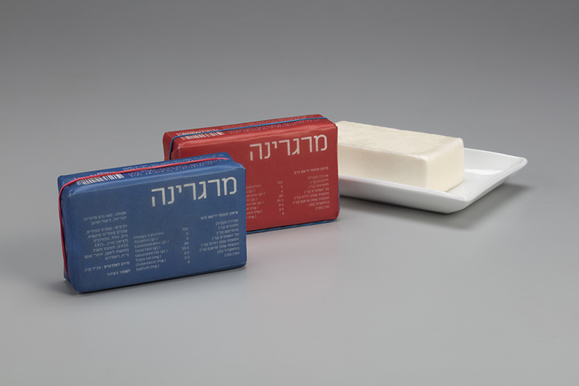
the packaging expresses the values of simplicity, functionality and meagerness
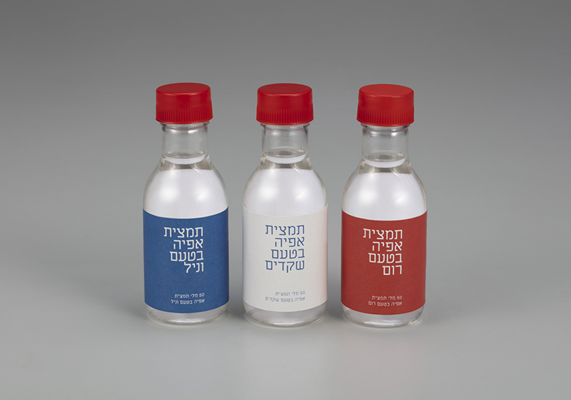
the design is for a brand of baking products
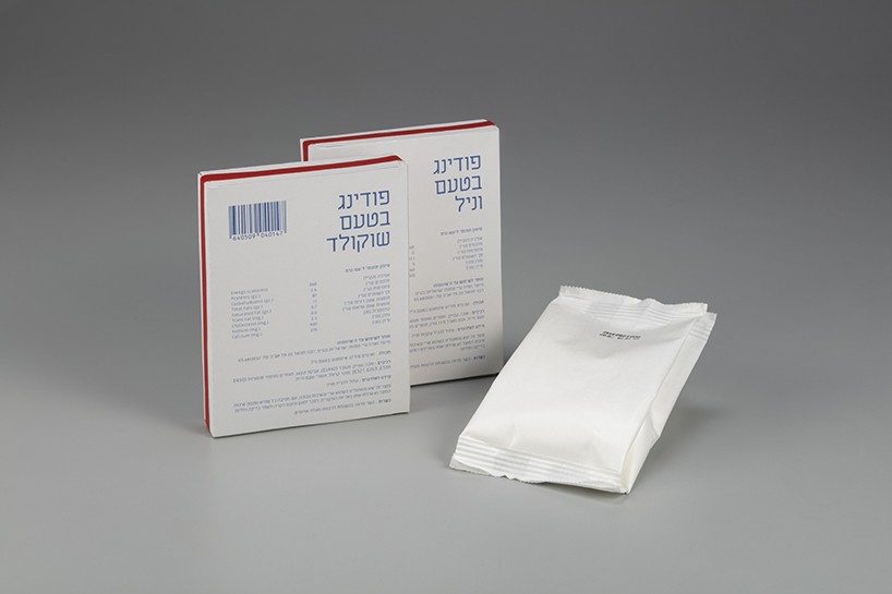
each package has a red mark that indicates the opening of the container
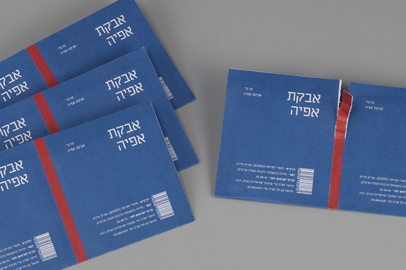
shadmi added rubber bands to some of the bottles and bags that seal the item shut and keep it fresh
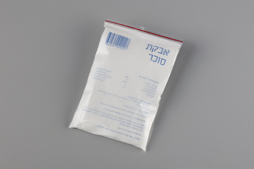
the package focuses on the product itself, and provides consumers with all necessary information
designboom has received this project from our ‘DIY submissions‘ feature, where we welcome our readers to submit their own work for publication. see more project submissions from our readers here.
shop
your own online design shop — no sales commission collected