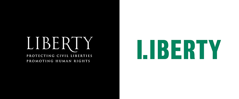
bringing over 80 years of history to the next generation of activists, design studio north has created a new visual identity for the UK’s largest civil liberties organization. founded in 1934, liberty works to give a voice to the marginalized and champion anyone whose rights come under threat. while their values and aims have remained constant throughout time, their outward image failed to reflect the cutting-edge nature of their work. the new logos and campaign material therefore aim to create clear, timeless and distinctive visual identity that appeals to a younger, more diverse and politically engaged audience.

liberty logotype
image courtesy of north design
liberty’s branding looked outdated, making the organization unappealing to new members. campaign material visually lacked strength, coherence and a clear voice. their fight to achieve positive and real impact on millions of ordinary lives was not communicated with their brand identity. liberty was instead seen as old-fashioned, and associated with westminster elitism and the legal bubble of the UK’s political power center. with this project north sought to convey liberty’s values and activities across all their platforms and audiences. the brand needed to work for the whole organization and its many stake holders, boosting its recognition, and also working on legal documents.
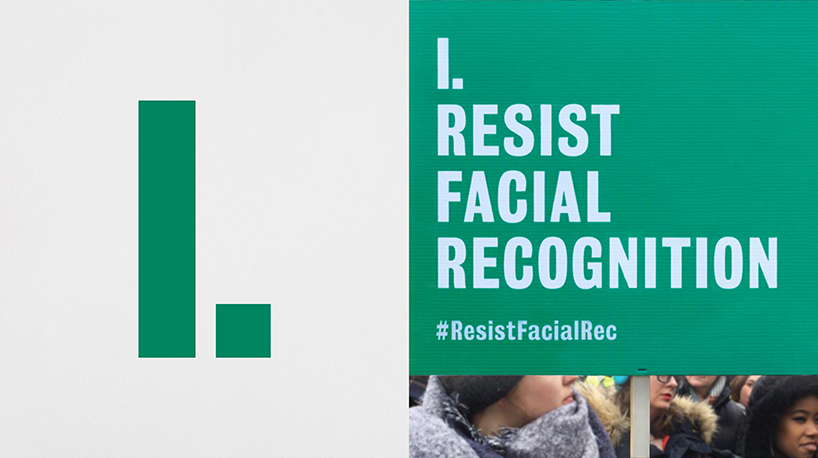
logo shorthand and campaign banner
image courtesy of north design
north introduced a new visual identity to make liberty more visible by shifting the emphasis of the brand and messaging to membership. the double l and i character in the new logotype functions as a rallying cry and campaigning tool that conveys the urgency behind liberty’s unique voice. to launch the visual identity north designed a brand campaign diving into liberty’s rich history, showcasing examples of the incredible work they have done over the last 85 years.

logo shorthand and liberty’s guide to the human rights act
image courtesy of north design
liberty are ordinary people standing up to power. our civil rights are dependent on the effort of individuals, and so challenge us to be responsible. the special l and i character expresses the dichotomy between the organization and the individual. it provided the formula for a singular and recognizable voice. with this device liberty can easily create consistency of messaging across campaigns and other branded materials. north was looking for a strong typographic expression so that liberty’s brand could stand out and be more visible. they used the bureau grot font family, which affords an approachable quality, despite its bold and condensed appearance.

logo shorthand and campaign material
image courtesy of north design
liberty are independent. their principles are guided by evidence, expertise and human impact. they are not influenced by political agenda, profit or popular opinion. it is crucial that liberty are perceived as nonpartisan. this eliminated politically charged colors such as red and blue. north also analyzed the branding of competitors in the human rights and legal sector, and identified a distinctive opportunity. finally, they were inspired by the argentinian women’s rights and pro-choice movement pañuelazo. they use handkerchiefs in a beautiful green-blue tone in their campaign, which north has payed homage to.

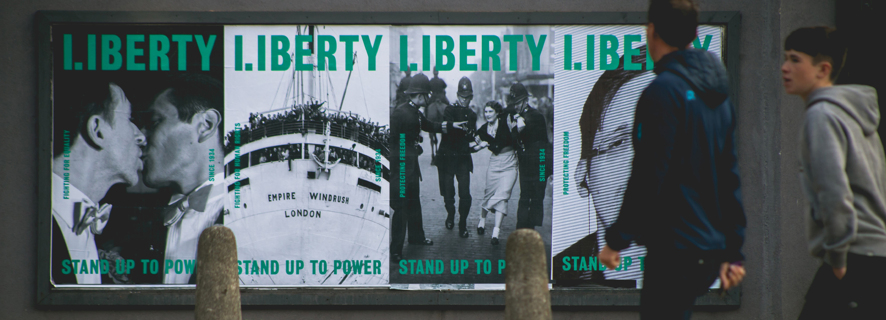
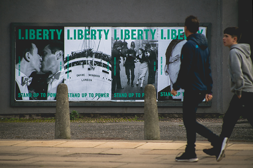
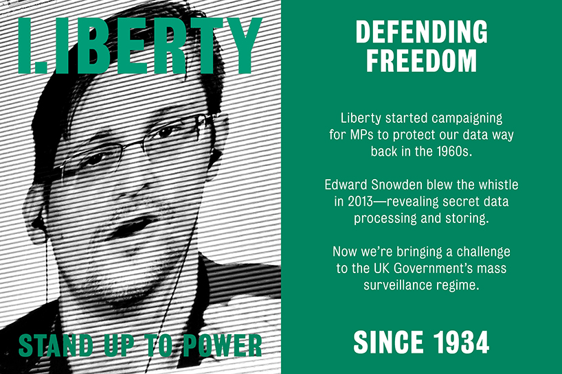
liberty brand campaign, 6-sheets
image © jackarts
the inspiration for the liberty brand campaign came from its illustrious past with many landmark cases. since 1934, liberty have campaigned on a huge range of issues – from fighting fascism, mass surveillance, internment and abuse of police power, to defending free speech and demanding equal rights for all. north tried to juxtapose historic and more recent issues in order to highlight what a crucial and dynamic role liberty have played in championing civil rights in the UK.
liberty brand campaign, 6-sheets
image © jackarts

liberty brand campaign
image © shutterstock

liberty brand campaign
image © getty images
liberty brand campaign
image © alamy

liberty brand campaign
image © getty images

liberty brand campaign, 6-sheets
image © jackarts
the liberty logotypes before and after
project info:
project type: visual identity design
design: north design
client: liberty
designboom has received this project from our ‘DIY submissions‘ feature, where we welcome our readers to submit their own work for publication. see more project submissions from our readers here.
edited by: lynne myers | designboom
dbinstagram (2250)
 May 22, 2024
 Nov 10, 2023
 Dec 20, 2022
 Dec 13, 2022
 Oct 26, 2022
logo design (249)
 Dec 08, 2025
 Aug 09, 2024
 Jul 03, 2024
 Feb 20, 2026
 Feb 18, 2026
 Jan 28, 2026
 Jan 02, 2026