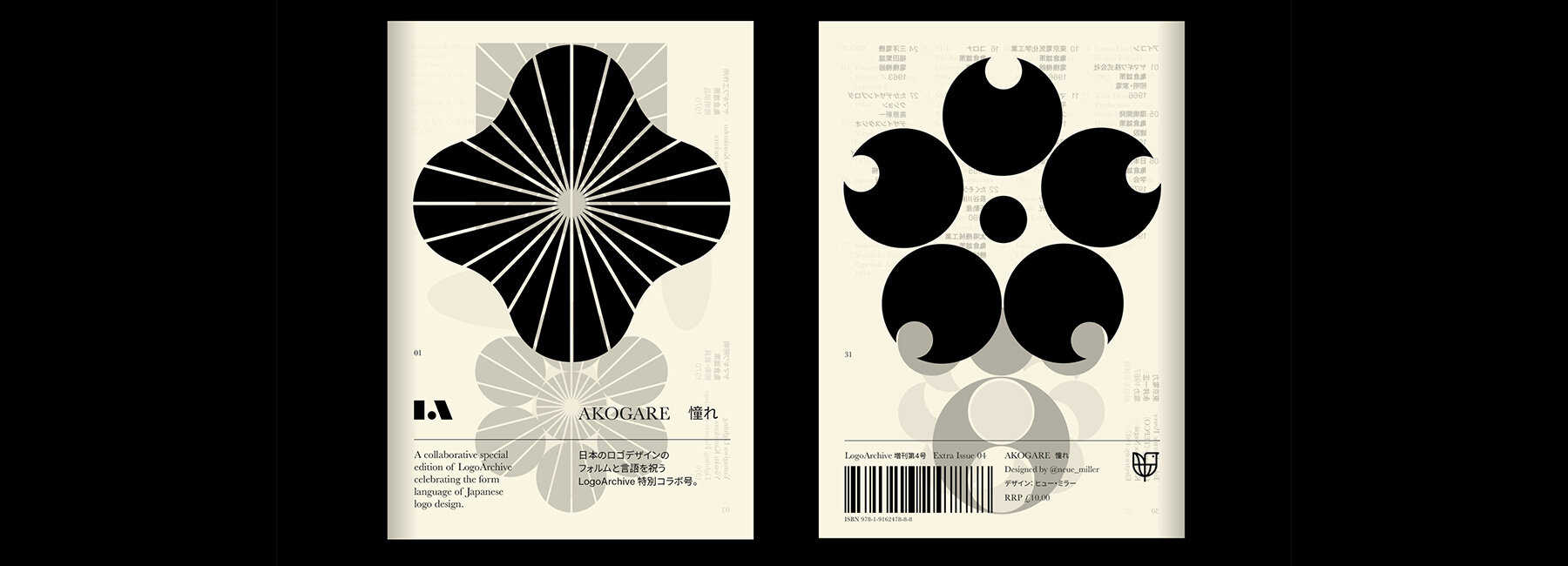
london-based writer and designer richard baird has collaborated with fellow designer hugh miller on agokare, the 4th issue of the LogoArchive zine — a series of booklets dedicated to the modernist logo-making of the mid-century. this extra issue, which is the first to be released in both english and japanese, explores japanese logo design.
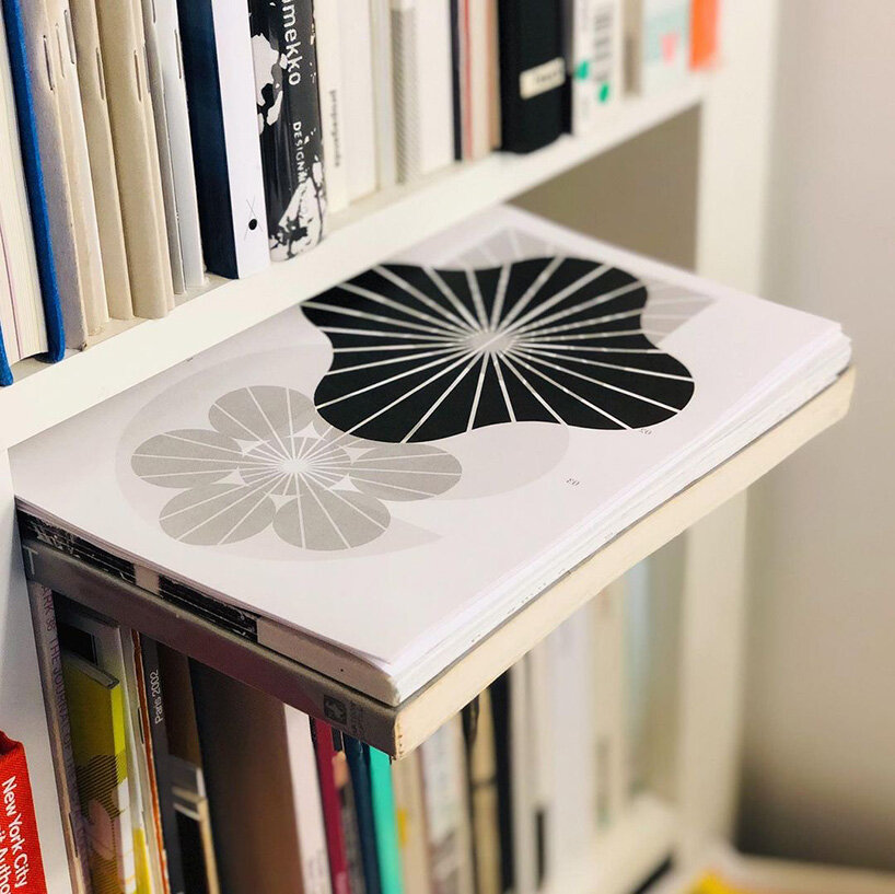
image by hugh miller
‘hugh miller had spent time working at renowned studio SPIN on projects such as the whitechapel and haunch of venison gallery identity and was embedded into the brand teams of both nokia and microsoft,’ comments richard baird. ‘I discovered his work whilst writing for BP&O and had the pleasure of meeting him back in 2018. hugh had co-founded the London office of international design studio BOND and, under his direction, had produced a string of projects that wove together elegant ideas, visual sophistication and material subtlety. when it came to the design of this extra Issue, which required cultural insight and a sensitive and delicate hand, hugh was an obvious choice, and a pleasure to work with. his insightful and creative approach honors the craft and care of the logos presented in this issue of LogoArchive.’
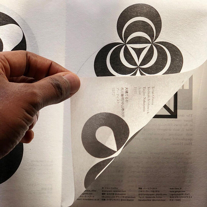
image by hugh miller
this akogare issue of the LogoArchive zine documents the japanese logo design from the 1960s until the 2000s. it focuses on transparency, in both visual design and materiality. it references the lightness and delicacy of items bought by baird and miller in japan, including issey miyake’s folded paper lights. utilizing japanese papers throughout, there’s also the addition of an extra composed of a heated die and using semi-transparent paper.
image by richard baird
‘the zine intends to evoke–through materials, processes, form, content and ‘atmosphere’–’akogare’, a deep feeling of respect and admiration for those I look up to, and a feeling of never being able to reach the same level,’ comments miller. ‘for me, this is japanese designers and publications such as IDEA and graphic design, and the works of igarashi, tanaka and nagai. the zine is a gift, as japanese designers and publications gave to the west. I hope, through its materiality, it also delivers a bit more nuance.’
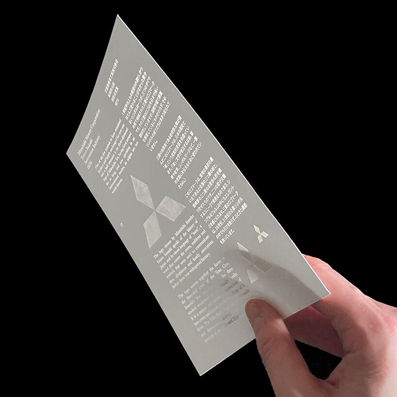
image by richard baird
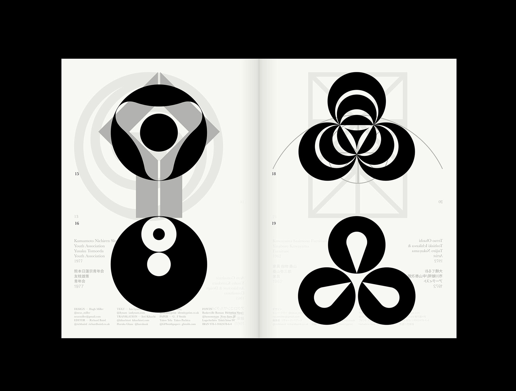
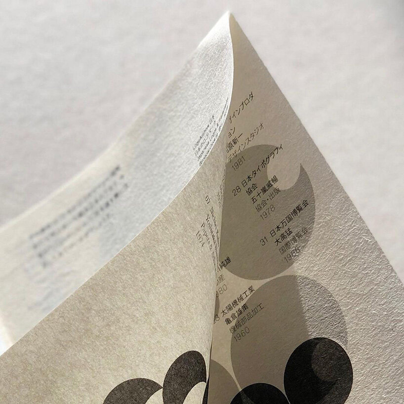
image by hugh miller
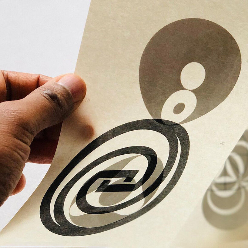
image by hugh miller

image by richard baird
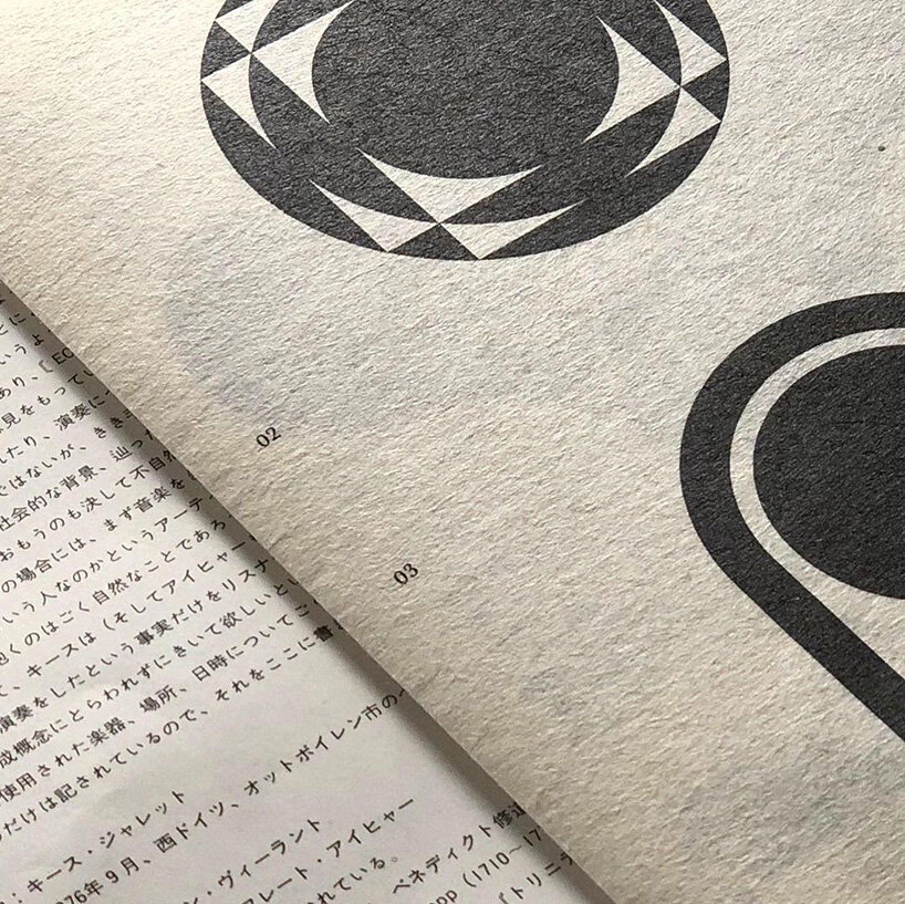
image by hugh miller
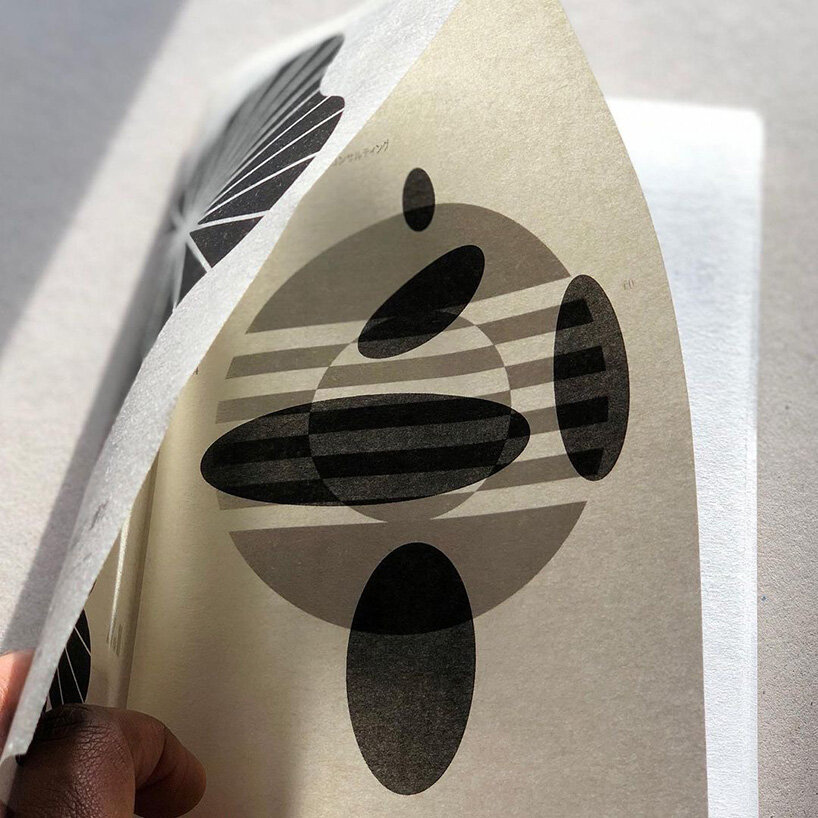
image by hugh miller
project info:
name: LogoArchive zine
edition: 4th issue
design: hugh miller
project: richard baird
publisher: BP&O
print: identity print
paper: G.F smith
logo design (245)
 Jul 03, 2024
 Aug 14, 2023
PRODUCT LIBRARY
 Jul 23, 2024
 Jul 01, 2024
 Jun 13, 2024
 Jun 06, 2024