Google’s sound and light installations at milan design week 2024
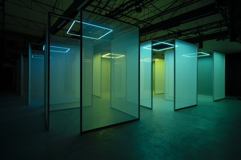
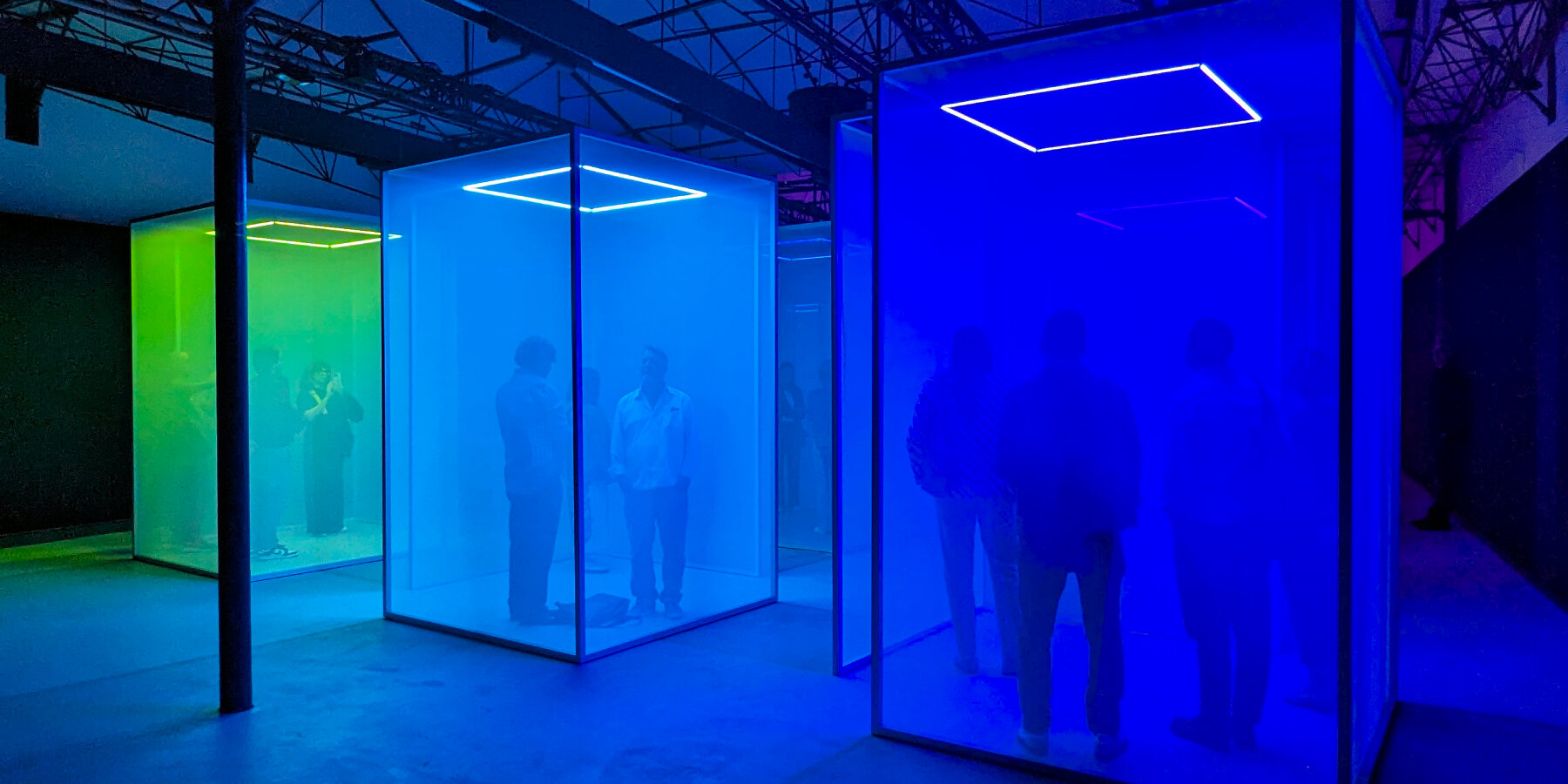
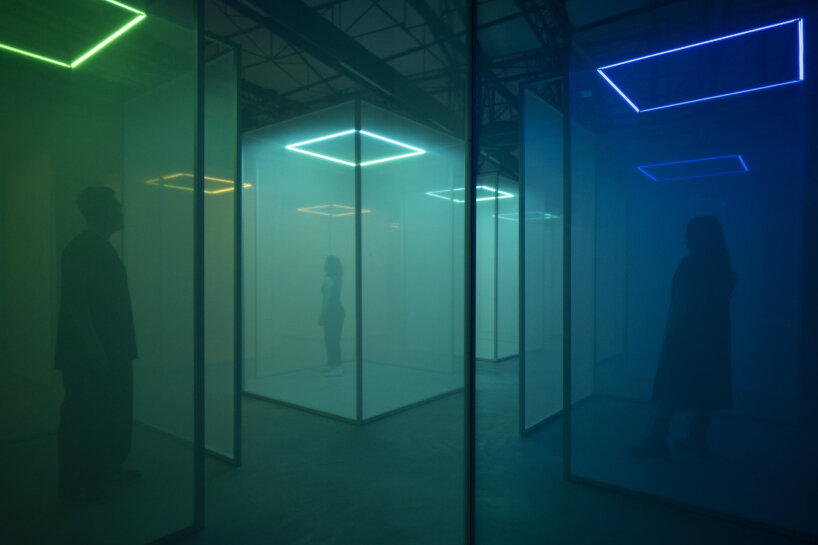
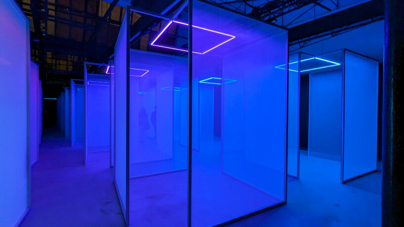
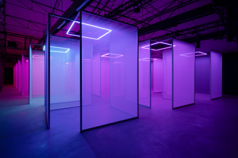
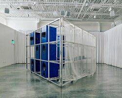
For Milan Design Week 2024, Google Design Studio is making sense of color. In fact, that’s the name of the immersive light and sound installations, in collaboration with arts and research lab, Chromasonic. When visitors enter the exhibition at Garage 21 in Via Archimede, 26 until April 21st, they find 21 open-box rooms flanked with semi-translucent panels. Inside each box, overhead neon lights shift their hues as the rhythm of the sound frequencies being played in the background changes.
Visitors are invited to stand, sit, walk around, close their eyes, lay on the floor, look. Fifteen to twenty minutes of their time, their silence, are borrowed. No smartphones, no rush, no adrenaline in the nothingness. They only feel, listen, see. As the sound frequencies vibrate and run through them, as they bask in the changing lights, positioning themselves right in the heart of the immersive installation, Google brings them back to themselves, to their bodies, attuning their senses at once and at last, all through the use of colors, hoping they can make sense of them.
images courtesy of Google (unless stated) | photos by Edoardo Delille & Giulia Piermartiri
Inside google’s making sense of color exhibition
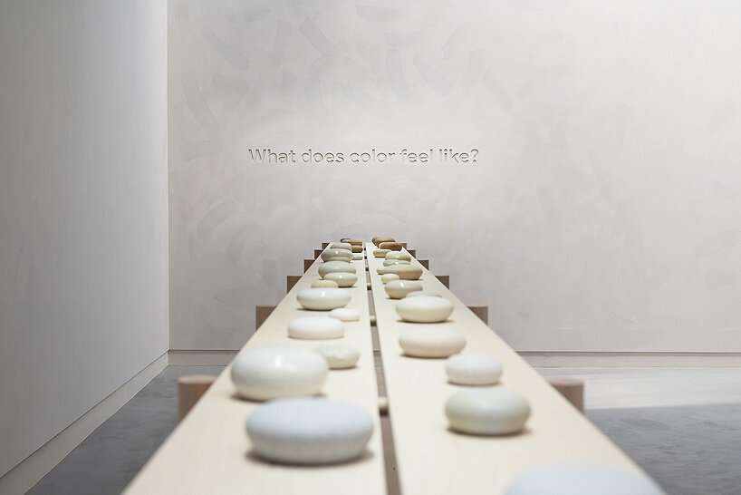
The sound frequencies and changing neon lights being constantly played inside Garage 21 is only the first part of Google’s installation for Milan Design Week 2024. Exiting from the dark, the visitors step inside the other senses in the next rooms, a meeting of soft palettes and gentle hues with a thoroughly curated and often-minimalist exhibition. In this second part of the installation, Google’s team ask: What does color feel like? What does color look like? What does color smell like? And what does color taste like? One by one, they are answered. The second: color can feel like the different shapes and textures of stones, where the hands graze the objects’ entire bodies, with the visitors’ eyes closed, just feeling, identifying textures, making them picture where they’ve seen this feel before.
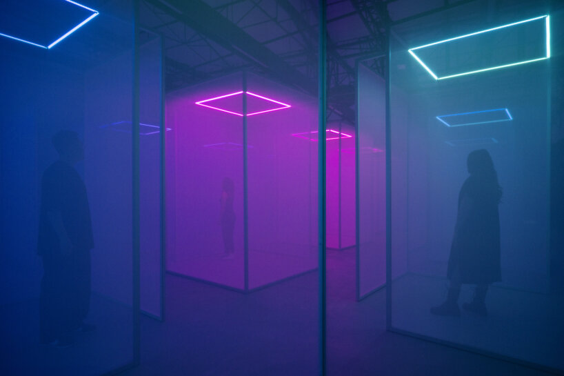
sound installation inside Google’s Making Sense of Color at Milan Design Week 2024
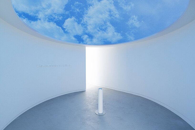
The third: color can look like blue skies with white clouds and a flock of birds passing by. They are played on a screen on the ceiling, yet visitors are pulled to look at them through the silver-plated pole with water pooling on the surface, perhaps a recollection of Google’s Shaped by Water during Milan Design Week 2023. Here, refraction and multiplication take place as the image above is seen from below. The fourth: color can smell like the blooming season of spring, with fresh flowers, pink ones, and other delicate aromas.
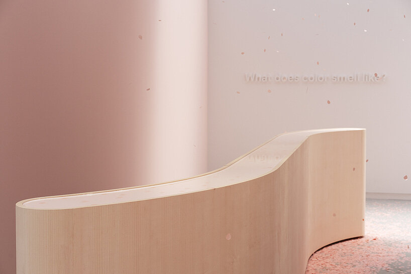
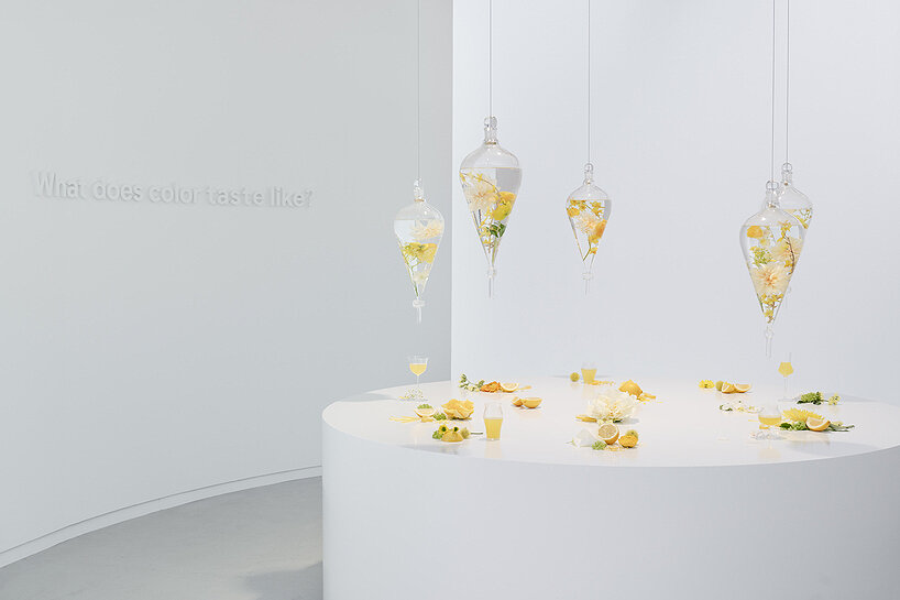
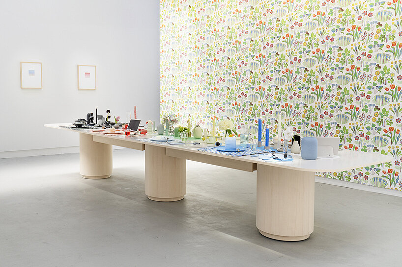
In Making Sense of Color, unscented recycled pink paper falls from above, like the petals of cherry blossom trees, descending onto a curved wooden platform resembling a man-made lake. A soothing floral scent orbits, hidden while its presence is still felt. The last: color can taste like an association of colors, like the sweet tinge of lemon in limoncello, or the flower-steeped water, a beverage of summer. Color can also have the flavor of a gathering of loved ones, on a long table, with all the favorite colored items from each seated member, from black placemats and blue glasses to green candles and the new white Pixel Fold.
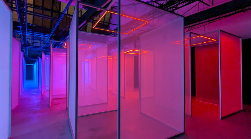
sound exhibition inside Google’s Making Sense of Color at Milan Design Week 2024 | image © designboom
A Full circle moment for google’s ivy ross
Behind the Making Sense of Color installation at Milan Design Week 2024, Ivy Ross leads the curation. The Vice President of Design, UX, and Research for Hardware Products at Google, Ivy Ross lets designboom in on the process of creating the installation, but soon enough, the conversation opens up the gates toward the past, a revisit that ends up being her full circle moment. When she was young, her father painted the walls of her bedroom purple. He picked up the carpet there too and dyed it purple. As Ivy Ross grew up, she started to note the effects of colors around her, influenced by her earlier childhood memory and her beloved purple box.
‘I didn’t realize it until I started working on it (the installation), how full circle this has come,’ Ivy Ross tells designboom in an interview during Making Sense of Color’s preview. ‘When I was still a jewelry artist, my work had to do with color. I worked with titanium and niobium, in which you charge the metal with electricity and they rearrange their molecular structure, so in light, they appear in different colors. All my early experimentation was with how to reflect the light, to change the metal to different colors. So, there is a nice coming-home between growing up in the purple box, and then making jewelry that was all about color.’
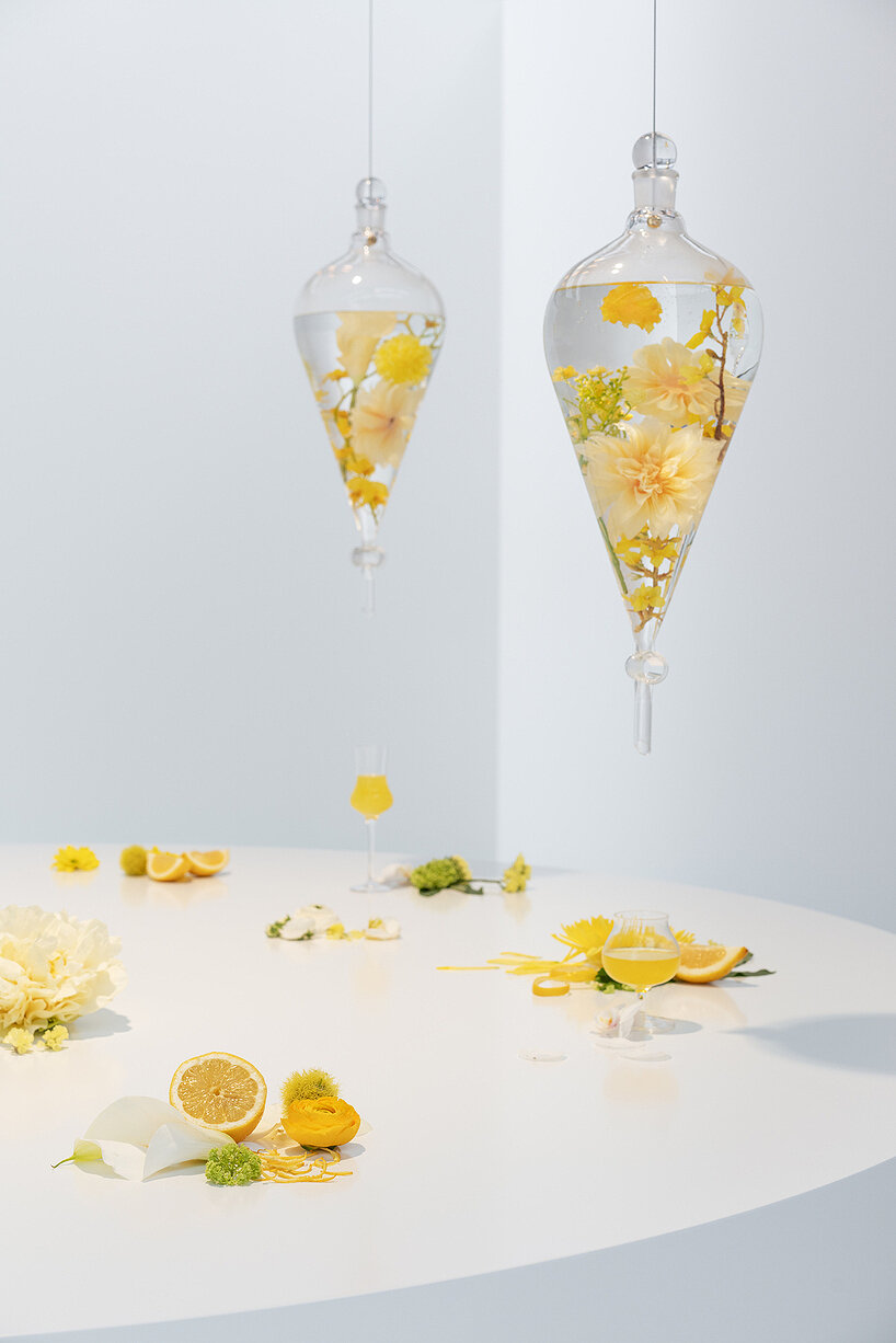
taste exhibition inside Google’s Making Sense of Color at Milan Design Week 2024
To make sense of color, Ivy Ross and Google’s design team attempted to articulate the questions running through the second part of the sound-frequency installation. She gives designboom the example of yellow and the object that may come to the visitor’s mind when they first see it. ‘You may think of a lemon or limoncello,’ Ivy Ross shares with designboom. ‘There was a lot of figuring out how we could express what we wanted to say, how these colors spelled out the images. For example, in the smell room, we used a special scent and created petals falling from the sky. Each area has its own materials based on what we wanted the guests to experience.’
The curation is based on scientific findings regarding color, touching on their psychological and physiological influences to people. Perhaps red may remind visitors of body temperature going up, danger or good luck, or in Ivy Ross’ experience, a visitor during the preview got out of the sound installation, walked up to her, and told her she felt cold when the lights changed to blue. ‘There’s all kinds of different hormones released during different art experiences and different sensations. So, everything we take in, not just our head but also our body, is feeling it. I think we tend to not consider that now we walk around because we’re so focused on the neck. But that’s what our 2019 exhibition proved, that our body is often feeling things even if our mind doesn’t even know it right.’
look installation inside Google’s Making Sense of Color at Milan Design Week 2024
When designboom wraps up the conversation with Ivy Ross, she’s asked about her favorite color. She ponders and shares two. Green, its light shade, makes her happy. She’s not sure whether it’s the color itself or some certain leaves in the forest. What she knows is that light green makes her happy. ‘And purple,’ she adds. ‘Just like the purple box I grew up in.’ This shade makes her feel calm and grounded, as if it emits a vibration, a blanket that cloaks her with its comforting fabric and weight. There are cultural and personal implications to colors, and the installations and exhibitions in Making Sense of Colors serve as a reminder of those.
Ivy Ross tells designboom that another guest came out of the exhibition and told her she started noticing the difference in the colors of the buildings just outside where the installation is. Somehow, some colors stand out, some fade into the background. The guest, as they told Ivy Ross, felt like a child fascinated with colors, as if remembering how to see and make sense of them again. ‘And that was pure joy for me because I think if there’s anything we want, it’s for people to just understand that there’s a three-dimensionality to color. It’s not just the visual. It’s the feeling and the sense,’ she shares with designboom.
smell installation inside Google’s Making Sense of Color at Milan Design Week 2024
Google’s Making Sense of Color is open until April 21st, 2024 | image © designboom
project info:
name: Making Sense of Color
team: Google Design Studio, Chromasonic
lead: Ivy Ross
chromasonic team: Johannes Girardoni and Harriet Girardoni (installation artists), Orpheo McCord and Joel Shearer (sound artists and composers)
design interviews (58)
 Jul 25, 2024
 Jul 12, 2024
 Jun 28, 2024
 Jun 13, 2024
 Jun 09, 2024
google (133)
 Jul 11, 2024
 May 27, 2024
 Jan 06, 2024
 Nov 10, 2023
immersive multimedia (88)
 Apr 22, 2022
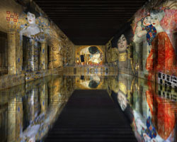 Nov 25, 2019
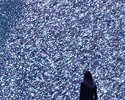 Nov 17, 2018
 May 20, 2017
 Sep 27, 2016
light installation art (154)
 Jul 11, 2024
 Jun 18, 2024
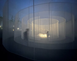 Jun 13, 2024
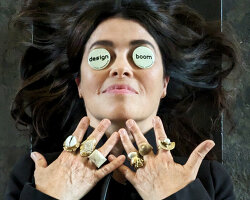 Jun 13, 2024
 Jun 07, 2024
milan design week 2024 (73)
 Jul 17, 2024
 Jul 10, 2024
 Jun 24, 2024
 May 27, 2024
 May 15, 2024
sound art (66)
 Jun 05, 2024
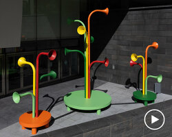 May 16, 2024
 Apr 26, 2024
 Apr 22, 2024
PRODUCT LIBRARY
 Jul 23, 2024
 Jul 01, 2024
 Jun 13, 2024
 Jun 06, 2024