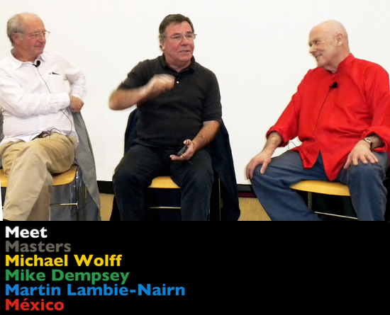
from left to right: mike dempsey, martin lambie-nairn and michael wolff image © designboom
last month three of the UK’s branding / graphic design masters: michael wolff, mike dempsey and martin lambie-nairn travelled to mexico to give talks in guadalajara and mexico city. designboom attended the ‘meet masters’ events where each designer shared their expertise via past and current projects.
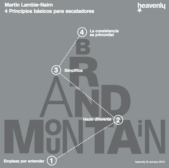
the first part of our coverage documents martin lambie-nairn’s talk in which he guided the audience up the ‘brand mountain’ his metaphor for some of the things that must be overcome to successfully crate a brand identity. here are martin’s ‘4 basic principles for climbers’ with case studies for each…
 — following text is an edited transcript of martin’s talk provided by martin lambie-nairn / heavenly group —
‘creating a brand identity is not something that clients do many times in their careers. consequently the expertise required is unlikely to be found within a company, so very often the team responsible will have very little experience of such projects. it’s a very public business. if you get it wrong then a lot of people know. it can also be risky business and is no place for the novice.
creating brand identities is a bit like climbing a mountain. like mountaineering it’s risky, dangerous and if you get it wrong, can be terminal for careers. so it pays to have you team led by somebody who has experience. I may not look like a mountaineer to you – but believe me, I have been up and down this particular mountain so many times over the last 25 years that I have discovered that there is a right way to do it, and there is a wrong way.
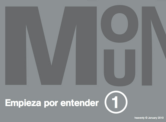
1. START WITH UNDERSTANDING we are in the business of promoting our client’s product to their customers. to attempt to solve a communication problem with no real understanding of the product (its market, its competition and the marketing strategy) is like sailing in crowded waters with no charts and no radar: at best, confusing, at worst, irresponsible.
 designed and produced whilst at lambie-nairn, 2006
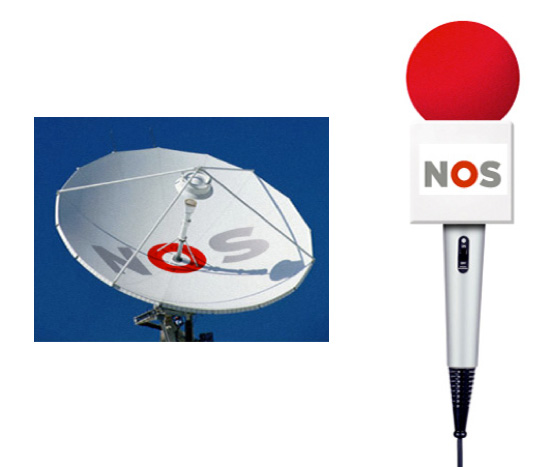
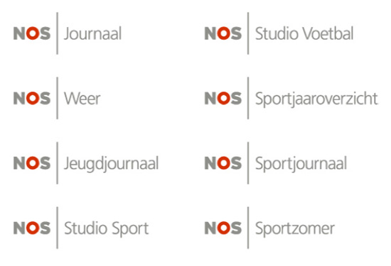
case study: NOS the NOS is the netherlands provider of news and sport on radio, television and online but prior to martin lambie-nairn’s rebrand it was not recognized by it’s audience because it didn’t have a distinct image.
 designed and produced whilst at lambie-nairn, 2006
in holland there are three public broadcast channels all are supplied news and sport from the NOS. the first problem was that the NOS had very little on-air space in which it could brand itself. television channels are able to promote itself using the air-time between the programmes, in what we call junctions. as the NOS is a provider of programmes it didn’t own such air-time so our solution recommended that the brand was made visible throughout the programmes, via sets and graphics, as well as the opening sequences. this would increase airtime from a few seconds to many minutes per programme.
designed and produced whilst at lambie-nairn, 2006
at the core of the identity scheme is the NOS core thought: ‘the hub of journalism’ which gave us the new logo. we redesigned the corporate identity for all uses on and off screen and recommended a naming system that added NOS to all programme names. we gave both sport and news a consistent look across all of its programmes by creating a visual language for each of them. all programme opening sequences started with the NOS identity and all sets were to use the brand visual language. within weeks of launch research confirmed that the NOS were no longer invisible. the dutch people were now very clear about who the NOS was and what it did.
2. DO IT DIFFERENTLY you may think that striving for originality is a given in our business but sadly I don’t think it is. I have worked in the broadcasting business all my life. with one or two notable exceptions, most broadcasters want their channels to look like the competition. being different to many clients is not always an aspiration and this observation is not confined to the broadcast business.
‘doing it differently’ requires courage from client and consultant alike, because doing something that hasn’t been done before means: – that success cannot be guaranteed. – taking a calculated risk. – if it goes wrong someone may loose their job.
for every successful project that I’ve been involved in, ‘being different’ was the key to its success.
BBC 2 ident, designed and produced whilst at lambie-nairn, 2002
case study BBC 2 when we were asked to re-brand BBC 2, research had told the channel that the british people thought it was dull and worthy. this was not good news for the channel controller as he had invested in a lot of money in new comedy and drama programmes aimed at a 20-35 year old educated audience. they couldn’t afford to change the programmes, so they decided to change the brand identity. we designed the whole channel around a series of idents that preceded each programme. as we were pretty clear who our audience was, we set out to surprise and intrigue them but we had no idea how the audience would receive the work.
BBC 2 ident, designed and produced whilst at lambie-nairn, 2002
it was made clear to us by our client that the programme director thought the identity was rubbish and that he was going to take it off the air in two weeks. our client might even loose her job. however, in this two weeks the programme director happened to have dinner with charles saatchi and richard rogers – who told him how much they loved the new idents. the programme director changed his mind and said he would not take the work off the air after all.
BBC 2 ident, designed and produced whilst at lambie-nairn, 2002after three months research showed that the same people who thought the channel dull now thought the channel clever, witty and surprising yet the programme schedule had not changed at all. the two’s, became famous and our client’s courage was rewarded. she was promoted.
3. MAKE IT SIMPLE we have a saying: ‘the problem may be complicated, but the solution had better be simple.’ all problems have countless issues and considerations that must be taken into account. however, we are charged with finding ways of communicating, which means that we must strip away the less important in order to arrive at the important. we are in the reduction business.
simplicity = clarity = understanding.
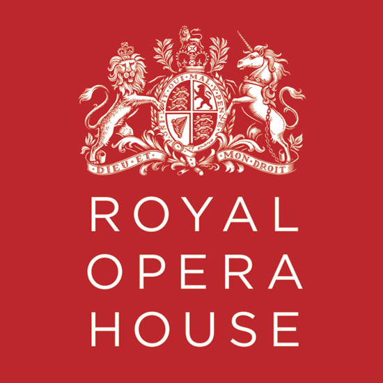 re-design of the royal opera house logo, 2008
case study: the royal opera house the royal opera house in covent garden brand identity had become messy and impossible to manage and as a consequence, expensive to produce. we were asked to rationalise and reorganise it. we recommended the project be divided into two parts. stage one would rationalise and simplify. stage two would raise the creative bar when new budget became available.
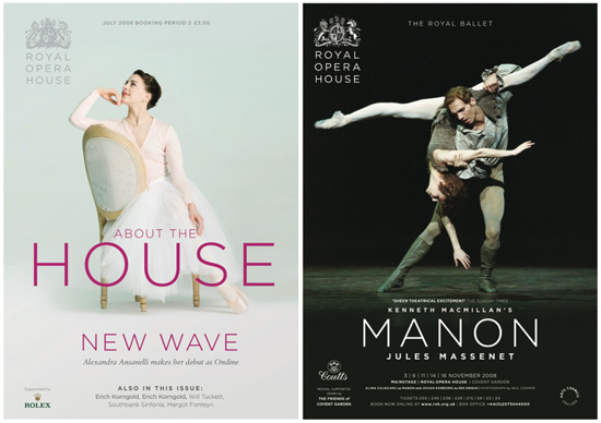 posters for the royal opera house, 2008
stage one – one master brand: royal opera house. – retain the royal coat of arms. – redraw arms to work in all media. – create new logo. – design templates for all printed material and web site. – prioritise all information copy.
stage two unfortunately was fell victim to last year’s financial crisis and the budget has yet to be found.
4. CONSISTENCY IS KING a consistent brand is a powerful brand and achieving consistency requires two things: firstly, a common visual identity and secondly, rigorous brand management. – the first is a design issue. – the second, a management issue. to be successful they must work together.
having created a brand identity it is important to recognise that brands don’t manage themselves. they are valuable assets that need to be managed. if left to their own devices, they will soon fall apart, and all that money and effort will be wasted. what’s more, brands need to be managed by people who know what they are doing. otherwise, it’s a bit like building a formula one racing car, but not bothering to keep the team of engineers to carry out the vital work of maintenance. it might sound strange coming from a branding consultant, but the truth is that great brands are not about strategy and design. they are about managing consistency.
designed and produced whilst at lambie-nairncase study: BBC news BBC news is the largest news organisation in the world. two years ago they realised that their brand was totally inconsistent and chaotic. the brand needed unifying, not just in the way it looked but also in the way it was managed. what was needed was an identity flexible enough to be relevant for the different programmes, whilst also owning some kind of visual and audio glue that would give consistency to all of its output. by using a consistent but flexible visual and audio for all BBC news programmes the BBC new is now clearly recognisable. BBC news understands that what they have achieved is valuable and wish to keep it that way by managing it rigorously.
designed and produced whilst at lambie-nairnCOMBINING ALL FOUR PRINCIPLES these then are the 4 basic principles that guide us on every project. however there is one project that illustrates what can happen when all 4 principles come together at the same time. the perfect storm of brand identity.
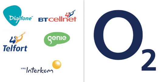 before: BT cellnet’s portfolio, some of the many logos used until 2001 after: O2 logo designed and produced whilst at lambie-nairn, 2002
case study: O2 in 2002 BT cellnet – the mobile phone arm of british telecom had a £2bn GBP debt, following the purchase other mobile phone companies in europe and a very expensive 3G licence from the government. to extricate this debt it decided to merge all the different mobile companies into one, break it away from the mother company and float it on the stock market. the product and employees stayed the same but a new managing director was appointed who decided to dump all the existing names and launch a totally new brand.
lambie-nairn were asked to pitch for the project. within half an hour our planner told me he thought he had solved the name, based on the comment a respondent made while researching the brief: ‘I never leave home without my keys, my wallet and my phone. they have become essential for life.’
our planner’s thinking went like this: what is essential for life? what analogy might that suggest? water, fire, oxygen?
answer: oxygen
better answer: O2 because it is the same symbol in any language.
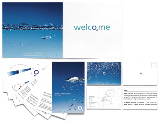
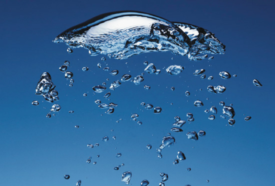 O2 made visible – designed and produced whilst at lambie-nairn
we had come up with an invisible element, O2, for an invisible product, digital signals we made them visible by putting the oxygen in water.
 examples of implementation – designed and produced whilst at lambie-nairn
critical to the success of the brand was the fact that O2 allowed us create and manage their brand identity. in partnership with O2’s advertising agency we built a team of designers and brand guardians who oversaw every piece of literature, every store, every ad, every commercial produced in europe and we witnessed spectacular results.
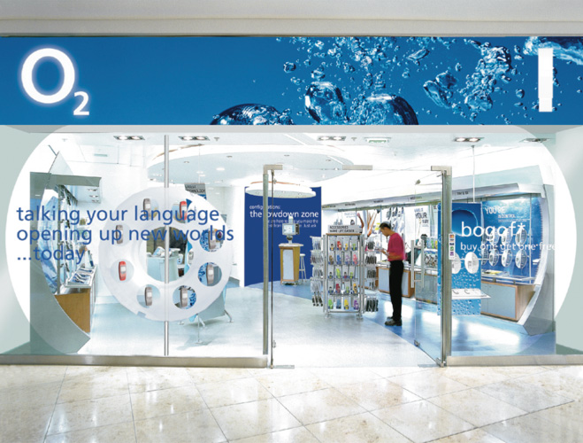 O2 store – designed and produced whilst at lambie-nairn– within two months O2 reached 70% brand awareness. – within seven months O2 exceeded every advertising and brand awareness target set. – closed first year at a high of 55% spontaneous awareness, – spending half the amount on advertising of its closest competitor. – became the most preferred mobile brand in europe. – 2006 the balance sheet value of O2 was £9bn GBP– at that point it was sold to telefonica for £18bn GBP, the brand value doubling the book value.
if you every find yourself asked to climb this ‘brand mountain’ and you have never climbed it before, there is one more principle you should follow.
take someone with you who has.’
about martin lambie-nairn martin lambie-nairn entered the world of commercial television in the 1960s at the BBC, where he worked on new television graphic techniques for over a decade. in the 1980s he designed the computer-animated identity for UK’s channel 4, which still informs the channel’s identity to this day. since then he has worked on brand identities for BBC 1, BBC 2 and BBC 3 as well as producing work for many other television stations across the world. besides his work for TV he is known for the successful branding of the mobile phone service provider O2, the supermarket sainsbury’s and the royal opera house and many more companies across the world.
lambie-nairn founded his company in his own name in 1976 and sold it to WPP in 1999. in 2007 set up the independent design consultancy ML-N in partnership with celia chapman. in 2009 ML-N was bought by the heavenly group of which martin lambie-nairn is now creative director.
LOGO DESIGN (244)
 Aug 14, 2023
 Aug 02, 2023
MEET MASTERS MEXICO (2)
 Feb 20, 2010
PRODUCT LIBRARY
 Apr 15, 2024
 Apr 15, 2024
 Apr 12, 2024
 Apr 04, 2024