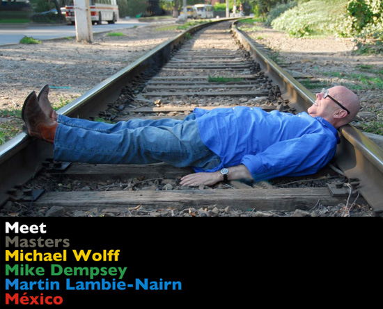
last month michael wolff, mike dempsey and martin lambie-nairn gave talks at the ‘meet masters‘ events in guadalajara and mexico city. the second part of our coverage features michael wolff’s presentation on ‘what branding is’ and documents the creation of the brand identity for the russian bank ‘poidjom!’ which he has worked on with NB studio since 2007.
— the following text is an edited transcript of michael’s talk – images courtesy of michael wolff & company —
‘when I was asked to work on the branding for life credit bank project the first thing that I asked the client was ‘what is special about your bank?’. because if there is nothing special about a company there is very little you can do to get people interested in it.
they told me that they give credit to people who don’t have much money, who don’t have a bank account, people who find it hard to get credit elsewhere. all of the credit advisers who work at these banks are women, because the banks feels that in general women are more understanding.
I saw people coming into these banks who had really difficult stories. it was interesting to observe how the women who worked for the banks tried to judge if people were being honest to them or not. I was impressed by their empathy and intelligence. but the banks looked very average. so I began discussing with the owners about re-branding but they had very little knowledge of it. so I had to explain it to them, but explaining branding can sound a little bit silly, a little pretentious. I had to think very carefully to myself about what branding is.
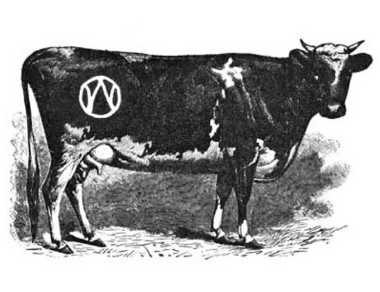
branding started with burning a mark in a cows rump. the purpose of this was so a farmer could say ‘this is my cow’. if anybody stole your cow you’d know because it was permanently marked with your brand. the next phase of branding came in the industrial revolution when companies started to say ‘I made it’. for example a ford badge said ‘it’s my car – I made it for you’ and this idea lays way to the signature brands.
next we enter into a very difficult world to understand. which is ‘why we like what we like, why we choose what we choose’ and ‘what creates our expectation levels’ . branding is like a sort of file in your brain in which you hold your ideas about something – that’s what branding is – it exists in the minds of individuals.
it’s like if you go into a cheap supermarket and they’ve run out of bread – your judgement might be ‘what a rubbish supermarket they’ve run out of bread’. but if you go to an expensive supermarket and the same thing happens you might think ‘how stupid I am I should have got here earlier. that’s how branding works. in the end it’s almost like a shakespearean quote:
‘to buy or not to buy’ ‘to join or not to join’ ‘to invest or not to invest’ ‘to trust or not to trust’
if we look at the actual shakespeare quote he says:
‘to be, or not to be, that is the question: whether ’tis nobler in the mind to suffer the slings and arrows of outrageous fortune, or to take arms against a sea of troubles and by opposing end them.’
many companies are just managing circumstances, managing predicament. so what I try and get across to a company is how to move from predicament management to a mission. how do we move from reacting to the current situation to doing things better, breaking new ground.
apple did just this with the computer industry – they saw that the language of the other computer companies was one of exclusivity: ‘you don’t know how to do this’ and this only increased technophobia. apple made the computer accessible to everybody by telling them how easy it was to use. they empowered the individual because they did something better than it was done before. they have created a brand identity which has allowed us to create a brand out of apple. if they went out of business next week many people would be upset about it. if dell went out of business next week less people would care.
to sum up what I think branding is I came up with these ten points:
1. customers create brands.
2. organisations create brand identities.
3. brand identities are designed as a shorthand to express a set of values and qualities, so that customers can more easily build brands.
4.customers build brands by attributing qualities to them, and holding their own versions in their minds.
5. brands have to be useful, attractive and substantial before they can become valuable; people can sense substance, or lack of it.
6. the role of the brand identity is to constantly nourish the growth of the brand.
7. a brand identity reaffirms the values of the brand in every detail and every point of contact.
8. god is in the details and not just in the numbers. ‘you can’t fatten a pig by measuring it.’
9. the whole is greater than the sum of the parts but it’s only throughout the whole that the parts can be represented and experienced.
10. the idea behind a successful brand has to be compelling and authentic. if an organisation doesn’t believe in it, then why should anyone else.
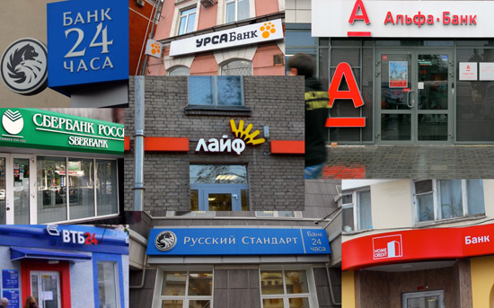
so, to get back to the bank project… we changed the name from ‘life credit’ which had an image like this:
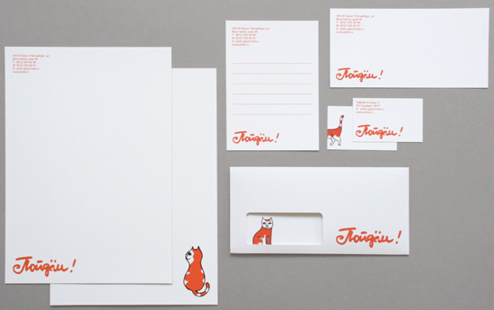
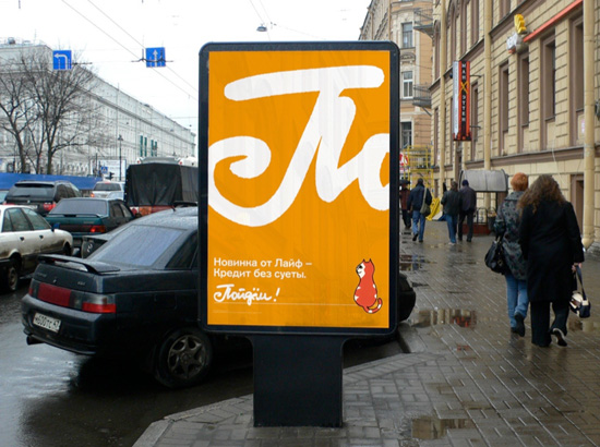
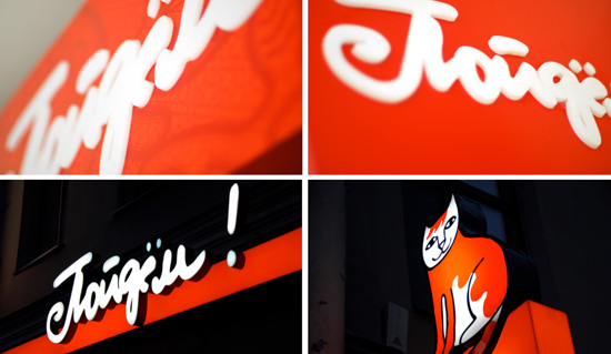
to ‘poidjom!’ which translated to which translates as a friendly ‘let’s go’, or ‘let’s do this together’. I remember as a child my dad saying ‘poidjom!’ to me when I didn’t want to leave the house. somehow it made me feel like everything was going to be OK.
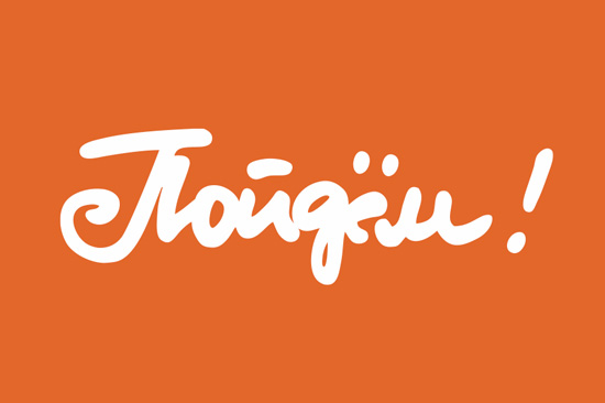
it was brave of the bank to agree to this name as I don’t think that there are any other brands in russia that are a verb.
next we began thinking about what the brand should look like. we wanted to use a domestic russian vernacular, which is lace and painting.

we also wanted a symbol that was warm, attractive and feminine and so we decided upon using a cat. but what cat? how would it look?
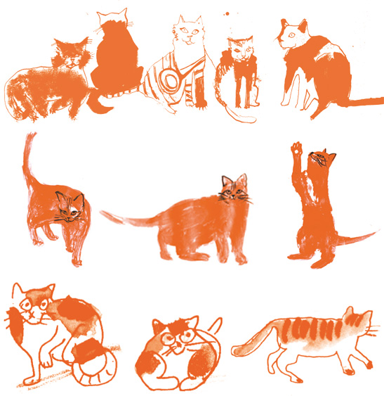
we worked with various illustrators trying to decide on how it should look. these were some of the first illustrations:
then we asked the cartoonist charlie barsotti to draw a cat for us:
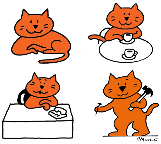
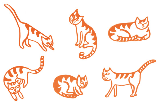
it became much more relaxed and comfortable. people thought that this cat was funny but not warm. so we ended up going in this direction:
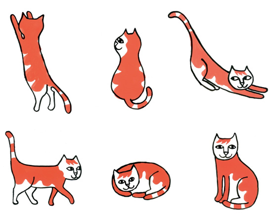
and this is the final version of the cat that we used:
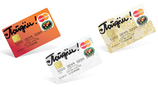
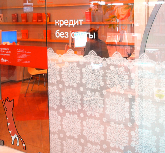
and how we used it:


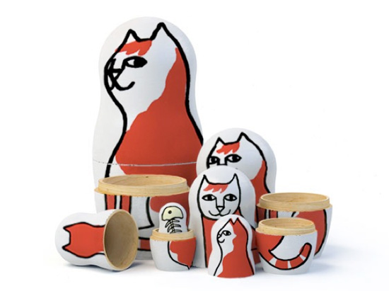
as you can see it’s very flexible and we are able to have fun with it.
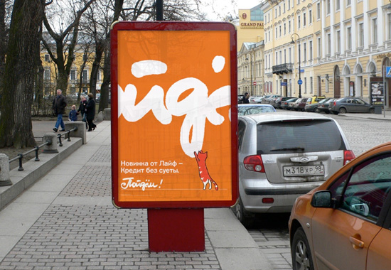
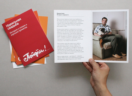
for the advertising communications we used normal looking everyday russian people in the photographs, the people who use the bank’s services. ordinary people with ordinary lives:
the interior of the branches are decorated with traditional russian mural paintings by local artists, so that they don’t feel cold and corporate but they don’t seem domestic either:
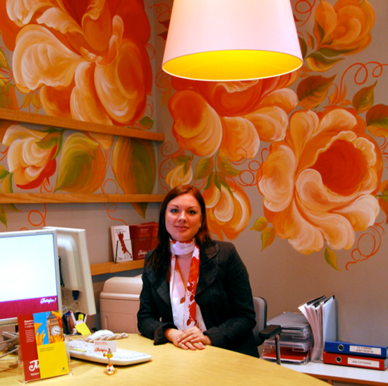
customers feel welcome rather than intimidated as they might do if it were filled with glass and modern furniture. the idea is that the space feels relaxed, welcoming and is filled with generous and warm female employees who if they can possibly help you, they will.
so you can see how the brand identity is beginning to roll out – and hopefully become part of russian life.
I don’t know if we’ll keep the cat or not? or how people will eventually respond to the name ‘let’s go!’. but you can see what we are trying to achieve. the brand identity we have built it’s very different from western banks and now we’ll see what values russian people attribute to it.
advice I’d like to end with some things I’ve learn’t – you can can think of it as advice if you want to.
being a designer is about putting yourself into other people’s shoes. in order to do that you have to take your own shoes off, because you can’t wear two pairs of shoes at the same time. you have to try and understand how people will see the brands you are building.
in my life I have developed three muscles:
1. inquisitiveness – asking the question ‘why is it like that?’ the wheel was invented over 3000 years ago but it wasn’t placed on luggage until the 1980s, so just think how many other dots we still have left to connect.
2. appreciation – allow yourself to be amazed by things, and appreciate the magnificence of things such as nature, things like the vivid colors of flowers or the wonderful smell and texture of an orange. it’s only through appreciation that you begin to feel the power you have to create things yourself.
3. imagination – your creativity, your passion to create something which wasn’t there before. remember that experience can be an enemy because it will try and tell you that it knows what you should do. but creativity doesn’t come from knowing what to do, it comes from nowhere. a creative spark doesn’t come from a logical place, it comes from somewhere we can’t describe, a feeling that you believe in. everybody is capable of it.
make sure that you train these three muscles. ‘
about michael wolff after training in architecture in london, working as a product designer, interior designer and graphic designer, michael wolff joined wally olins and wolff olins began.
under michael’s creative leadership, wolff olins became the foremost company in ‘corporate identity’ – and one of the most effective branding companies in the world. among their clients were; audi, apple (the beatles, not computers), the london borough of camden (the first in local government to use professional graphic designers), P&O, renault, the city of paris, 3i, pilkington and volkswagen.
he left wolff olins in 1983 to lead the addison design company. clients there included london underground, ave – the high speed train in spain, the barcelona olympic games, the ‘greening’ of bp, jaguar and shell.
he is: patron of the inclusive design challenge at the RCA (royal college of art). member of the home office design and technology alliance. chairman of the legible london initiative. visiting professor at the university of the arts in london. former president of the D&AD (design and art directors association). former president of the CSD (chartered society of designers). senior fellow of the RCA.
michael now runs michael wolff & company in london. among recent clients are: mothercare and ministry of sound and insead in the eu. citibank and citigroup in the us. the probusiness bank in russia.
LOGO DESIGN (244)
 Aug 14, 2023
 Aug 02, 2023
MEET MASTERS MEXICO (2)
PRODUCT LIBRARY
 Apr 17, 2024
 Apr 15, 2024
 Apr 15, 2024
 Apr 12, 2024