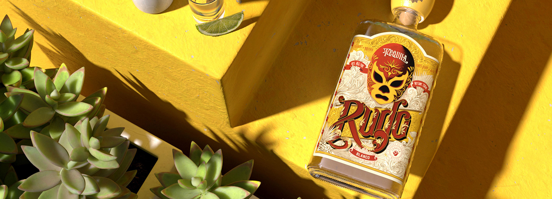
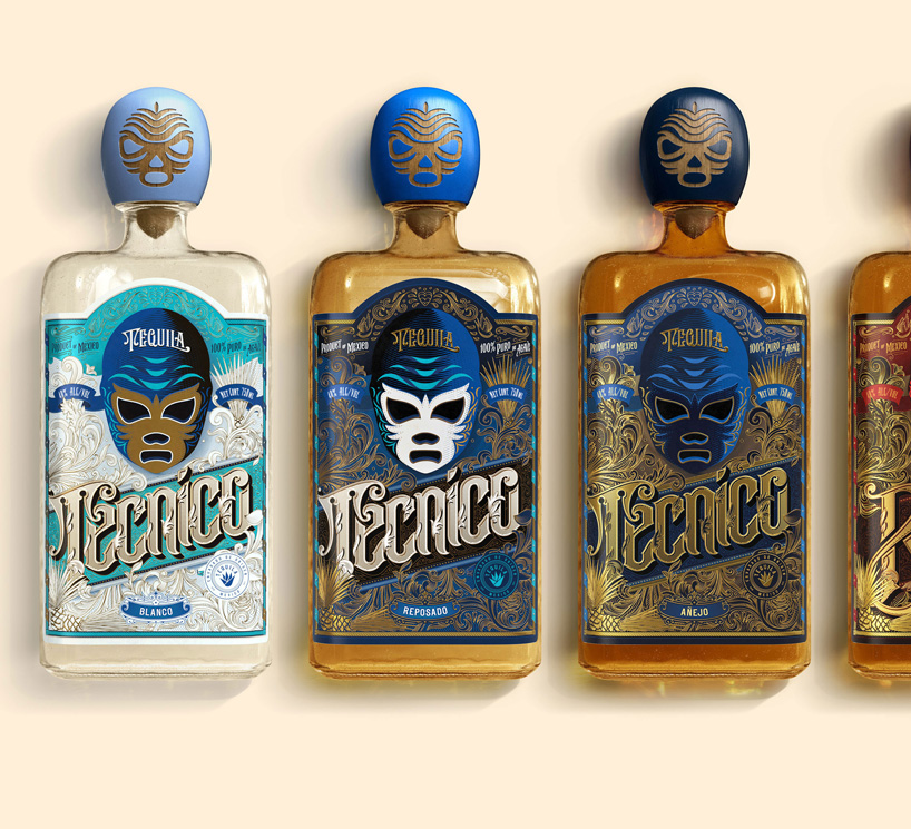
london-based designer anton burmistrov introduces an updated design for the bottles of tequila brand ‘rudo and tecnico’. drawing influence from the intricate masks worn by lucha libre wrestlers in mexico, the new packaging incorporates a detailed mask as its centerpiece, surrounded by typography and intricate flourishes.
all images courtesy of anton burmistrov
tequilas ‘rudo and tecnico’ are inspired by lucha libre, an extremely popular mexican style of professional wrestling, and its rich cultural tradition. all lucha matches are based on the eternal battle between forces of good and evil, represented by two groups of wrestlers: ‘tecnicos’, noble fighters and heroes, and the famous villains of the sport, brawlers and rule-breakers, ‘rudos’. in his design, anton burmistov intends to express the essence of lucha; its cool, edgy and mysterious style, represented through the elaborate wrestling masks.
the previous ‘rudo and tecnico’ labels were illustrated in a comic book style, with too many colors intermingling between the two products, and making it difficult for customers to distinguish between the ‘rudo’ and ‘tecnico’ tequila options. each age expression within the brand featured different wrestlers’ figures, cluttering the brand message. meanwhile, the paper used for the labels was thin, metallic and did not highlight the artisanal origins of the products.
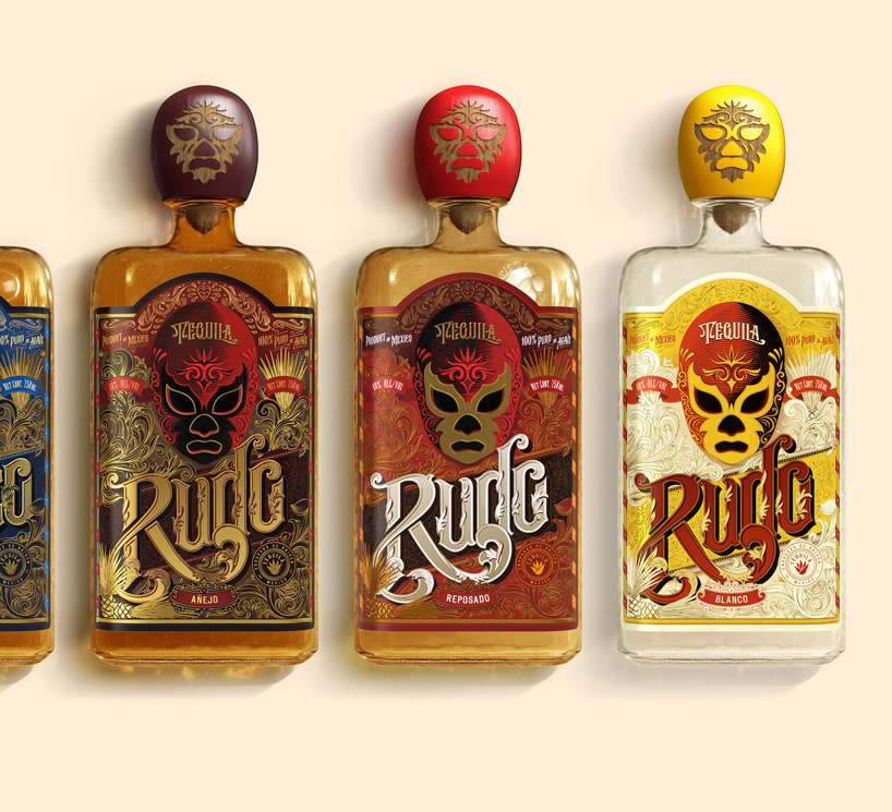
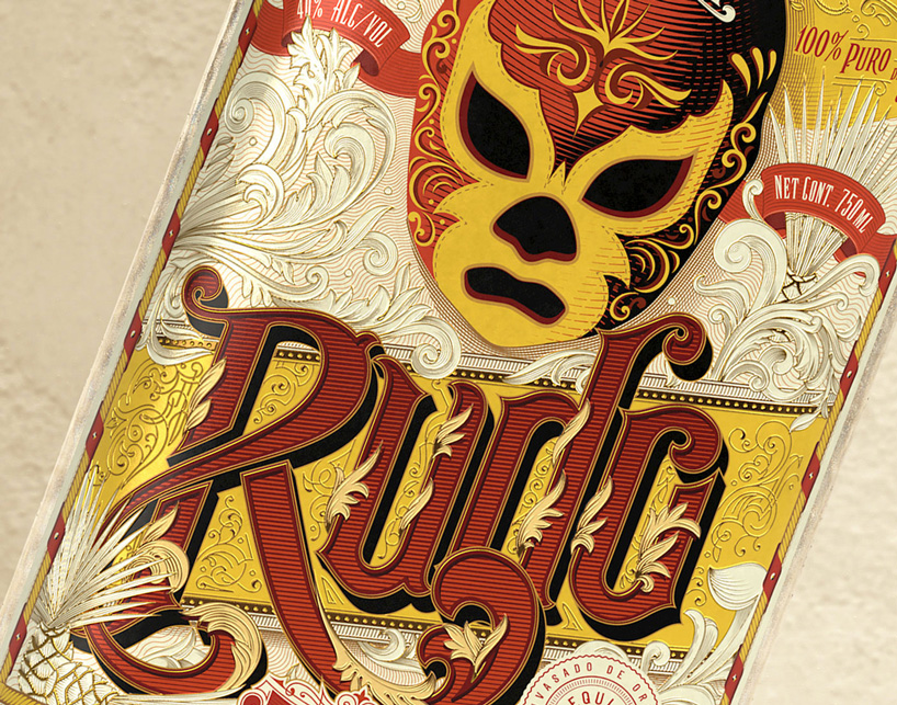
in the new design for the ‘rudo and tecnico’ tequilas, the lucha mask serves as the main centerpiece, as well as a visual anchor. the mask is surrounded by elements that highlight the lucha libre cultural tradition — hand-drawn typography, illustrations, and victorian flourishes. the tequilas are bottled into semi-artisanal, recycled mexican glass, laser-cut wooden tops bear the design of a wrestling mask, while labels are printed on premium robust stock with gold ink finish.

the color of labels is based on the tequila’s maturity — for instance, the blanco tequila option, which has the smallest aging period, is adorned with pale colors. on the other hand, the mature color of the anejo tequila is complimented by darker tones and golden ink. overall, the new label design for ‘rudo and tecnico’ seeks to highlight the artisanal roots and premium quality of the product, and to help it connect with a larger customer base. 


project info:
name: re-design of rudo and tecnico tequilas
designer: anton burmistrov
designboom has received this project from our ‘DIY submissions‘ feature, where we welcome our readers to submit their own work for publication. see more project submissions from our readers here.
edited by: myrto katsikopoulou | designboom
packaging design (102)
 Jul 24, 2024
 Jul 13, 2024
 Feb 14, 2024
 Nov 13, 2023
 Nov 10, 2023
PRODUCT LIBRARY
 Jul 23, 2024
 Jul 01, 2024
 Jun 13, 2024
 Jun 06, 2024