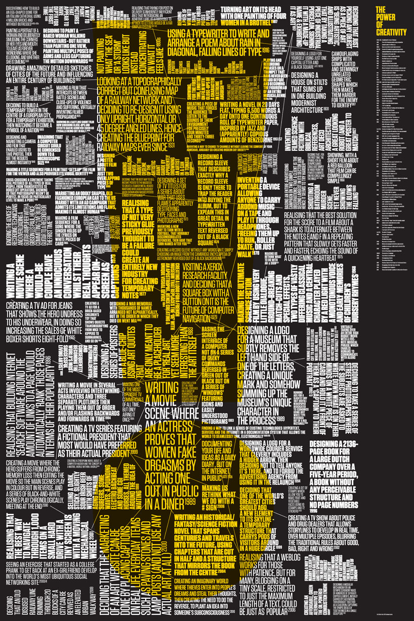
a recent project that stemmed from a D&AD brief on the ‘power of creativity’. the posters collects 99 examples of creativity across hundreds of years.
designboom (DB) talks to michael johnson (MJ) of johnson banks about his work and how approaches to branding have changed in recent years.
DB: please could you tell us briefly about the evolution of johnson banks?MJ: after various jobs in design and consultancy in various world cities, I set up johnson banks in the early nineties at the latter end of a recession.
we spent much of the nineties finding our feet and searching for some kind of graphic ‘voice’. much of the work was initially print based – we must have done literally hundreds of posters in the 90s. by the end of that decade things were changing – the advent of digital was fairly obvious and we were also beginning to persuade potential clients that they could entrust a smaller and younger company with proper identity and branding projects.
so far this millennium we’ve concentrated almost exclusively on larger branding projects, primarily in the ‘third sector’, culture, arts and education (with occasional huge blue-chip projects like virgin atlantic). more recently we’ve started several significant projects in the impact investment sector and we’re doing more international work now. current clients are in new york, paris, beijing and doha – the majority of our turnover this year will be overseas.
 part of ‘arkitypo’, where johnson banks created an alphabet of 26 letters using state-of-the-art 3D printers
![]() the new logo for the bone marrow registry, anthony nolan, which matches potential donors to patients
the new logo for the bone marrow registry, anthony nolan, which matches potential donors to patients
DB: which have been your most significant and satisfying projects to date?MJ: think two early noughties projects established good ‘markers’ for us in terms of thinking and approach – our shelter rebrand showed how a charity could take its branding seriously and almost overnight helped confirm them as a major charity in their sector.
at a similar time we helped create the more th>n brand (a direct insurance company) from scratch. it showed that blue-chip brand creation didn’t have to be a stuffy and conservative business.
after that I think our project for the pew centre in philadephia was a bit of a paradigm shift for multipart, multi-stakeholder projects since it allowed the many parts of the organisation to have a voice, yet be part of a whole. we created an identity system that almost turned itself inside out at times – but it somehow seemed to work.
most recently we adapted our thinking again when developing related yet separate identities for the brighton dome and brighton festival – one is classical, almost beautiful, the other is bright, bold, almost brutal.
 the identity for the BFI (british film institute), based on a lens flare, applied to the outside of their building
 the two new identities, above for brighton dome and…
 the brighton festival – they are designed to be related, yet look slightly different
DB: what is the attraction of identity design for you?MJ: even at college I was fascinated by identity, and my first ever job was at wolff olins. as I gathered my thoughts and developed as a designer in my twenties I began to appreciate the broader skills of graphic design, and more recently I’ve been getting very involved with moving image.
but identity and brand will always be ‘home’ for me. it’s where you can make a genuine difference to companies and organisations, where debate is done in the boardroom – wide-ranging discussions about everything from strategy to brand narrative then design. done well, good ‘verbal branding’ can have a huge influence on the direction of brands, before you get anywhere near the visual brand.
finally all of that thought has to be distilled down into the smallest space, then expanded out with limitless possibilities. I find it absorbing and exhilarating, especially when you really turn companies around or raise hundreds of millions for a charity or not-for-profit.
 stamps that celebrated great british fashion
 these were interactive stamps for children where you could make your own stamp faces. they won a D&AD gold in 2004
DB: what mistakes or ‘traps’ should a young designer avoid when working on a branding project?MJ: one of the great temptations as a young designer is to copy your heroes. and actually, for a while, it can be really useful to have a kind of visual ‘mentor’ or two. but I think it’s important, eventually, to let go and search for something that feels more like you. young designers feel under pressure to find their voice too early – sometimes designers get discovered out of college, have a brief few years in the sun and then fade. it’s understandable, I guess, the allure of some odd and limited kind of fame, but if you can back it up with a proper body of work you’ll last longer.
and, although this is perhaps controversial, I’ve always thought the designers who can stay in this business for a serious amount of time manage to navigate their way through styles and trends. if you’re going to be influenced, try to draw inspiration from art or music or architecture – drawing only on other graphic designers’ work leads ultimately to quite stale thinking.
for example, yesterday I bought an interesting book on artists’ manifestos. it’s fascinating. I’m reading another book on theoretical physics – also engrossing. where and when they’ll be of use, I have no idea, but I’m sure they will be, one day.
in terms of learning how to do branding projects, I’d encourage people to keep their eyes open and maybe not listen to their tutors on this one. there’s still a rather arcane view in many of the design colleges that identity = one colour logo in corner. things have moved on a little…
 a new global art initiative curating art across the world for three years across nine exhibitions, spearheaded by the guggenheim in new york
 the more th>n identity
![]() the flexible logo system for the pew center for arts & heritage in philadelphia
the flexible logo system for the pew center for arts & heritage in philadelphia
DB: do you think it’s important for a graphic designer to be able to draw?MJ: I get asked this a lot. and, the truth is, some of the best designers that have been at johnson banks over twenty years actually couldn’t draw that well. one of my best ever designers never really got beyond stick drawings – the computer has become so many peoples’ ‘drawing instrument’…
I still think, however, that the ability to try out ideas in a sketchbook at speed is incredibly valuable. in an hour, with a pencil and ten pages of a sketchbook I know I can work out a design scheme quite carefully – or – just as importantly, I can see where an idea is going to break down, so I don’t spend a day on the computer going down a blind alley.
I do think that, ultimately, half-decent drawing skills will save you time. and there’s no doubt that, just now and then, in a meeting being able to ‘draw’ a solution to make a point rather than retreating to a computer can really help.
 a project inspired by an event at the V&A – we created an alphabet of letter-shaped postcards so you could ‘send a letter’
![]() the identity for shelter, a homelessness charity, designed in 2003
the identity for shelter, a homelessness charity, designed in 2003
DB: the work you produce is quite diverse, what are your thoughts on specialisation vs generalisation?MJ: I’m in the business of finding words and pictures that help organisations communicate better, and usually to differentiate them from others. so, kind of by definition, we work in many styles and stay general – we’re determinedly pluralist. I’m drawn to the roots of modernism, and am not a natural ‘clutterer’, but we’ll actively try to keep our solutions as diverse as possible.
I would hate to be one of those designers whose clients approach them asking for ‘a solution that looks like the one you did for client so-and-so’. getting locked into a particular style strikes me as pretty short-sighted – once you’re no longer flavor of the month, it’s game over and the history of graphic design is littered with examples of people whose ‘style’ became popular then just as quickly, unpopular.
as for specialisation, well, more and more we are only doing identity and branding, which is occasionally limiting at times. so we’ll take on unusual projects such as stamps or exhibition projects or do unusual typographic research projects in 3D or different languages to give ourselves a break, especially if the opportunity is too good to turn down.
DB: are you conscious not to develop a specific house style?MJ: well, like I say – as soon as I see or detect recurring ‘tics’ in our work I’ll try to get the studio to work in a different way. for example, we’ve done a few projects recently using the colour yellow. I’m not sure why. we should stop doing that soon. I became aware with the print work that we did in the 90s that we were perhaps developing an overly ‘beautiful’ approach with type and photography, so as soon as the chance came to do messier, rougher work, I took it.
the late, great, tibor kalman allegedly felt uncomfortable doing one type of brief more than three times, and he had a point. after three goes at it, you almost know too much and don’t keep your mind open enough to new thoughts and possibilities.
![]() the identity for this inward investment organization uses 44 separate symbols of the city
the identity for this inward investment organization uses 44 separate symbols of the city
 trinity laban’s new identity turns in space to allow different levels of emphasis to the two separate campuses. here we see laban, the dance side of the conservatoire
 the logo for a two-year long series of events in tokyo and london called UK japan. it reads in both languages, a genuinely bilingual logo
DB: what do you think the most significant developments in identity design have been in the last five years?MJ: the biggest recent developments in identity have definitely been in the way that brands and identities are becoming more open to being ‘active’ and dynamic, rather than just the old one colour logo, plonked in the corner and ignored by the ad agency.
I guess the work we and companies like wolff olins have done over the last half decade have consistently asked this question. when our clients have answered positively we’ve supplied morphing, twisting, modulating solutions that seem much more in keeping with an ever-changing, online environment.
I wrote about this six years ago in a post that gathered a lot of traction and have recently based a new chapter in the second edition of my book on this phenomenon (problem solved, 2nd edition phaidon 2012).
of course part of me wonders, when an idea gathers a lot of attention, what will come next? for example, now that we and others have proved that identities can keep changing, will we go on to make them more rigid again?
I’m also intrigued at how out of vogue symbols have become. in a pressurized, online environment where size of name has become paramount, symbols have become secondary. maybe they will respond. starbucks are investing in their twin-tailed mermaid and twitter in their bird – perhaps we’ll see a return to images and symbolism to help us recognise brands more quickly.
 part of a complete redesign of the virgin atlantic brand involved finding a way to brand the ‘belly’ of the aircraft
 a perennial favourite with students, this poster tracks the possible paths of a design student from college though to paying off their mortgage (and, er, dying)
DB: how do you think the popularity of online design resources has influenced design being produced today?MJ: there’s no doubt that when you’re up against it, being able to find and download a useful picture or illustration for just $10 is pretty useful. but when the same backgrounds and vector shapes keep re-appearing in your work and in others, that’s when this corner-cutting can catch you out. I’m always determined to use ‘real’ pictures of identities and applications as much as we can, rather than the fake ones you see scattered across the internet.
one effect of online ‘scrapbook’ sites likes it’s nice that, ffffound and pinterest is that visual ideas now get picked up, assimilated and copied very quickly. it makes it very tricky to remember quite when you saw something first, and I fear it means that a general ‘look’ gets permeated immediately.
also fascinating is the power of sites such as creative review and brand new. it’s of course flattering to have your work featured on these sites but sometimes the comments can be devastating – I’ve known designers be poleaxed for days by someone’s throwaway comment, often left anonymously by someone working in a copy shop in the back of beyond. you have to develop a very thick skin to deal with it.
 michael johnson self-portrait
DB: what lessons have you learned from a project that has changed your outlook on life?MJ: the last five or six years has seen us get really involved in the charity, NGO, not-for-profit and arts sectors. now, for a long time, ‘charity’ projects were a bit of a no-no for graphic designers, seen as dowdy and uninteresting, but I’ve long been fascinated by them. since many of them have quite clear figures on funds raised, and ‘before and after’ awareness research, you can see within 12 months of an identity change or rebrand if what you’ve proposed is working.
when you work with someone like acumen fund in new york (who are proposing and succeeding with entrepreneurial routes out of poverty), and really see how the brand process can help them at a fundamental level, it really changes the way you see branding and design. for years, the goal of course was to do ‘good’ design, but now I’m beginning to learn that design can be good, effective and might genuinely change peoples’ lives.
and I don’t mean that ‘selling more pizza with a re-designed pack’ type of effectiveness. or that ‘yet another noodle bar logo’ definition of ‘good’ design.
I mean funds raised, lives changed, futures ensured. I’m beginning to see (and have the figures to prove) that design can be both good and make a genuine difference.
DB: what is the best piece of advice you have ever been given?many, many years ago I was mumbling slightly about something unresolved in my portfolio and an interviewer told me to either take it out or redo it – but never apologise for something that stays in there. that was a good tip and one I often repeat to students now.
DB: what is the worst piece of advice you have ever been given?worst advice? my own, perhaps, to myself when in the summer of 2001 I advised myself that it was fine to employ three graduates and spend a king’s ransom on two vintage guitars. a month later it was 9/11 and everything went basically pear-shaped…
graphic studio interviews (193)
 Nov 21, 2022
 Feb 10, 2019
 Jun 21, 2018
 May 17, 2018
 Oct 04, 2017
johnson banks (13)
 Aug 12, 2015
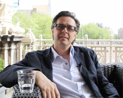 Jun 15, 2015
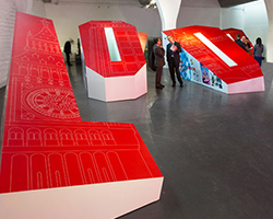 Oct 22, 2013
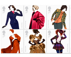 May 15, 2012
PRODUCT LIBRARY
 Sep 07, 2024
 Sep 02, 2024
 Aug 29, 2024
 Aug 21, 2024