the artwork for miss kō’s intricate and beautiful tattoos was created by horikitsune (alex kofuu reinke)
GBH have designed the branding for miss kō, an asian fusion restaurant in paris that also boasts an interior by philippe starck.
located in the heart of paris, miss kō is not just a restaurant; it’s a crazy place where street food, cocktails, art, and music meet to create a unique culinary experience. inside miss kō it’s the future; a place where cultures collide, fantasy rules and nothing is what it seems. it’s like blade runner – only happy.
 the interior of miss kō was designed by phillipe starck
 miss kō interior
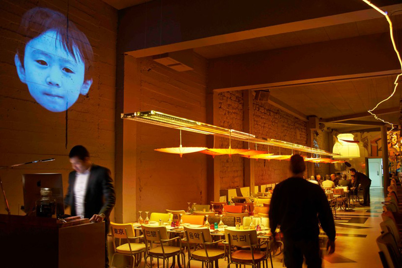
 a 26m long table runs the length of the restaurant
phillipe starck has channelled his limitless creative madness into the miss kō interiors, creating a place where art has no barriers and dinners are surrounded by endless technology. one of miss kō’s most unusual features is a 26m long table running the length of the restaurant entirely made from digital screens, each playing news channels from all over asia.
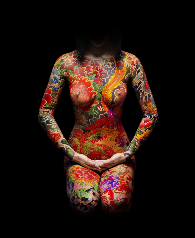
the restaurant’s name and identity are based around the character of miss kō. a young, sexy but eternally mysterious symbol of asia, and the embodiment of its traditions and its strangeness. miss kō shows us her ‘yakuza’ full body suit tattoo, a sign in some asian cultures of ties to the underworld.
the artwork for miss kō’s intricate and beautiful tattoos was created by horikitsune (alex kofuu reinke), the only european to have trained as an apprentice in the traditional japanese art of irezumi. he studied for more than 15 years in japan under of the world-renowned irezumi artist horiyoshi III. photography by celebrity and fashion photographer uli webber.
the miss kō logotype is simply 9 grains of rice; the staple of all asian cuisine and integral to the asian way of life. each of the 9 grains represents one of the asian countries which inspired the creation of the miss kō menu.
miss kō, restaurant designed by philippe starck
video courtesy of label dalbin, paris
 formal and informal logo
 embossed logo
 logo lockup
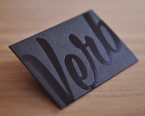
 the logo and the imagery of miss kō come together in the business cards to create an unexpected juxtaposition of strangeness and tradition.
 the miss kō identity is an eclectic mix of things taken from miss kō’s world… the cocktail menu is her private sketchbook, each cocktail is depicted as a crazy asian character and named after one of miss ko’s friends (ginza boy, madame keiko, li mon li, crazy mofo).

 the dessert menu is a photo album saved from her childhood.
 the food and drink menu covers are a celebration of miss kō’s tattoos. the repeated disembodied tattooed body-parts are both strange and beautiful, almost symbolic of the asian relationship to food and to the animal kingdom.

 the miss kō signage was designed to replicate the many different bright, overlapping signs found in a busy asian street.

 connected to the signage by a tangle of wires is a chest high animation of the miss kō logo to draw in passers-by from the street. each part of the signage displays the name Miss Kō in a different asian language creating a strange hieroglyphic effect.
animated logo box
 the logo has animated versions, an ambient dancing rice animation is projected onto the floor. the rice occasionally comes together seemingly at random to create the miss kō logotype.
dancing logo
GBH (6)
 Sep 08, 2014
 Sep 18, 2013
 Aug 09, 2013
 Jun 28, 2012
logo design (249)
 Dec 08, 2025
 Aug 09, 2024
 Jul 03, 2024
philippe starck (108)
 Feb 02, 2026
 Mar 28, 2025
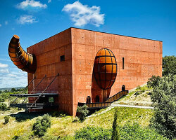 Oct 18, 2024
 May 14, 2024
 Feb 18, 2026
 Jan 28, 2026
 Jan 02, 2026
 Dec 28, 2025