nadeem haidary turns flags into symbolic, cultural infographics
all photos courtesy of nadeem haidary
nadeem haidary’s ‘state of the union’ takes a set of metrics and visually transforms elements on the flag to represent the country’s current state, making it a dynamic and information-driven symbol. over years or decades, citizens would be able to perceive shifts in the country as they get wealthier, healthier and live better lives — or not.
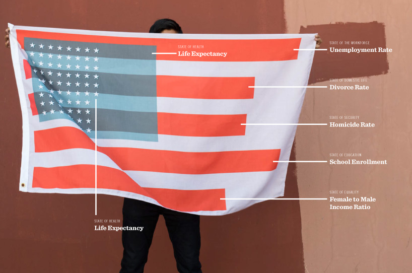
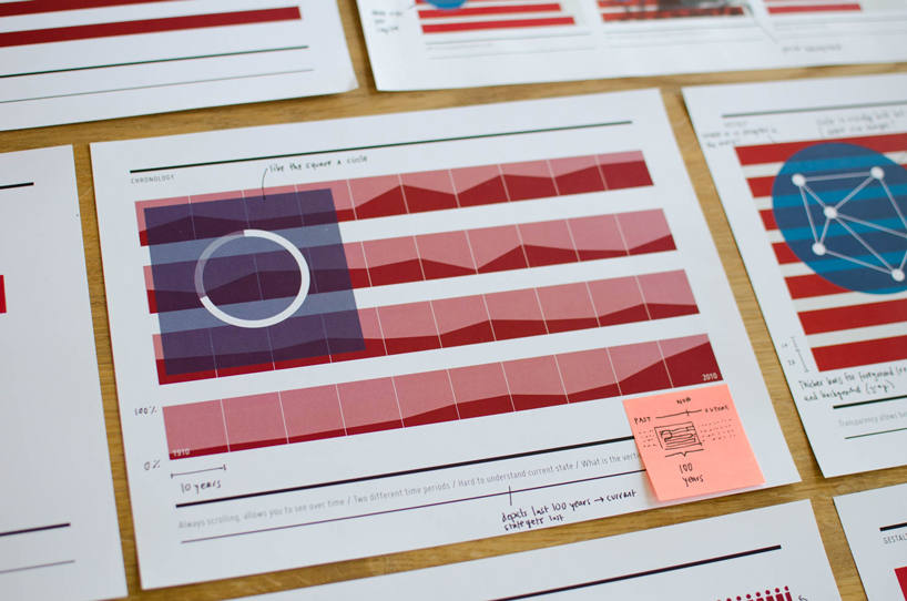
in the case of the american flag here, meaning is driven by the condition of the citizens it represents rather than abstract notions of statehood or bygone colonies. the stars represent each year of life expectancy. the blue field on which they sit stretches based on GDP per capita. the stripes are a sort of horizontal bar graph showing five different socioeconomic metrics: unemployment, divorce rate, homicide rate, school enrollment and gender salary ratios.
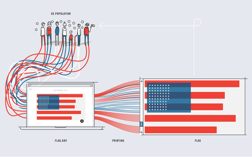
the process of gathering data, visualizing it, and creating digital and physical flag outputs
the intention is that over time one can see holistically how a country performed according to its values, such as through the visual completeness of the stripes or as author refers to it, ‘the gestalt of a nation’.
‘state of the union’ intentionally recasts countries’ flags in a retroactive approach to design. one can easily imagine the cultural emblems looking very different if at the outset they are designed to be data-driven and constantly changing.
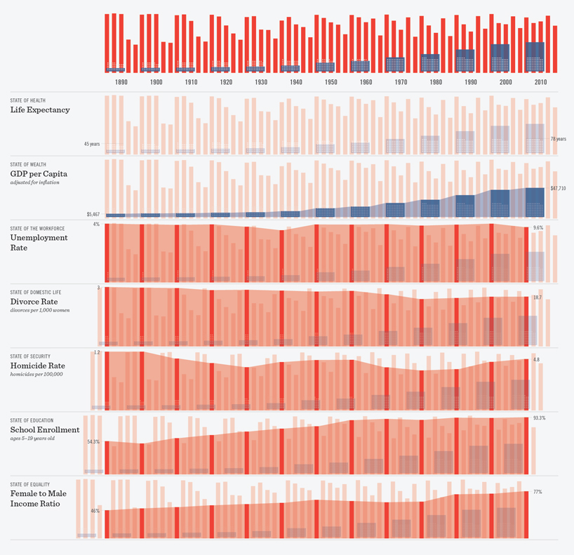
breaking out each metric over the last twelve decades shows some broad trends
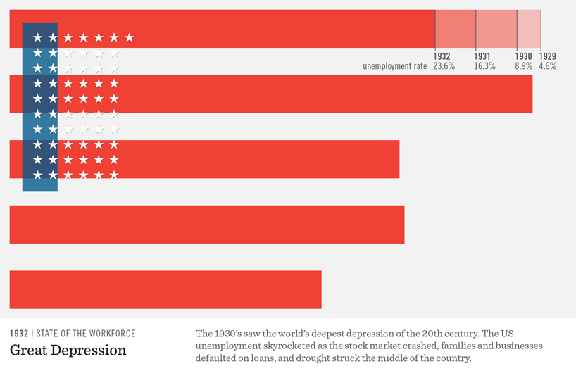
great depression’s impact on the unemployment rate
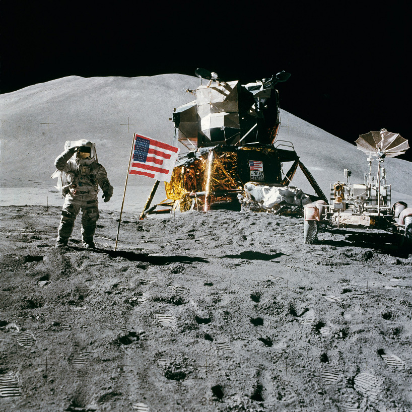
1973 apollo 15 moon landing reimagined
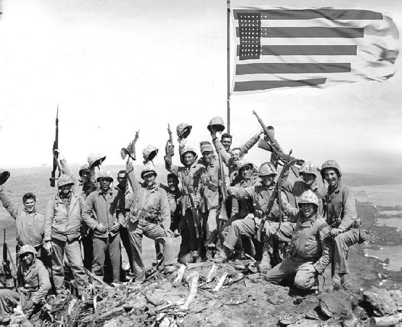
1945 iwo jima reimagined
flags thought as a constantly scrolling filmstrip
each country has it’s own values, which makes comparing nations to each other tricky and unnecessary. rather, each territory might choose it’s own metrics to measure (e.g. canada as a melting pot). below, you’ll see a few moments in time for other nation’s flags. for instance, the life expectancy of a person in japan, proudly amongst the highest in the world today, is correlated to the diameter of the circle. while it tends to go up over time, in 1945 life expectancy was actually lower than it had been almost 50 years prior because of world war II.
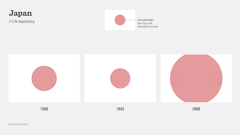
life expectancy in japan
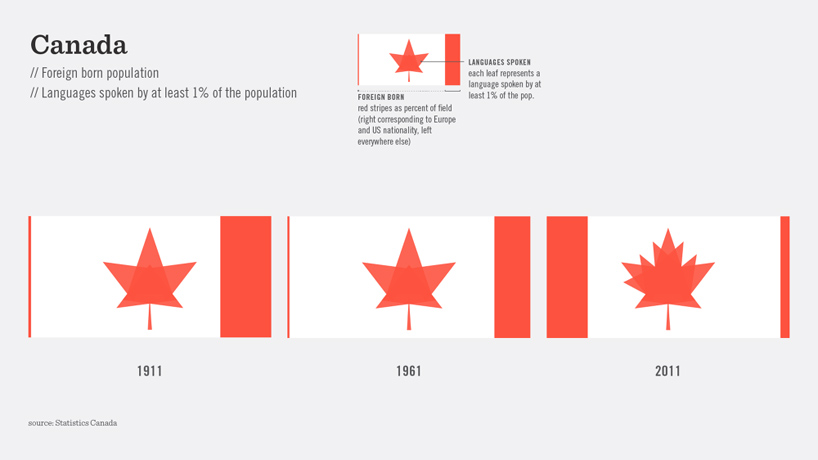
canada foreign population and languages spoken
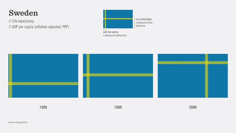
sweden life expectancy
designboom has received this project from our ‘DIY submissions‘ feature, where we welcome our readers to submit their own work for publication. see more project submissions from our readers here.
edited by: juliana neira | designboom
infographics (19)
 Aug 06, 2020
 May 02, 2019
 May 07, 2018
 Apr 10, 2016
 Nov 05, 2014
PRODUCT LIBRARY
 Jul 23, 2024
 Jul 01, 2024
 Jun 13, 2024
 Jun 06, 2024