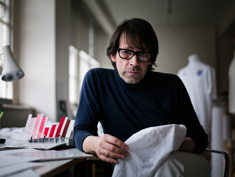
two days ago the english national football wore a new tailored by umbro kit for the first time in a euro 2012 qualifying game against bulgaria. the back of the shirt features a pattern designed by peter saville and has been the topic of much discussion in england this week. in this interview saville explains his involvement in the project and the idea behind his design.
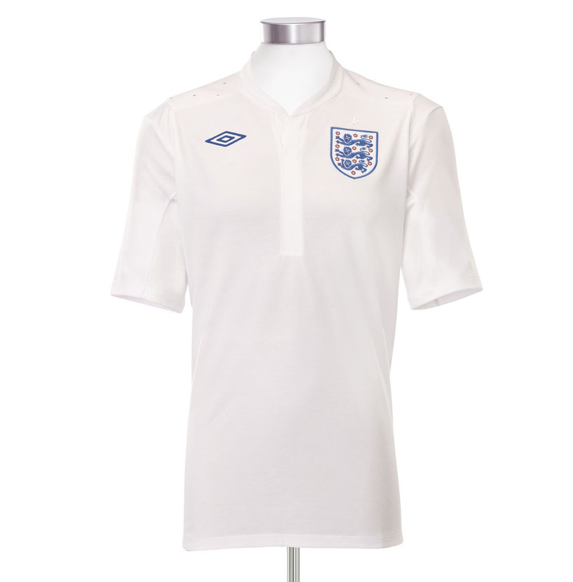 england home shirt front DB: are you a football fan or do you play football? PS: at school I mainly played rugby but we played football at lunch times and I quite enjoyed it. I’m a recreational football fan. I watch ‘match of the day’ every saturday it’s a highlight of my weekend, but I don’t go to games very often. I went to a couple last year for work related reasons, but not related to this project. I did the identity for a gallery in moscow called ‘the garage’, which is owned by dasha zhukova who is roman abramovich’s partner, so I went to to watch chelsea versus manchester united at stamford bridge. dasha made it very clear to me that if, my team (united) scored I must not seem happy!
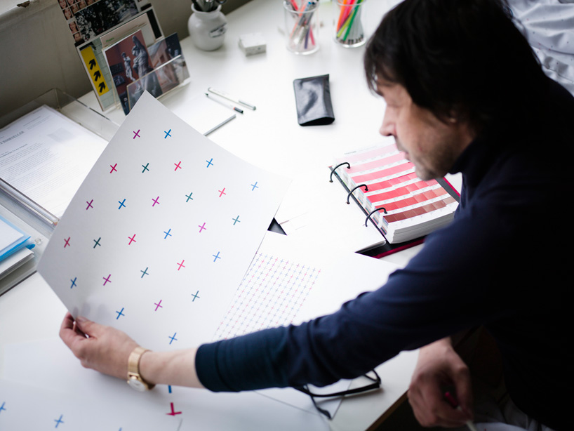
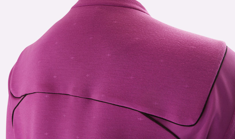
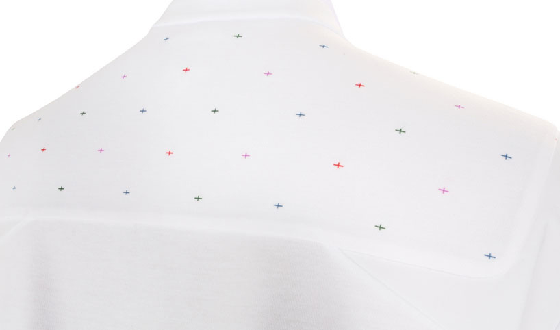 england home shirt – detail of the pattern designed by saville which runs across the shoulders how did your interest in football inform your approach to designing the new kit? well, I knew what football was, you have to know what things are to design for them or within them. you have to know where the activity exists in the psyche of society and what football means to the people engaged with it. for example I wouldn’t feel comfortable doing a project within american baseball because I don’t know anything about it – I don’t know what matters in baseball.
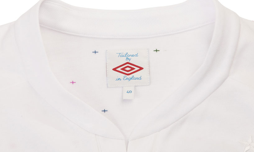
how long did it take to come up with the final kit design? not that long because there was not much time, there’s never much time. when you arrive at a solution it always seems obvious but it doesn’t always arrive immediately, it’s a constant editing process. you never know what the people you are working for are going to respond to or what they might choose. to begin with there’s an awful lot of possibilities and then they are whittled down until something finally locks into place. in the first presentation there were fifty different possibilities. then as we got to that point of common response things started to happen much quicker. 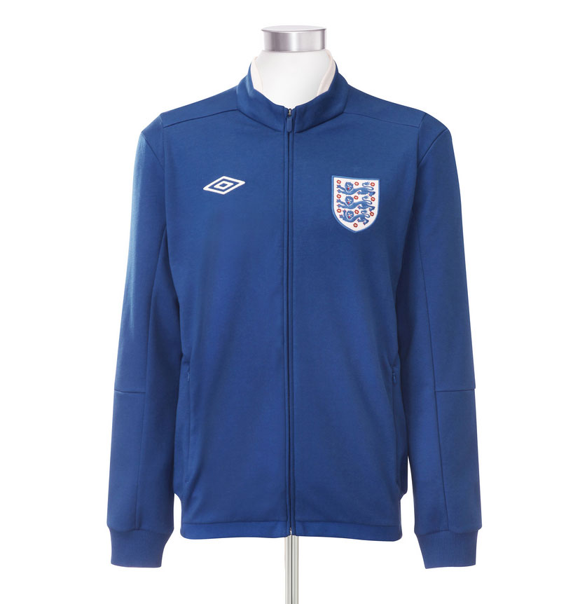 anthem jacket what are the key differences between designing something that will be worn and something that isn’t? there’s a lot of differences. we only concerned ourselves with the surface of the shirt. this design is very much about what it means and what it stands for – more than the fact it’s worn on the shoulder of this particular shirt. it is a design for the head as much as it is for the eyes. it is more about being a symbol of something, than the surface of something.
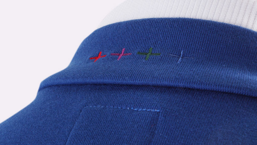 anthem jacket detail national football shirts carry a strong sense of tradition through specific identifiers, what were the restraints on this project in terms of colors and imagery? interestingly there weren’t any restraints on this project – only our own. it was a case of what we felt might be common sense or what would be acceptable. I didn’t think we’d see this idea through, where this symbol of national heritage being revisited and reinterpreted . I thought it would be a bridge to far to change the colors of a national symbol. it’s kind of remarkable that we have done that. the limitations usually end up being self imposed… the bigger something is or the more people something is for then the more you can kind of feel trapped by that and think ‘oh no, you couldn’t possibly do that’ and the idea we finally went with is one where I thought ‘we can’t really do that’ but actually we could.
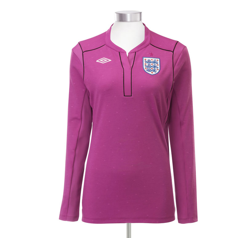 women’s goalkeeper shirt who crossed your mind most often when you designed the kit, the players or the fans? the first thing that crossed my mind was modern englishness. the image aware society that we now have in england and the reinvention of savile row. the look of englishness as manifest through tailoring and fashion particularly over this last decade and is informed by earlier decades. first of all this was about a garment. about a white shirt and what a white shirt might be now. it was only when the cross pattern became the way we were going to go, that what this idea might mean to the audience and the players became the significant thought. later it became about the players and the fans – they are one and the same, they are the same people. then, when it became about the cross of saint george it became about society.
 womens goalkeeper shirt do football kits always represent the era in which they are designed? they have but now things are different. there is some great kits at the moment. but they reference earlier eras. we have this big cannon of design and pop culture now and football kits are a facet of popular culture. we reference popular culture in a kind of re-sampling / re-mixing way. the great designs of the moment are evocative of the fifties of the forties or the sixties. for instance, aitor throup’s red england away shirt is a riff or a remix of the 1966 cup winning shirt. the only way to distinguish the look of design and fashion now is to understand the context in which you are seeing them. there is a DNA of looks that are circulating through today’s aesthetics. there isn’t a universal time anymore. it’s a time where there are references to history and suggestions of the future all in the same context. some people can read it very clearly like a language for other people it’s just stuff.
how does knowing that the kit will be replaced influence your approach? when you work on things that you know are going to be renewed you start thinking about that almost from the beginning, you start to think where the idea could go next. this is a design that can evolve and hopefully it will – there’s lots of different ways to work with it.
– all images courtesy of umbro
see more images of the new kit in our earlier piece
for more information visit the umbro website or the umbro blog
peter saville (4)

umbro (6)
 Sep 01, 2010
 Jul 05, 2010
 Jun 14, 2010
 May 03, 2010
 Mar 16, 2010
 Feb 18, 2026
 Jan 28, 2026
 Jan 02, 2026
 Dec 28, 2025