NIKE world cup fonts
all images courtesy of NIKE
NIKE have designed several new fonts for teams playing at this year’s FIFA world cup including two collaborations with renowned graphic designers, wim crouwel (netherlands) and neville brody (england).
designboom spoke to stu mcarthur, design director at NIKE football to learn more about about the process…
designboom: how are fonts assigned to each team?
stu mcarthur: we design unique fonts for the best NIKE teams as an extension of the ‘pride’ elements of each kit design. the fonts are created with a focus of being culturally relevant, as well as playing a role in completing the kit’s overall design. functionally, we are also looking to improve legibility for the spectators at home and in the stands.
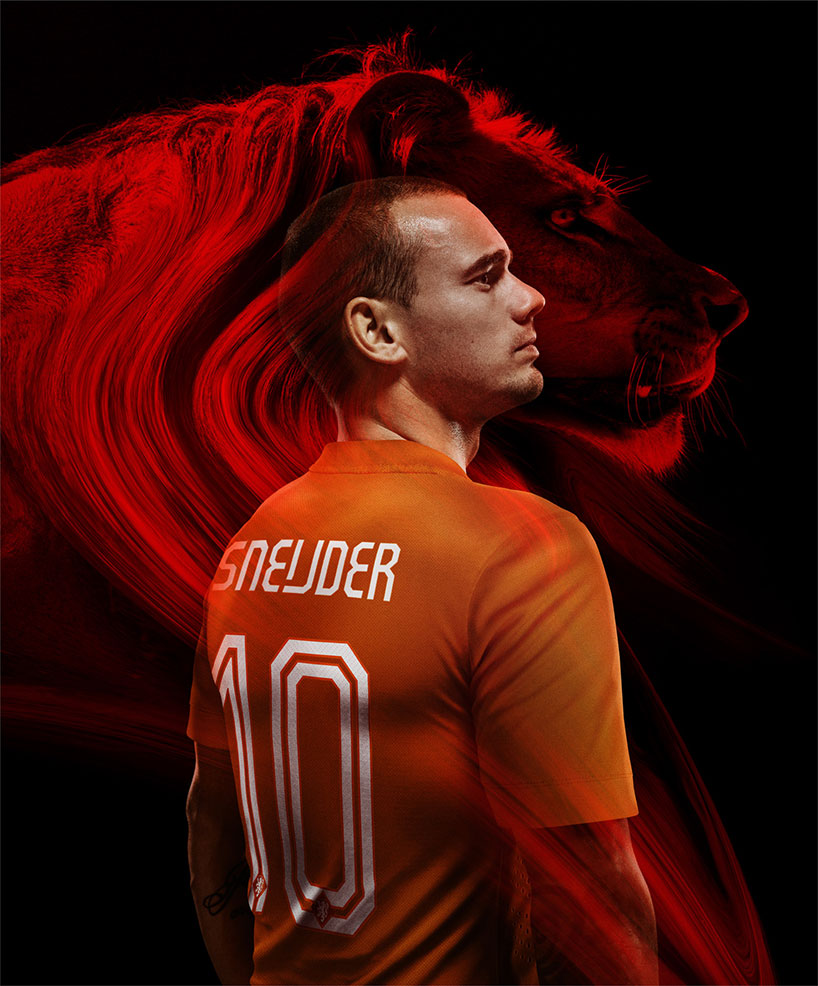
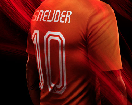
wesley sneijder wearing the dutch home kit featuring the typeface ‘case crouwel’ a collaboration between NIKE’s floor wesseling and wim crouwel. the typeface features an optional ligature for the dutch ‘ij’ gliding vowel.
DB: when are external typographers brought in to help?
SM: it’s not something we usually do but with this summer’s tournament, we wanted to extend the national pride elements of the design and this felt like a great way to do that. working with neville brody on england’s font was a huge honor – he’s one of the best living british typographers and he’s a huge football fan. in terms of the typeface for the dutch kit, wim crouwel is a friend of NIKE and has been working with us on some other projects, so it felt natural to bring him on board.
DB: how do you justify the cost and time of developing a new custom typeface?
SM: for each federation this is the pinnacle moment for their players, fans and everyone carrying that country’s passport! we see this element of the design as a vital piece of the team’s storytelling.
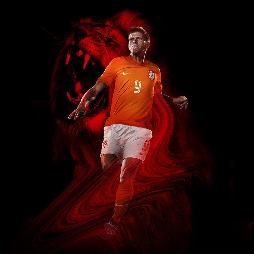
case crouwel applied to the front of the dutch home kit as worn by klaas jan huntelaar
DB: what criteria is used to strike a balance between originality and legibility?
SM: this is where you earn your wages as a designer, firstly the font has to be original & relevant, does it resonate with the country or team? does it fit with NIKE’s overall direction? we want to create a beautiful unique font that resonates with the players & fans alike. in the case of the dutch typeface we followed wim’s modernist typography rules, focused on spacing letter shapes purely to be legible while also creating a modern look. this style has been a modernist (and a niche) discussion in the dutch graphic world for the past six decades.
DB: what FIFA regulations do the typefaces have to meet in order to be used?
SM: we have to meet certain requirements in terms of the stroke widths, colors, legibility and so on – the rulebook is quite thorough but it never proves too challenging to the process.
DB: what’s your favorite NIKE typeface?
SM: we are very proud of the england and holland typefaces but my personal favorite is the one we worked on for france. a stylized version of ITC avante garde, which fits the character of the french team perfectly. the font is wider than usual, so the first time we used it on the new marinière (away) shirt we had to anticipate the width of the letters to ensure each player’s name would fit in a straight line across the shoulders while vertically staying between the hooped stripes on the shirt.
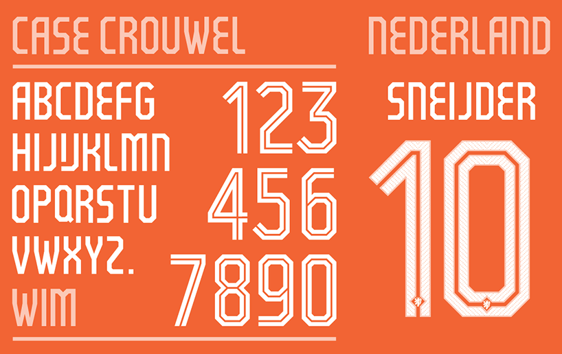
case crouwel in the dutch home colors
netherlands – case crouwel by NIKE football & wim crouwel
based on the typeface gridnik, the lines inside the numbers are reminiscent of the numbers famously seen in football in the 1970s. to lend a further stamp of authority, each number also houses a small royal dutch football association crest at the bottom.
floor wesseling, a graphic designer at NIKE football who worked directly with wim crouwel on the new typeface, told us more about the collaboration:
‘when we started with the design of the dutch national team I received a brief where I saw a little image of wim crouwel’s ‘neu alphabet‘ among the inspiration images. we already knew wim and asked him if he would be interested to collaborate in making a typeface for the dutch kits – he happily agreed.’
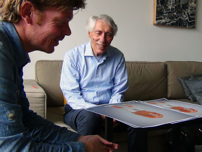
floor wesseling and wim crouwel at crouwel’s home reviewing case crouwel
‘gridnik by wim was another reference – it’s a great, legible typeface that is recognizable as being typically dutch. we decided to make a condensed version of it for the name plates and later on including an inline in the back number set as a nod to the retro numbers from the 1970s – an important time in dutch football. I went back and forth to wim’s house every other week where we shared coffee and stroopwafels while reviewing the progress of the typeface.’
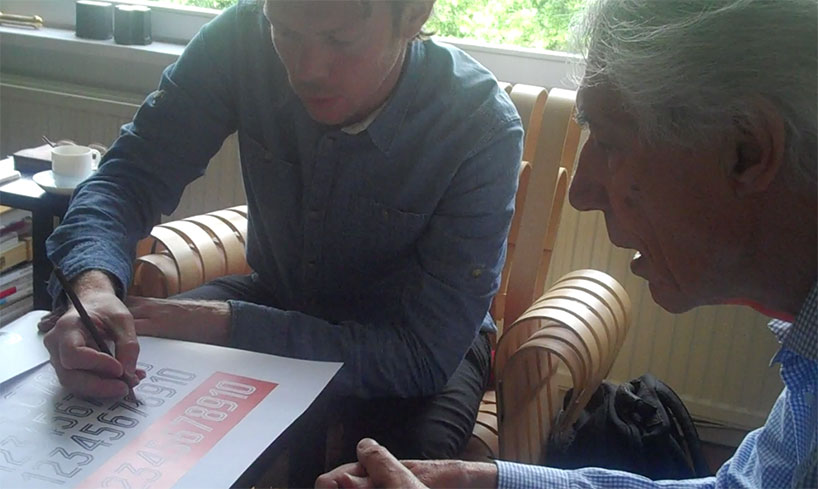
crouwel and wesseling making changes made to the dutch team’s typeface
‘wim was always very bright, witty and happy to give us his feedback. he’d take a pencil and make adjustments on the prints. altering the proportions initially and then later on the spacing of the letters and numbers on the shirts – looking for the perfect balance of name, number and background. during this process we realized we could set the dutch ‘ij’ vowel as ligature for names like sneijder.’
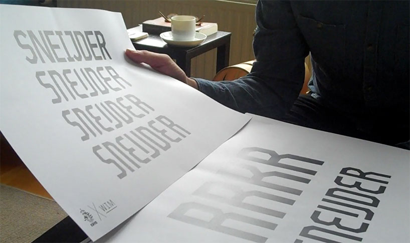
design developments of case crouwel
‘we were very pleased with the final result – we were able to create a classic kit that celebrates the history of the dutch football association and at the same time we created a canvas for one of the nation’s most important designers to show his work. we called the new typeface ‘case crouwel’ not just to give the final product a name but to celebrate what was a very special collaboration for us all.’
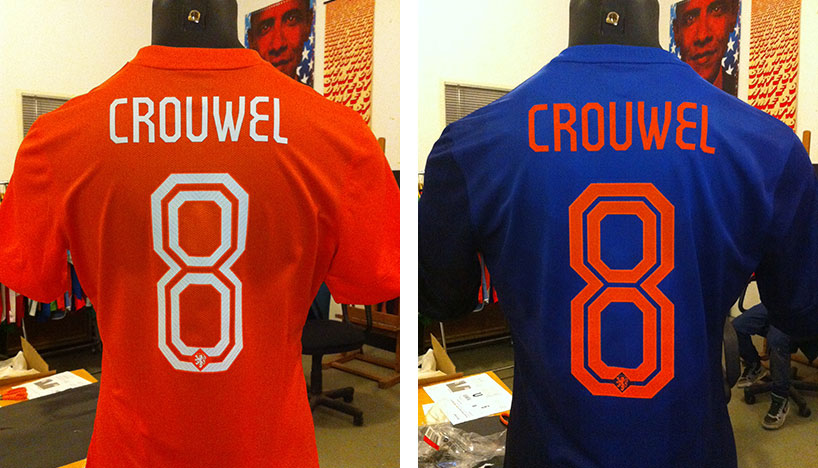
the dutch home and away shirts featuring case crouwel
‘floor was inspired by my typefaces; new alphabet and gridnik. I served as his sparring partner during the process’ – wim crouwel
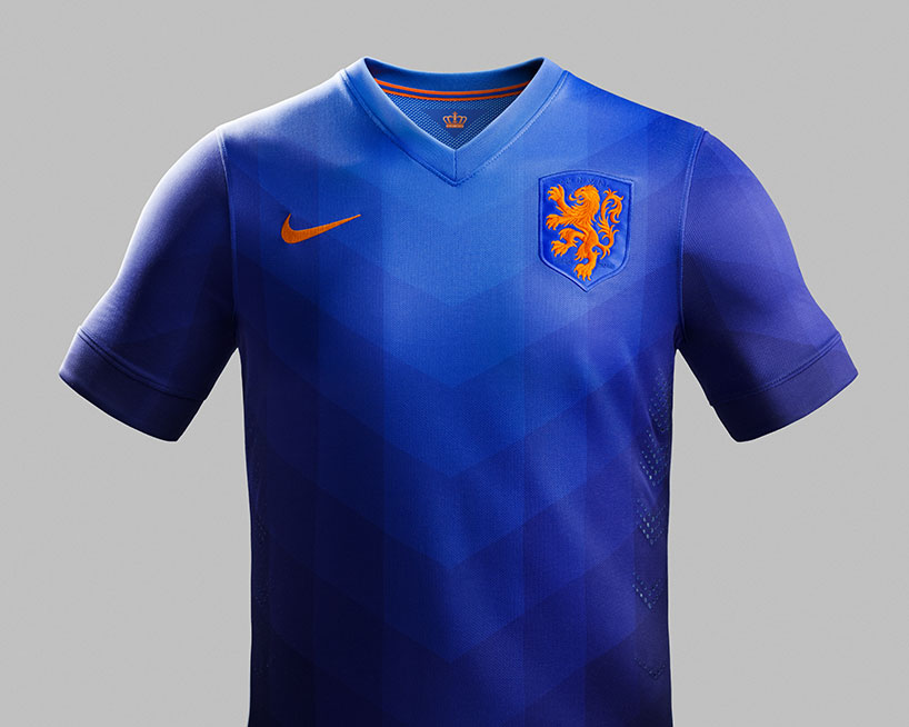
NIKE 2014 netherlands away shirt
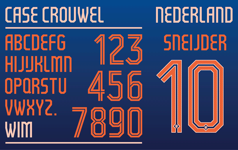
case crouwel as displayed on the dutch away kit
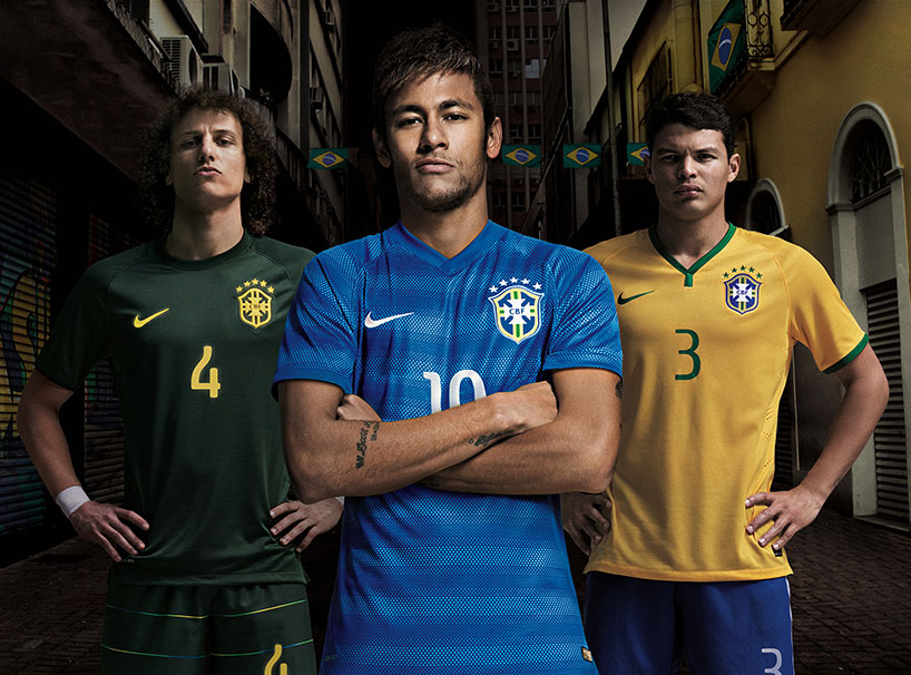
david luiz, neymar jr. and thiago silva model the NIKE 2014 brazil kits featuring numbers set in the typeface fundição brazil
brazil – fundição brazil by NIKE football
the style of the name and number is inspired by the classic fonts widely used on brazilian hand printed street posters. the name and number on each kit have been carefully designed, with micro fine pinholes for moisture management and cooling, and a fluorescent outline to aid visibility.
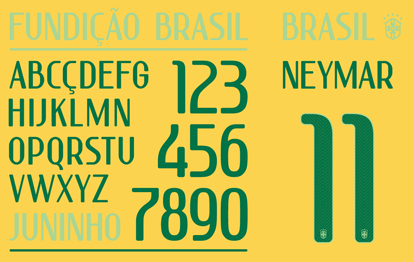
fundição brasil in brazil’s home colors
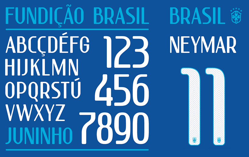
fundição brasil in brazil’s away colors
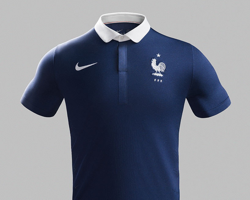
NIKE 2014 france home shirt
france – ITC avante garde
NIKE worked on a stylized version of ITC avante garde, that could only be described as ‘french’. the french crest is embroidered on the bottom of each player’s number.
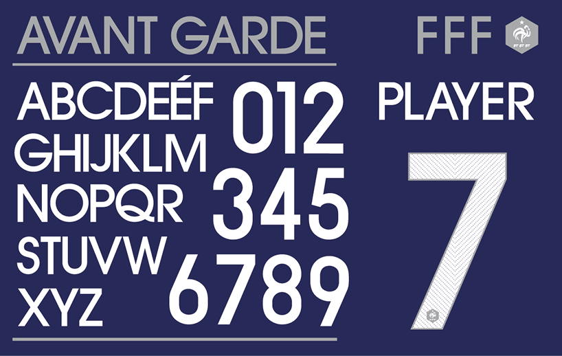
avant garde in home colors
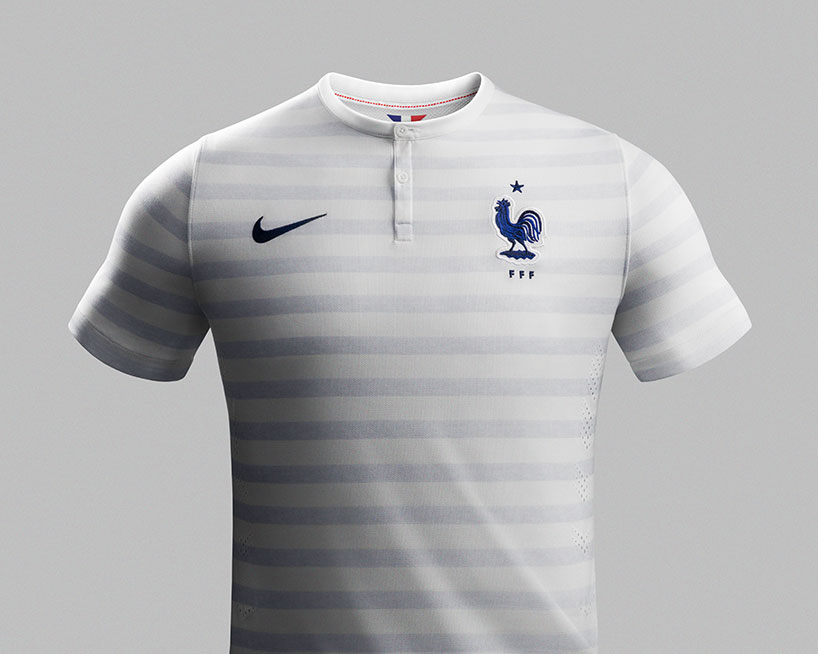
NIKE 2014 france away shirt ‘marinière’
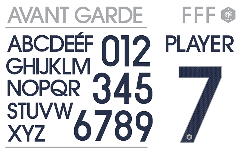
avant garde in france’s away colors
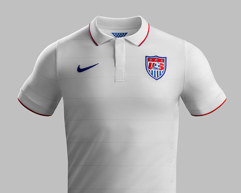
NIKE 2014 USA home shirt
USA – REX by font fabric
REX by font fabric is a modern, angular font that recalls the angular numbers used commonly by U.S. sport teams. each number on the back of the jersey houses a small U.S. soccer crest at the bottom.
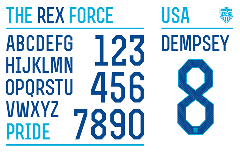
the rex font in USA’s home colors
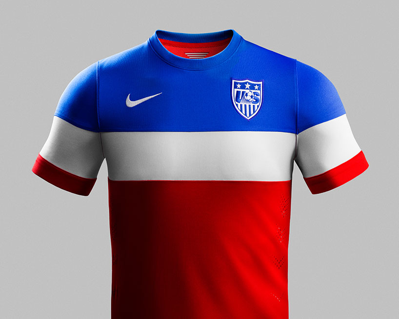
NIKE 2014 USA away shirt
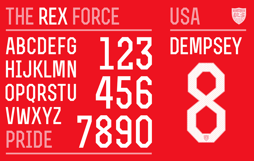
the rex font in USA’s away colors
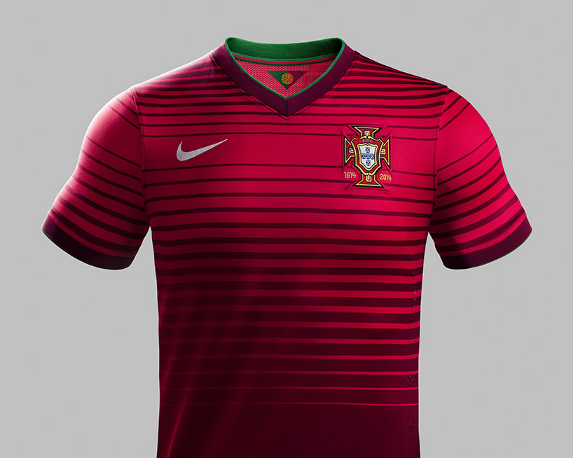
NIKE 2014 portugal home shirt
portugal – ronaldo designed by NIKE football
the name and numbers on the back of the home jersey have been specially created, and are inspired by the old typefaces used on traditional portuguese signage. the custom font is a modern take on art deco lettering.
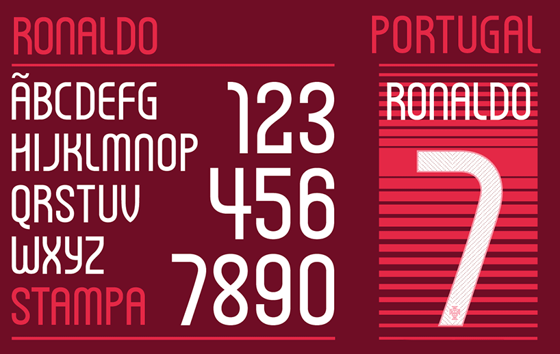
ronaldo typeface in portugal’s home colors
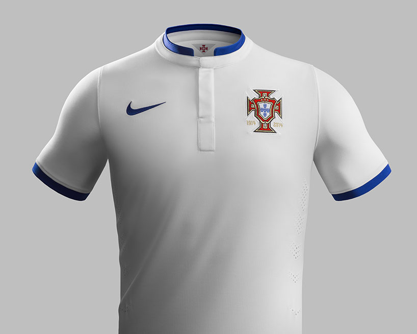
NIKE 2014 portugal away shirt
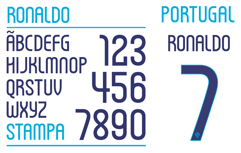
ronaldo typeface in portugal’s away colors
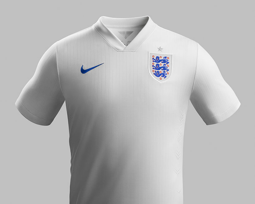
NIKE 2014 england home kit
england – case brody designed by neville brody & NIKE football
‘it has been an extraordinary honor to design the fonts for the england national team. the core inspiration was to focus on the intersection between flair and workmanlike reliability. small touches emphasize the idea of innovation, invention and surprise, built around a more geometric structure. the industrialized suggestion of a stencil was simultaneously based on a pinstripe motif, combining style with no-frills efficiency.’ – neville brody
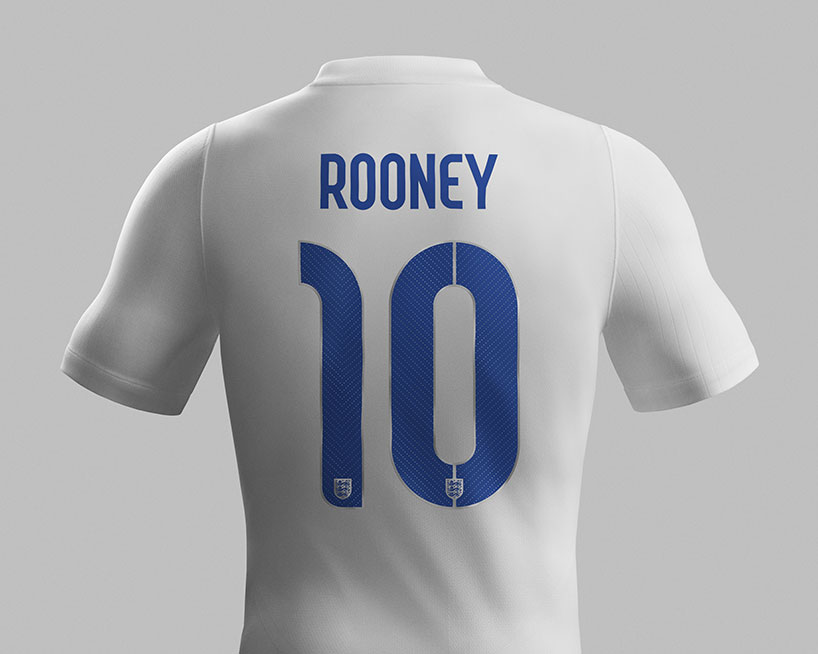
rooney’s name and number set in the case brody typeface on the england home shirt
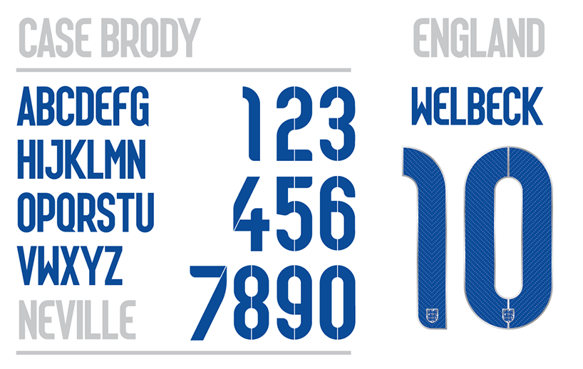
case brody in england’s home colors
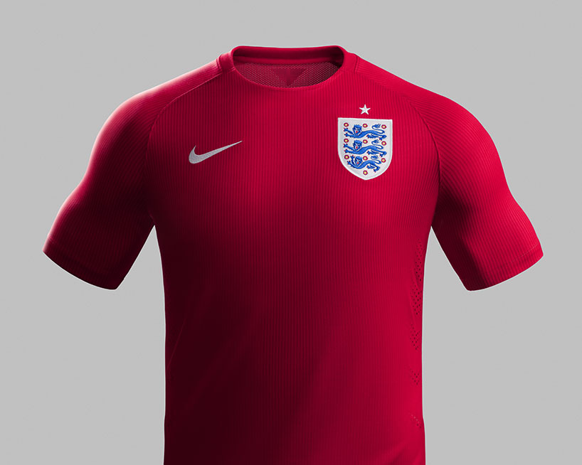
NIKE 2014 england away kit
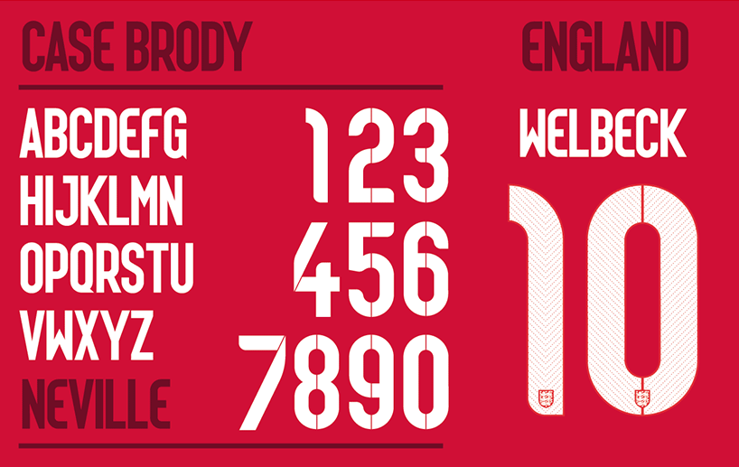
case brody in england’s away colors
more – read our recent interviews with NIKE designers:
tobie hatfield »
mark parker »
eric avar »
martin lotti »
tinker hatfield »
FIFA world cup 2014 (34)
NIKE (219)
typography design (133)
PRODUCT LIBRARY
a diverse digital database that acts as a valuable guide in gaining insight and information about a product directly from the manufacturer, and serves as a rich reference point in developing a project or scheme.
