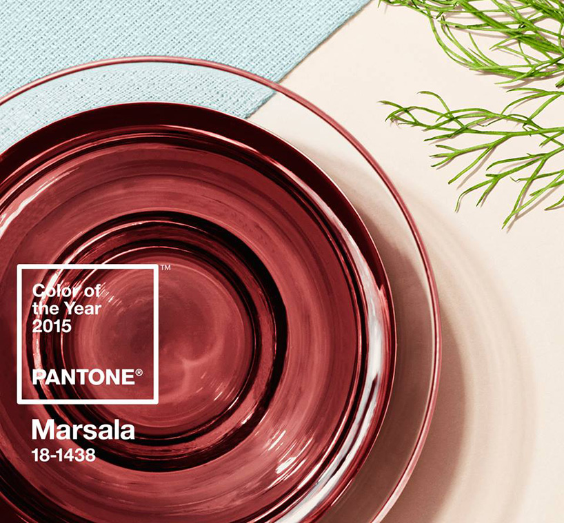
color company pantone has selected ‘marsala’ as the color of the year for 2015. the full-bodied qualities of ‘marsala 18-1438’ make for a grounded statement color when used on its own, and a strong accent to many other tones. much like the fortified wine that gives ‘marsala’ its name, the hue materializes the richness of a fulfilling meal while its red-brown roots emit a natural earthiness. leatrice eiseman, executive director of pantone color institute describes, ‘marsala is a subtly seductive shade, one that draws us in to its embracing warmth. it is a natural fit for the kitchen and dining room – making it ideal for tabletop, small appliances and linens throughout the home.’
all images courtesy of pantone
the hue embodies the richness of a fulfilling meal
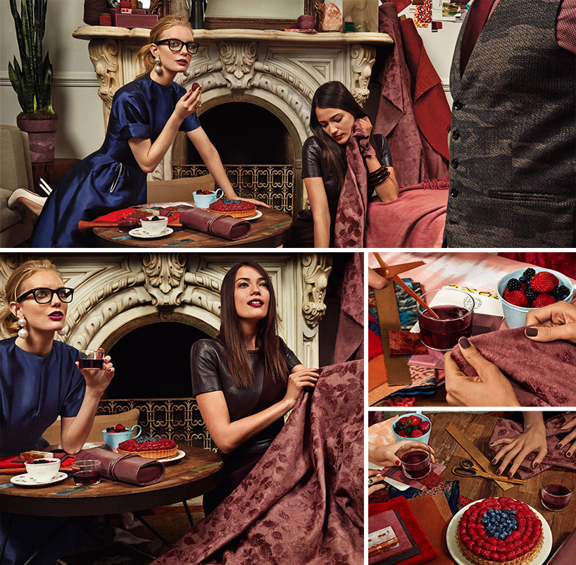
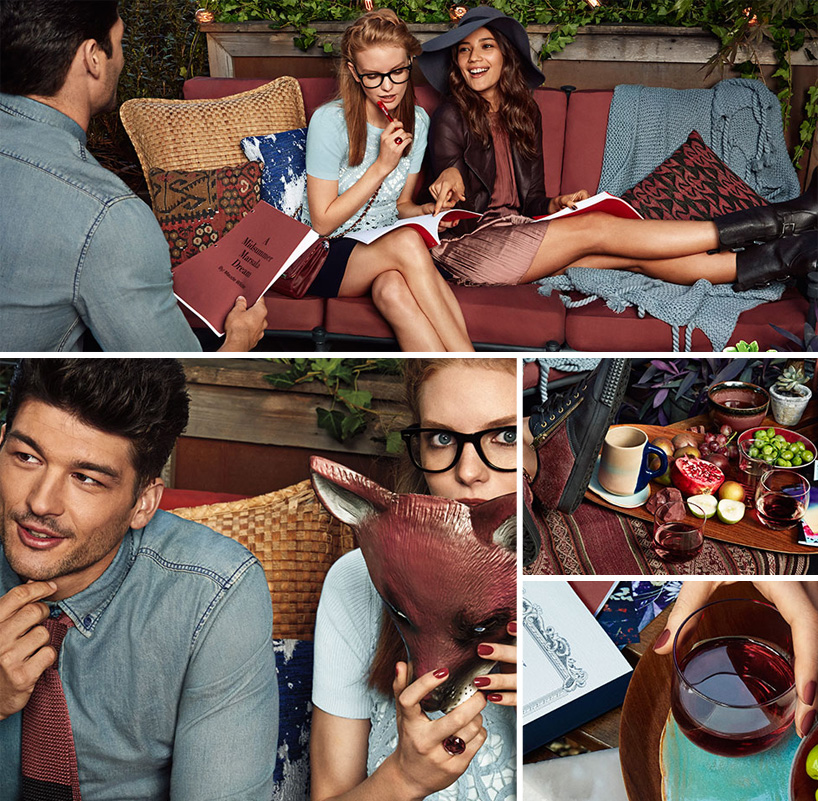
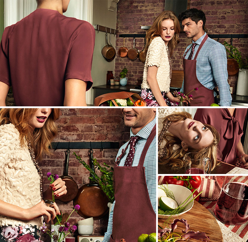
marsala, applied to interior accent pieces, accessories and paint
how the 2015 color of the year was selected:
since 2000, the pantone color institute has been designating a color of the year to express in color what is taking place in the global zeitgeist. a color that will resonate around the world, the pantone color of the year is a reflection of what people are looking for, what they feel they need that color can help to answer. not necessarily the hot fashion color of the moment, but a color crossing all areas of design which is an expression of a mood, an attitude, on the part of the consumers. to distill the prevailing mood into a single hue, the pci team, led by executive director leatrice eiseman, combs the world looking for future design and color influences, watching out for that one color seen as ascending and building in importance through all creative sectors. influences can include the entertainment industry, upcoming films, art, emerging artists, travel destinations and socio-economic conditions. influences may also stem from technology, lifestyles + playstyles, new textures and effects that impact color, and even upcoming sports events that capture worldwide attention. with each unique color shade having its own special symbolism, an additional key consideration is the emotional component and the inherent meaning of the color.
pantone (43)
 Dec 07, 2023
 May 07, 2023
 Dec 02, 2022
 Dec 09, 2021
 Dec 10, 2020
PRODUCT LIBRARY
 Jul 23, 2024
 Jul 01, 2024
 Jun 13, 2024
 Jun 06, 2024