pentagram has unveiled a new refined and modernized warner bros. logo, featuring a cleaner and sleeker version of the company’s iconic shield which has been part of their visual identity since its founding in 1923. the project includes both the brand identity and brand strategy and draws from the entertainment giant’s heritage, aiming to position it for the future while looking ahead to the studio’s centennial in 2023. the project updates the iconic WB shield and makes it the foundation of a comprehensive identity system, including a custom typeface inspired by the logo.
![]()
warner bros. is known for being an industry pioneer: in 1927 they introduced the first synchronized dialogue in movies, and they were also responsible for the revolutionary matrix films. this legacy was key when developing the new brand strategy, where pentagram conducted in-depth research, interviews and discussions with staff and stakeholders around the world. after talking with employees, creative partners, filmmakers, writes, producers, show runners, actors and production staff, the design studio understood the motivation behind these people — telling great stories.
![]()
‘we believe in the power of story’ is warner bros. new brand position, capturing the legacy of the company. this new sense of focus has been amplified in the logo and can be seen in its clean lines. the shield, which has been updated many times throughout the company’s history, streamlines it to its key elements, with a form based on the classical proportions of the golden ratio. the designers looked at the construction of the letterforms of the WB monogram, preserving their quirkiness but making them more modern. the letters of the monogram align as though made in one continuous gesture, emphasizing unity and connection.
![]()
‘the logo has been optimized to perform across various platforms and scales, from the small spaces of the digital world to giant installations like the iconic water tower on the warner bros. studio lot,’ comments pentagram. ‘it also works well with a wide range of content. the logo appears in the signature Warner Bros. blue, which has been brightened to a more contemporary hue, with the wordmark set off in a slightly darker shade to create a complementary contrast.’
![]()
![]()
![]()
![]()
project info:
name: warner bros. new logo
design: pentagram
client: warner bros. entertainment group
sector: entertainment
discipline: brand identity
office: new york
partner: emily oberman
project team: timothy cohan, greg morrison, tom grunwald, todd goldstein, lisa grant, alpa pandya, austin mcghie
logo design (245)
 Jul 03, 2024
 Aug 14, 2023
pentagram (43)
 Mar 14, 2022
 Mar 04, 2022
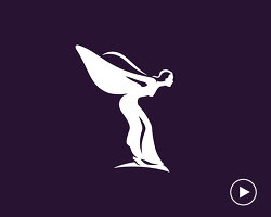 Aug 25, 2020
 Jul 22, 2020
 Dec 18, 2019
PRODUCT LIBRARY
 Jul 23, 2024
 Jul 01, 2024
 Jun 13, 2024
 Jun 06, 2024