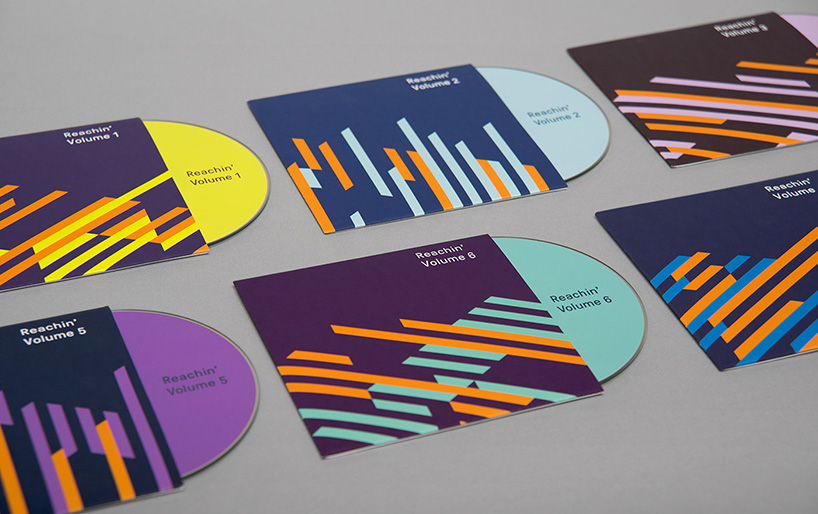
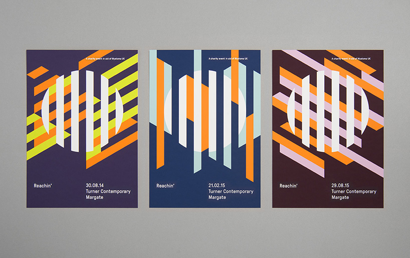
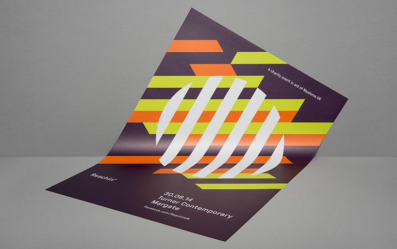
karoshi have designed the identity for reachin’ – a fundraising event in aid of myeloma UK. reachin’ is hosted at the turner contemporary in margate and the new identity drew inspiration from the venue architecture by david chipperfield. myeloma UK’s primary orange features as a constant ‘hero color’ to reference the charity and is paired with a unique event palette. the identity has been applied to on and off-line marketing collateral, event graphics, projection animations and merchandise.
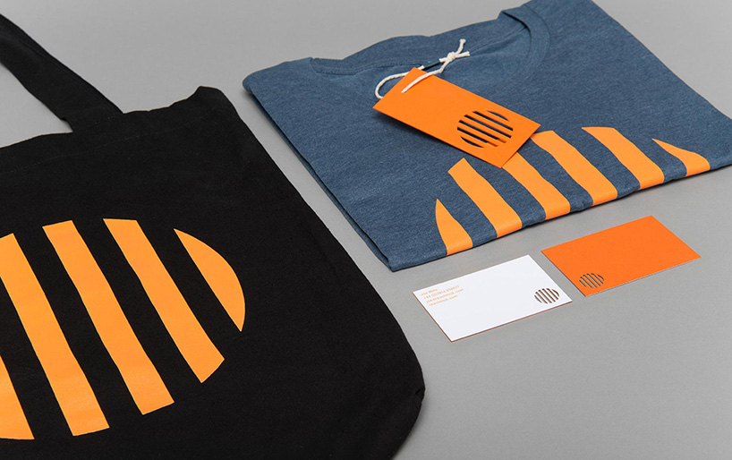
various applications of the identity

reachin’ logo
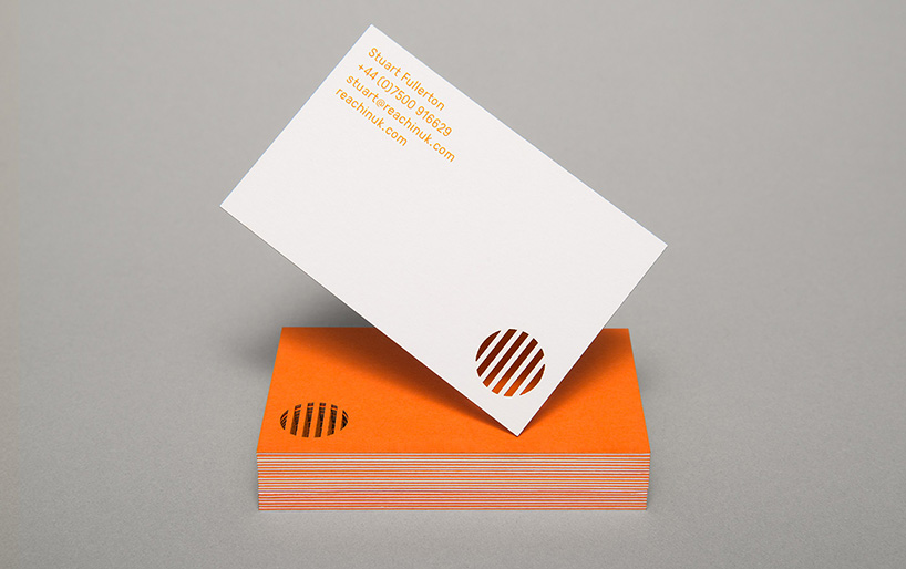
business cards
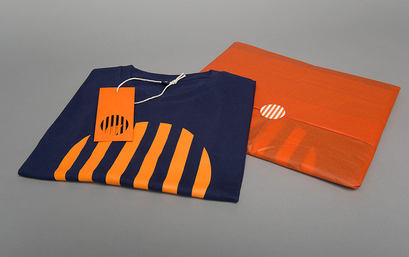
t-shirts
flyers
poster
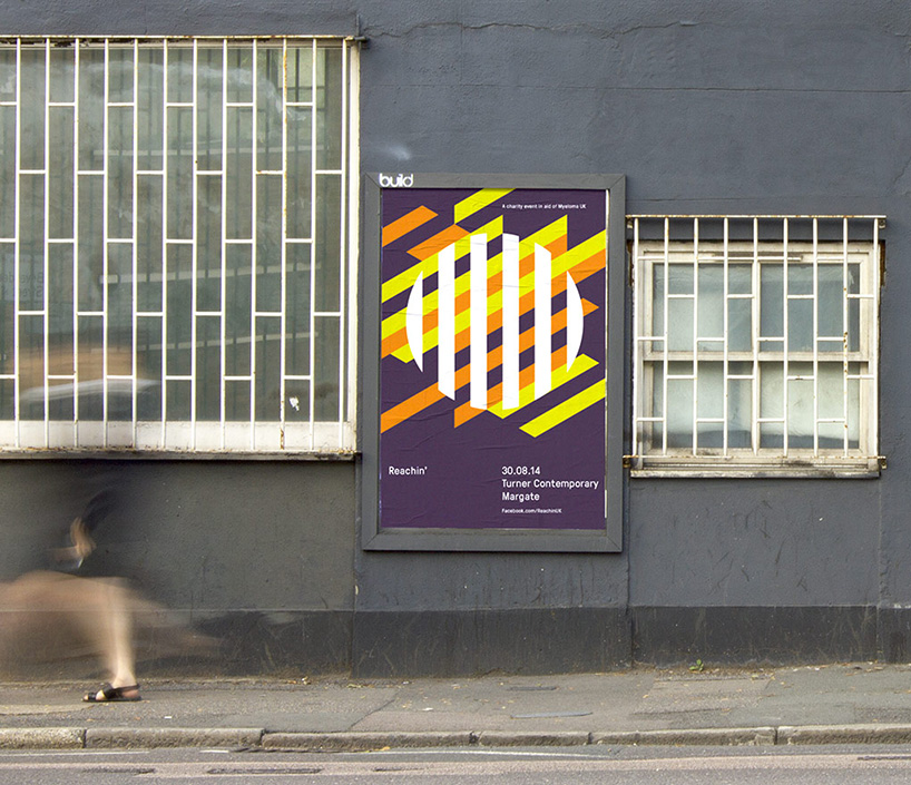
poster
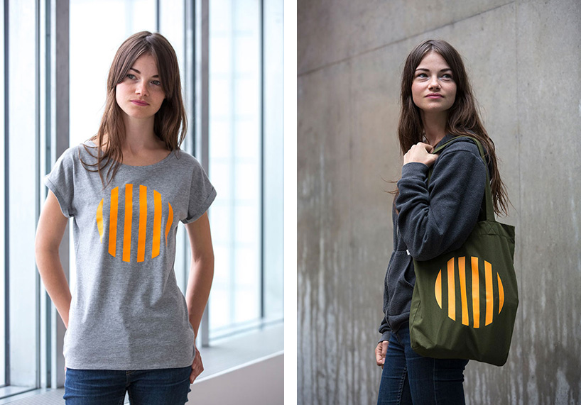
t-shirt and bag
KEEP UP WITH OUR DAILY AND WEEKLY NEWSLETTERS
LOGO DESIGN (244)
 Aug 14, 2023
 Aug 02, 2023
POSTERS (78)
 Mar 28, 2024
 Mar 06, 2024
 Jul 29, 2022
 May 26, 2022
PRODUCT LIBRARY
 Apr 17, 2024
a powerful symbol of the house’s cultural heritage, the jockey silk with colorful geometric motifs is an inspiration for leather goods and textiles.
connections: +670
 Apr 15, 2024
watch our livestream talk with BMW Design at 19:15 CEST on monday 15 april, featuring alice rawsthorn and holger hampf in conversation.
connections: +320
 Apr 15, 2024
the solo show features five collections, each inspired by a natural and often overlooked occurence, like pond dipping and cloud formations.
 Apr 12, 2024
discover our guide to milan design week 2024, the week in the calendar where the design world converges on the italian city.
connections: 47