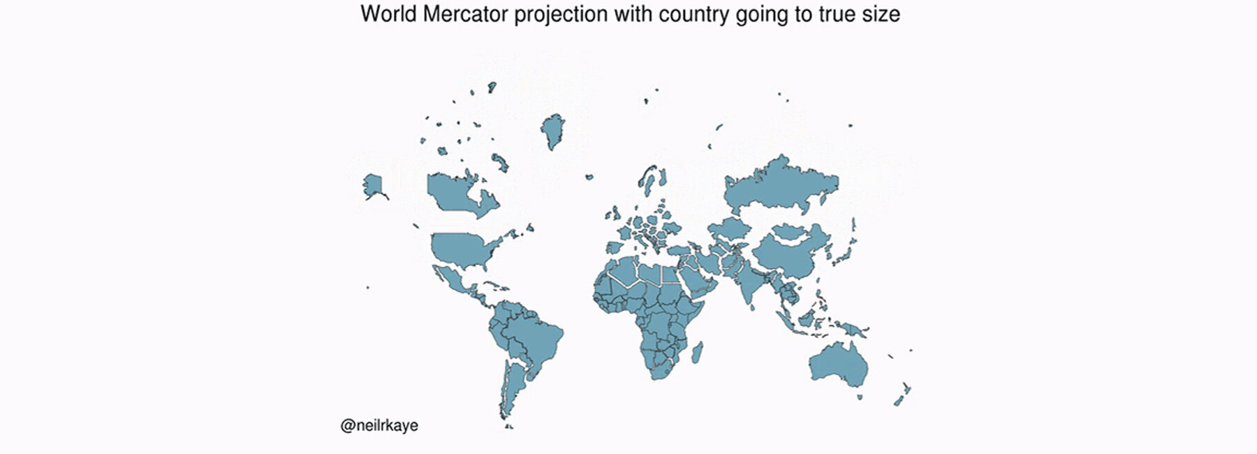
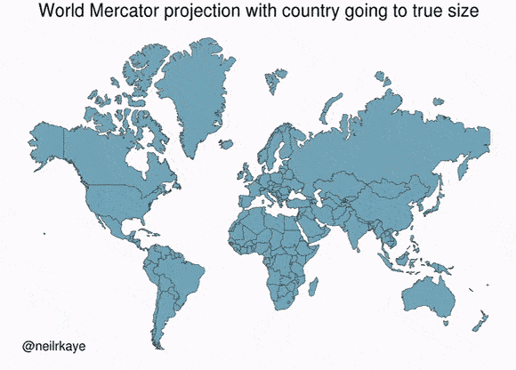
created in 1596, the maps that we currently use are surprisingly inaccurate at reflecting the true size of many countries. these maps were invented by gerardus mercator who was able to portray the correct shapes of the land masses but favored wealthy territories to the north, exploding them in size. neil r kaye — a climate data scientist at met office — has come up with an accurate world map that shows the countries on the northern hemisphere are, well, much smaller than what we typically think.
images and animated gif by neil r kaye
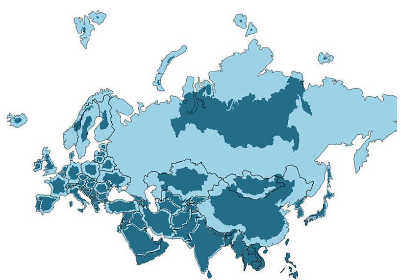
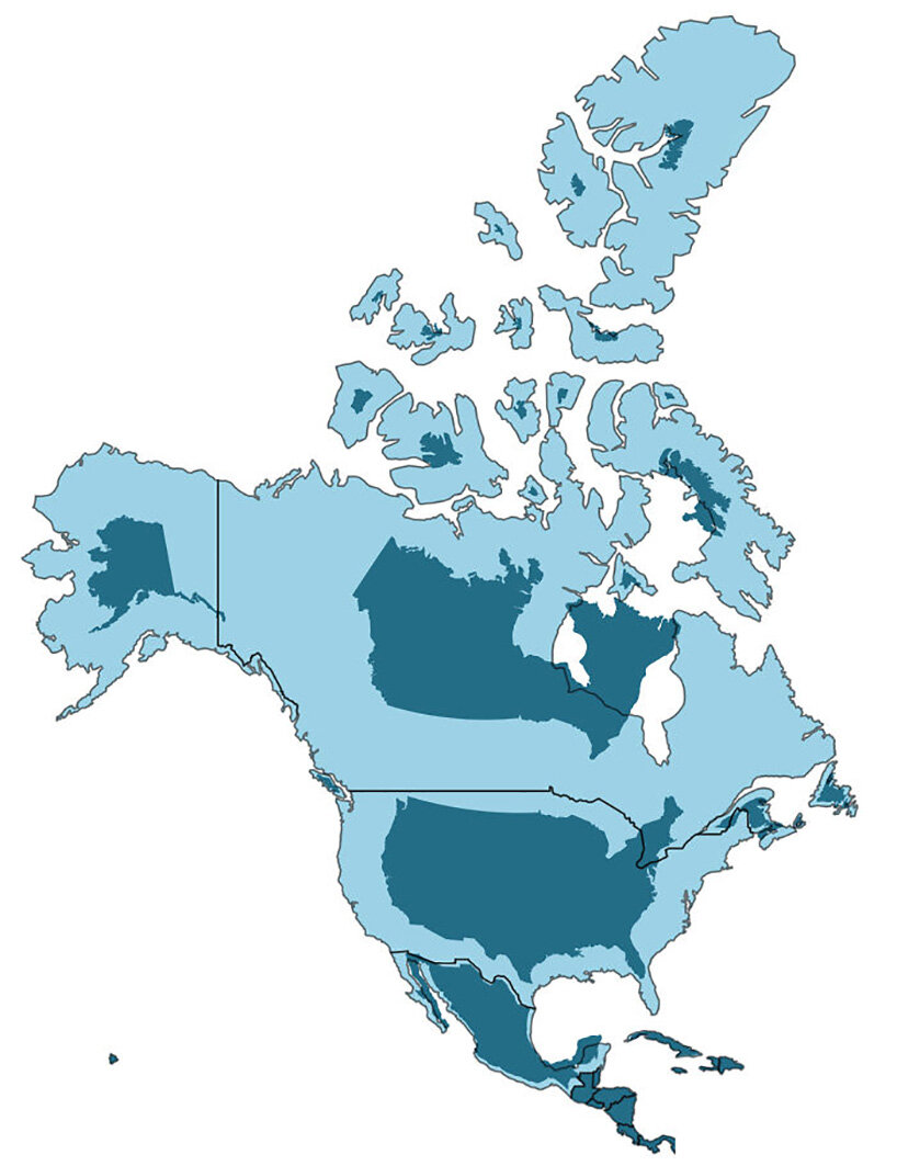
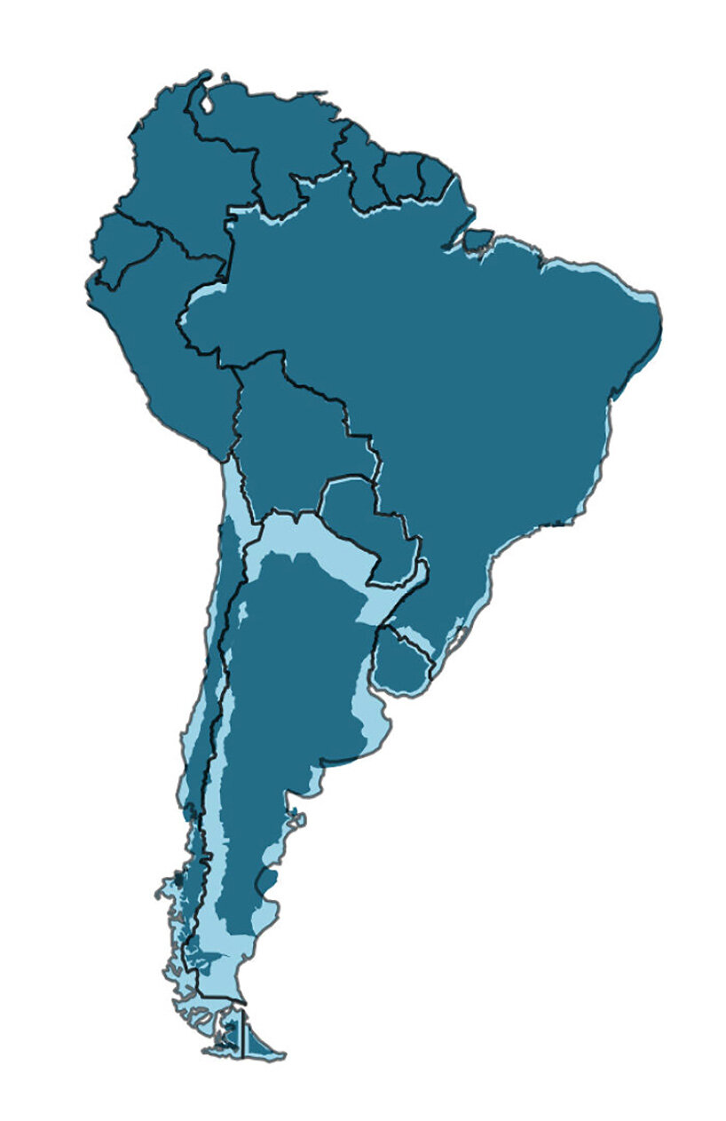
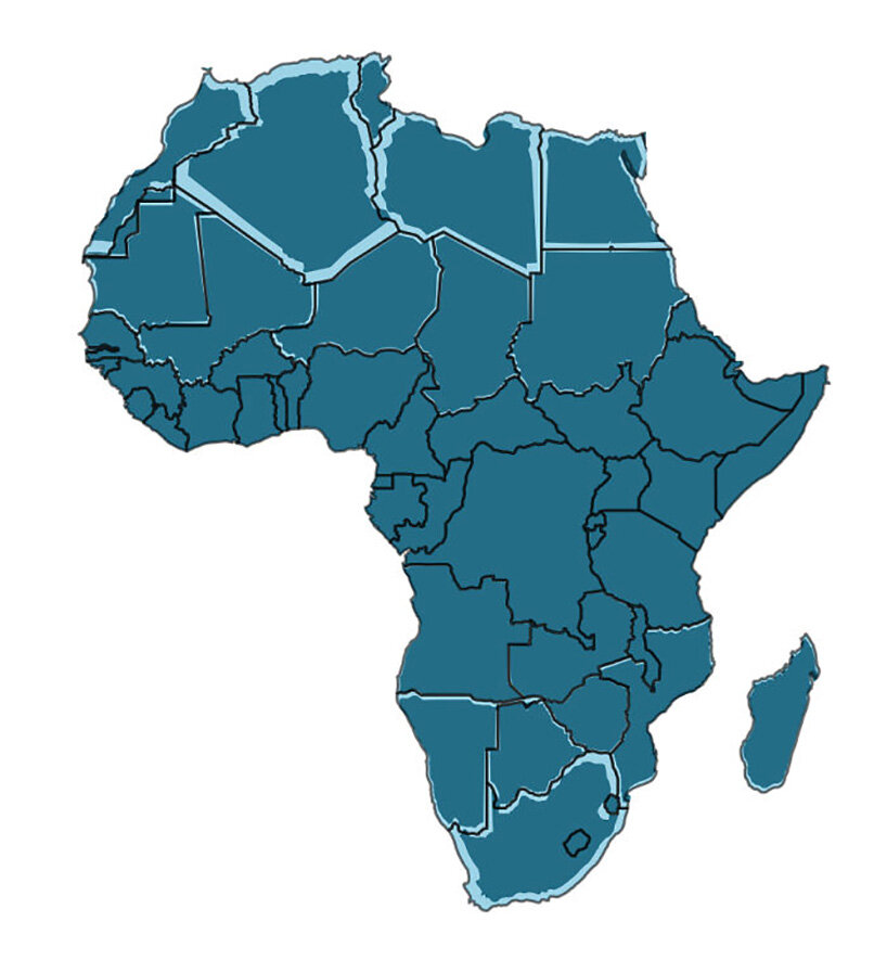
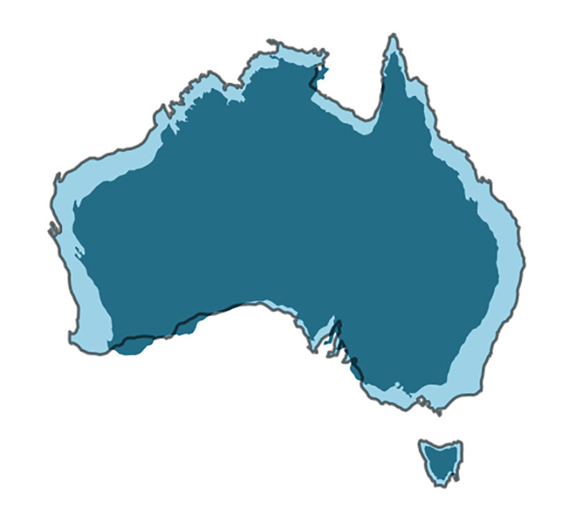
so what is wrong with the mercator map? let’s start with africa, which is 14 times larger that greenland and yet on the map both are shown almost equal. now let’s move to south america, where brazil is more than five times larger than alaska in reality, whereas in the map alaska is shown larger than brazil. another example is russia which we believe is quite large and in reality is smaller than africa. the same can be seen with greenland, canada and the us, in a map that presents overall an eurocentric colonial view of the world.
‘each country is projected to the spherical projection and placed at the center of where it appears in the natural earth projection,’ kaye explained on reddit. ‘there was then some manual tweaking of countries that are closer to the poles, demonstrating you can’t fit shapes on a sphere back together again once you put them on the flat.’
map art and design (56)
 Jul 23, 2023
 Jul 29, 2022
 Nov 06, 2021
 Jun 13, 2021
 May 30, 2021
PRODUCT LIBRARY
 Jul 23, 2024
 Jul 01, 2024
 Jun 13, 2024
 Jun 06, 2024