
rio 2016 multisensory paralympic logo by tátil design de ideias
the logo for the rio 2016 paralympic games is a shape and symbol intended to be accessible to all individuals, due to its multisensory nature.
rio 2016 multisensory paralympic logo by tátil design de ideias
brazil-based creative agency tátil design de ideias has created the logo for the rio 2016 paralympic games. invited by the international paralympic committee (IPC) to create the symbol of the paralympic games, the tátil design de ideias logo references the traditional olympic brand, yet speaks to a more accessible or approachable shape. the team devised an off-balance human heart formed from an infinity sign. the rio 2016 paralympic symbol is accessible to all individuals, as the shape of the logo is one which IPC and tátil design de ideias believe honors the multisensory necessity of a world comprised of capable people with varied refinements in sense.
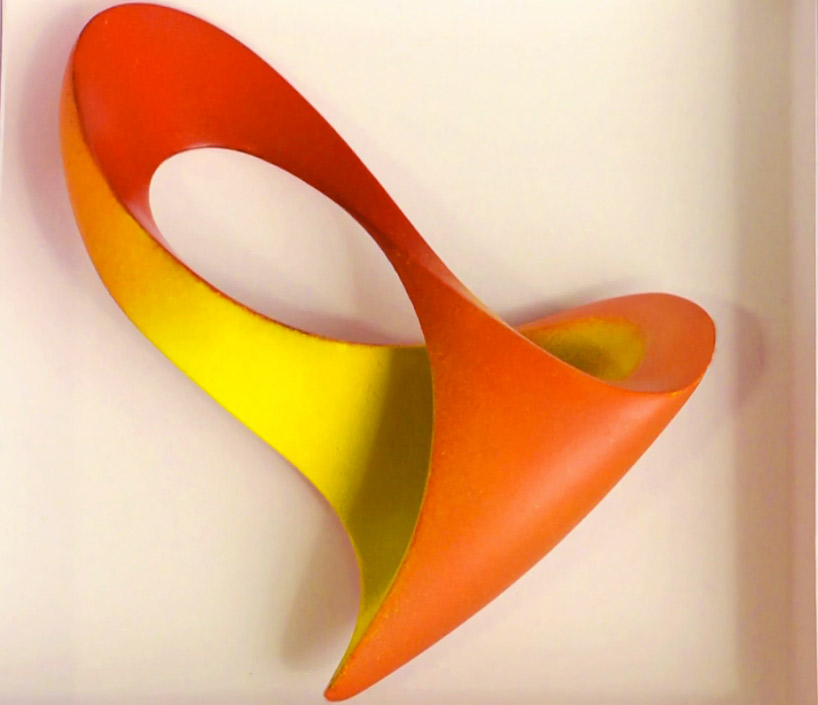 a model of the heart shaped design
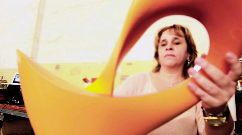 production process
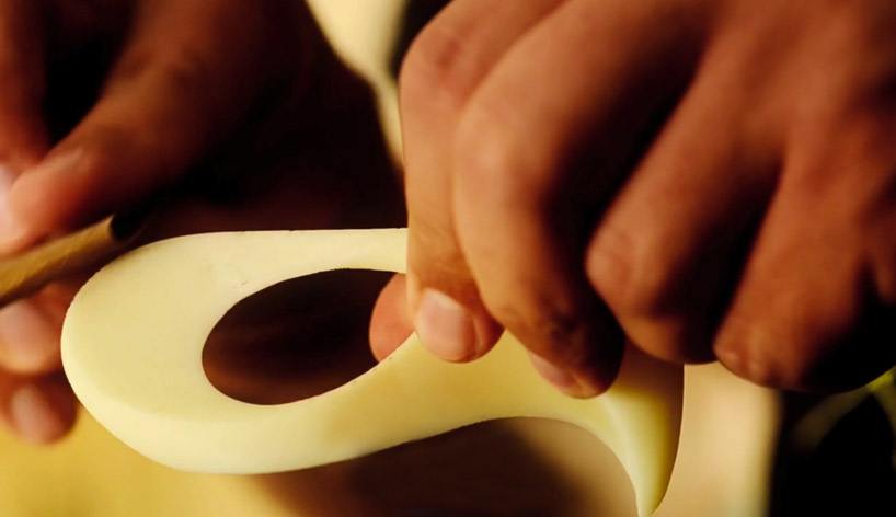
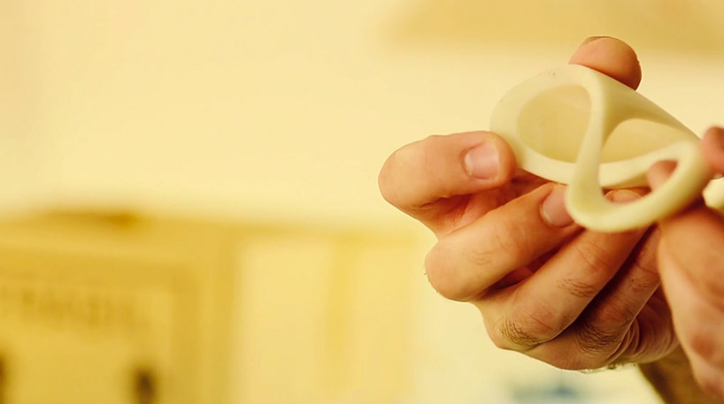
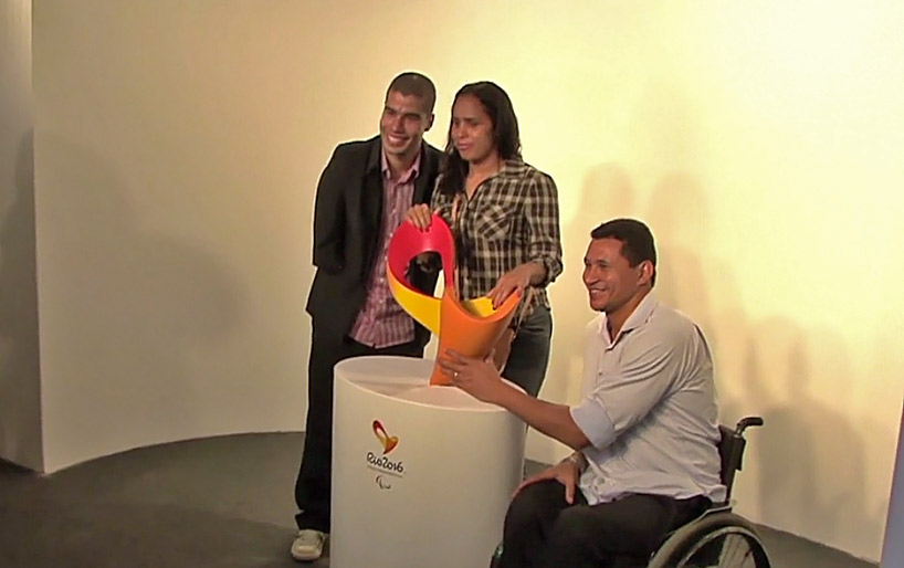 blind brazilian paralympic medalist adria dos santos remarked that touching the sculptural form of the symbol ‘revived all the excitement of [her] career’
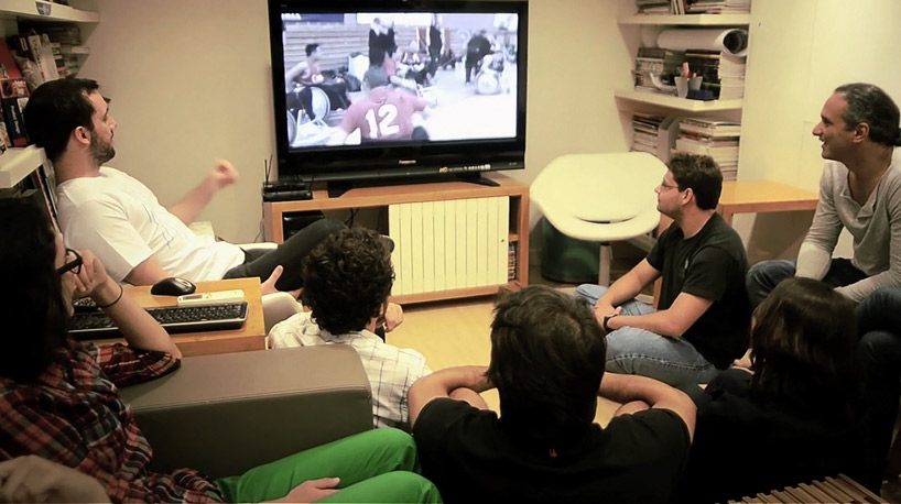 in the initial stages of the design process, the team watched hours of footage of previous paralympic events
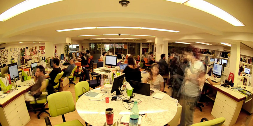 the office of tátil design de ideias at work
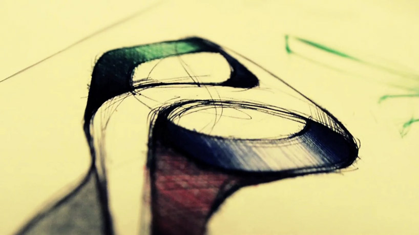 conceptual drawing
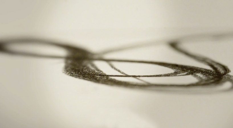
rio 2016 multisensory paralympic creation explanation brand
video documentation of the making of the paralympic symbol for rio 2016
shop
your own online design shop — no sales commission collected