COLOR RUSH EXHIBITION BY SABINE MARCELIS AT THE VITRA SCHAUDEPOT
Back in 2016, the VITRA Design Museum unveiled the Herzog & de Meuron-designed Schaudepot. The striking brick structure was built to provide the institution with a venue for publicly presenting key objects from its extensive collection.
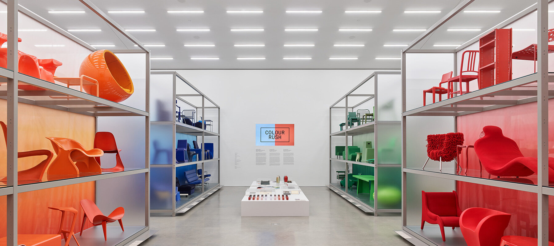
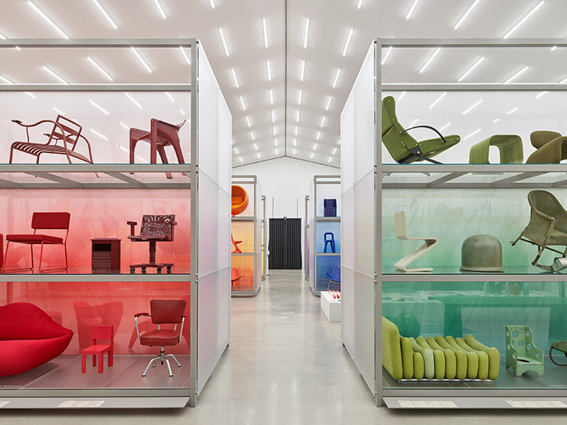
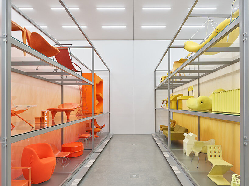
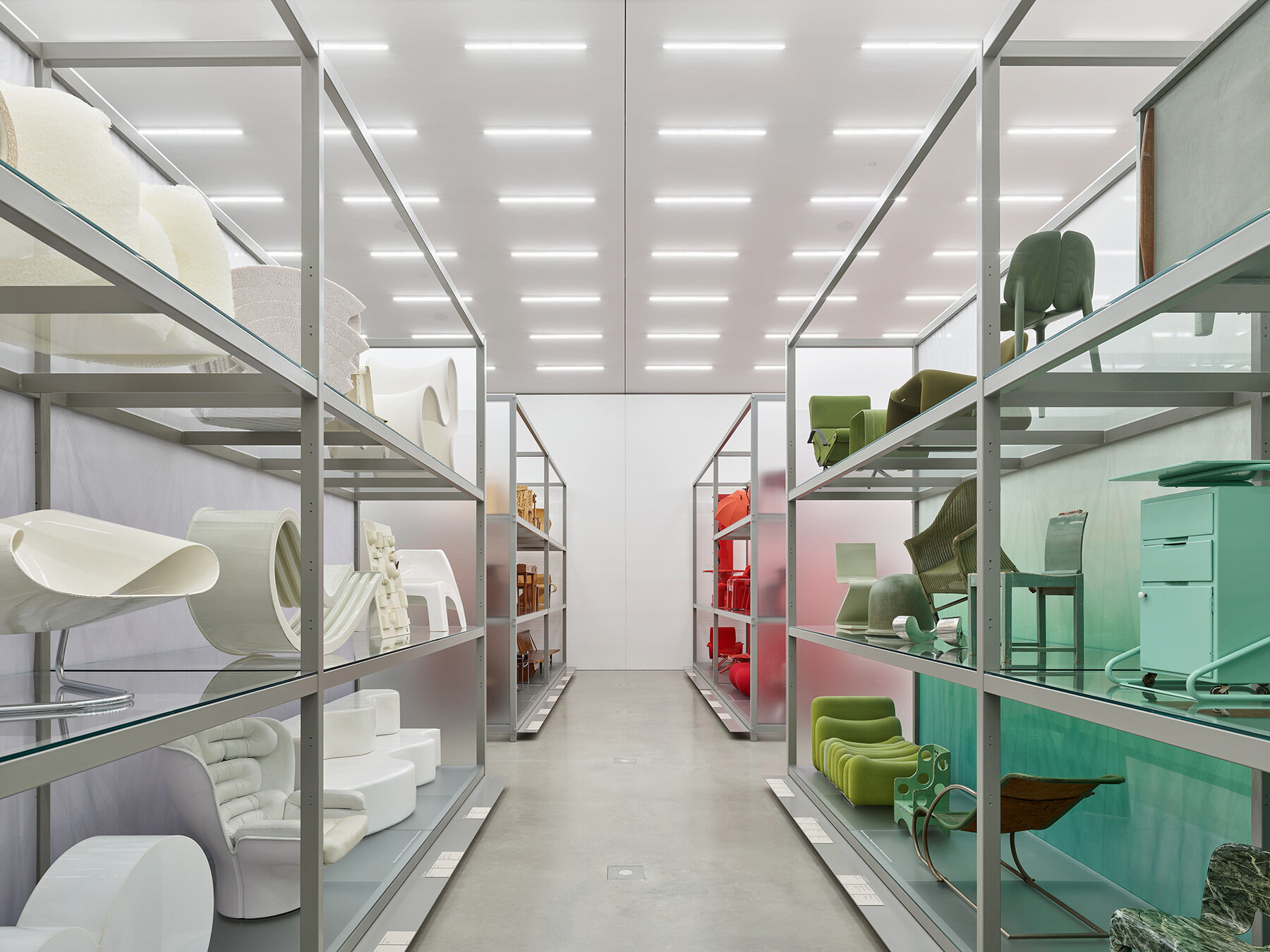
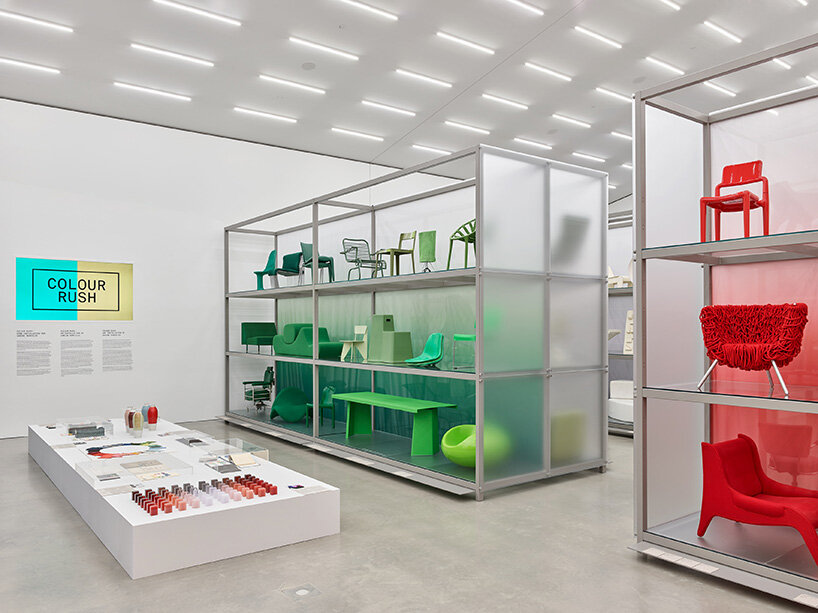
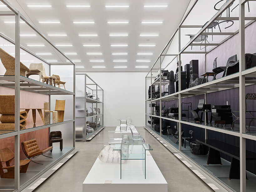
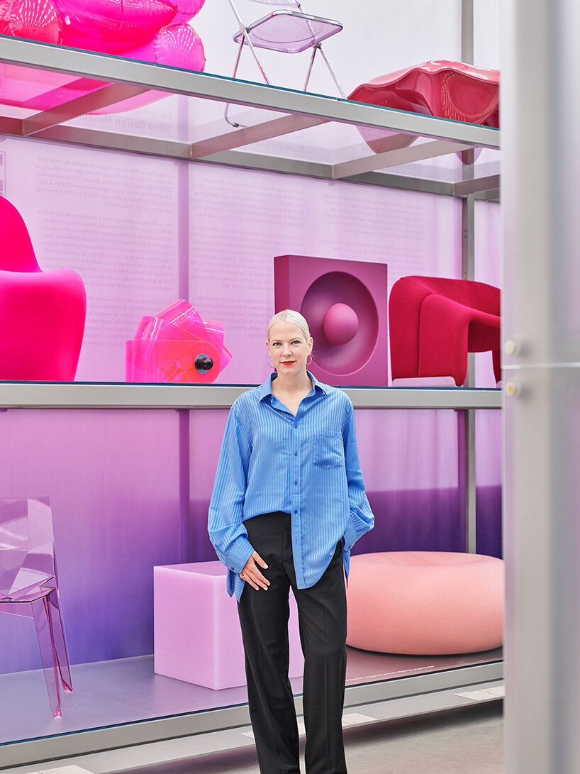
On display from May 2022 to May 2023, this year’s annual presentation sees Dutch designer Sabine Marcelis sort VITRA’s four hundred exhibits by color, resulting in a rainbow arrangement of products that create a dialogue between different periods and styles, while providing an overwhelming immersive experience.
images © Vitra Design Museum / Mark Niedermann
THE PRODUCTS FORM A RAINBOW GRADIENT
‘Our world is full of color,’ comments the official release. ‘Its various shades unleash emotions, assist orientation, indicate functions or perils, and mark cultural, political, professional, or religious identities. Although each of us perceives colors in their own way, all times and cultures have symbols and traditions distinguished by specific hues. This is one reason why colors play a central role in the design of interiors, fashions, and public spaces. But the colors we choose for our clothes and homes also reveal personal predilections and contemporary trends.’
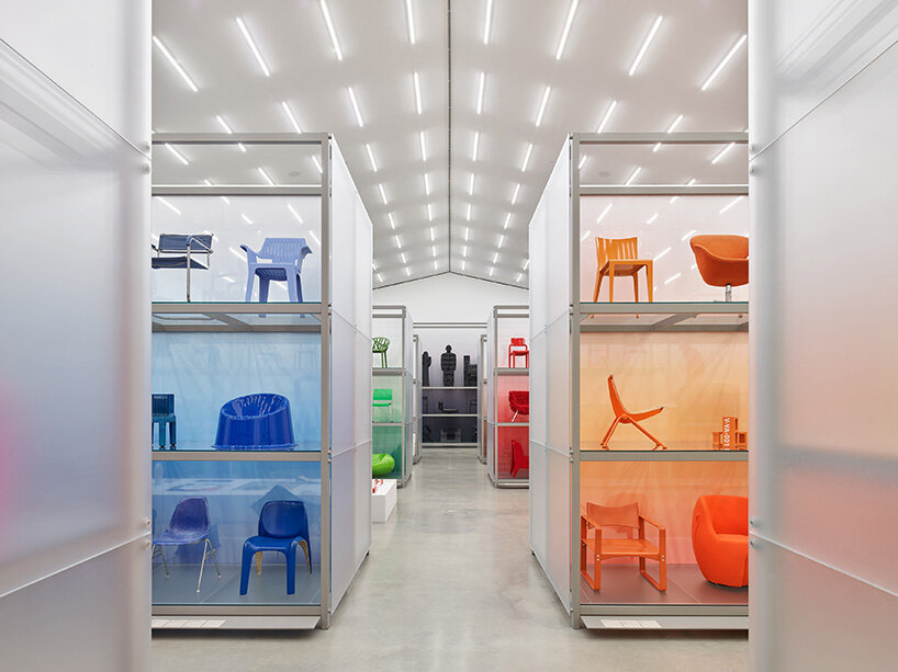
Titled Color Rush, the exhibition designed by Sabine Marcelis at the VITRA Schaudepot is an homage to the role of color in design across all periods and styles. Once immersed inside the brightly-lit space, visitors discover contrasts, tonalities, and intensities, while understanding the added effect of material and surface. The show is an example of why choosing color is such an important part of home and furniture design.
For example, natural colors are used in cozy atmospheres while bright hues are intended for unconventional attitudes. On the other hand, the lack of a color treatment may express a minimalist or purist philosophy.
With the exhibition, Marcelis continues with the color passion many creatives have had in the past. From Le Corbusier’s palette of carefully branded shades, to Panton’s vivid hippie colors, all the way to Hella Jongerious who states she doesn’t have a favorite color.
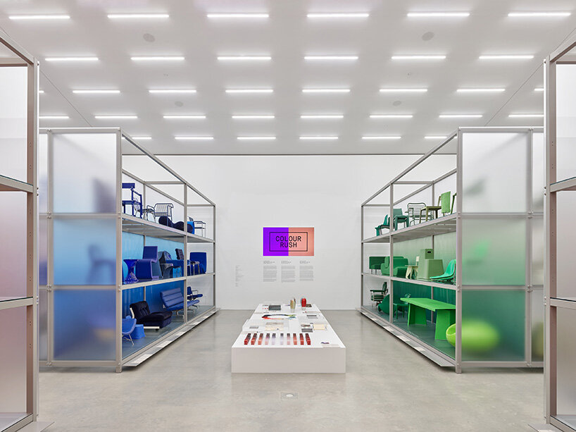
The examination of color is central to the work of Sabine Marcelis, who has built a personal style around shiny surfaces, pastel color gradients and refractions. For Color Rush, she teamed with the collection curators to select nearly four hundred objects representing different color groups. The resulting color gradients create an immersive experience that results in a majestic understanding of the museum’s collection and the colorful history of modern design.
exhibition info:
name: Color Rush
location: VITRA design museum
exhibition design: Sabine Marcelis
dates: May 2022 – May 2023
dbinstagram (2250)
 May 22, 2024
 Nov 10, 2023
 Dec 20, 2022
 Dec 13, 2022
 Oct 26, 2022
exhibition design (589)
 Jul 23, 2024
 Jul 23, 2024
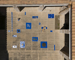 Jul 22, 2024
 Jul 16, 2024
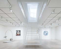 Jul 15, 2024
sabine marcelis (23)
 Apr 16, 2024
 Apr 02, 2024
 Dec 14, 2023
 Oct 28, 2023
 Aug 30, 2023
vitra (99)
 Jun 18, 2024
 May 21, 2024
 Mar 26, 2024
 Aug 31, 2023
 Jun 20, 2023
PRODUCT LIBRARY
 Jul 23, 2024
 Jul 01, 2024
 Jun 13, 2024
 Jun 06, 2024