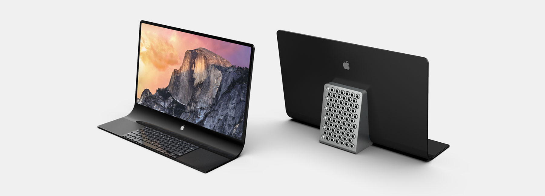
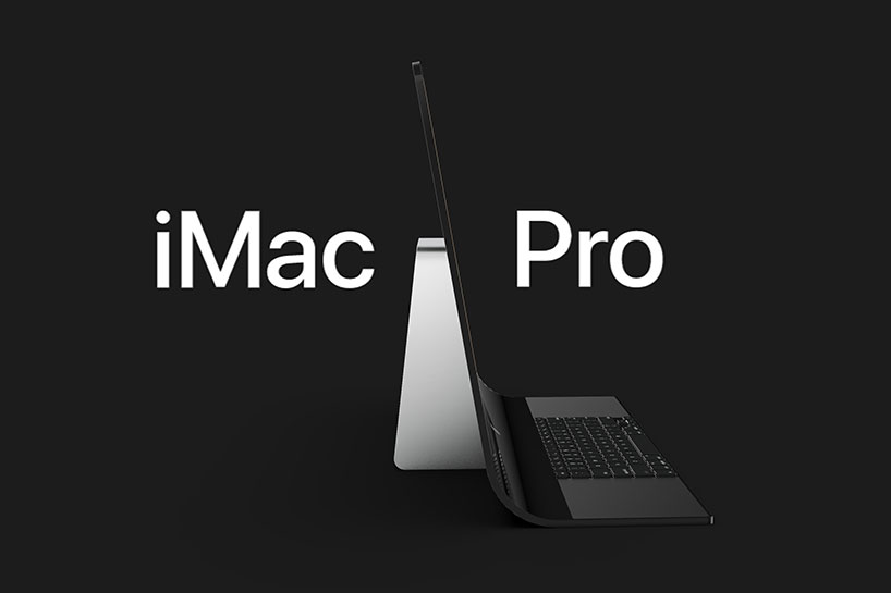
last month, the US patent and trademark office published one of apple’s latest patent applications for a potential iMac pro design. the patent — first filed in may 2019 — hints at drastic changes in the overall aesthetic of the current iMac, which has not been updated since 2012. sarang sheth, an industrial designer, took the measurements from the official diagram and visualized a conceptual look-book of the product using 3D modeling software, rhino and rendering software keyshot.
3D modeled and rendered by sarang sheth
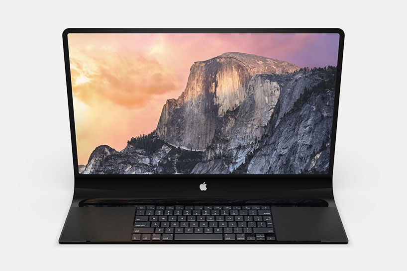
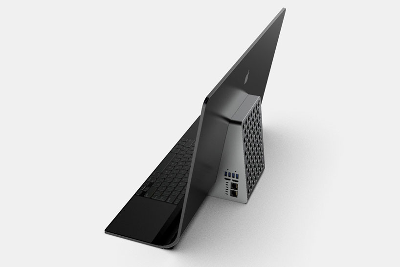
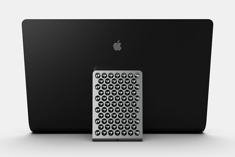
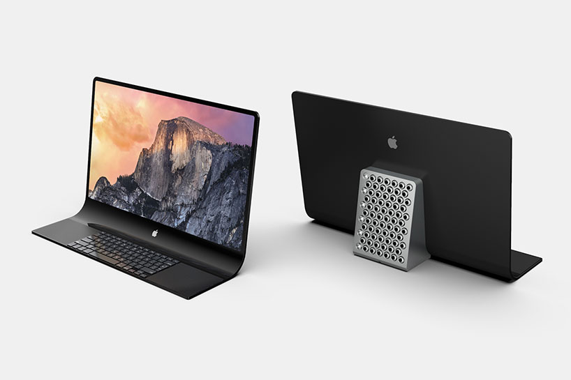
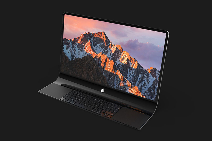
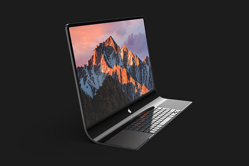
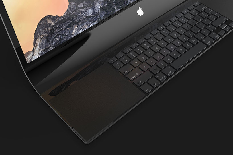
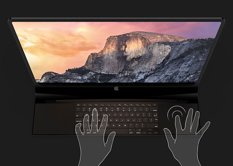
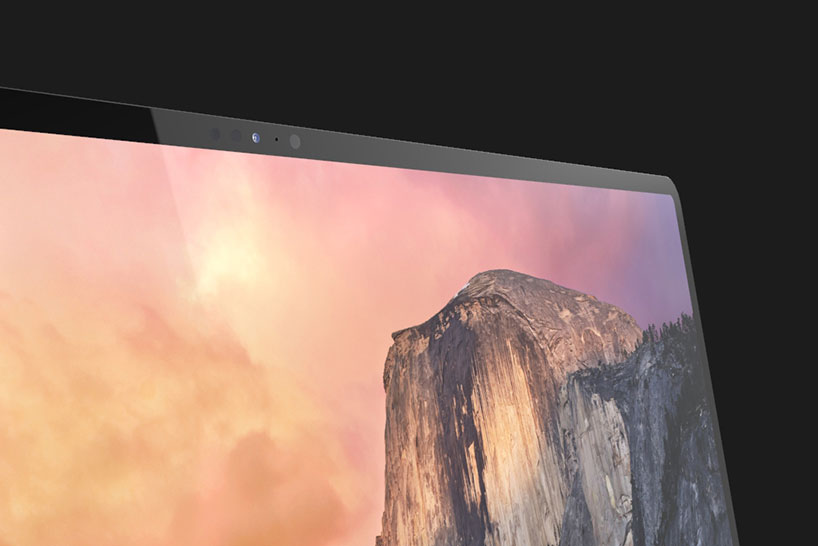
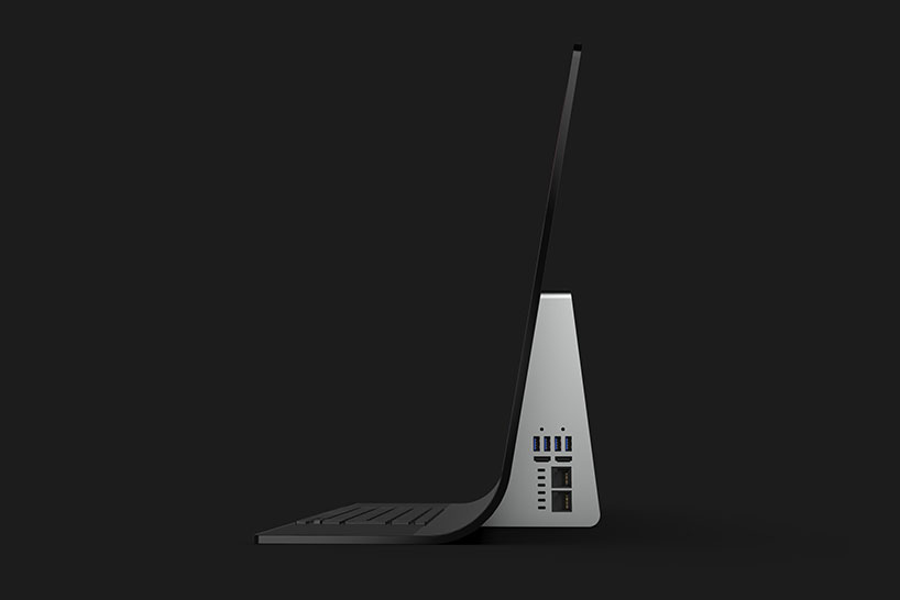
simplified into a glass unibody, the all-in-one apple iMac pro seamlessly transitions down from the screen to the keyboard and two trackpads in one motion. on the back of the screen, all of the macintosh computing hardware can be found in an aluminum cheese-grater casing. the desktop would also feature a 24-inch retina display complete with a glowing apple logo in the middle, a faceID camera module, and outlet for 4 USB ports.
sheth, who is also the editor-in-chief at yanko design, has shared multiple product shots of his rendered model, finished in apple’s iconic space black color — see sheth’s original article on yanko design here.
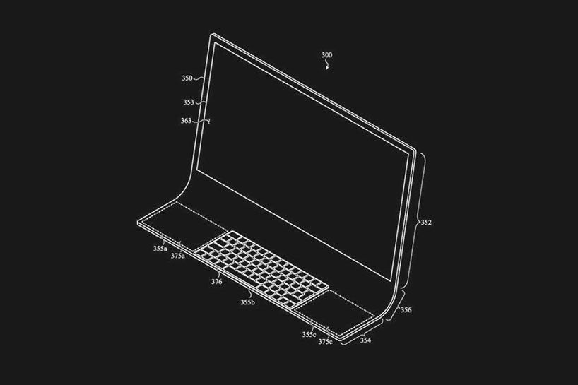
official patent drawing by apple
project info:
official patent: apple iMac pro
designer/visualizer: sarang sheth
3D software: rhino 6
rendering software: keyshot 9
apple (174)
 Jun 27, 2024
 Jun 10, 2024
 May 24, 2024
 Apr 03, 2024
PRODUCT LIBRARY
 Jul 23, 2024
 Jul 01, 2024
 Jun 13, 2024
 Jun 06, 2024