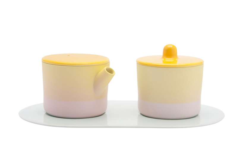
‘s.b. 33’ milk & sugar set in yellow / pink / light blue
working together with 1616 arita japan–one of the oldest japanese porcelain manufacturers– scholten & baijings have conceived a very comprehensive service. consisting of bowls, candleholders, cups, plates, serving platters, vases and a tea set, the ‘color porcelain’ collection has been produced as different series: minimal, colourful, and extraordinary, which refer to the intensity of the hand painted color, details and patterns used to finish them.
situated in the nishimatsuura district in japan’s saga prefecture, arita is known for its distinctive porcelain, where the tradition of painting the vitrified translucent ceramic dates back to 1616, when abducted korean potter yi sam-sam-pyeong discovered a superior quality clay in the region. focusing on this historical practice, the dutch designers prepared a colour analysis which involved archived masterpieces, looking into those japanese pigments which have played a prominent role in the production of works made from the natural materila including aquarelle blue, light green, red-orange and yellow ochre.
scholten & baijings have used these hues individually in their work, however collectively forming the specific arita colour spectrum. the resulting layered compositions are executed in different shades of glaze in combination with the natural porcelain colour– the latter encompassing a special delicat grey-white tone which makes it unique in the world. the combination of traditional craftsmanship and sholten & baijings’ signature style results in mix of asian and european culture which creates a dialogue between applied art and everyday use.
 ‘s.b. 49’ cup & saucer in yellow / pink
 ‘s.b. 40’ teacup in orange / grey
 ‘s.b. 54’ teapot in white / light blue
 left: ‘s.b. 53’ container in pink / gridright: ‘s.b. 51’ container in light blue / grid

 ‘s.b. 29’ bowl in white / red


 left: ‘s.b. 64’ low vase in white / pinkright: ‘s.b. 69’ high vase in white / light blue
 stefan scholten of scholten & baijings at the london design museum’s ‘designs of the year 2013’ exhibition where ‘colour porcealin’ is being showcasedimage © designboom
 the extensive range of pieces which include candle holders, teacups, vases and platesimage © designboom
 the pieces are finished in hues which collectively form the specific arita colour spectrumimage © designboom
 documentation of the hand production of each pieceimage © designboom
 stefan scholten explaining the development of ‘colour porcelain’ to designboomimage © designboom
designs of the year 2013 (6)
 Jul 05, 2013
 Mar 26, 2013
 Mar 24, 2013
 Mar 21, 2013
 Jan 14, 2013
scholten and baijings (17)
 Jun 12, 2016
 Apr 15, 2016 Jun 07, 2015
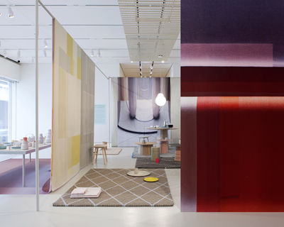 Oct 19, 2013
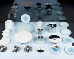 Apr 12, 2013
 Mar 10, 2026
 Mar 08, 2026
 Mar 04, 2026
 Feb 24, 2026