
spin rebrands google think tank ‘jigsaw’ with puzzle piece motif
all images courtesy of spin
london-based design studio spin has completed the graphic rebrand of jigsaw — a cross-sector, inter-disciplinary think tank created by google, formerly called ‘google ideas’. the name ‘jigsaw’ reflects the vision of the brand as it aims to tackle difficult geopolitical issues alongside a teams of engineers, research scientists, product managers, and issue experts. it also acknowledges the creators’ belief in collaborative problem solving, and that any puzzle is best answered when many different people look for the missing pieces together.
the rebrand reflects the values of jigsaw — an inter-disciplinary think tank created by google
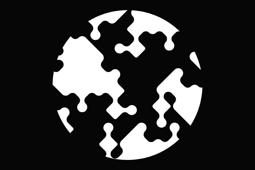
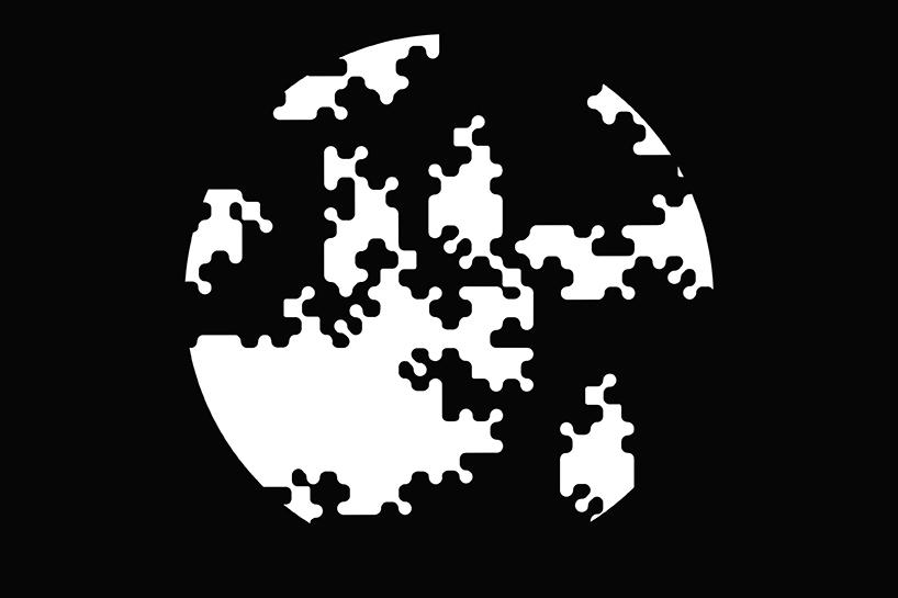
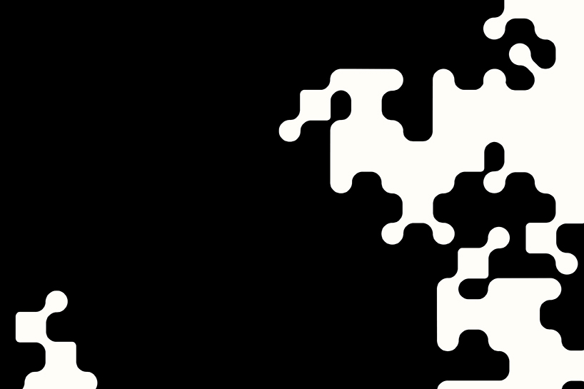
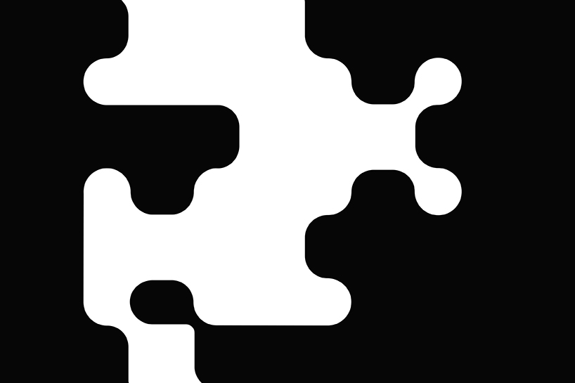
the new identity system sees the brand name adopted as a visual motif — puzzle pieces make up the capital letter ‘J’, while graphic patterns are formed from cut-out components. these segments are used to build images that recall the image of a globe, alongside more abstracted versions that reference problem solving skills and interdisciplinary collaboration.
we spoke with tony brook, creative director of spin, who told us more about the project brief, the most challenging aspects of the design process, and the visual language realized for the brand.
the organization of puzzle piece motifs forms the abstract image of a globe
designboom: how did the project come about?
tony brook: the ‘google ideas’ team approached us about helping them create a new brand for them. they were familiar with our work, and when we happened to be in new york we came to their offices for a chat.
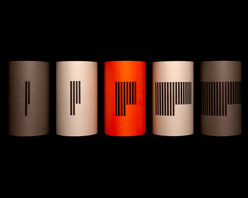
various configurations can be made using the identity symbols
DB: what brief did you get from google?
TB: to give a new identity and impetus to the work ‘google ideas’ was already undertaking in helping protect vulnerable internet users from outside interference, especially those who are working in difficult political environments. they wanted to lose nothing of the brand they had already built, but give even more meaning to what they wanted to create.
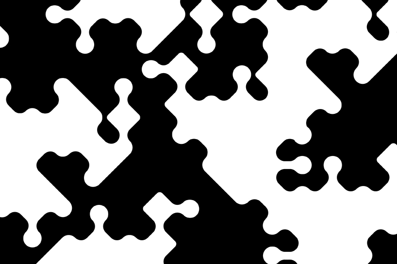
abstract patterns are formed by the configuration of the jigsaw motif
DB: how did you interpret the brief and what objectives did you set yourselves – what was important to see in the final solution?
TB: we wanted to create an identity that has a strong but flexible visual language that could adapt itself to different requirements. the solution manages to reflect the name without being clichéd. it has a distinct flavor.
the graphics relay ideas about the relationship between people and places
DB: what was the most challenging aspect of the project?
TB: finding a name as always, we went through hundreds of names, but in the end it came from jared cohen, founder and president of jigsaw and we all agreed it felt right.
LOGO DESIGN (244)
 Aug 14, 2023
 Aug 02, 2023
SPIN (3)
 Apr 19, 2015
 Mar 09, 2015
PRODUCT LIBRARY
 Apr 15, 2024
 Apr 15, 2024
 Apr 12, 2024
 Apr 04, 2024