since 1924, umbro has produced some of football’s most iconic kits. their designs have been worn by the game’s biggest names, revered for their beauty and occasionally caused controversy. umbro’s current home and away kits for the english national team were developed in collaboration with the fashion designer aitor throup under the banner ‘tailored by umbro’. the kits stand out for their minimal styling and unique construction.
designboom spoke to aitor throup and catherine rees of umbro about the ‘tailored by umbro’ strips…
— aitor throup:
DB: how does working on sportswear differ from working on other kinds of clothing? AT: my approach to design is more connected to traditional ‘sportswear’ than traditional ‘fashion’. at the heart of my work is an on-going study of the human anatomy in motion, and a search for new 3-dimensional garment solutions. I am also excited about inventing new functional garment features. all of these approaches go directly hand-in-hand with performance apparel design – the thought process is really similar.
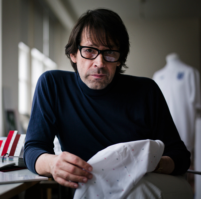
 aitor throup
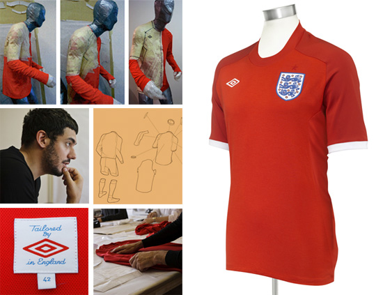
what has been the biggest challenge of working with umbro? probably the changing and evolution of the process between design, development and production. I always construct my own blocks and patterns specifically for each project I work on, and from the first instance I began developing a football-specific ergonomic and articulated block with umbro. this was a new way of looking at garment design for them, because all of a sudden I was bringing my life-size custom made football mannequins to meetings and we began to internally develop products in 3D rather than 2D.
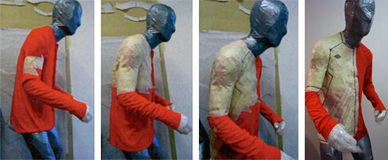 making of the england away kit – the kit was constructed on custom made ‘football’ mannequins.
what did you set out to achieve with the ‘tailored by umbro’ designs? when I started working with umbro, they were at a very important pivotal stage. nike had recently acquired them and the big idea was to re-instate umbro’s unique heritage in a contemporary and relevant way, which seemed like an extremely exciting challenge.
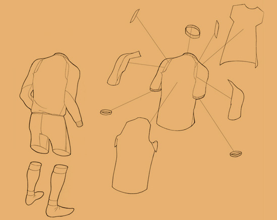 break down of the new england away shirt – sketch by aitor throup
the first part of the process didn’t even involve design in any way – it was a rich and deep analysis and study of the history of umbro as a brand and of football as a sport. this paved a very logical path for us to embark on. everything made a lot of sense from the beginning, and everyone was instantly convinced of what umbro should be and represent.
throughout the first part of the initial research process we had begun to accumulate imagery and information, and we began to categorize this into terms such as: ‘uncluttered’, ‘smart’, ‘crafted’, ‘construction’, ‘detail’, ‘fit’ these were all terms that we wouldn’t have instantly associated with football and kits, but they were consistently present throughout our exploration. then we made an important discovery: we found an early football shirt by umbro in the archive of the national football museum in preston, and the back neck label said: ‘tailored by umbro in england’. then we realized: as umbro was founded in 1924, this was before a ‘sportswear’ industry even existed … anyone who made clothes in those days were effectively ‘tailors’ – and therefore they approached garment design and construction with a tailoring mentality.
‘tailoring’ was the term that united and explained all the images we had previously gathered and categorized. we had to generate a way of re-instating a tailored approach into football apparel design in a relevant way. my own work has been described as forward-thinking tailoring, due to the fact that I ‘build’ garments on my own sculptures. as umbro were originally tailors working on football apparel, it seemed logical for me to get involved and apply the concept of tailoring in a performance context.
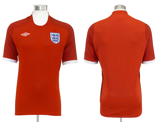
the construction and materials are developed with regular feedback from the players and manager. the shirt is designed on an articulated mannequin, which means that there are no traditional seams, allowing the shirt to move with the body during play. a sloping neckline increases ventilation to the player body. the front body is a polyester / cotton blend that is 20 grams lighter than the england home kit.
what is the major differences / between the england kits’ and regular football kits? I think that in general modern football kits have for some time been too shiny, badly cut and have utilized a product language intended to make the designs look overtly ‘technical’. for example, a lot of designs include bits of inserted fabric in contrast colors, in random places, which don’t actually have a performance function – they are just intended to generate a ‘sporty aesthetic’ and result in a really fussy and cluttered appearance.
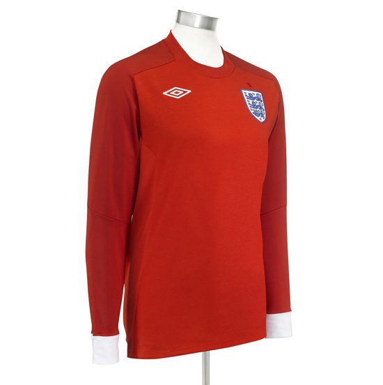 england away long-sleeve shirt
when you look at iconic football kits from umbro’s heritage, you instantly realize that the design language was much more refined and sophisticated back then – ‘timeless’ actually. we are trying to re-instate the same considered and refined approach to design, whilst incorporating modern technologies and fabrics, along with forward thinking pattern cutting. the form is probably the main focus for us – the majority of football kits seem to be constructed too big for the body, with enough room for the body to move inside of them. the new umbro kits are constructed to move with the body.
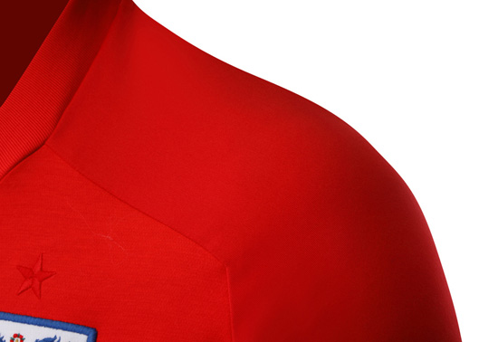 shoulder detail
what restrictions do you have with regards to using color and the ‘look’ of the kit? for both england kits so far (home and away) we have concentrated on a pure and minimal utilization of england’s traditional colours (white for the home kit, red for the away kit). it was instinctive to build on umbro’s heritage directly also through colour on these two new kits.
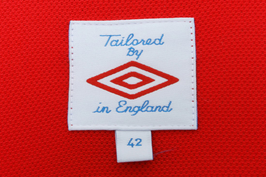 label detail – rather than being sold in sizes ‘large, medium, or small’ the shirts are sold according to chest size for a better fit.
did you look at the design of any other sportswear to help you see how the cut of the kit could be improved – such as the elbow and shoulder joints? no. such design features were simply developed through studying in detail how the body moves in a game of football. the idea of articulating garments so that the surface area grows and shrinks as your skin does is something I have been exploring for some time, and working with umbro it naturally evolved into a performance-specific solution.
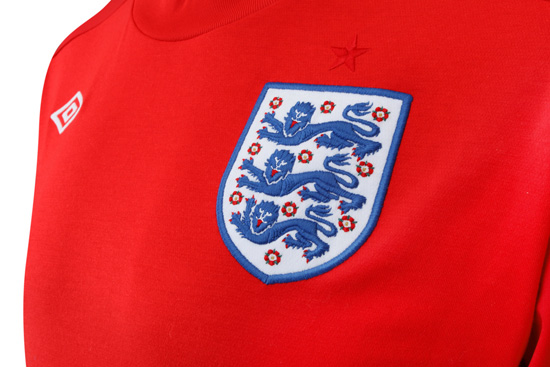 detail of england badge – the crest was simplified when the england home kit was launched in 2009.
are you a football fan and do you play football and has a personal interest in the sport given you any valuable insight when designing? I’m a big football fan – it’s definitely my sport of choice. I support burnley football club, which is where I grew up in the north of england. I also used to play football when I was younger but I suffered a bad injury playing football when I was 17. my ankle had to be screwed back together and that pretty much ended my football playing days, although I still enjoy a kick about now and again.
ironically, football is actually the one and only reason I became a designer. it was on the terraces of turf moor (home of burnley FC) that I was first introduced to the obsessive nature of how the football ‘casuals’ dressed. I was all of a sudden surrounded by this amazing uniformity and sense of style which consisted of mainly labels like stone island and CP company (and anything else connected to massimo osti). a group of us became as interested in the garments as in the football, and we would save money for a whole year just to be able to buy one coat. eventually my drawings (which I had been doing since I was a very young kid) and my interest in these garments came together and led me to explore a new path which eventually became ‘fashion’, although I had no interest in the traditional sense of the word.
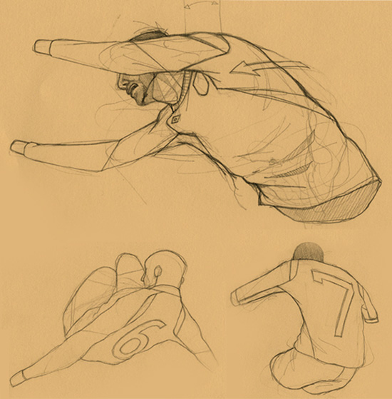 sketch of the new england away goalkeeper jersey by aitor throup
have the things you learned from working on the umbro kits fed back into your own clothing designs? fortunately, I have been able to grow and evolve by learning from every single project and collaboration I have worked on. working with umbro has exposed me to a whole new world of design, where things are purely designed for the benefit of the player’s performance. for me it’s imperative to work on things that have a true purpose or function – things that have a valid reason for existing beyond a stylistic one.
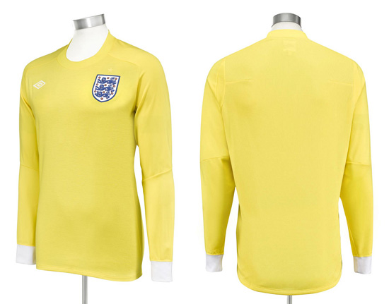 new england away goalkeeper jersey
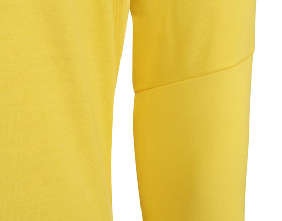 elbow detail
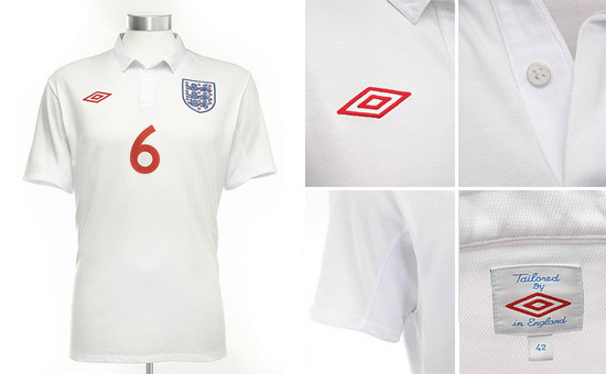 england home shirt – the shirt was designed by aitor throup in collaboration with saville row tailor charlie allen.
— catherine rees, umbro PR manager:
DB: what inspired umbro to create the ‘tailored by umbro’ range? CR: ‘tailored by umbro’ isn’t a range of specific clothing, it’s more of a philosophy that’s inspired us and the direction of the umbro brand. in the days before mass produced sports apparel, football garments were tailored, a skill that umbro prided itself in. the company boasted about it on the labels of its garments: ‘tailored by umbro in england’ this simple message caught the imagination of our creative team.
the football tailoring concept doesn’t just apply to the style of the kits. we aim to look at the specific culture around a team, the colors they wear, the key moments in their history and build a kit that references all these points whilst also looking to the future in terms of the technology used to create them.
why did you choose to work with aitor throup? we came across aitor’s work whilst he was studying for his MA at the royal college of art, london. umbro funds an annual design competition at the college, and aitor was the winner in 2006.
his work caught the eye because it’s rooted in ideas of movement and the body, something that is obviously extremely important in the creation of modern football kits, but it also contains clear parallels with the world of tailoring – so he was the clear choice to come on board here at umbro.
how have fans reacted to the ‘tailored by umbro’ kits? there has been an overwhelmingly positive response from both fans and football kit enthusiasts. we keep a close eye on how people talk about our products online, and we were delighted when the england home kit was voted as football shirt of the year by the public on footy-boots.com. since then, all the other shirts that have been created using the football tailoring philosophy have received a similarly positive response.
does the production of the kits mean they cost more than a regular football kit? the new england away shirt costs the same as the home, and we feel that the cost reflects the amount of research, craftsmanship, technology and design that has gone into its creation. the price reflects the quality of the overall product.
— some of the other ‘tailored by umbro’ kits:
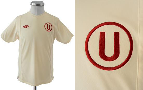 universitario (peru), home kit
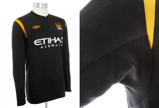 manchester city (england), away kit
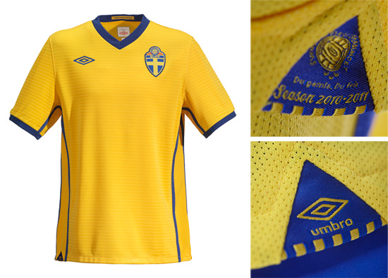 sweden national team, home kit
you can find more information on all of umbro’s latest projects over at the umbro blog.
all images courtesy of umbro.
— design-aerobics 2010: sports course interested in sports design? designboom are currently holding a two month online design education course on this topic, which began on march 8th, 2010. more info on how to enroll can be found here.
aitor throup (3)
super sport (103)
umbro (6)
PRODUCT LIBRARY
a diverse digital database that acts as a valuable guide in gaining insight and information about a product directly from the manufacturer, and serves as a rich reference point in developing a project or scheme.
