
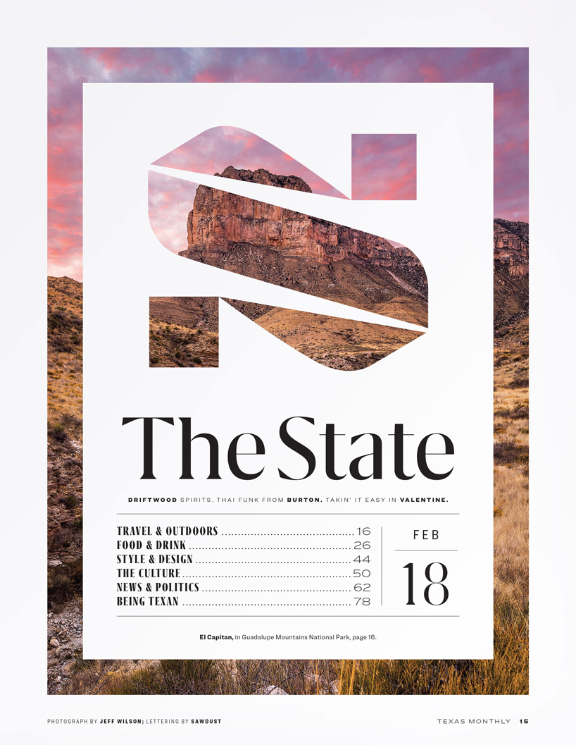
creative studio sawdust gives american magazine texas monthly a new look, crafting a fresh typographic identity for the near-half-century-old publication. the redesign, with its generous use of white space, is intended to give the publication’s photographs and illustrations more room to shine.
images courtesy of sawdust
the london-based studio, whose portfolio includes NIKE, the new york times and coca cola, has designed a typography for texas monthly‘s new lifestyle sections. created in conjunction with their recent magazine and website redesign, sawdust gives the magazine a modern refresh with emphasis placed on large drop caps and new 3D effect contents title lettering.
‘most of these changes stem from inspiration, none of them stem from desperation, and we hope we’ve avoided folly’, it reads in an editor’s letter on the periodical’s website. ‘but that’s for our readers to decide.’

typography design (133)
 Sep 13, 2023
 Feb 23, 2023
 Jan 24, 2023
 Jan 19, 2023
PRODUCT LIBRARY
 May 09, 2024
 May 06, 2024
 Apr 17, 2024
 Apr 15, 2024