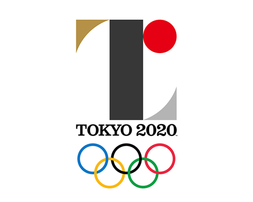
the official tokyo 2020 olympics logo by kenjiro sano was unveiled today in the japanese capital


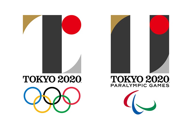
tokyo has unveiled the logos for the 2020 olympic and paralympic games – both form part of the official brand identity designed by kenjiro sano.


the tokyo 2020 games logo is an abstract capital T made with a black stem at its center, silver and gold serifs and a red dot to the upper right side – referencing the sun from the japanese flag. the logo is said to represent ‘the whole world coming together’ and ‘unity as one team’. the same elements from the 2020 games logo are re-organised to create the mark for the paralympic games – symbolising equality between all athletes.


both symbols are accompanied by a word mark reading ‘TOKYO 2020’ that appears to be set in a customized version of edouard hoffmann’s clarendon.


tokyo2020_olympics_logo_db02
the tokyo 2020 paralympic games logo by kenjiro sano


a video showing the concept behind the logo also hints at how it will be used as part of a broader identity scheme – the elements from the logos being repeated and scaled in different configurations that work alone or can be layered over the top of imagery and video.


official launch video for the tokyo 2020 olympics logo


here’s the official press release from the tokyo 2020 website:


‘when the world comes together for tokyo 2020, we will experience the joy of uniting as one team. by accepting everyone in the world as equals, we will learn the full meaning of coming together as one.


the tokyo 2020 emblems were created to symbolise the power of this unity.


the black colour of the central column represents diversity, the combination of all colours. the shape of the circle represents an inclusive world in which everyone accepts each other. the red of the circle represents the power of every beating heart.


these elements combine to create the emblems of both the olympic and paralympic games.


the tokyo 2020 olympic emblem is inspired by the t in tokyo tomorrow team


the tokyo 2020 paralympic emblem is inspired by = the universal sign of equality.


2020 is almost here.


let’s unite in the spirit of these emblems to stage an olympic and paralympic games for a better world and a brighter future.’


tokyo2020_olympics_logo_db03
stills from the official launch video showing how the 2020 olympic games logo re-configures into the tokyo 2020 paralympic games logo


tokyo2020_olympics_logo_db04
the geometric elements are repeated and scaled to different sizes to form a graphic pattern as part of the wider identity


tokyo2020_olympics_logo_db05
this pattern can then be used with video and photography as shown here…


tokyo2020_olympics_logo_db06
still from the tokyo 2020 logo launch film

tokyo2020_olympics_logo_db07
still from the tokyo 2020 logo launch film

tokyo2020_olympics_logo_db08
still from the tokyo 2020 logo launch film


tokyo2020_olympics_logo_db09
the tokyo 2020 olympic and paralympic games logos by kenjiro sano


the logos were unveiled on june 24th during a special event at the tokyo metropolitan government plaza to celebrate the five-year countdown to the 2020 games. following the unveiling, tokyo 2020 president yoshiro mori said:


‘the tokyo 2020 games emblem is a wonderful work of art that represents the aspirations and the ultimate goal that athletes around the world aim to achieve – taking part in the olympic games. the emblem is also a symbol behind which the whole of japan can unite as a single integrated body and join the collective endeavours of the tokyo 2020 organising committee, the tokyo metropolitan government, the national government, the japanese olympic committee, the japanese business community, as well as the games volunteers and everyone who is assisting with the preparations for the 2020 games. let us all unite our efforts under the new games emblems and work together as one to ensure the realisation of a truly inspirational olympic games in 2020.’