
the standard east village’s café and restaurant identities by triboro
triboro (who we interviewed last year) have just launched their new website. among the beautiful new projects featured on the site are two identities they designed for andré balazs’ hotel, the standard east village.
triboro told designboom more…
‘james truman from andré balazs properties brought us onto the project to create the identities for two very different establishments, one a relaxed café and the other a very high-end restaurant, lead by the amazing michelin-starred chef john fraser.
the goal was to have the identities of the two establishments not only have their own distinct personalities, but also to fit comfortably into the east village and maintain some connection/heritage with the bowery—similar to how the exterior architecture blends with the street through the townhouse.
our approach to design usually involves us seeking to imbue each project with some kind of soul. we really thought about the idea of each establishment as a new neighbor, whose personality will either be embraced by the surrounding community or rejected, and we ended up drawing from different inspirations to inspire each identity.’
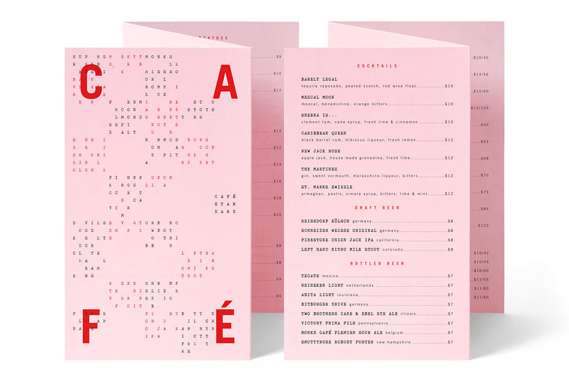
whenever possible the concrete poetry grew out of the application organically, in this case on a menu cover.
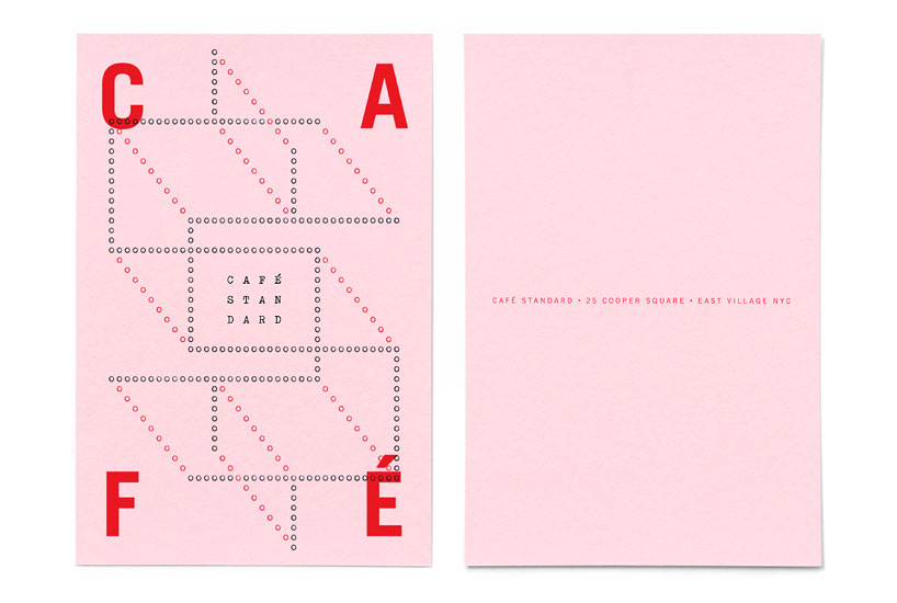
‘for the café we wanted to maintain some link to the history of poets and writers in the east village. people like allen ginsberg, william burroughs or jim jarmusch, who all lived nearby at different periods. the identity has two parts—the word c a f é which resides in and defines the corners of every application—and the other content that was typed out on a manual typewriter. the two parts play off each other, contrasting but still maintaining cohesion across different applications. also both parts communicate a sense of play and offer built-in opportunities for diversity. the typewriter really allowed us to play with language. amazingly, there is still one small shop in manhattan that restores and sells old manual typewriters. we sat there for hours testing different typewriters until we found one with the right mix of typographic characteristics. we then typed out all sorts of concrete poetry, textual alignments, and wordplay until we developed a series of compositions that fit to each application.’
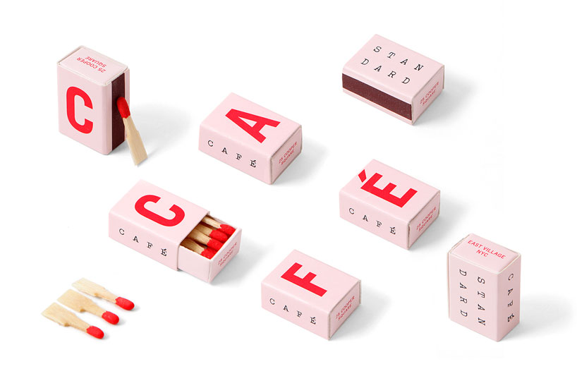
the tiny matchboxes (the size of a sugar cube) allowed us to play with the modularity of the identity system. we could spell out the full name with multiple matchboxes or break it up as individual letters.
the cafe’s receipt card includes a dollar sign typed out of zeros.
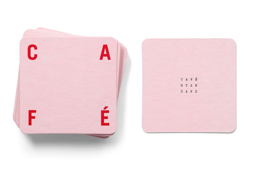
the coasters emphasized the schizo nature of the identity—the two personalities could live separately from one another but both be present. also there is an interplay between the cocktail glass and coaster. on one side the small typewriter text shows up in your drink, magnified, when flipped over the word C A F É frames the cocktail perfectly.
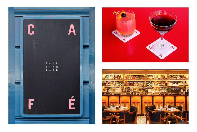
the identity translated well to chalkboards, sandwich boards and the entrance to the café.
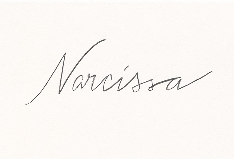
the narcissa logo: we wanted something that was not labored, refined or slick, but instead felt honest, imperfect and human.
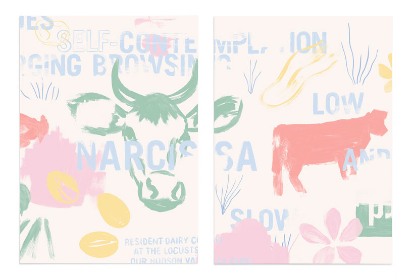
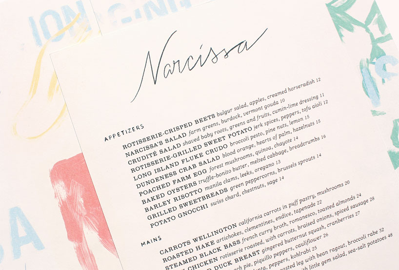
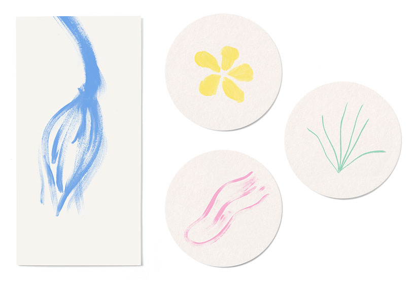
‘with narcissa, the inspiration was less overt. the restaurant features seasonal, local and organic produce from andré balazs’ own hudson valley farm. the namesake is a dairy cow that lives on the farm called narcissa. although you might expect a restaurant of it’s caliber to take itself very seriously with its design, the standard wanted something that was more colorful and inviting. if the writers of the neighborhood inspired the café, the artists inspired the restaurant identity. we wrote the logo and headers of the menu by hand and painted a larger mural that was split over four panels and used on the backside of the menus. we painted the mural in a pretty abstract sketchy style and referenced elements on the farm, the cow, and the garden of the restaurant. it’s us sort of trying to channel a window into the cow’s mind, her hobbies, what she sees and dreams about.’
narcissa menus.
inside of menu.
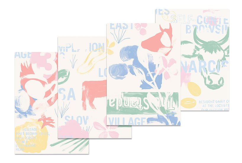
we painted a 4-panel mural for the backside of the menus.
check presenter and coasters.
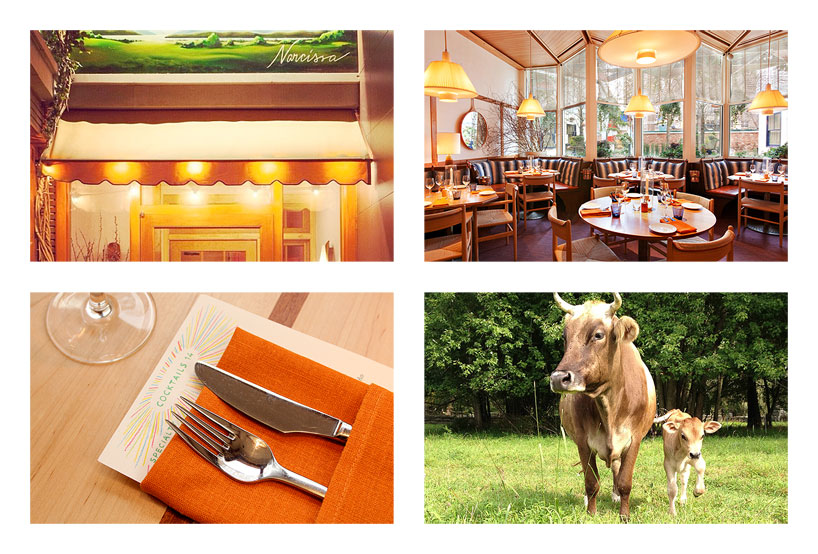
the space and the restaurant’s namesake dairy cow, narcissa.
TRIBORO (2)
 Jun 25, 2013
PRODUCT LIBRARY
 Apr 17, 2024
 Apr 15, 2024
 Apr 15, 2024
 Apr 12, 2024