the »typographic manifesto.« tackles the problem of the ‘black art’ that slowly dies out
the project is an analog-digital-hybrid that addresses typographers, designers, and people who are interested in the topic of the old craft.
the »typographic manifesto.« book by sebastian moock tackles the problem of the fundamental typographic knowledge, the so-called ‘black art’, which is not passed on to future generations and thus slowly dies out. this concept serves as an analog-digital-hybrid that addresses typographers, designers, and in general people who are interested in the topic of typography. the book written on 320 pages, presents five theses, including discussions with well-known typographers — rolf rehe, friedrich forssman, erik spiekermann, henning skibbe, charlotte rohde. all images courtesy of sebastian moock
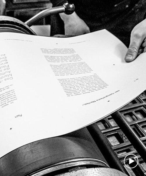
the »typographic manifesto.« was printed with an HP indigo and in letterpress, so it is an analog-digital-hybrid
the »typographic manifesto.« is an invitation to everyone to expand the two-dimensional surface on the monitor in order to experience writing three-dimensional again. this work is brought closer to the target group in a cross-medial way in order to ignite the passion for lead typesetting and thus preserve the culture of the ‘black art’. sebastian moock, an award-winning art director, graphic designer, and typographer, has been involved with analog and digital printing techniques from an early stage on.
‘I regularly learned the old craft with lead letters from former hand typesetters and printers in an active book printing museum. I was fascinated by the understanding as well as the micro typography which is crucial for this material and which is directly transferred to the typeface.’ stated sebastian. ‘I also found that the knowledge transfer and the feeling for writing are easier to explain to the visitors than the theoretical part at the time of their studies.’
a documentary photo of the letterpress process
the book has a cross-medial structure and its analog and digital parts complement each other. this is achieved through audio recordings (typomanifest podcast), a touring exhibition (typesetting box), and a social media strategy. the process of this book is documented in sebastian’s bachelor thesis with many videos, photos, and test prints. the flag of the »typographic manifesto.«

the content of the »typographic manifesto.«

a typography map shows the place of erik spiekermann

polaroid with erik spiekermann and sebastian moock
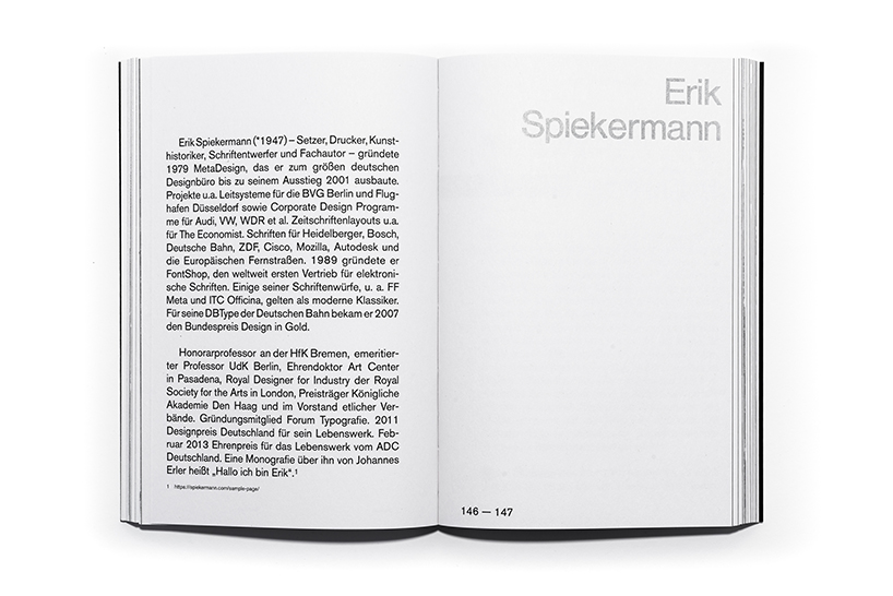
bio about erik spiekermann

the quote: ‘what you touch you grasp sooner’ by erik from the interview

the interview with erik which is also in the TYPOMANIFEST podcast
the workshop at erik’s p98a in berlin
the classical set from the letterpress is used for the five theses

the TYPOMANIFEST podcast is now available on spotify, apple podcast, google podcast and www.typomanifest.de
project info:
name: the »typographic manifesto.«
designer: sebastian moock
participants: rolf rehe, friedrich forssman, erik spiekermann, henning skibbe, charlotte rohde
format: 160 x 240 mm
designboom has received this project from our ‘DIY submissions‘ feature, where we welcome our readers to submit their own work for publication. see more project submissions from our readers here.
shop
your own online design shop — no sales commission collected