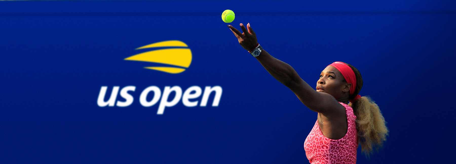
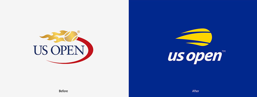
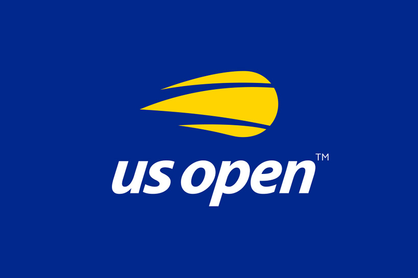
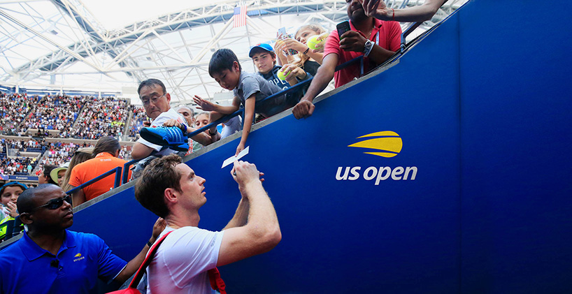
accompanying the united states tennis association’s (USTA) 50th year anniversary of the US open is a bold, new logo. a strong blue backdrop. a simple sans serif. all lowercased text. the golden-flamed tennis ball is gone and so is its trippy, red tail. graphic designers of the internet, what do you think?
all images courtesy of chermayeff & geismar & haviv
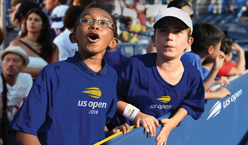
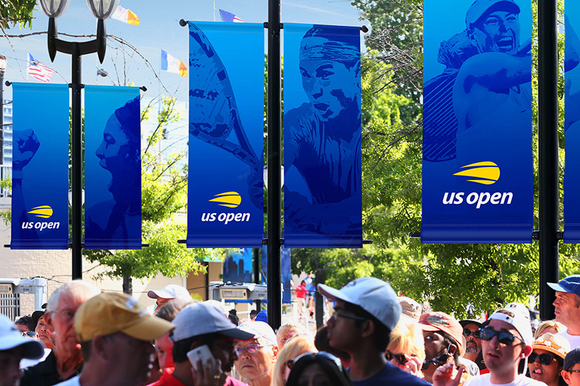
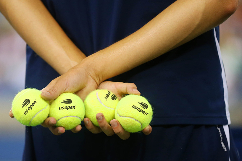
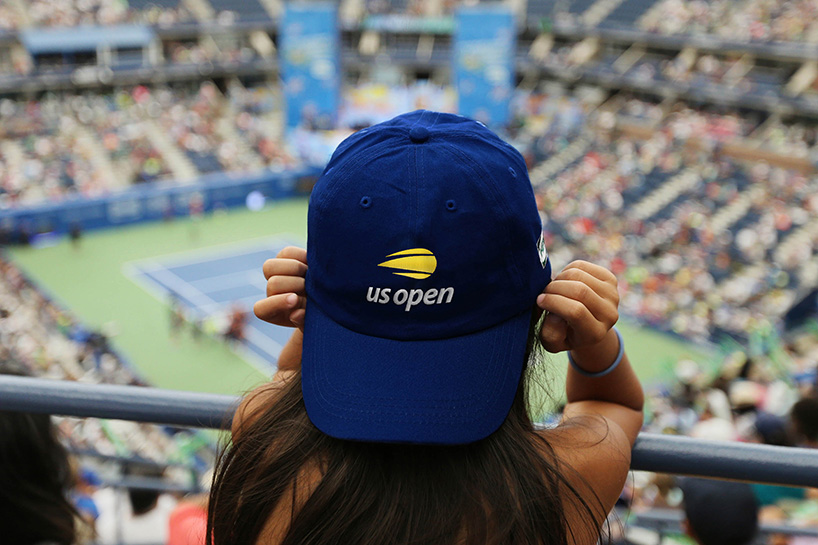
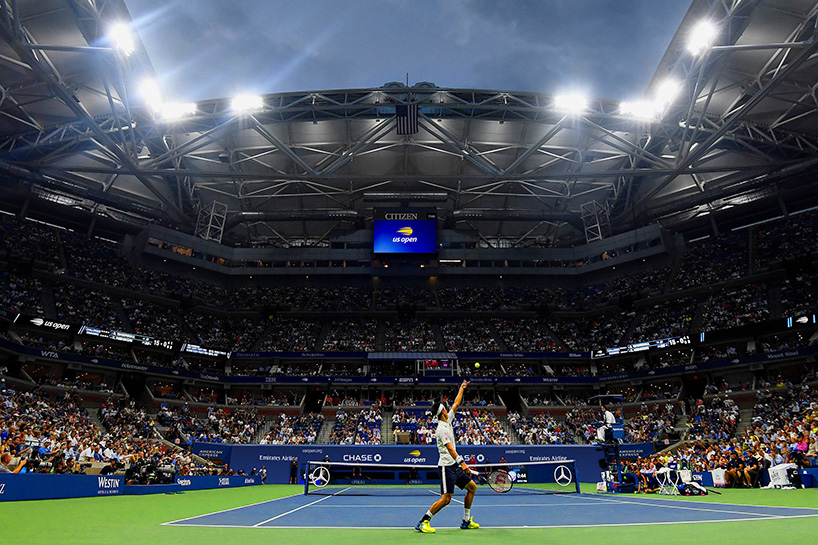
the new US open logo — designed by renowned firm chermayeff & geismar & haviv — is a streamlined version of the tennis tournament’s flaming ball’d, thin-serif’d logo, first introduced in 1997, which explains the clip-art-style tennis ball. but the logo is just one of the outcomes of the USTA’s five-year transformation. the billie jean king national tennis center is also completed. together, the facility and the logo aim to create a visual identity for the tournament — a modernized identity, designed to stay in style well into the future.
LOGO DESIGN (244)
 Aug 14, 2023
 Aug 02, 2023
PRODUCT LIBRARY
 Apr 15, 2024
 Apr 15, 2024
 Apr 12, 2024
 Apr 04, 2024