chermayeff & geismar & haviv redesigns warner bros. logo
Chermayeff & Geismar & Haviv redesigns the emblematic shield logo of Warner Bros. Pictures and Studios for the entire portfolio under the Warner Bros. family. The design team has stripped off the Warner Bros. Pictures Inc. banner on the middle of the shield and ushered in thicker, bolder, and sharper details of the curvature and letterforms of the shield and the capital letters ‘WB’ in an attempt to retain the classic, recognizable look of the logo while adopting a chunkier and more sleek style. Starting May 2023, the revamped shield is the new logo of the company and its brands, falling in the same year that marks the 100th anniversary of the storied Warner Bros. studio.
The design team redraws and distills the classic 1948 Warner Bros. emblem through reductive geometry, streamlined curves, and even more vibrant hues. The shield has gotten bigger; the laddered and pointed edges above are now decked out with softer, sloping turns; the tips have been sharpened; the shadowing inside the shield is even more pronounced; and the new logo adapts to the movies’ and characters’ personalities with thorough details that immediately recall a specific protagonist or scene.
![]()
images courtesy of Chermayeff & Geismar & Haviv
Highlighting the curvature of the rounded letterforms
Chermayeff & Geismar & Haviv studied the design elements of the iconic Warner Bros. Pictures shield starting with its original three-dimensional rendering. The design team redrew it from scratch and from there, they began to include bits of their rendition. The equalized the weight of the W and B letterforms with the stroke of the encasing shield shape, and the strong, sans serif, all-capital letters for the wordmarks have been accentuated to underscore the curvature of the rounded letterforms, such as the Ps, Bs, and Rs.
‘This distinctive character of the lettering resonates with the revised WB letters in the shield while updating the typography for modern uses and legibility,’ states Chermayeff & Geismar & Haviv. The design team believes that the revamped consistency of line weight that harmoniously works between elements can create a unified, timeless symbol that can work seamlessly with all the properties in the company’s extensive portfolio.
The new look of the Warner Bros. Pictures family logo comes two-fold. The solid rendition of yellow and blue is slated to be used for corporate communications, while the outline rendition – the more design-adaptable one – promotes movies, television shows, games, and other content. ‘Both manifestations can take on the background colors and textures of creative content, providing a consistent canvas for the visual artists at the Warner Bros. family of brands to explore and riff on for the big screen around the world,’ says Chermayeff & Geismar & Haviv.
![]()
new Warner Bros. logo for Harry Potter
![]()
the shield has gotten bigger and the laddered and pointed edges above are now decked out with softer turns
![]()
the tips have been sharpened, and the shadowing inside the shield is even more pronounced
Chermayeff & Geismar & Haviv redesigns Warner Bros. logo
![]()
making the new logo thicker and softer
![]()
a chunkier look for the redesigned logo
![]()
the solid rendition of yellow and blue is slated to be used for corporate communications
project info:
name: Warner Bros. Pictures Logo
design: Chermayeff & Geismar & Haviv
company: Warner Bros. Pictures Inc.
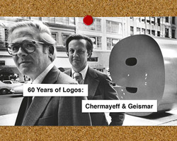
chermayeff and geismar (9)
 Dec 15, 2017
 Dec 04, 2017
 Oct 04, 2017
 Jan 29, 2013
logo design (245)
 Jul 03, 2024
 Aug 14, 2023
PRODUCT LIBRARY
 Jul 23, 2024
 Jul 01, 2024
 Jun 13, 2024
 Jun 06, 2024