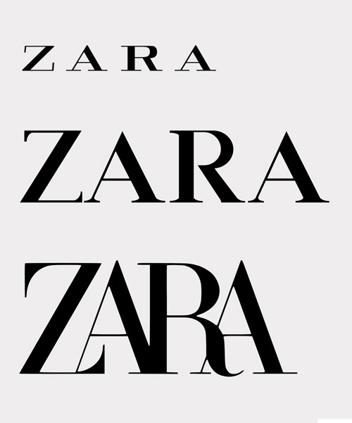
spanish retailer ZARA revealed a logo redesign at the end of last month that saw its branding undergo some over-enthusiastic kerning – that’s the spacing between letters. designed by french agency baron & baron, the new identity has since been met with criticism among designers.

ZARA new logo by baron & baron causes controversy amongst critics

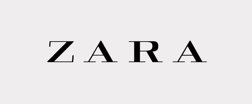
ZARA’s previous logo featured more spacious lettering


german typographer erik spiekermann went as far as to call it ‘the worst piece of type [he’s] seen in years‘. in a twitter post, spiekerman asked if it was designed by ‘one of those new robots that will replace humans‘. meanwhile fabio basile of british design studio fortnight mocked the logo with an image forecasting the fashion retailer’s logo in eight years, if it were to follow the same pattern.


the last time ZARA changed its logo was in 2011. still composed of the four letters that make up its name, as has always been the case, the transformation of its insignia introduced a new font and an increase in spacing to create a sense of minimalism.


ZARA is not the only retailer to change up its brand identity. british luxury fashion house burberry unveiled updates to its logo in august 2018, designed in collaboration with peter saville. french fashion house celine dropped the accent from its name in the following month to create a simplified and ‘more balanced’ design. the new looks have caused concerns that luxury brand’s logos are becoming uniformed as they undergo sans-serification.