
A Modern Spin On A Cultural Classic by michael page from uk
designer's own words:
the style i was generally aiming for was for a more formal, relaxed audience, which are far more likely to be reading blogs. the use of the mole motif was a simple play on words and was designed to be a cute, relaxed image that can be used on t-shirts, and other promotional material, perhaps even on it's own it it become more recognised.
modern font with mole logo at end
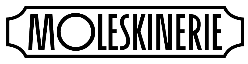 art deco inspired simple logo
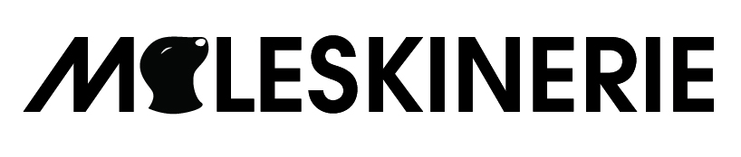 avant garde font with mole motif for o
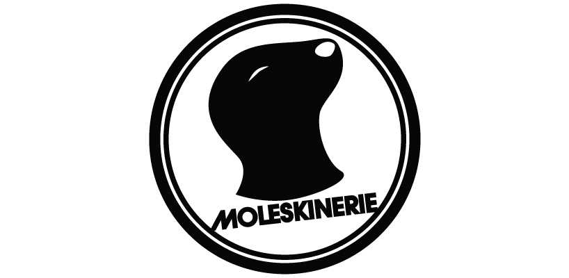 circular mole logo with avant garde font
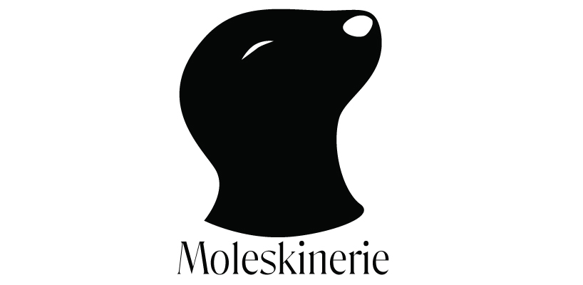 classic font with mole logo large
 classic style logo and font
shortlisted entries (2162)