Additional entry for the first Moleskinerie logo design by ellie pham from uk
designer's own words:
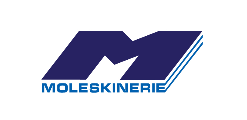
- My design includes both text and a graphic symbol. The symbol is created from the
first letter ‘M’ of the brand with a 3D effect representing a combination of tradition and
modern as well as solidity and eternity. The position of the brand name creates a consistency for the logo.
- Light blue is used for the text, meanwhile dark blue is the color of the symbol which express trustworthy, inspiration and spirituality.
- The professional and elegant font UTM Micra is used to present the name Moleskinerie which is very clear, strong and easy to read.
Moleskinerie in color
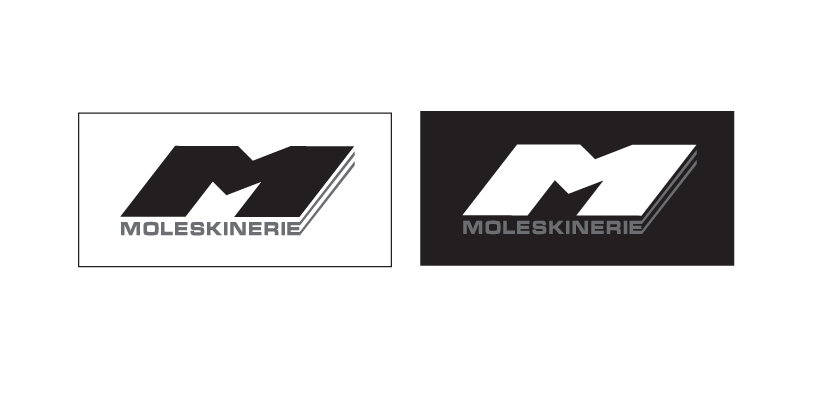 Moleskinerie in black and white
shortlisted entries (2162)