as simple as it is.
by andré santos from portugal
designer's own words:
at the beginning of the research to execute this logotype, i made a mental map to understand the words that are around moleskine. history, memories, travel, calligraphy, typography, words, sketchs... these are a few of them and i started to think about a logo that could mix the manual gesture (analogic) and the typography (digital), used on web. trying to represent a calligraphy that could transport us to history, warm feelings, and then to overprint a typography, the most racional and cold side of the logo.
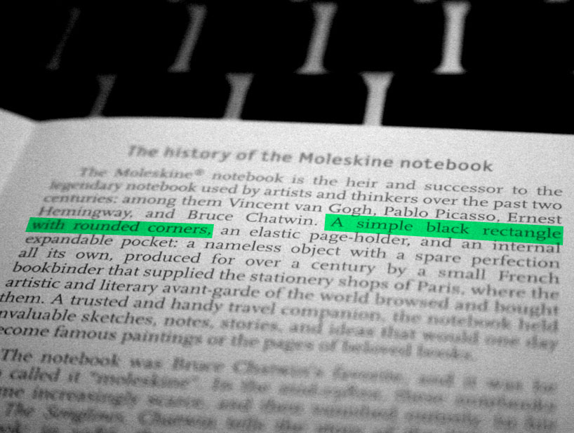
than, i realised that i had a definition of moleskine made by itself in a folder that came with my moleskine. i opened the folder and it had the history of moleskine and a genious definition: "a simple black rectangle with rounded corners". in fact, this resumes moleskine in just a few words. moleskine is so strong and has such a unmistakable shape that i decided to resume my logo in "a simple black rectangle with rounded corners".
nowadays, moleskine books are sold in so many colors, so the logotype could assume different colours, depending on the backgrounds, supports and so on...
we like moleskine.
but what is it?
oh, i see…
can you be more specific please?
it is this!
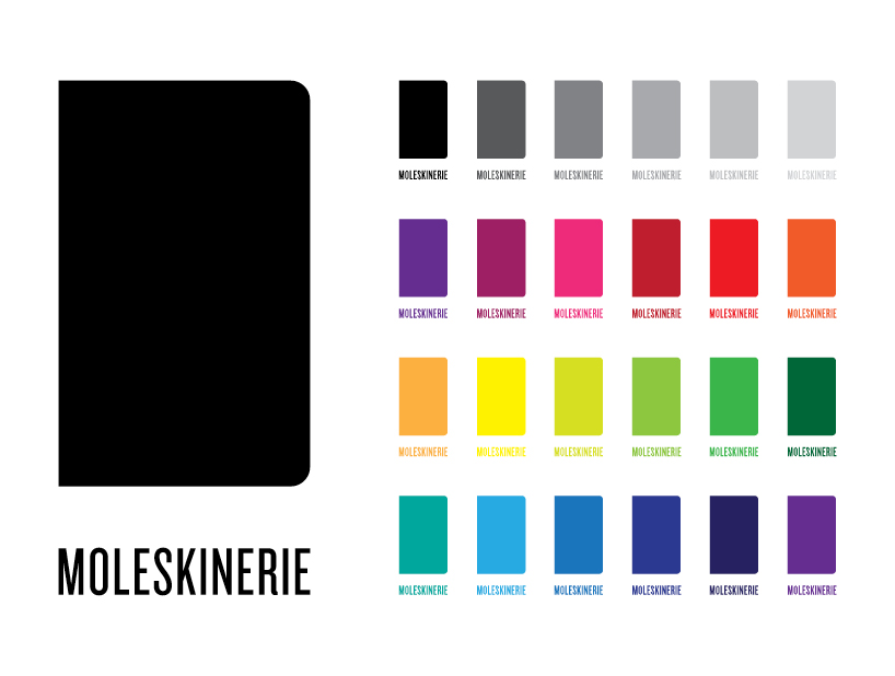
and it has so many colours!