
B logo type
by natasa skrbic from serbia
designer's own words:
design of this logo and logotype represents a clear message of moleskine brand type and also a subject of moleskinerie blog.
logo is a simple combination of stylized fountain pen with dark blue color which certainly
resembles the ink, and also stylized open notebook, with blank pages, ready for use.
although the blue color, in this case symbolizes the ink, it also has a meaning of trustworthiness, devotion and stability.
logotype is written in serif font, black color, already well-known, used for moleskine logotype.
the reason why logotype is the same as at moleskine is that the idea was to combine samting already recoznizable with a completely new sign. the black color symbolizes elegance and sophistication.
Logo and logotype
Logo and logotype – Positive/Negative
Logo and logotype – Downsizing
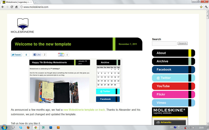
Blog – logo and logotype example