bubble foam by ana isabel madrigal from mexico
designer's own words:
A very important issue when cleaning is to enjoy the activity that you have to do. That’s why the colors, the smell, the texture and of course, the functionabillity of the cleaning product can make the difference between a bad experience or a great experience.
This idea is based on the sensorial experience while a person realizes his cleaning tasks.
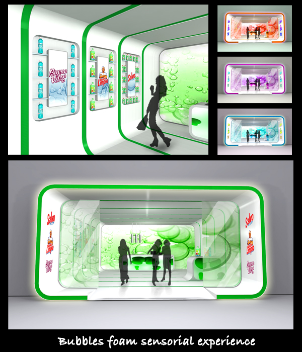
The main entrance of the shop is about 30 cm projected outside the main wall for calling attention from people that walks around.
All the space is white making reference to the cleaning function of the product, and the color details that you can see, are lighting effects that remains to the Procter & Gamble cleaning product colors.
This lighting effects are changing constantly from one green to an orange, then to a violet and all imaginable colors in a random slow speed way.
Just at the end of the store there’s a wall that has a graphic that also changes of color. This graphic is specially elected because it make reference to the foam that all detergents, in a liquid or powder of Procter & Gamble crate in one way or another.
While the person is in the shop, will be emerged in a peaceful and pleasant sensorial atmosphere. The products are exposed in the walls giving each family (Salvo®, Buena Vibra® and Maestro Limpio®) a special place. The graphics that can join the products can explain bravely its advantages.
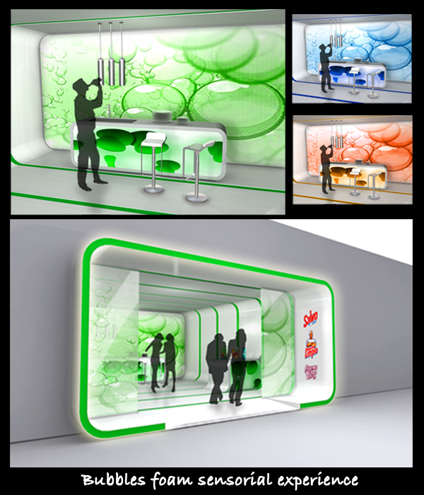
In the other wall there’s a place for relaxing where users can sit and get comfortable un a soft sitting place made of cushions that represent the softness of the products in contact with the user.
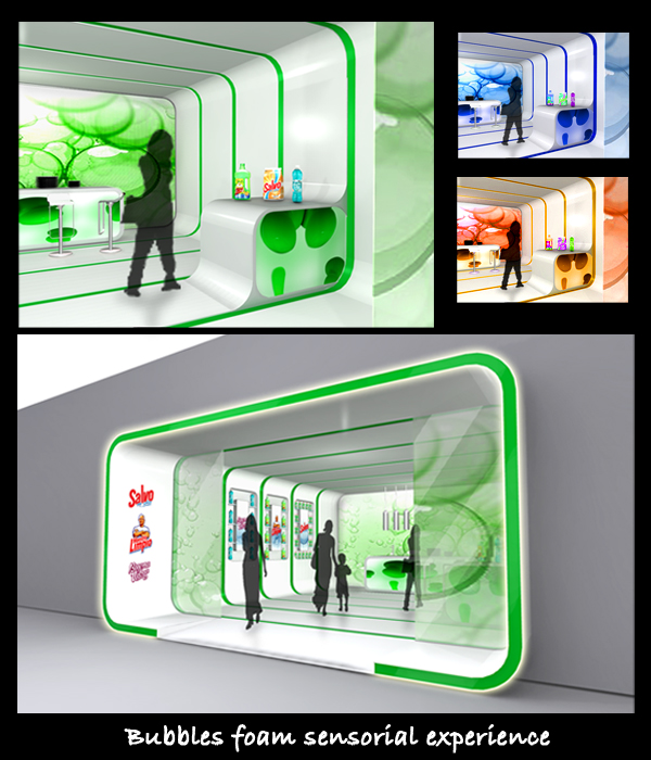
Finally, the back of the store, where you can find someone that will help you to know much more about the products.
Information, functionability and a great sensorial experience is what Procter & Gamble products must express in the in-store point of sale design.
aimc bubble foam 1
 aimc bubble foam 2
 aimc bubble foam 3