colors are the new black by anina benulic from slovenia
designer's own words:
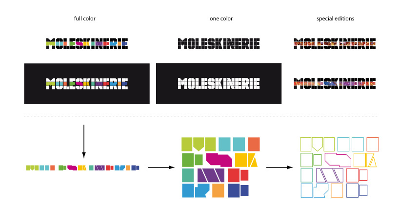
the structure of the logo implies the fine and mostly clear color categorization and logical differentiation of moleskin’s notebooks - depending on the purpose and use. the structure incorporates simplicity and modularity of the collection and its diversity and contrast as well. color scheme roughly follows the actual color palette of moleskin’s products.
each letter is basically black, with a color band, deviding it in the middle. this separates each letter from others, giving each it's own character, while making the logotype different, memorable and overall recognisable. in further applications, the color band functions as an independent graphic element that strenghtens and supports the recognizability of the visual brand identity. due to the strong artistic language of the color element, we can de-construct it and re-establish it in a new composition, without ever impinging on the coherence of the overall identity. all elements can be used in the same manner in the outline form. although color is an important attribute in the logo identity, the simple modular structure allows it to also function well in only one color or in the negative. on special occasions the color band can serve as a carrier or a base for an image, pattern or texture which is linked to the meaning or context of the specific occasion.
the logo and the development of specific graphic element
 the usage of the logo on a photograph
 the stationary
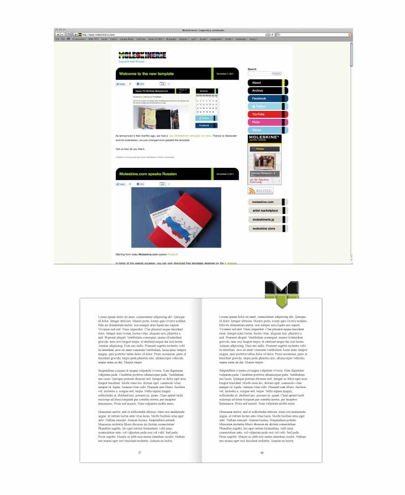 the logo used on the web page and the bookmark
 t-shirts, badges and bags
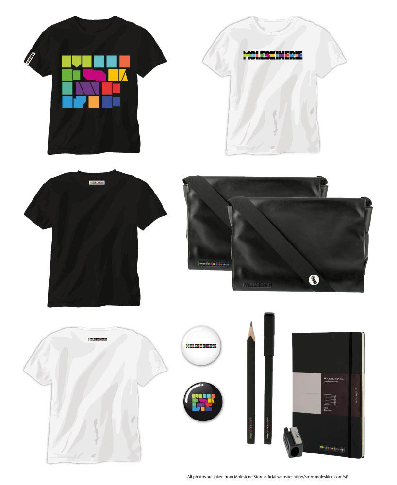 t-shirts, badges, bags and other accessories