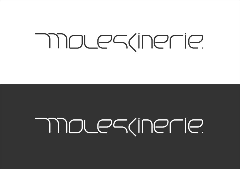
Cornered Moleskinerie Logo
by christian zammit from netherlands
designer's own words:
The idea behind this Moleskinerie logo is to combine a classical feature from the Moleskine notebook; the rounded corner of the pages, to a more contemporary typeface suitable for a blog. The geometry of the typeface is a combination of perpendicular intersections at different angles. Each and every intersection is curved as the corner of the notebook pages.
Cornered – Moleskinerie Logo
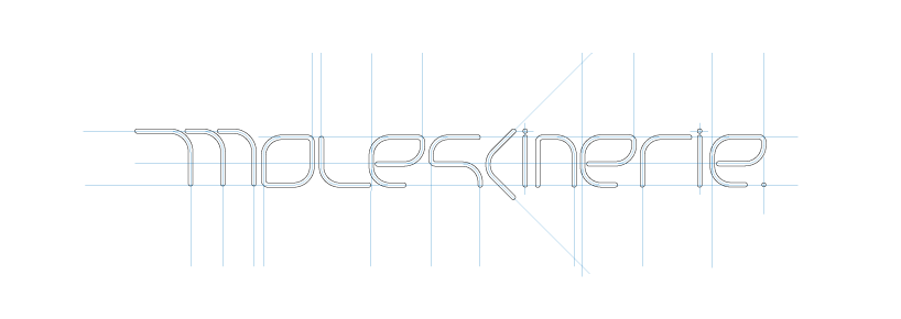
Cornered – Moleskinerie Logo Construction
Cornered – Moleskinerie Logo on Different Coloured Backgrounds
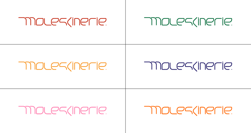
Cornered – Moleskinerie Logo – Different on Colours on White Background