design for a better world... by mizanur rahman from uk
designer's own words:
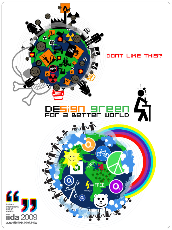
"De-sign for a better world" is a collective image which presents the destruction of the earth on one side as the “polluted world” and the beauty on the other as the “paradise world” through the simplicity of symbolism. It can be used as an advert in a design magazine or even in a public subway station billboard... the spirit of the image applies to everyone!
We see symbols and signs everywhere and they are used to represent good and bad things, more than often they are bad. Signs may be simple in their presentation, but beneath their basic designs lay deeper meanings of danger and menacing implications on the environment. Using infamous signs such as the “airport” sign or the symbol for “fire hazard”; the “polluted world” shows just how damaged the world is and that we all stand apart on how to solve the problems that the earth faces...
In retrospect, the "paradise world" is simpler, cleaner and more beautiful. It has symbols of peace, sustainable ways of creating energy, recycling, changing bad habits and creating new good ones. It shows we all stand together for the preservation of the "earth-kind" not just humankind.
so as designers, in all fields, we have a responsibility to take the initiative to design, create and sustain for a better world, not just for the future, but for what exists now and beyond. It’s the challenge for designers now, to create products that don’t have symbols which represent danger and harm for the planet, but create enviro-friendly products that can have symbols and logos that represent benefits for our planet.
de-sign for a better world advert
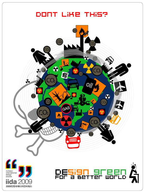 polluted earth symbols and signs
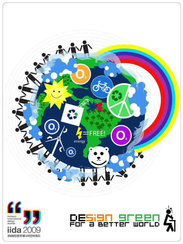 paradise earth symbols and signs