han river column based icons by yoonshik lee from korea
designer's own words:
The information graphics on the Han River Bike Road are minute and a futile attempt to communicate with the bikers as well as any visitor. It is a treasure-hunt for information. They are either placed at wrong angles where bikers can barely make them out or extremely small to be understood from a distance, where bikers can miss the signs if they can only read from a very close distance.
Our solution to this problem was to use the Riverside bridge columns to our advantage. The columns are a big part to the whole Han River Bike Road experience; leaving them empty is an inefficient and “un-green” choice. We have used the existing Seoul Sign Pictograms, as the people are more familiar to them. To these existing pictograms we have added a Big Head Character as a means to attract the people in one big swoop. With this attention we can now deliver the message they need to see without wasting their time. The character itself is humanoid and is able to point to the direction of its sign with a clear indication of the distance. There is a male and female character in case there are two nearby instances of the same place. Not only is it used to pinpoint two different locations, but it also can be used as a small interaction between the two characters to attract people to the sign.
They are attractive, simple and to the point. It does not blur the Han River Bike Road experience; the bikers can only take a glance to receive all the information they need. The signs are not a treasure-hunt for information. More so we think our pictograms enhances the experience, as it brings a bit of familiarity to the river and reminds us that Han River is indeed ours to take care of.
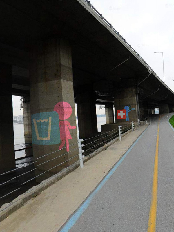
Scenario Scene
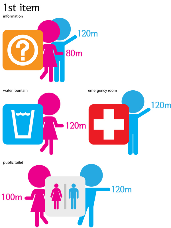 1st item of icons
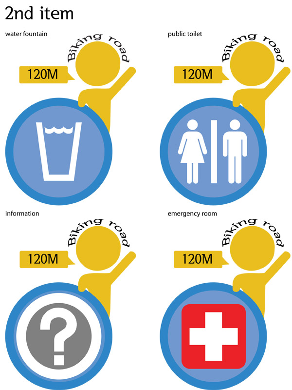 2nd item of icons